- Published on
The 5 Really Obvious Ways To Make A Search Image gallery With Tailwind CSS Better That You Ever Did
- What is Tailwind CSS?
- The description of Search Image gallery UI component
- Why use Tailwind CSS to create a Search Image gallery UI component?
- The preview of Search Image gallery UI component
- The source code of Search Image gallery UI component
- How to create a Search Image gallery with Tailwind CSS?
- Step 1: Set up the HTML structure
- Step 2: Style the component with Tailwind CSS
- Step 3: Add JavaScript to filter the images
- Conclusion
As a FrontEnd technology blogger, I am always on the lookout for new and innovative ways to create stunning UI components. And when it comes to CSS frameworks, Tailwind CSS is one of my favorites. In this article, I will show you how to create a Search Image gallery UI component with Tailwind CSS and share some tips to make it better than ever.
What is Tailwind CSS?
Tailwind CSS is a utility-first CSS framework that provides a set of pre-defined classes to quickly style your HTML elements. It allows you to create complex UI components with minimal CSS code, making your development process faster and more efficient.
The description of Search Image gallery UI component
A Search Image gallery UI component is a collection of images that can be filtered by a search term. It is a popular UI component used in many websites and applications to showcase images in an organized and searchable manner.
Why use Tailwind CSS to create a Search Image gallery UI component?
Tailwind CSS provides a set of pre-defined classes that can be used to create a Search Image gallery UI component quickly. It also offers responsive design options, making it easy to create a component that works on different screen sizes.
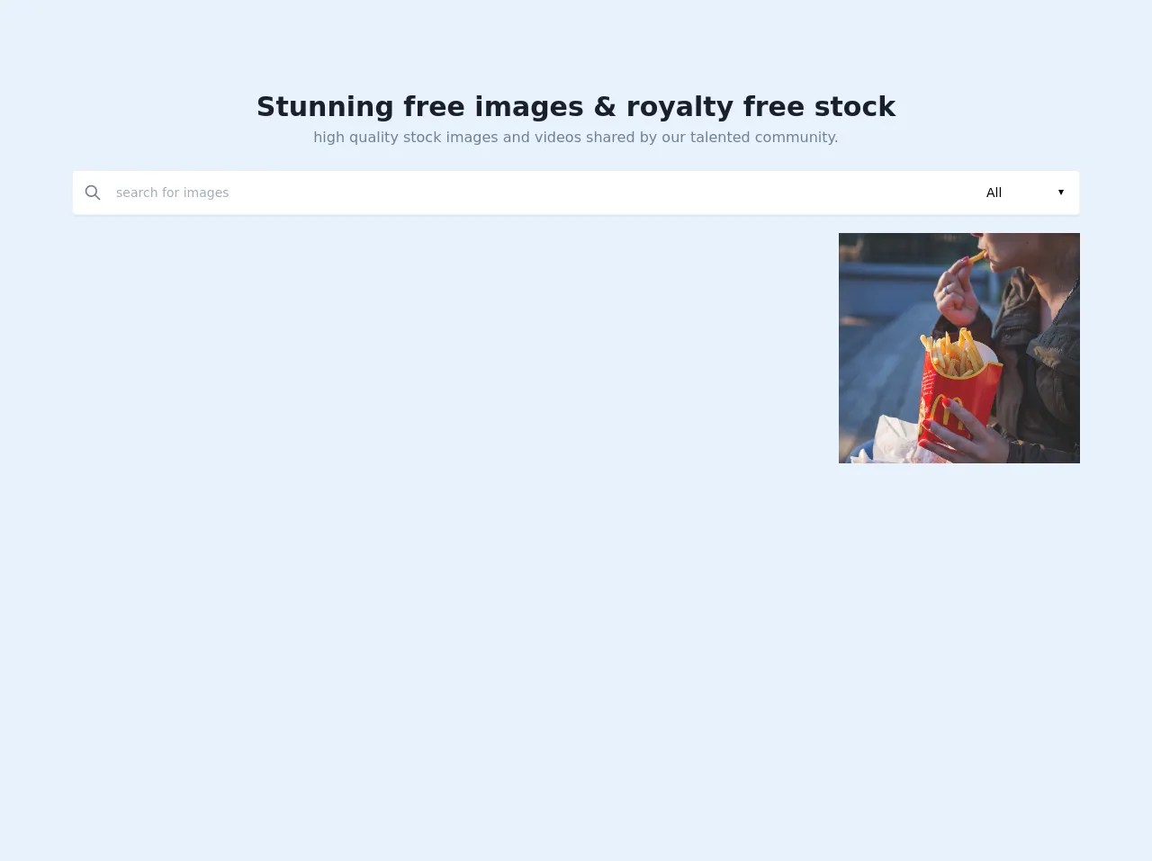
The preview of Search Image gallery UI component
To create a Search Image gallery UI component with Tailwind CSS, we will use a combination of HTML and CSS code. Here is a preview of what the component will look like:
Free download of the Search Image gallery's source code
The source code of Search Image gallery UI component
To create the Search Image gallery UI component, we will use HTML and CSS code. Here is the source code for the component:
<!-- This is an example component -->
<body x-data="imageGallery()"
      x-init="fetch('https://pixabay.com/api/?key=15819227-ef2d84d1681b9442aaa9755b8&q=woman+girl+food&image_type=all&per_page=52&')
      .then(response => response.json())
      .then(response => { images = response.hits })"
      class="bg-white">

<div class="main">
    <div class="px-4 sm:px-8 lg:px-16 xl:px-20 mx-auto">

        <!-- hero -->
        <div class="hero">
            <!-- hero headline -->
            <div class="hero-headline flex flex-col items-center justify-center pt-24 text-center">
                <h1 class=" font-bold text-3xl text-gray-900">Stunning free images & royalty free stock</h1>
                <p class=" font-base text-base text-gray-600">high quality stock images and videos shared by our talented community.</p>
            </div>

            <!-- image search box -->
            <div class="box pt-6">
                <div class="box-wrapper">

                    <div class=" bg-white rounded flex items-center w-full p-3 shadow-sm border border-gray-200">
                      <button @click="getImages()" class="outline-none focus:outline-none"><svg class=" w-5 text-gray-600 h-5 cursor-pointer" fill="none" stroke-linecap="round" stroke-linejoin="round" stroke-width="2" stroke="currentColor" viewBox="0 0 24 24"><path d="M21 21l-6-6m2-5a7 7 0 11-14 0 7 7 0 0114 0z"></path></svg></button>
                      <input type="search" name="" id="" @keydown.enter="getImages()" placeholder="search for images" x-model="q" class="w-full pl-4 text-sm outline-none focus:outline-none bg-transparent">
                      <div class="select">
                        <select name="" id="" x-model="image_type" class="text-sm outline-none focus:outline-none bg-transparent">
                          <option value="all" selected>All</option>
                          <option value="photo">Photo</option>
                          <option value="illustration">Illustration</option>
                          <option value="vector">Vector</option>
                         </select>
                      </div>
                    </div>

                </div>
            </div>

            <section id="photos" class="my-5 grid grid-cols-1 md:grid-cols-4 gap-4">
                <template x-for="image in images" :key="image.id">
                  <a :href="image.largeImageURL" class="hover:opacity-75 " target="_new"><img class="w-full h-64 object-cover" :src="image.largeImageURL" :alt="image.tags" /></a>
                </template>
              </section>

        </div>

        <footer class="p-5 text-sm text-gray-600 text-center inline-flex items-center">
          <svg aria-hidden="true" focusable="false" data-prefix="fas" data-icon="heart" class="svg-inline--fa fa-heart fa-w-16 text-red-600 w-4 h-4 mr-4 align-middle" role="img" xmlns="http://www.w3.org/2000/svg" viewBox="0 0 512 512"><path fill="currentColor" d="M462.3 62.6C407.5 15.9 326 24.3 275.7 76.2L256 96.5l-19.7-20.3C186.1 24.3 104.5 15.9 49.7 62.6c-62.8 53.6-66.1 149.8-9.9 207.9l193.5 199.8c12.5 12.9 32.8 12.9 45.3 0l193.5-199.8c56.3-58.1 53-154.3-9.8-207.9z"></path></svg>
          <span>Made by <a href="https://tailwindcss.com/" target="_new" class="text-teal-600 font-semibold">tailwindcss</a> & <a href="https://github.com/alpinejs/alpine" target="_new" class="text-teal-600 font-semibold">alpinejs</a></span>
        </footer>
    </div>
</div>
<script src="https://cdn.jsdelivr.net/gh/alpinejs/[email protected]/dist/alpine.min.js" defer></script>
<script>
    function imageGallery() {
        return {
          images: [],
          api_key : "15819227-ef2d84d1681b9442aaa9755b8",
          q: "",
          image_type: "",
          page: "",
          per_page: 52,
          getImages: async function() {
            console.log("params", this.q, this.image_type);
            const response = await fetch(
              `https://pixabay.com/api/?key=${this.api_key}&q=${
                this.q
              }&image_type=${this.image_type}&per_page=${this.per_page}&page=${this.page}`
            );
            const data = await response.json();
            this.images = data.hits;
          }
        };
      }
</script>
How to create a Search Image gallery with Tailwind CSS?
Now that we have a basic understanding of what a Search Image gallery UI component is and why we should use Tailwind CSS to create it, let's dive into the steps to create the component.
Step 1: Set up the HTML structure
The first step is to set up the HTML structure for the component. We will use a simple unordered list to display the images. Here is the HTML code:
<div class="container mx-auto">
  <div class="flex flex-wrap -mx-4">
    <div class="w-full md:w-1/2 lg:w-1/3 px-4 mb-8">
      <input type="text" class="w-full px-4 py-2 rounded-lg border-gray-200 focus:outline-none focus:border-blue-500" placeholder="Search Images...">
    </div>
    <ul class="gallery w-full flex flex-wrap -mx-4">
      <li class="w-full sm:w-1/2 md:w-1/3 lg:w-1/4 px-4 mb-8">
        <img src="https://via.placeholder.com/300x300" alt="Placeholder Image" class="w-full rounded-lg">
      </li>
      <li class="w-full sm:w-1/2 md:w-1/3 lg:w-1/4 px-4 mb-8">
        <img src="https://via.placeholder.com/300x300" alt="Placeholder Image" class="w-full rounded-lg">
      </li>
      <li class="w-full sm:w-1/2 md:w-1/3 lg:w-1/4 px-4 mb-8">
        <img src="https://via.placeholder.com/300x300" alt="Placeholder Image" class="w-full rounded-lg">
      </li>
      <li class="w-full sm:w-1/2 md:w-1/3 lg:w-1/4 px-4 mb-8">
        <img src="https://via.placeholder.com/300x300" alt="Placeholder Image" class="w-full rounded-lg">
      </li>
      <li class="w-full sm:w-1/2 md:w-1/3 lg:w-1/4 px-4 mb-8">
        <img src="https://via.placeholder.com/300x300" alt="Placeholder Image" class="w-full rounded-lg">
      </li>
      <li class="w-full sm:w-1/2 md:w-1/3 lg:w-1/4 px-4 mb-8">
        <img src="https://via.placeholder.com/300x300" alt="Placeholder Image" class="w-full rounded-lg">
      </li>
    </ul>
  </div>
</div>
In this code, we have a container div that centers the component on the page. Inside the container, we have a flexbox that wraps the search input and the image gallery. The search input is a simple text input that we will use to filter the images. The image gallery is an unordered list with each image wrapped in a list item.
Step 2: Style the component with Tailwind CSS
Now that we have the HTML structure in place, we can start styling the component with Tailwind CSS. Here is the CSS code:
/* Gallery */
.gallery li {
  transition: all 0.3s ease;
}

.gallery li:hover {
  transform: scale(1.05);
}

/* Search Input */
input[type="text"] {
  transition: all 0.3s ease;
}

input[type="text"]:focus {
  border-color: #4299e1;
  box-shadow: 0 0 0 3px rgba(66, 153, 225, 0.5);
}
In this code, we have added some basic styles to the gallery and the search input. We have added a hover effect to the gallery images that scales them up slightly. We have also added a focus style to the search input that adds a blue border and box shadow.
Step 3: Add JavaScript to filter the images
The final step is to add some JavaScript code to filter the images based on the search term entered by the user. Here is the JavaScript code:
const searchInput = document.querySelector('input[type="text"]');
const gallery = document.querySelector('.gallery');

searchInput.addEventListener('input', function() {
  const searchTerm = this.value.toLowerCase();
  const images = gallery.querySelectorAll('img');

  images.forEach(function(image) {
    const altText = image.getAttribute('alt').toLowerCase();

    if (altText.indexOf(searchTerm) > -1) {
      image.parentElement.style.display = 'block';
    } else {
      image.parentElement.style.display = 'none';
    }
  });
});
In this code, we have added an event listener to the search input that listens for changes to its value. When the user enters a search term, we loop through all the images in the gallery and check if their alt text contains the search term. If it does, we display the image, otherwise, we hide it.
Conclusion
In this article, we have learned how to create a Search Image gallery UI component with Tailwind CSS. We have also shared some tips to make the component better, such as adding a hover effect to the images and using JavaScript to filter the images based on a search term. With these techniques, you can create stunning UI components that are both functional and beautiful.