- Published on
6 Ideas To Help You Create A search box With Tailwind CSS Like A Pro
- What is Tailwind CSS?
- The Description of Search Box UI Component
- Why Use Tailwind CSS to Create a Search Box UI Component?
- The Preview of Search Box UI Component
- The Source Code of Search Box UI Component
- How to Create a Search Box with Tailwind CSS?
- 1. Customize the Background Color
- 2. Add Autocomplete Suggestions
- 3. Use Icons Instead of Text
- 4. Add Filters
- 5. Customize the Border Radius
- 6. Use Different Sizes
- Conclusion
What is Tailwind CSS?
Tailwind CSS is a utility-first CSS framework that provides a set of pre-defined classes to help you quickly build custom user interfaces. It is designed to be highly customizable and flexible, allowing you to create unique designs without writing custom CSS.
The Description of Search Box UI Component
A search box is a common UI component that allows users to search for specific content on a website or application. It typically consists of a text input field and a search button, and may include additional features such as autocomplete suggestions or filters.
Why Use Tailwind CSS to Create a Search Box UI Component?
Tailwind CSS provides a comprehensive set of utility classes that make it easy to create custom search boxes with minimal CSS code. By using Tailwind CSS, you can save time and effort while still achieving a professional-looking design.
The Preview of Search Box UI Component
To create a search box with Tailwind CSS, you can use the following HTML and CSS code:
<div class="bg-white rounded-md flex items-center">
  <input type="text" placeholder="Search" class="px-4 py-2 border-gray-300 focus:outline-none focus:ring-2 focus:ring-blue-600 focus:border-transparent rounded-l-md flex-grow">
  <button class="px-4 py-2 bg-blue-600 text-white rounded-r-md">Search</button>
</div>
{{__placeholder1__}}
This code creates a search box with a white background, rounded corners, and a text input field with a placeholder text of "Search". The input field has padding, a gray border, and a focus state with a blue ring and transparent border. The button has blue background color, white text, and rounded corners on the right side.
Free download of the search box's source code
The Source Code of Search Box UI Component
To create the search box UI component, you can use the following HTML and CSS code:
<div class="bg-white rounded-md flex items-center">
  <input type="text" placeholder="Search" class="px-4 py-2 border-gray-300 focus:outline-none focus:ring-2 focus:ring-blue-600 focus:border-transparent rounded-l-md flex-grow">
  <button class="px-4 py-2 bg-blue-600 text-white rounded-r-md">Search</button>
</div>
{{__placeholder2__}}
This code uses the Tailwind CSS utility classes to create a search box with a white background, rounded corners, and a text input field with a placeholder text of "Search". The input field has padding, a gray border, and a focus state with a blue ring and transparent border. The button has blue background color, white text, and rounded corners on the right side.
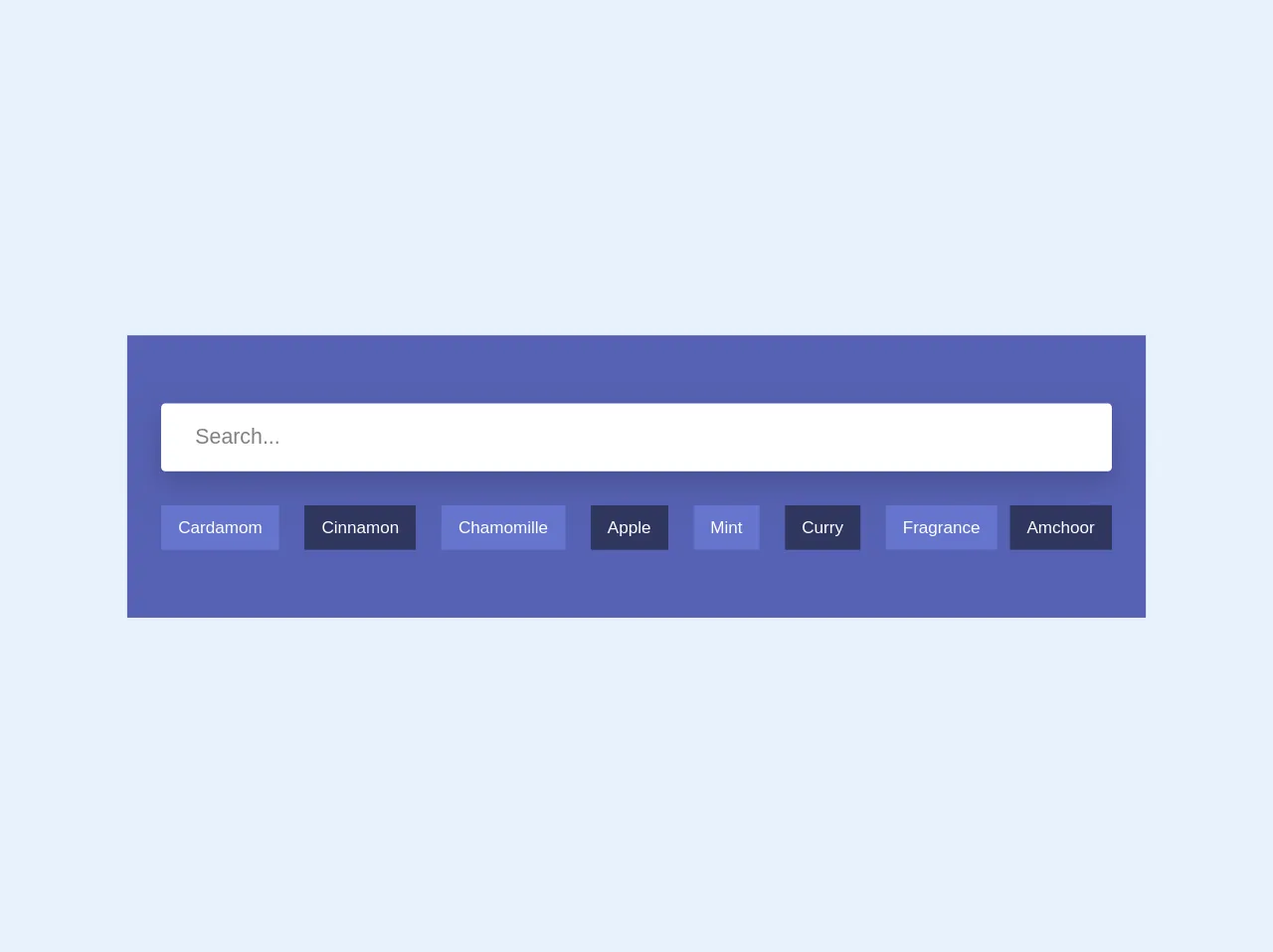
<section class="bg-indigo-dark h-50 p-8">
              <div class="container mx-auto py-8">
                <input class="w-full h-16 px-3 rounded mb-8 focus:outline-none focus:shadow-outline text-xl px-8 shadow-lg" type="search" placeholder="Search...">
                <nav class="flex">
                  <a class="no-underline text-white py-3 px-4 font-medium mr-3 bg-indigo hover:bg-indigo-darker" href="#">Cardamom</a>
                  <a class="no-underline text-white py-3 px-4 font-medium mx-3 bg-indigo-darker hover:bg-indigo" href="#">Cinnamon</a>
                  <a class="no-underline text-white py-3 px-4 font-medium mx-3 bg-indigo hover:bg-indigo-darker" href="#">Chamomille</a>
                  <a class="no-underline text-white py-3 px-4 font-medium mx-3 bg-indigo-darker hover:bg-indigo" href="#">Apple</a>
                  <a class="no-underline text-white py-3 px-4 font-medium mx-3 bg-indigo hover:bg-indigo-darker" href="#">Mint</a>
                  <a class="no-underline text-white py-3 px-4 font-medium mx-3 bg-indigo-darker hover:bg-indigo"  href="#">Curry</a>
                  <a class="no-underline text-white py-3 px-4 font-medium mx-3 bg-indigo hover:bg-indigo-darker" href="#">Fragrance</a>
                  <a class="no-underline text-white py-3 px-4 font-medium ml-auto bg-indigo-darker hover:bg-indigo" href="#">Amchoor</a>
              </nav>
          </div>
      </section>
How to Create a Search Box with Tailwind CSS?
Here are six ideas to help you create a search box with Tailwind CSS like a pro:
1. Customize the Background Color
To customize the background color of the search box, you can use the bg-* utility classes. For example, to create a search box with a gray background, you can use the bg-gray-100 class:
<div class="bg-gray-100 rounded-md flex items-center">
  <input type="text" placeholder="Search" class="px-4 py-2 border-gray-300 focus:outline-none focus:ring-2 focus:ring-blue-600 focus:border-transparent rounded-l-md flex-grow">
  <button class="px-4 py-2 bg-blue-600 text-white rounded-r-md">Search</button>
</div>
2. Add Autocomplete Suggestions
To add autocomplete suggestions to the search box, you can use JavaScript to fetch data from a server and display the suggestions in a dropdown menu. You can use the z-* and shadow-* utility classes to control the position and appearance of the dropdown menu.
3. Use Icons Instead of Text
To use icons instead of text for the search button, you can use an icon font or SVG icon. You can use the w-* and h-* utility classes to control the size of the icon.
4. Add Filters
To add filters to the search box, you can use checkboxes or select dropdowns to allow users to filter their search results. You can use the mr-* utility class to add margin between the filters and the search box.
5. Customize the Border Radius
To customize the border radius of the search box, you can use the rounded-* utility classes. For example, to create a search box with rounded corners on all sides, you can use the rounded-md class:
<div class="bg-white rounded-md flex items-center">
  <input type="text" placeholder="Search" class="px-4 py-2 border-gray-300 focus:outline-none focus:ring-2 focus:ring-blue-600 focus:border-transparent rounded-md flex-grow">
  <button class="px-4 py-2 bg-blue-600 text-white rounded-md">Search</button>
</div>
6. Use Different Sizes
To use different sizes for the search box, you can use the text-*, px-*, and py-* utility classes to control the font size and padding of the text input and button. For example, to create a smaller search box, you can use the text-sm, px-2, and py-1 classes:
<div class="bg-white rounded-md flex items-center">
  <input type="text" placeholder="Search" class="px-2 py-1 border-gray-300 focus:outline-none focus:ring-2 focus:ring-blue-600 focus:border-transparent rounded-md flex-grow text-sm">
  <button class="px-2 py-1 bg-blue-600 text-white rounded-md text-sm">Search</button>
</div>
Conclusion
Creating a search box with Tailwind CSS is a great way to save time and effort while still achieving a professional-looking design. By using Tailwind CSS utility classes, you can easily customize the appearance and functionality of your search box to meet your specific needs. Try out these six ideas to help you create a search box with Tailwind CSS like a pro.