- Published on
6 Tips To Build A Search bar With Tailwind CSS
- What is Tailwind CSS?
- The description of Search bar ui component
- Why use Tailwind CSS to create a Search bar ui component?
- The preview of Search bar ui component
- The source code of Search bar ui component
- How to create a Search bar with Tailwind CSS?
- 1. Use the relative class to position the search bar container.
- 2. Use the text-gray-600 class to set the text color of the search bar.
- 3. Use the bg-white class to set the background color of the search bar.
- 4. Use the h-10 class to set the height of the search bar.
- 5. Use the px-5 class to set the horizontal padding of the search bar.
- 6. Use the rounded-full class to set the border radius of the search bar.
- Conclusion
What is Tailwind CSS?
Tailwind CSS is a utility-first CSS framework that allows you to quickly build custom designs without having to write your own CSS. It provides a set of pre-defined classes that you can use to style your HTML elements. With Tailwind CSS, you can easily create responsive designs, customize your styles, and speed up your development process.
The description of Search bar ui component
A search bar is a common UI component used in many web applications. It allows users to search for specific content on a website. A search bar typically consists of a text input field and a button that triggers the search.
Why use Tailwind CSS to create a Search bar ui component?
Tailwind CSS provides a set of pre-defined classes that make it easy to create a search bar UI component. You don't have to write your own CSS, which can save you a lot of time and effort. Additionally, Tailwind CSS is highly customizable, so you can easily modify the styles to fit your specific design needs.
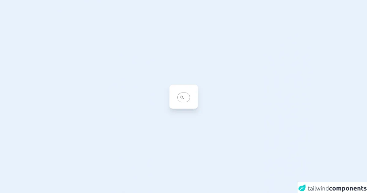
The preview of Search bar ui component
To create a search bar UI component with Tailwind CSS, you can use the following classes:
<div class="relative text-gray-600">
  <input type="search" name="search" placeholder="Search" class="bg-white h-10 px-5 pr-10 rounded-full text-sm focus:outline-none">
  <button type="submit" class="absolute right-0 top-0 mt-3 mr-4">
    {{__placeholder1__}}
  </button>
</div>
Free download of the Search bar's source code
The source code of Search bar ui component
To create a search bar UI component with Tailwind CSS, you can use the following classes:
<div class="relative text-gray-600">
  <input type="search" name="search" placeholder="Search" class="bg-white h-10 px-5 pr-10 rounded-full text-sm focus:outline-none">
  <button type="submit" class="absolute right-0 top-0 mt-3 mr-4">
    <svg class="h-4 w-4 fill-current" xmlns="http://www.w3.org/2000/svg" viewBox="0 0 20 20"><path d="M9 0C4.029 0 0 4.029 0 9s4.029 9 9 9 9-4.029 9-9-4.029-9-9-9zm0 16.2c-3.867 0-7.2-3.333-7.2-7.2s3.333-7.2 7.2-7.2 7.2 3.333 7.2 7.2-3.333 7.2-7.2 7.2z"/></svg>
  </button>
</div>
<div class="relative flex min-h-screen flex-col justify-center overflow-hidden bg-gradient-to-br from-lime-300 to-green-500 p-6 sm:py-12">
  <div class="relative rounded-2xl bg-white px-6 pt-10 pb-8 shadow-xl ring-1 ring-gray-900/5 sm:mx-auto sm:max-w-lg sm:px-10">
    <div class="mx-auto max-w-md">


      <form action="" class="relative mx-auto w-max">
        <input type="search"
              class="peer cursor-pointer relative z-10 h-12 w-12 rounded-full border bg-transparent pl-12 outline-none focus:w-full focus:cursor-text focus:border-lime-300 focus:pl-16 focus:pr-4" />
        <svg xmlns="http://www.w3.org/2000/svg" class="absolute inset-y-0 my-auto h-8 w-12 border-r border-transparent stroke-gray-500 px-3.5 peer-focus:border-lime-300 peer-focus:stroke-lime-500" fill="none" viewBox="0 0 24 24" stroke="currentColor" stroke-width="2">
          <path stroke-linecap="round" stroke-linejoin="round" d="M21 21l-6-6m2-5a7 7 0 11-14 0 7 7 0 0114 0z" />
        </svg>
      </form>


    </div>
  </div>
</div>
How to create a Search bar with Tailwind CSS?
Here are 6 tips to help you create a search bar with Tailwind CSS:
1. Use the relative class to position the search bar container.
<div class="relative">
  <!-- Search bar content goes here -->
</div>
2. Use the text-gray-600 class to set the text color of the search bar.
<div class="relative text-gray-600">
  <!-- Search bar content goes here -->
</div>
3. Use the bg-white class to set the background color of the search bar.
<input type="search" name="search" placeholder="Search" class="bg-white">
4. Use the h-10 class to set the height of the search bar.
<input type="search" name="search" placeholder="Search" class="h-10">
5. Use the px-5 class to set the horizontal padding of the search bar.
<input type="search" name="search" placeholder="Search" class="px-5">
6. Use the rounded-full class to set the border radius of the search bar.
<input type="search" name="search" placeholder="Search" class="rounded-full">
Conclusion
Creating a search bar with Tailwind CSS is easy and efficient. With the pre-defined classes provided by Tailwind CSS, you can quickly style your search bar and customize it to fit your specific design needs. By following the tips outlined in this article, you can create a beautiful and functional search bar for your web application.