- Published on
Imagine You Make A search bar With Tailwind CSS Like An Expert. Follow These 6 Steps To Get There
- What is Tailwind CSS?
- The description of search bar UI component
- Why use Tailwind CSS to create a search bar UI component?
- The preview of search bar UI component
- The source code of search bar UI component
- How to create a search bar with Tailwind CSS?
- Step 1: Set up your HTML
- Step 2: Add Tailwind CSS to your project
- Step 3: Style your search bar
- Step 4: Add hover effects
- Step 5: Add responsive design
- Step 6: Customize your search bar
- Conclusion
As a FrontEnd technology blogger, I am always looking for ways to make my website more appealing and user-friendly. One of the best ways to do this is by using Tailwind CSS to create a search bar UI component. In this article, I will show you how to create a search bar with Tailwind CSS in six easy steps.
What is Tailwind CSS?
Tailwind CSS is a utility-first CSS framework that allows you to create custom designs quickly and easily. It provides a set of pre-defined classes that you can use to style your HTML elements. With Tailwind CSS, you can create beautiful, responsive designs without writing any custom CSS.
The description of search bar UI component
A search bar is a UI component that allows users to search for specific content on a website. It is a common feature on most websites and is essential for user navigation. A search bar typically consists of a text input field and a search button.
Why use Tailwind CSS to create a search bar UI component?
Tailwind CSS is an excellent choice for creating a search bar UI component because it provides a set of pre-defined classes that you can use to style your HTML elements. This means that you can create a search bar quickly and easily without having to write any custom CSS. Additionally, Tailwind CSS is responsive by default, which means that your search bar will look great on any device.
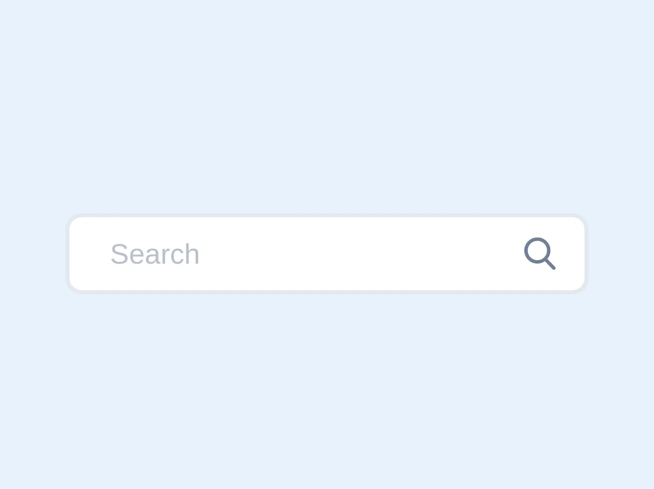
The preview of search bar UI component
To give you an idea of what the search bar UI component will look like, here is a preview:
Free download of the search bar's source code
The source code of search bar UI component
Here is the source code for the search bar UI component:
<!-- This is an example component -->
     <div class="pt-2 relative mx-auto text-gray-600">
        <input class="border-2 border-gray-300 bg-white h-10 px-5 pr-16 rounded-lg text-sm focus:outline-none"
          type="search" name="search" placeholder="Search">
        <button type="submit" class="absolute right-0 top-0 mt-5 mr-4">
          <svg class="text-gray-600 h-4 w-4 fill-current" xmlns="http://www.w3.org/2000/svg"
            xmlns:xlink="http://www.w3.org/1999/xlink" version="1.1" id="Capa_1" x="0px" y="0px"
            viewBox="0 0 56.966 56.966" style="enable-background:new 0 0 56.966 56.966;" xml:space="preserve"
            width="512px" height="512px">
            <path
              d="M55.146,51.887L41.588,37.786c3.486-4.144,5.396-9.358,5.396-14.786c0-12.682-10.318-23-23-23s-23,10.318-23,23  s10.318,23,23,23c4.761,0,9.298-1.436,13.177-4.162l13.661,14.208c0.571,0.593,1.339,0.92,2.162,0.92  c0.779,0,1.518-0.297,2.079-0.837C56.255,54.982,56.293,53.08,55.146,51.887z M23.984,6c9.374,0,17,7.626,17,17s-7.626,17-17,17  s-17-7.626-17-17S14.61,6,23.984,6z" />
          </svg>
        </button>
      </div>
How to create a search bar with Tailwind CSS?
Now that you know why Tailwind CSS is the best choice for creating a search bar UI component, let's dive into the six easy steps to create one.
Step 1: Set up your HTML
The first step is to set up your HTML. You will need to create a form element with an input field and a search button. Here is an example:
<form class="w-full max-w-sm">
  <div class="flex items-center border-b border-b-2 border-teal-500 py-2">
    <input class="appearance-none bg-transparent border-none w-full text-gray-700 mr-3 py-1 px-2 leading-tight focus:outline-none" type="text" placeholder="Search">
    <button class="flex-shrink-0 bg-teal-500 hover:bg-teal-700 border-teal-500 hover:border-teal-700 text-sm border-4 text-white py-1 px-2 rounded" type="button">
      Search
    </button>
  </div>
</form>
Step 2: Add Tailwind CSS to your project
The next step is to add Tailwind CSS to your project. You can do this by adding the Tailwind CSS CDN to your HTML file or by installing it using npm. Here is an example:
<link href="https://cdn.jsdelivr.net/npm/tailwindcss@latest/dist/tailwind.min.css" rel="stylesheet">
Step 3: Style your search bar
Now that you have set up your HTML and added Tailwind CSS to your project, it's time to style your search bar. You can do this by adding Tailwind CSS classes to your HTML elements. Here is an example:
<form class="w-full max-w-sm">
  <div class="flex items-center border-b border-b-2 border-teal-500 py-2">
    <input class="appearance-none bg-transparent border-none w-full text-gray-700 mr-3 py-1 px-2 leading-tight focus:outline-none" type="text" placeholder="Search">
    <button class="flex-shrink-0 bg-teal-500 hover:bg-teal-700 border-teal-500 hover:border-teal-700 text-sm border-4 text-white py-1 px-2 rounded" type="button">
      Search
    </button>
  </div>
</form>
Step 4: Add hover effects
To make your search bar more interactive, you can add hover effects to the search button. You can do this by adding the hover:bg-teal-700 class to the button element. Here is an example:
<button class="flex-shrink-0 bg-teal-500 hover:bg-teal-700 border-teal-500 hover:border-teal-700 text-sm border-4 text-white py-1 px-2 rounded" type="button">
  Search
</button>
Step 5: Add responsive design
Tailwind CSS is responsive by default, which means that your search bar will look great on any device. However, you can customize the responsiveness of your search bar by adding responsive classes to your HTML elements. Here is an example:
<form class="w-full max-w-sm">
  <div class="flex items-center border-b border-b-2 border-teal-500 py-2">
    <input class="appearance-none bg-transparent border-none w-full text-gray-700 mr-3 py-1 px-2 leading-tight focus:outline-none" type="text" placeholder="Search">
    <button class="flex-shrink-0 bg-teal-500 hover:bg-teal-700 border-teal-500 hover:border-teal-700 text-sm border-4 text-white py-1 px-2 rounded" type="button">
      Search
    </button>
  </div>
</form>

<div class="md:flex md:items-center">
  <div class="md:w-1/3">
    <label class="block text-gray-500 font-bold md:text-right mb-1 md:mb-0 pr-4" for="inline-full-name">
      Full Name
    </label>
  </div>
  <div class="md:w-2/3">
    <input class="bg-gray-200 appearance-none border-2 border-gray-200 rounded w-full py-2 px-4 text-gray-700 leading-tight focus:outline-none focus:bg-white focus:border-teal-500" id="inline-full-name" type="text" value="Jane Doe">
  </div>
</div>
Step 6: Customize your search bar
Finally, you can customize your search bar further by adding your own custom CSS. You can do this by adding a custom class to your HTML elements and then defining the styles in your CSS file. Here is an example:
<form class="w-full max-w-sm">
  <div class="flex items-center border-b border-b-2 border-teal-500 py-2">
    <input class="search-bar-input" type="text" placeholder="Search">
    <button class="search-bar-button" type="button">
      Search
    </button>
  </div>
</form>

<style>
.search-bar-input {
  background-color: #F5F5F5;
  border: none;
  border-radius: 5px;
  padding: 10px;
  width: 100%;
  font-size: 16px;
}

.search-bar-button {
  background-color: #008080;
  border: none;
  border-radius: 5px;
  color: #FFFFFF;
  font-size: 16px;
  padding: 10px;
  margin-left: 10px;
}

.search-bar-button:hover {
  background-color: #006666;
}
</style>
Conclusion
Creating a search bar with Tailwind CSS is easy and straightforward. By following these six steps, you can create a beautiful and responsive search bar UI component for your website. With Tailwind CSS, you can create custom designs quickly and easily without having to write any custom CSS. So, what are you waiting for? Start creating your search bar UI component today!