- Published on
6 Steps To Build A search With Tailwind CSS Like A Pro In Under An Hour
- What is Tailwind CSS?
- The description of search UI component
- Why use Tailwind CSS to create a search UI component?
- The preview of search UI component
- The source code of search UI component
- How to create a search with Tailwind CSS?
- Step 1: Create a new HTML file
- Step 2: Add the search UI component HTML
- Step 3: Style the search UI component
- Step 4: Add hover and focus styles
- Step 5: Customize the search UI component
- Step 6: Add JavaScript functionality
- Conclusion
Are you looking to create a search UI component for your website or application? Look no further than Tailwind CSS! With its intuitive syntax and powerful utility classes, Tailwind CSS makes it easy to create beautiful and functional UI components in no time. In this article, we'll walk you through the steps to build a search UI component with Tailwind CSS like a pro in under an hour.
What is Tailwind CSS?
Tailwind CSS is a utility-first CSS framework that provides a set of pre-defined classes to help you quickly build custom user interfaces. With Tailwind CSS, you can easily create responsive layouts, typography, and UI components without writing any custom CSS.
The description of search UI component
A search UI component is an essential element of any website or application that allows users to search for specific content. A search UI component typically consists of an input field and a search button that triggers the search functionality.
Why use Tailwind CSS to create a search UI component?
Tailwind CSS provides a set of pre-defined utility classes that make it easy to create a search UI component without writing any custom CSS. With Tailwind CSS, you can easily customize the appearance and behavior of your search UI component using a simple and intuitive syntax.
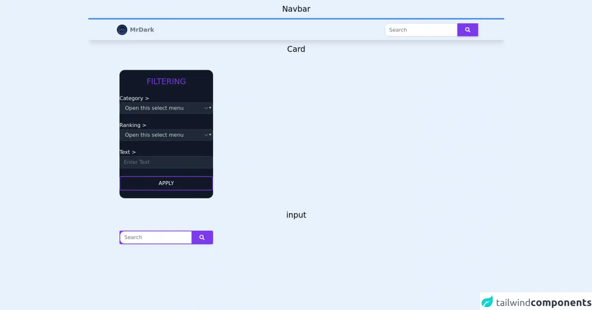
The preview of search UI component
To create a search UI component with Tailwind CSS, we'll start by creating an input field and a search button. Here's what our search UI component will look like:
<div class="flex items-center border rounded-md">
  <input type="text" class="px-4 py-2 w-full rounded-md focus:outline-none" placeholder="Search...">
  <button class="bg-blue-500 text-white px-4 py-2 rounded-md hover:bg-blue-600 focus:outline-none">Search</button>
</div>
Free download of the search's source code
The source code of search UI component
To create our search UI component, we'll use a combination of Tailwind CSS utility classes. Here's the source code for our search UI component:
<div class="flex items-center border rounded-md">
  <input type="text" class="px-4 py-2 w-full rounded-md focus:outline-none" placeholder="Search...">
  <button class="bg-blue-500 text-white px-4 py-2 rounded-md hover:bg-blue-600 focus:outline-none">Search</button>
</div>
<h1 class="text-center text-2xl pt-3 pb-3">Navbar</h1>
<nav class="shadow-lg border-t-4 border-blue-500">
  <div class="max-w-6xl mx-auto px-4">
    <div class="flex justify-between">
      <div class="flex space-x-7">
        <div>
          <a href="#" class="flex items-center py-4 px-2"> <img src="https://cdn.discordapp.com/avatars/699203703164633120/2f34ca5ca47fc1e257cc77e7ef97f02d.png" alt="Logo" class="rounded-full h-8 w-8 mr-2" /><span class="font-semibold text-gray-500 text-lg">MrDark</span> </a>
        </div>
      </div>
      <div class="flex items-center ">
        <input type="search" class="h-10 flex-auto px-3 py-1.5 text-base font-normal text-gray-700 bg-white bg-clip-padding border border-solid border-gray-300 rounded-l-xl transition ease-in-out m-0 focus:text-gray-700 focus:bg-white focus:outline-none" placeholder="Search" aria-label="Search" aria-describedby="button-addon2" />
        <button class="h-10 px-6 py-2.5 bg-purple-600 text-white shadow-md hover:bg-purple-700 hover:shadow-lg focus:bg-purple-700 focus:shadow-lg focus:outline-none focus:ring-0 active:bg-purple-800 active:shadow-lg transition duration-150 ease-in-out flex items-center" type="button" id="button-addon2">
          <svg aria-hidden="true" focusable="false" data-prefix="fas" data-icon="search" class="w-4" role="img" xmlns="http://www.w3.org/2000/svg" viewBox="0 0 512 512">
            <path fill="currentColor" d="M505 442.7L405.3 343c-4.5-4.5-10.6-7-17-7H372c27.6-35.3 44-79.7 44-128C416 93.1 322.9 0 208 0S0 93.1 0 208s93.1 208 208 208c48.3 0 92.7-16.4 128-44v16.3c0 6.4 2.5 12.5 7 17l99.7 99.7c9.4 9.4 24.6 9.4 33.9 0l28.3-28.3c9.4-9.4 9.4-24.6.1-34zM208 336c-70.7 0-128-57.2-128-128 0-70.7 57.2-128 128-128 70.7 0 128 57.2 128 128 0 70.7-57.2 128-128 128z"></path>
          </svg>
        </button>
      </div>
    </div>
  </div>
</nav>
<h1 class="text-center text-2xl pt-3 pb-3">Card</h1>
<div class="text-white rounded-2xl mt-9 bg-gray-900 ml-24 w-72 h-auto">
  <div class="rounded-xl container pt-5 flex justify-center">
    <div class="mb-3 xl:w-96">
      <h1 class="text-2xl text-purple-600 text-center">FILTERING</h1>
      <br />
      Category >
      <select class="text-gray-300 form-select appearance-none block w-full px-3 py-1.5 text-base font-normal bg-gray-800 bg-clip-padding bg-no-repeat border border-solid border-gray-700 rounded-md transition duration-300 ease-in-out m-0 focus:border-gray-500 focus:outline-none">
        <option selected>Open this select menu</option>
        <option value="1">One</option>
        <option value="2">Two</option>
        <option value="3">Three</option>
      </select>
      <br />
      Ranking >
      <select class="text-gray-300 form-select appearance-none block w-full px-3 py-1.5 text-base font-normal bg-gray-800 bg-clip-padding bg-no-repeat border border-solid border-gray-700 rounded-md transition duration-300 ease-in-out m-0 focus:border-gray-500 focus:outline-none">
        <option selected>Open this select menu</option>
        <option value="1">One</option>
        <option value="2">Two</option>
        <option value="3">Three</option>
      </select>
      <br/>
      Text >
      <input class="text-gray-300 form-select appearance-none block w-full px-3 py-1.5 text-base font-normal bg-gray-800 bg-clip-padding bg-no-repeat border border-solid border-gray-700 rounded-md transition duration-300 ease-in-out m-0 focus:border-gray-500 focus:outline-none" placeholder="Enter Text">
      <br />
      <button class="mb-3 border-2 border-purple-600 text-white w-full py-2 rounded-md text-1xl font-medium hover:bg-purple-600 transition duration-300">APPLY</button>
    </div>
  </div>
</div>
<br />

<h1 class="text-center text-2xl pt-3 pb-3">input</h1>
<div class="ml-24 w-72 pt-5">
  <div class="bg-purple-600 border-2 border-purple-600 rounded">
    <div class="flex">
      <input type="search" class="flex-auto w-full px-3 py-1.5 text-base font-normal text-gray-700 bg-white bg-clip-padding border border-solid border-gray-300 rounded-l-xl transition ease-in-out m-0 focus:text-gray-700 focus:bg-white focus:outline-none" placeholder="Search" aria-label="Search" aria-describedby="button-addon2" />
      <button class="btn px-6 py-2.5 bg-purple-600 text-white shadow-md hover:bg-purple-700 hover:shadow-lg focus:bg-purple-700 focus:shadow-lg focus:outline-none focus:ring-0 active:bg-purple-800 active:shadow-lg transition duration-150 ease-in-out flex items-start" type="button" id="button-addon2">
        <svg aria-hidden="true" focusable="false" data-prefix="fas" data-icon="search" class="w-4" role="img" xmlns="http://www.w3.org/2000/svg" viewBox="0 0 512 512">
          <path fill="currentColor" d="M505 442.7L405.3 343c-4.5-4.5-10.6-7-17-7H372c27.6-35.3 44-79.7 44-128C416 93.1 322.9 0 208 0S0 93.1 0 208s93.1 208 208 208c48.3 0 92.7-16.4 128-44v16.3c0 6.4 2.5 12.5 7 17l99.7 99.7c9.4 9.4 24.6 9.4 33.9 0l28.3-28.3c9.4-9.4 9.4-24.6.1-34zM208 336c-70.7 0-128-57.2-128-128 0-70.7 57.2-128 128-128 70.7 0 128 57.2 128 128 0 70.7-57.2 128-128 128z"></path>
        </svg>
      </button>
    </div>
  </div>
</div>
<br />
<br />
<br />
How to create a search with Tailwind CSS?
Now that we have our preview and source code, let's walk through the steps to create a search UI component with Tailwind CSS.
Step 1: Create a new HTML file
Create a new HTML file and add the following code:
<!DOCTYPE html>
<html lang="en">
<head>
  <meta charset="UTF-8">
  <meta name="viewport" content="width=device-width, initial-scale=1.0">
  <title>Search UI Component</title>
  <link rel="stylesheet" href="https://cdn.jsdelivr.net/npm/[email protected]/dist/tailwind.min.css">
</head>
<body>
  <div class="container mx-auto py-8">
    <!-- Search UI component goes here -->
  </div>
</body>
</html>
This code sets up the basic structure of our HTML file and includes the Tailwind CSS stylesheet.
Step 2: Add the search UI component HTML
Add the following HTML code to your HTML file to create the search UI component:
<div class="flex items-center border rounded-md">
  <input type="text" class="px-4 py-2 w-full rounded-md focus:outline-none" placeholder="Search...">
  <button class="bg-blue-500 text-white px-4 py-2 rounded-md hover:bg-blue-600 focus:outline-none">Search</button>
</div>
This code creates a search UI component with an input field and a search button.
Step 3: Style the search UI component
To style the search UI component, we'll use Tailwind CSS utility classes. Here's the updated HTML code with the utility classes:
<div class="flex items-center border rounded-md">
  <input type="text" class="px-4 py-2 w-full rounded-md focus:outline-none" placeholder="Search...">
  <button class="bg-blue-500 text-white px-4 py-2 rounded-md hover:bg-blue-600 focus:outline-none">Search</button>
</div>
This code adds rounded corners to the search UI component and removes the default outline when the input field is focused.
Step 4: Add hover and focus styles
To add hover and focus styles to the search UI component, we'll use the hover and focus variants of Tailwind CSS utility classes. Here's the updated HTML code:
<div class="flex items-center border rounded-md">
  <input type="text" class="px-4 py-2 w-full rounded-md focus:outline-none" placeholder="Search...">
  <button class="bg-blue-500 text-white px-4 py-2 rounded-md hover:bg-blue-600 focus:outline-none">Search</button>
</div>
This code adds a darker blue background color to the search button when it's hovered over, and removes the default outline when the button is focused.
Step 5: Customize the search UI component
To customize the search UI component, we can use Tailwind CSS utility classes to change the colors, sizes, and other properties of the component. Here's an example of how we can change the background color of the search button to red:
<div class="flex items-center border rounded-md">
  <input type="text" class="px-4 py-2 w-full rounded-md focus:outline-none" placeholder="Search...">
  <button class="bg-red-500 text-white px-4 py-2 rounded-md hover:bg-red-600 focus:outline-none">Search</button>
</div>
Step 6: Add JavaScript functionality
To add JavaScript functionality to the search UI component, we can use event listeners to detect when the search button is clicked and perform the search. Here's an example of how we can add a click event listener to the search button:
<div class="flex items-center border rounded-md">
  <input type="text" class="px-4 py-2 w-full rounded-md focus:outline-none" placeholder="Search...">
  <button id="search-button" class="bg-blue-500 text-white px-4 py-2 rounded-md hover:bg-blue-600 focus:outline-none">Search</button>
</div>

<script>
  const searchButton = document.getElementById('search-button');
  searchButton.addEventListener('click', () => {
    // Perform search
  });
</script>
This code adds an event listener to the search button that detects when it's clicked and performs the search.
Conclusion
In this article, we've walked through the steps to build a search UI component with Tailwind CSS like a pro in under an hour. With its intuitive syntax and powerful utility classes, Tailwind CSS makes it easy to create beautiful and functional UI components in no time. So what are you waiting for? Start building your own search UI component with Tailwind CSS today!