- Published on
Ultimate Guide: Build A Sales Chart With Tailwind CSS
- What is Tailwind CSS?
- The description of Sales Chart ui component
- Why use Tailwind CSS to create a Sales Chart ui component?
- The preview of Sales Chart ui component
- The source code of Sales Chart ui component
- How to create a Sales Chart with Tailwind CSS?
- Conclusion
As a FrontEnd technology blogger, it is important to keep up with the latest trends and tools. One such tool that has been gaining popularity in recent years is Tailwind CSS. Tailwind CSS is a utility-first CSS framework that allows developers to quickly and easily create responsive and customizable user interfaces. In this article, we will explore how to use Tailwind CSS to build a Sales Chart ui component.
What is Tailwind CSS?
Tailwind CSS is a utility-first CSS framework that provides a set of pre-defined CSS classes that can be used to style HTML elements. It is designed to be highly customizable and allows developers to quickly create responsive and modern user interfaces. Tailwind CSS provides a large number of utility classes that can be used to style various aspects of an element, such as its size, color, font, and spacing.
The description of Sales Chart ui component
A Sales Chart ui component is a graphical representation of sales data over a period of time. It is used to visualize trends and patterns in sales data and to help identify areas for improvement. A Sales Chart ui component typically includes a horizontal axis that represents time and a vertical axis that represents sales data. The chart itself is made up of a series of data points that are connected by lines or bars.
Why use Tailwind CSS to create a Sales Chart ui component?
Tailwind CSS is a great choice for creating a Sales Chart ui component because it provides a large number of utility classes that can be used to style the chart. This makes it easy to customize the appearance of the chart to match the design of your website or application. Additionally, Tailwind CSS is designed to be highly responsive, which means that the chart will look great on any device or screen size.
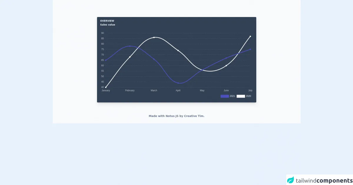
The preview of Sales Chart ui component
To create a Sales Chart ui component with Tailwind CSS, we will use a combination of HTML and CSS. The HTML will define the structure of the chart, while the CSS will be used to style it. Here is a preview of what the Sales Chart ui component will look like:
Free download of the Sales Chart's source code
The source code of Sales Chart ui component
To create the Sales Chart ui component, we will use a combination of HTML and CSS. The HTML will define the structure of the chart, while the CSS will be used to style it. Here is the source code for the Sales Chart ui component:
<link rel="stylesheet" href="https://demos.creative-tim.com/notus-js/assets/styles/tailwind.css">
<link rel="stylesheet" href="https://demos.creative-tim.com/notus-js/assets/vendor/@fortawesome/fontawesome-free/css/all.min.css">
<script src=" https://cdnjs.cloudflare.com/ajax/libs/Chart.js/2.9.3/Chart.min.js"> </script>

<section class="pt-16 bg-blueGray-50">
  <div class="w-full xl:w-8/12 xl:mb-0 px-4 mx-auto mt-6">
    <div class="relative flex flex-col min-w-0 break-words w-full mb-6 shadow-lg rounded bg-blueGray-700">
      <div class="rounded-t mb-0 px-4 py-3 bg-transparent">
        <div class="flex flex-wrap items-center">
          <div class="relative w-full max-w-full flex-grow flex-1">
            <h6 class="uppercase text-blueGray-100 mb-1 text-xs font-semibold">
              Overview
            </h6>
            <h2 class="text-blueGray-100 text-xs font-semibold">
              Sales value
            </h2>
          </div>
        </div>
      </div>
      <div class="p-4 flex-auto">
        <!-- Chart -->
        <div class="relative h-350-px">
          <div class="chartjs-size-monitor">
            <div class="chartjs-size-monitor-expand">
              <div class=""></div>
            </div>
            <div class="chartjs-size-monitor-shrink">
              <div class=""></div>
            </div>
          </div>
          <canvas id="line-chart" style="display: block; height: 350px; width: 791px;" width="1582" height="700" class="chartjs-render-monitor"></canvas>
        </div>
      </div>
    </div>
      <footer class="relative bg-blueGray-50 pt-8 pb-6 mt-1">
  <div class="container mx-auto px-4">
    <div class="flex flex-wrap items-center md:justify-between justify-center">
      <div class="w-full md:w-6/12 px-4 mx-auto text-center">
        <div class="text-sm text-blueGray-500 font-semibold py-1">
          Made with <a href="https://www.creative-tim.com/product/notus-js" class="text-blueGray-500 hover:text-gray-800" target="_blank">Notus JS</a> by <a href="https://www.creative-tim.com" class="text-blueGray-500 hover:text-blueGray-800" target="_blank"> Creative Tim</a>.
        </div>
      </div>
    </div>
  </div>
</footer>
  </div>
</section>

<script>
var config = {
          type: "line",
          data: {
            labels: [
              "January",
              "February",
              "March",
              "April",
              "May",
              "June",
              "July",
            ],
            datasets: [
              {
                label: new Date().getFullYear(),
                backgroundColor: "#4c51bf",
                borderColor: "#4c51bf",
                data: [65, 78, 66, 44, 56, 67, 75],
                fill: false,
              },
              {
                label: new Date().getFullYear() - 1,
                fill: false,
                backgroundColor: "#fff",
                borderColor: "#fff",
                data: [40, 68, 86, 74, 56, 60, 87],
              },
            ],
          },
          options: {
            maintainAspectRatio: false,
            responsive: true,
            title: {
              display: false,
              text: "Sales Charts",
              fontColor: "white",
            },
            legend: {
              labels: {
                fontColor: "white",
              },
              align: "end",
              position: "bottom",
            },
            tooltips: {
              mode: "index",
              intersect: false,
            },
            hover: {
              mode: "nearest",
              intersect: true,
            },
            scales: {
              xAxes: [
                {
                  ticks: {
                    fontColor: "rgba(255,255,255,.7)",
                  },
                  display: true,
                  scaleLabel: {
                    display: false,
                    labelString: "Month",
                    fontColor: "white",
                  },
                  gridLines: {
                    display: false,
                    borderDash: [2],
                    borderDashOffset: [2],
                    color: "rgba(33, 37, 41, 0.3)",
                    zeroLineColor: "rgba(0, 0, 0, 0)",
                    zeroLineBorderDash: [2],
                    zeroLineBorderDashOffset: [2],
                  },
                },
              ],
              yAxes: [
                {
                  ticks: {
                    fontColor: "rgba(255,255,255,.7)",
                  },
                  display: true,
                  scaleLabel: {
                    display: false,
                    labelString: "Value",
                    fontColor: "white",
                  },
                  gridLines: {
                    borderDash: [3],
                    borderDashOffset: [3],
                    drawBorder: false,
                    color: "rgba(255, 255, 255, 0.15)",
                    zeroLineColor: "rgba(33, 37, 41, 0)",
                    zeroLineBorderDash: [2],
                    zeroLineBorderDashOffset: [2],
                  },
                },
              ],
            },
          },
        };
        var ctx = document.getElementById("line-chart").getContext("2d");
        window.myLine = new Chart(ctx, config);

    </script>
How to create a Sales Chart with Tailwind CSS?
To create a Sales Chart with Tailwind CSS, follow these steps:
- Create an HTML element to contain the chart. This can be a
divelement or any other container element. - Create an HTML
canvaselement to draw the chart on. Thecanvaselement should be a child of the container element. - Use JavaScript to draw the chart on the
canvaselement. There are many JavaScript libraries that can be used to create charts, such as Chart.js or D3.js. - Use Tailwind CSS utility classes to style the chart. This can include setting the size of the chart, the color of the lines or bars, and the font of the labels.
Conclusion
In conclusion, Tailwind CSS is a great tool for creating responsive and customizable user interfaces. It provides a large number of utility classes that can be used to style various aspects of an element, making it easy to create a Sales Chart ui component. By following the steps outlined in this article, you can create a Sales Chart with Tailwind CSS that will look great on any device or screen size.