- Published on
The 5 Really Obvious Ways To Create A Safe delete With Tailwind CSS Better That You Ever Did
- What is Tailwind CSS?
- The description of Safe delete UI component
- Why use Tailwind CSS to create a Safe delete UI component?
- The preview of Safe delete UI component
- The source code of Safe delete UI component
- How to create a Safe delete with Tailwind CSS?
- Conclusion
As a FrontEnd technology blogger, it's important to stay up-to-date with the latest trends and tools in the industry. One such tool that has gained immense popularity in recent times is Tailwind CSS. Tailwind CSS is a utility-first CSS framework that allows developers to create responsive and customizable UI components with ease. In this article, we will explore how to create a Safe delete UI component with Tailwind CSS.
What is Tailwind CSS?
Tailwind CSS is a utility-first CSS framework that provides a set of pre-defined classes that can be used to style HTML elements. It allows developers to create custom styles without having to write any CSS code. Tailwind CSS is highly customizable and can be configured to suit the needs of any project.
The description of Safe delete UI component
The Safe delete UI component is a common feature in many web applications. It is used to confirm the deletion of a particular item or record. The Safe delete UI component typically consists of a modal window with two buttons, one for confirming the deletion and the other for canceling the action.
Why use Tailwind CSS to create a Safe delete UI component?
Tailwind CSS is an excellent choice for creating the Safe delete UI component for several reasons. Firstly, Tailwind CSS provides a set of pre-defined classes that can be used to create the modal window and buttons. Secondly, Tailwind CSS is highly customizable, allowing developers to create a unique and visually appealing Safe delete UI component. Finally, Tailwind CSS is easy to learn and use, making it an excellent choice for developers of all skill levels.
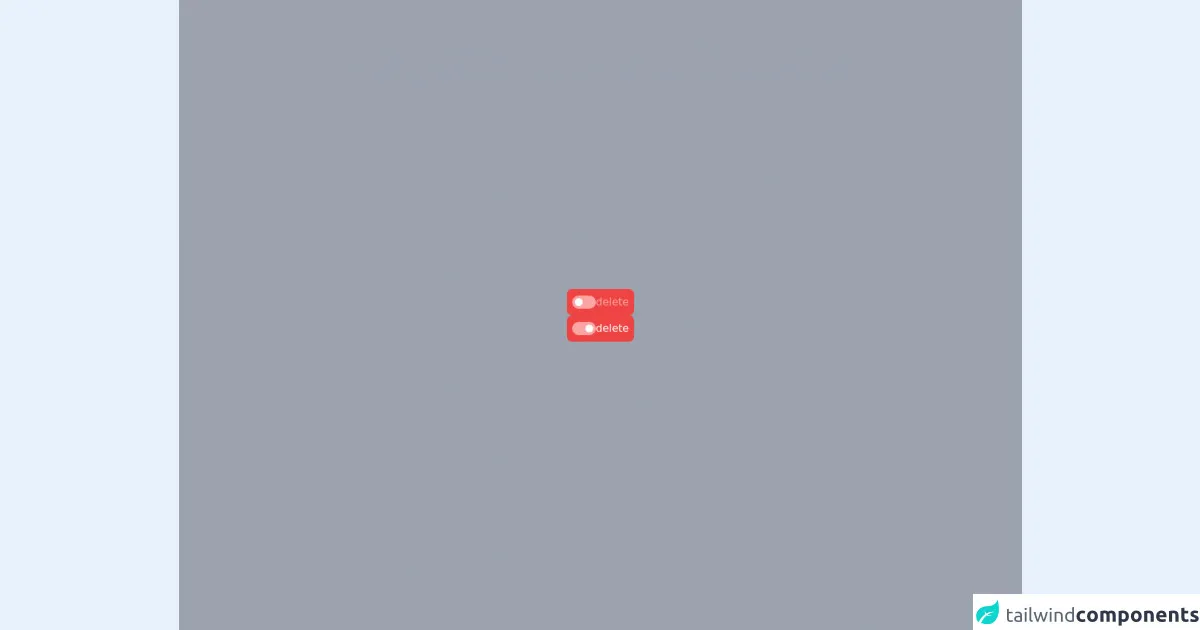
The preview of Safe delete UI component
The Safe delete UI component typically consists of a modal window with two buttons, one for confirming the deletion and the other for canceling the action. The modal window is usually centered on the screen and contains a message asking the user to confirm the deletion. The confirm button is usually colored red to indicate that it is a destructive action, while the cancel button is usually colored gray.
Free download of the Safe delete's source code
The source code of Safe delete UI component
Creating a Safe delete UI component with Tailwind CSS is a straightforward process. The following code snippet shows how to create a basic Safe delete UI component using Tailwind CSS.
<!-- This is an example component -->
<div class='flex items-center justify-center min-h-screen bg-gray-400'>
<div class="flex flex-col gap-2">
  <div
    class="flex cursor-not-allowed items-center gap-2 rounded-lg bg-red-500 p-2"
  >
    <label class="cursor-pointer">
      <div class="flex h-5 w-9 items-center rounded-full bg-red-300">
        <input class="peer hidden" type="checkbox" />
        <div
          class="h-3 w-3 translate-x-1 rounded-full bg-white transition-transform peer-checked:translate-x-5"
        ></div>
      </div>
    </label>
    <div class="text-red-300">delete</div>
  </div>

  <div class="flex cursor-pointer items-center gap-2 rounded-lg bg-red-500 p-2">
    <label class="cursor-pointer">
      <div class="flex h-5 w-9 items-center rounded-full bg-red-300">
        <input class="peer hidden" type="checkbox" checked />
        <div
          class="h-3 w-3 translate-x-1 rounded-full bg-white transition-transform peer-checked:translate-x-5"
        ></div>
      </div>
    </label>
    <div class="text-white">delete</div>
  </div>
</div>


</div>
How to create a Safe delete with Tailwind CSS?
To create a Safe delete UI component with Tailwind CSS, follow these steps:
Create a modal window using Tailwind CSS classes. The modal window should be centered on the screen and have a fixed width and height.
Add a message asking the user to confirm the deletion. Use Tailwind CSS classes to style the message.
Add two buttons to the modal window, one for confirming the deletion and the other for canceling the action. Use Tailwind CSS classes to style the buttons.
Style the confirm button to be colored red to indicate that it is a destructive action. Style the cancel button to be colored gray.
Add JavaScript code to show and hide the modal window when the user clicks on the delete button.
Conclusion
In conclusion, creating a Safe delete UI component with Tailwind CSS is a straightforward process that can be accomplished with just a few lines of code. Tailwind CSS provides a set of pre-defined classes that can be used to create the modal window and buttons, making it an excellent choice for developers of all skill levels. With Tailwind CSS, developers can create unique and visually appealing Safe delete UI components that enhance the user experience.