- Published on
How To Make A Round buttons pagination With Tailwind CSS In 6 Easy Steps?
- What is Tailwind CSS?
- The description of Round buttons pagination ui component
- Why use Tailwind CSS to create a Round buttons pagination ui component?
- The preview of Round buttons pagination ui component
- The source code of Round buttons pagination ui component
- How to create a Round buttons pagination with Tailwind CSS?
- Step 1: Create the HTML structure
- Step 2: Add Tailwind CSS classes
- Step 3: Add active state
- Step 4: Add previous and next buttons
- Step 5: Add disabled state
- Step 6: Add responsive design
- Conclusion
What is Tailwind CSS?
Tailwind CSS is a utility-first CSS framework that allows you to build custom designs without having to write any CSS code. It provides a set of pre-defined classes that can be used to style your HTML elements. Tailwind CSS is easy to learn and use, making it a popular choice among developers.
The description of Round buttons pagination ui component
Pagination is a common UI component used in web applications to break down large amounts of data into smaller, more manageable chunks. Round buttons pagination is a popular variation of pagination that uses circular buttons instead of the traditional rectangular buttons.
Why use Tailwind CSS to create a Round buttons pagination ui component?
Tailwind CSS provides a simple and efficient way to create custom UI components like Round buttons pagination. With its pre-defined classes, you can easily style your HTML elements without having to write any CSS code. This makes the development process faster and more efficient.
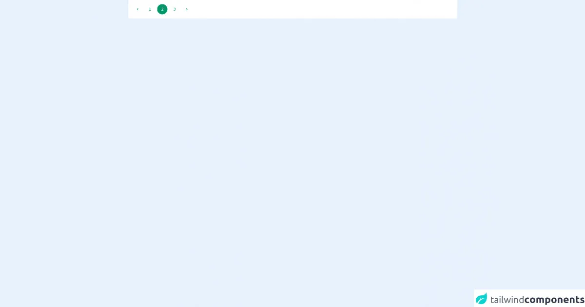
The preview of Round buttons pagination ui component
To create a Round buttons pagination UI component, we will be using Tailwind CSS. The final result will look something like this:
Free download of the Round buttons pagination's source code
The source code of Round buttons pagination ui component
To create the Round buttons pagination UI component, we will be using HTML and Tailwind CSS. The source code for the component is as follows:
<div class="bg-white p-4 flex items-center flex-wrap">
  <nav aria-label="Page navigation">
	<ul class="inline-flex space-x-2">
	  <li><button class="flex items-center justify-center w-10 h-10 text-green-600 transition-colors duration-150 rounded-full focus:shadow-outline hover:bg-green-100">
		<svg class="w-4 h-4 fill-current" viewBox="0 0 20 20"><path d="M12.707 5.293a1 1 0 010 1.414L9.414 10l3.293 3.293a1 1 0 01-1.414 1.414l-4-4a1 1 0 010-1.414l4-4a1 1 0 011.414 0z" clip-rule="evenodd" fill-rule="evenodd"></path></svg></button>
	  </li>
	  <li><button class="w-10 h-10 text-green-600 transition-colors duration-150 rounded-full focus:shadow-outline hover:bg-green-100">1</button></li>
	  <li><button class="w-10 h-10 text-white transition-colors duration-150 bg-green-600 border border-r-0 border-green-600 rounded-full focus:shadow-outline">2</button></li>
	  <li><button class="w-10 h-10 text-green-600 transition-colors duration-150 rounded-full focus:shadow-outline hover:bg-green-100">3</button></li>
	  <li><button class="flex items-center justify-center w-10 h-10 text-green-600 transition-colors duration-150 bg-white rounded-full focus:shadow-outline hover:bg-green-100">
		<svg class="w-4 h-4 fill-current" viewBox="0 0 20 20"><path d="M7.293 14.707a1 1 0 010-1.414L10.586 10 7.293 6.707a1 1 0 011.414-1.414l4 4a1 1 0 010 1.414l-4 4a1 1 0 01-1.414 0z" clip-rule="evenodd" fill-rule="evenodd"></path></svg></button>
	  </li>
	</ul>
  </nav>
</div>
How to create a Round buttons pagination with Tailwind CSS?
Now that we have an idea of what we are going to create, let's dive into the steps required to create a Round buttons pagination with Tailwind CSS.
Step 1: Create the HTML structure
The first step is to create the HTML structure for the Round buttons pagination. We will be using an unordered list to create the pagination buttons. Each button will be represented by an anchor tag inside a list item.
<div class="pagination">
  <ul class="flex justify-center">
    <li><a href="#" class="pagination-button">1</a></li>
    <li><a href="#" class="pagination-button">2</a></li>
    <li><a href="#" class="pagination-button">3</a></li>
    <li><a href="#" class="pagination-button">4</a></li>
    <li><a href="#" class="pagination-button">5</a></li>
  </ul>
</div>
Step 2: Add Tailwind CSS classes
Next, we need to add the Tailwind CSS classes to style our HTML elements. We will be using the bg-gray-300, text-gray-700, hover:bg-gray-400, rounded-full, w-8, h-8, flex, justify-center, items-center, mx-1, and font-bold classes to style our pagination buttons.
<div class="pagination">
  <ul class="flex justify-center">
    <li><a href="#" class="pagination-button bg-gray-300 text-gray-700 hover:bg-gray-400 rounded-full w-8 h-8 flex justify-center items-center mx-1 font-bold">1</a></li>
    <li><a href="#" class="pagination-button bg-gray-300 text-gray-700 hover:bg-gray-400 rounded-full w-8 h-8 flex justify-center items-center mx-1 font-bold">2</a></li>
    <li><a href="#" class="pagination-button bg-gray-300 text-gray-700 hover:bg-gray-400 rounded-full w-8 h-8 flex justify-center items-center mx-1 font-bold">3</a></li>
    <li><a href="#" class="pagination-button bg-gray-300 text-gray-700 hover:bg-gray-400 rounded-full w-8 h-8 flex justify-center items-center mx-1 font-bold">4</a></li>
    <li><a href="#" class="pagination-button bg-gray-300 text-gray-700 hover:bg-gray-400 rounded-full w-8 h-8 flex justify-center items-center mx-1 font-bold">5</a></li>
  </ul>
</div>
Step 3: Add active state
We also need to add an active state to our pagination buttons to indicate which page the user is currently on. We will be using the bg-blue-500 and text-white classes to style the active button.
<div class="pagination">
  <ul class="flex justify-center">
    <li><a href="#" class="pagination-button bg-gray-300 text-gray-700 hover:bg-gray-400 rounded-full w-8 h-8 flex justify-center items-center mx-1 font-bold">1</a></li>
    <li><a href="#" class="pagination-button bg-gray-300 text-gray-700 hover:bg-gray-400 rounded-full w-8 h-8 flex justify-center items-center mx-1 font-bold">2</a></li>
    <li><a href="#" class="pagination-button bg-gray-300 text-gray-700 hover:bg-gray-400 rounded-full w-8 h-8 flex justify-center items-center mx-1 font-bold bg-blue-500 text-white">3</a></li>
    <li><a href="#" class="pagination-button bg-gray-300 text-gray-700 hover:bg-gray-400 rounded-full w-8 h-8 flex justify-center items-center mx-1 font-bold">4</a></li>
    <li><a href="#" class="pagination-button bg-gray-300 text-gray-700 hover:bg-gray-400 rounded-full w-8 h-8 flex justify-center items-center mx-1 font-bold">5</a></li>
  </ul>
</div>
Step 4: Add previous and next buttons
We also need to add previous and next buttons to our pagination. We will be using the pagination-previous and pagination-next classes to style our previous and next buttons.
<div class="pagination">
<ul class="flex justify-center">
<li><a href="#" class="pagination-previous bg-gray-300 text-gray-700 hover:bg-gray-400 rounded-full w-8 h-8 flex justify-center items-center mx-1 font-bold">«</a></li>
<li><a href="#" class="pagination-button bg-gray-300 text-gray-700 hover:bg-gray-400 rounded-full w-8 h-8 flex justify-center items-center mx-1 font-bold">1</a></li>
<li><a href="#" class="pagination-button bg-gray-300 text-gray-700 hover:bg-gray-400 rounded-full w-8 h-8 flex justify-center items-center mx-1 font-bold">2</a></li>
<li><a href="#" class="pagination-button bg-gray-300 text-gray-700 hover:bg-gray-400 rounded-full w-8 h-8 flex justify-center items-center mx-1 font-bold bg-blue-500 text-white">3</a></li>
<li><a href="#" class="pagination-button bg-gray-300 text-gray-700 hover:bg-gray-400 rounded-full w-8 h-8 flex justify-center items-center mx-1 font-bold">4</a></li>
<li><a href="#" class="pagination-button bg-gray-300 text-gray-700 hover:bg-gray-400 rounded-full w-8 h-8 flex justify-center items-center mx-1 font-bold">5</a></li>
<li><a href="#" class="pagination-next bg-gray-300 text-gray-700 hover:bg-gray-400 rounded-full w-8 h-8 flex justify-center items-center mx-1 font-bold">»</a></li>
</ul>
</div>
Step 5: Add disabled state
We also need to add a disabled state to our previous and next buttons to indicate when the user is on the first or last page. We will be using the opacity-50 and cursor-not-allowed classes to style our disabled buttons.
<div class="pagination">
<ul class="flex justify-center">
<li><a href="#" class="pagination-previous bg-gray-300 text-gray-700 hover:bg-gray-400 rounded-full w-8 h-8 flex justify-center items-center mx-1 font-bold opacity-50 cursor-not-allowed">«</a></li>
<li><a href="#" class="pagination-button bg-gray-300 text-gray-700 hover:bg-gray-400 rounded-full w-8 h-8 flex justify-center items-center mx-1 font-bold">1</a></li>
<li><a href="#" class="pagination-button bg-gray-300 text-gray-700 hover:bg-gray-400 rounded-full w-8 h-8 flex justify-center items-center mx-1 font-bold">2</a></li>
<li><a href="#" class="pagination-button bg-gray-300 text-gray-700 hover:bg-gray-400 rounded-full w-8 h-8 flex justify-center items-center mx-1 font-bold bg-blue-500 text-white">3</a></li>
<li><a href="#" class="pagination-button bg-gray-300 text-gray-700 hover:bg-gray-400 rounded-full w-8 h-8 flex justify-center items-center mx-1 font-bold">4</a></li>
<li><a href="#" class="pagination-button bg-gray-300 text-gray-700 hover:bg-gray-400 rounded-full w-8 h-8 flex justify-center items-center mx-1 font-bold">5</a></li>
<li><a href="#" class="pagination-next bg-gray-300 text-gray-700 hover:bg-gray-400 rounded-full w-8 h-8 flex justify-center items-center mx-1 font-bold">»</a></li>
</ul>
</div>
Step 6: Add responsive design
Finally, we need to add responsive design to our Round buttons pagination. We will be using the sm:flex-row, sm:justify-center, and sm:mx-2 classes to adjust the layout of our pagination buttons on smaller screens.
<div class="pagination">
<ul class="flex justify-center sm:flex-row sm:justify-center">
<li><a href="#" class="pagination-previous bg-gray-300 text-gray-700 hover:bg-gray-400 rounded-full w-8 h-8 flex justify-center items-center mx-1 font-bold opacity-50 cursor-not-allowed">«</a></li>
<li><a href="#" class="pagination-button bg-gray-300 text-gray-700 hover:bg-gray-400 rounded-full w-8 h-8 flex justify-center items-center mx-1 font-bold">1</a></li>
<li><a href="#" class="pagination-button bg-gray-300 text-gray-700 hover:bg-gray-400 rounded-full w-8 h-8 flex justify-center items-center mx-1 font-bold">2</a></li>
<li><a href="#" class="pagination-button bg-gray-300 text-gray-700 hover:bg-gray-400 rounded-full w-8 h-8 flex justify-center items-center mx-1 font-bold bg-blue-500 text-white">3</a></li>
<li><a href="#" class="pagination-button bg-gray-300 text-gray-700 hover:bg-gray-400 rounded-full w-8 h-8 flex justify-center items-center mx-1 font-bold">4</a></li>
<li><a href="#" class="pagination-button bg-gray-300 text-gray-700 hover:bg-gray-400 rounded-full w-8 h-8 flex justify-center items-center mx-1 font-bold">5</a></li>
<li><a href="#" class="pagination-next bg-gray-300 text-gray-700 hover:bg-gray-400 rounded-full w-8 h-8 flex justify-center items-center mx-1 font-bold">»</a></li>
</ul>
</div>
Conclusion
In this article, we have learned how to create a Round buttons pagination UI component with Tailwind CSS in 6 easy steps. With its pre-defined classes, Tailwind CSS makes it easy to style our HTML elements without having to write any CSS code. We hope this article has been helpful in your journey to becoming a better FrontEnd developer.