- Published on
6 Steps To Make A Ribbon in the corner With Tailwind CSS Like A Pro In Under An Hour
- What is Tailwind CSS?
- The description of Ribbon in the corner ui component
- Why use Tailwind CSS to create a Ribbon in the corner ui component?
- The preview of Ribbon in the corner ui component.
- The source code of Ribbon in the corner ui component.
- How to create a Ribbon in the corner with Tailwind CSS?
- Step 1: Create a new HTML file
- Step 2: Add Tailwind CSS
- Step 3: Create a relative container
- Step 4: Create the Ribbon
- Step 5: Position the Ribbon
- Step 6: Style the Ribbon
- Conclusion
What is Tailwind CSS?
Tailwind CSS is a utility-first CSS framework that allows developers to rapidly build custom user interfaces. It provides a set of pre-defined CSS classes that can be used to style HTML elements. With Tailwind CSS, developers can easily create complex layouts and designs without writing any custom CSS.
The description of Ribbon in the corner ui component
A Ribbon in the corner is a UI component that is commonly used to draw attention to a specific element on a web page. It is typically a small banner that is placed in the corner of an element, such as an image or a button. The Ribbon in the corner can be used to highlight a new feature, a promotion, or any other important information.
Why use Tailwind CSS to create a Ribbon in the corner ui component?
Tailwind CSS provides a set of pre-defined classes that can be used to create a Ribbon in the corner UI component quickly and easily. By using Tailwind CSS, developers can avoid writing custom CSS, which can save time and reduce the risk of errors.
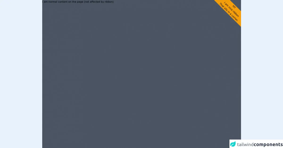
The preview of Ribbon in the corner ui component.
To create a Ribbon in the corner with Tailwind CSS, we will use the following classes:
- bg-red-600: sets the background color of the Ribbon to red.
- text-white: sets the text color of the Ribbon to white.
- py-1: sets the padding on the top and bottom of the Ribbon to 0.25rem.
- px-2: sets the padding on the left and right of the Ribbon to 0.5rem.
- transform: rotate(-45deg): rotates the Ribbon by -45 degrees.
- absolute: positions the Ribbon absolutely within its parent element.
Free download of the Ribbon in the corner's source code
The source code of Ribbon in the corner ui component.
To create a Ribbon in the corner with Tailwind CSS, we will use the following HTML and CSS:
<div class="relative">
  <img src="image.jpg" alt="Image">
  <div class="absolute top-0 right-0 bg-red-600 text-white py-1 px-2 transform rotate-45deg">New</div>
</div>
.relative {
  position: relative;
}

.absolute {
  position: absolute;
}
<div class="overflow-hidden bg-gray-600 h-screen">

  <div  class=" bg-yellow-500 origin-top float-right mt-9 mr-9 w-72 text-center" style="transform:translateX(50%) rotate(45deg);" >
    <div class="">Hi!</div>
    <div class="">I am nice ribbon</div>
    <div class="">That sits in a corner. </div>
  </div>

  <div class="absolute"> I am normal content on the page (not affected by ribbon)</div>

</div>
How to create a Ribbon in the corner with Tailwind CSS?
Follow these six steps to create a Ribbon in the corner with Tailwind CSS:
Step 1: Create a new HTML file
Create a new HTML file and add the following code:
<!DOCTYPE html>
<html>
<head>
  <title>Ribbon in the corner with Tailwind CSS</title>
  <link rel="stylesheet" href="https://cdn.jsdelivr.net/npm/[email protected]/dist/tailwind.min.css">
</head>
<body>
  <div class="relative">
    <img src="image.jpg" alt="Image">
    <div class="absolute top-0 right-0 bg-red-600 text-white py-1 px-2 transform rotate-45deg">New</div>
  </div>
</body>
</html>
Replace "image.jpg" with the path to your image.
Step 2: Add Tailwind CSS
Add the Tailwind CSS stylesheet to your HTML file by adding the following code to the head section:
<link rel="stylesheet" href="https://cdn.jsdelivr.net/npm/[email protected]/dist/tailwind.min.css">
Step 3: Create a relative container
Create a relative container by adding the following code to your HTML file:
<div class="relative">
  <img src="image.jpg" alt="Image">
</div>
Step 4: Create the Ribbon
Create the Ribbon by adding the following code to your HTML file:
<div class="absolute top-0 right-0 bg-red-600 text-white py-1 px-2 transform rotate-45deg">New</div>
Step 5: Position the Ribbon
Position the Ribbon by adding the following classes to the Ribbon element:
<div class="absolute top-0 right-0">New</div>
Step 6: Style the Ribbon
Style the Ribbon by adding the following classes to the Ribbon element:
<div class="absolute top-0 right-0 bg-red-600 text-white py-1 px-2 transform rotate-45deg">New</div>
Conclusion
In this article, we have learned how to create a Ribbon in the corner UI component with Tailwind CSS. By following the six steps outlined in this article, you can create a Ribbon in the corner like a pro in under an hour. With Tailwind CSS, you can easily create complex UI components without writing any custom CSS.