- Published on
How To Create A Responsive Team Cards #1 - Dark Mode With Tailwind CSS From Scratch
- What is Tailwind CSS?
- The description of Responsive Team Cards #1 - Dark Mode ui component
- Why use Tailwind CSS to create a Responsive Team Cards #1 - Dark Mode ui component?
- The preview of Responsive Team Cards #1 - Dark Mode ui component
- The source code of Responsive Team Cards #1 - Dark Mode ui component
- How to create a Responsive Team Cards #1 - Dark Mode with Tailwind CSS?
- Step 1: Set up your development environment
- Step 2: Create the HTML structure
- Step 3: Style the HTML elements using Tailwind CSS
- Step 4: Add responsive design features
- Step 5: Add dark mode feature
- Conclusion
What is Tailwind CSS?
Tailwind CSS is a utility-first CSS framework that helps developers build responsive and customizable user interfaces quickly. It provides a set of pre-defined classes that can be used to style HTML elements without writing any CSS code.
The description of Responsive Team Cards #1 - Dark Mode ui component
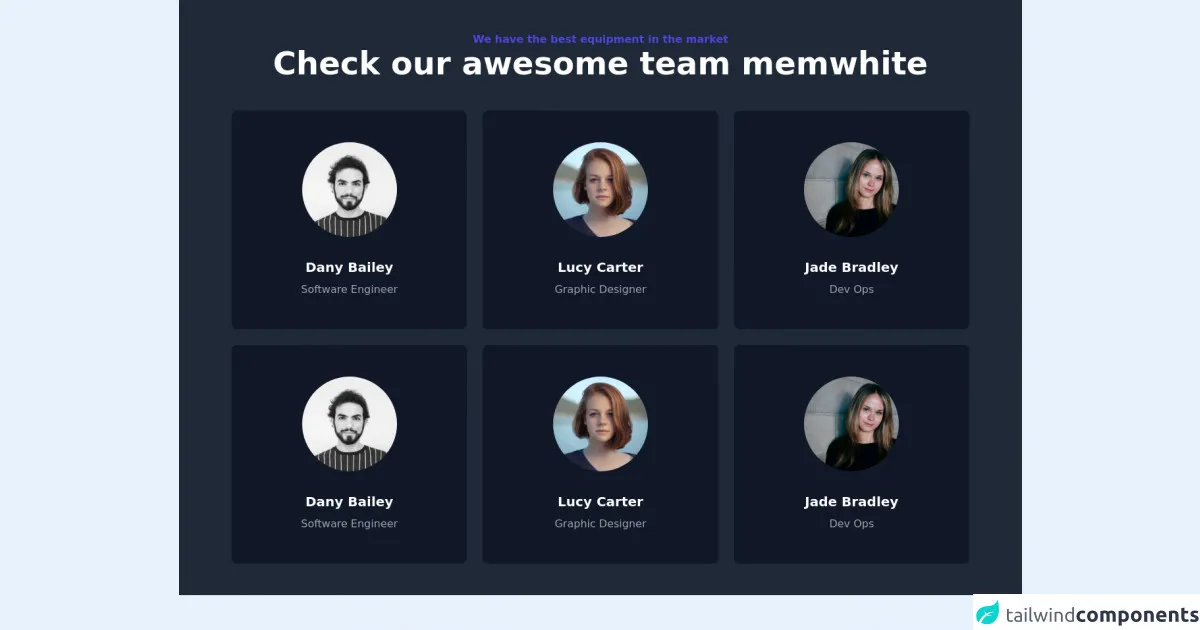
Responsive Team Cards #1 - Dark Mode is a user interface component that displays information about a team of people. It is designed to be responsive, meaning that it adapts to different screen sizes and devices. The dark mode feature makes it easy to use in low-light environments.
Why use Tailwind CSS to create a Responsive Team Cards #1 - Dark Mode ui component?
Tailwind CSS provides a set of pre-defined classes that can be used to style HTML elements without writing any CSS code. This makes it easy to create responsive and customizable user interfaces quickly. Additionally, Tailwind CSS is designed to work well with modern front-end frameworks like React and Vue.js.
The preview of Responsive Team Cards #1 - Dark Mode ui component
Free download of the Responsive Team Cards #1 - Dark Mode's source code
The source code of Responsive Team Cards #1 - Dark Mode ui component
<div class="w-full bg-gray-800">
    <section class="max-w-6xl mx-auto px-4 sm:px-6 lg:px-4 py-12">
        <div class="text-center pb-12">
            <h2 class="text-base font-bold text-indigo-600">
                We have the best equipment in the market
            </h2>
            <h1 class="font-bold text-3xl md:text-4xl lg:text-5xl font-heading text-white">
                Check our awesome team memwhite
            </h1>
        </div>
        <div class="grid grid-cols-1 sm:grid-cols-2 md:grid-cols-2 lg:grid-cols-3 gap-6">
            <div class="w-full bg-gray-900 rounded-lg sahdow-lg p-12 flex flex-col justify-center items-center">
                <div class="mb-8">
                    <img class="object-center object-cover rounded-full h-36 w-36" src="https://images.unsplash.com/flagged/photo-1570612861542-284f4c12e75f?ixid=MnwxMjA3fDB8MHxwaG90by1wYWdlfHx8fGVufDB8fHx8&ixlib=rb-1.2.1&auto=format&fit=crop&w=1170&q=80" alt="photo">
                </div>
                <div class="text-center">
                    <p class="text-xl text-white font-bold mb-2">Dany Bailey</p>
                    <p class="text-base text-gray-400 font-normal">Software Engineer</p>
                </div>
            </div>
            <div class="w-full bg-gray-900 rounded-lg sahdow-lg p-12 flex flex-col justify-center items-center">
                <div class="mb-8">
                    <img class="object-center object-cover rounded-full h-36 w-36" src="https://images.unsplash.com/photo-1438761681033-6461ffad8d80?ixid=MnwxMjA3fDB8MHxwaG90by1wYWdlfHx8fGVufDB8fHx8&ixlib=rb-1.2.1&auto=format&fit=crop&w=1170&q=80" alt="photo">
                </div>
                <div class="text-center">
                    <p class="text-xl text-white font-bold mb-2">Lucy Carter</p>
                    <p class="text-base text-gray-400 font-normal">Graphic Designer</p>
                </div>
            </div>
            <div class="w-full bg-gray-900 rounded-lg sahdow-lg p-12 flex flex-col justify-center items-center">
                <div class="mb-8">
                    <img class="object-center object-cover rounded-full h-36 w-36" src="https://images.unsplash.com/photo-1499952127939-9bbf5af6c51c?ixid=MnwxMjA3fDB8MHxwaG90by1wYWdlfHx8fGVufDB8fHx8&ixlib=rb-1.2.1&auto=format&fit=crop&w=1176&q=80" alt="photo">
                </div>
                <div class="text-center">
                    <p class="text-xl text-white font-bold mb-2">Jade Bradley</p>
                    <p class="text-base text-gray-400 font-normal">Dev Ops</p>
                </div>
            </div>
            <div class="w-full bg-gray-900 rounded-lg sahdow-lg p-12 flex flex-col justify-center items-center">
                <div class="mb-8">
                    <img class="object-center object-cover rounded-full h-36 w-36" src="https://images.unsplash.com/flagged/photo-1570612861542-284f4c12e75f?ixid=MnwxMjA3fDB8MHxwaG90by1wYWdlfHx8fGVufDB8fHx8&ixlib=rb-1.2.1&auto=format&fit=crop&w=1170&q=80" alt="photo">
                </div>
                <div class="text-center">
                    <p class="text-xl text-white font-bold mb-2">Dany Bailey</p>
                    <p class="text-base text-gray-400 font-normal">Software Engineer</p>
                </div>
            </div>
            <div class="w-full bg-gray-900 rounded-lg sahdow-lg p-12 flex flex-col justify-center items-center">
                <div class="mb-8">
                    <img class="object-center object-cover rounded-full h-36 w-36" src="https://images.unsplash.com/photo-1438761681033-6461ffad8d80?ixid=MnwxMjA3fDB8MHxwaG90by1wYWdlfHx8fGVufDB8fHx8&ixlib=rb-1.2.1&auto=format&fit=crop&w=1170&q=80" alt="photo">
                </div>
                <div class="text-center">
                    <p class="text-xl text-white font-bold mb-2">Lucy Carter</p>
                    <p class="text-base text-gray-400 font-normal">Graphic Designer</p>
                </div>
            </div>
            <div class="w-full bg-gray-900 rounded-lg sahdow-lg p-12 flex flex-col justify-center items-center">
                <div class="mb-8">
                    <img class="object-center object-cover rounded-full h-36 w-36" src="https://images.unsplash.com/photo-1499952127939-9bbf5af6c51c?ixid=MnwxMjA3fDB8MHxwaG90by1wYWdlfHx8fGVufDB8fHx8&ixlib=rb-1.2.1&auto=format&fit=crop&w=1176&q=80" alt="photo">
                </div>
                <div class="text-center">
                    <p class="text-xl text-white font-bold mb-2">Jade Bradley</p>
                    <p class="text-base text-gray-400 font-normal">Dev Ops</p>
                </div>
            </div>
        </div>
    </section>
</div>
How to create a Responsive Team Cards #1 - Dark Mode with Tailwind CSS?
To create a Responsive Team Cards #1 - Dark Mode with Tailwind CSS, follow these steps:
Step 1: Set up your development environment
Before you can start building your Responsive Team Cards #1 - Dark Mode, you need to set up your development environment. This includes installing Node.js, creating a new project, and installing Tailwind CSS.
Step 2: Create the HTML structure
The first step in creating your Responsive Team Cards #1 - Dark Mode is to create the HTML structure. This includes creating a container element and adding individual card elements for each team member.
Step 3: Style the HTML elements using Tailwind CSS
Once you have created the HTML structure, you can start styling the elements using Tailwind CSS. This involves adding pre-defined classes to the HTML elements to achieve the desired styling.
Step 4: Add responsive design features
To make your Responsive Team Cards #1 - Dark Mode truly responsive, you need to add responsive design features. This includes using Tailwind CSS's responsive classes to adjust the layout and styling of the cards based on the screen size.
Step 5: Add dark mode feature
Finally, you can add the dark mode feature to your Responsive Team Cards #1 - Dark Mode. This involves using Tailwind CSS's dark mode classes to adjust the color scheme of the cards based on the user's preference.
Conclusion
In conclusion, creating a Responsive Team Cards #1 - Dark Mode with Tailwind CSS is a straightforward process that can be done quickly and easily. By following the steps outlined in this article, you can create a responsive and customizable user interface that is easy to use and looks great on any device.