- Published on
The Ultimate Guide To Help You Build A Responsive Tailwind table With Tailwind CSS
- What is Tailwind CSS?
- The description of Responsive Tailwind table ui component
- Why use Tailwind CSS to create a Responsive Tailwind table ui component?
- The preview of Responsive Tailwind table ui component
- The source code of Responsive Tailwind table ui component
- How to create a Responsive Tailwind table with Tailwind CSS?
- Conclusion
What is Tailwind CSS?
Tailwind CSS is a utility-first CSS framework that provides a set of pre-defined CSS classes to make it easier to style HTML elements. It comes with a large number of pre-defined classes that you can use to style your website without having to write custom CSS code.
The description of Responsive Tailwind table ui component
A responsive Tailwind table is a user interface component that displays data in a table format. It is responsive, meaning that it can adapt to different screen sizes and devices. This makes it ideal for displaying data on mobile devices, tablets, and desktops.
Why use Tailwind CSS to create a Responsive Tailwind table ui component?
Tailwind CSS is a great choice for creating a responsive Tailwind table ui component because it provides a set of pre-defined classes that can be used to style the table. This makes it easier to create a responsive table that looks great on all devices.
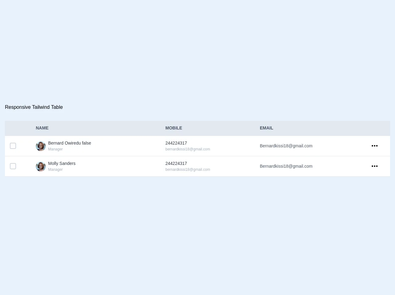
The preview of Responsive Tailwind table ui component
Here is a preview of what a responsive Tailwind table ui component might look like:
Free download of the Responsive Tailwind table's source code
The source code of Responsive Tailwind table ui component
Here is the source code for a responsive Tailwind table ui component:
<div class="container mx-auto pt-4 px-4 py-16 ">
	<div class="container">
	<h1 class="mb-8">
    Responsive Tailwind Table
  </h1>
	<div id="app" style="overflow-x:auto;">
		<table class="w-full shadow-lg rounded">
			<thead>
				<tr class="text-left bg-gray-300 border-b border-grey uppercase">
			        <th class="px-2 py-6"></th>
			        <th class="text-sm text-gray-700">Name</th>
			        <th class="hidden md:table-cell  text-sm text-gray-700">Mobile</th>
			        <th class="hidden md:table-cell text-sm text-gray-700">Email</th>
			        <th></th>
		      	</tr>
			</thead>
	        <tbody class="bg-white">
		      	<tr class="accordion border-b border-grey-light hover:bg-gray-100" @click="panel = true">
			        <td class="px-3 py-4">
			         	<span class="bg-white border-2 ml-1 rounded border-gray-400 w-5 h-5 flex flex-shrink-0 focus-within:border-blue-500">
							<input type="checkbox" class="opacity-0 absolute">
							<svg class="fill-current hidden w-4 h-4 text-green-500 pointer-events-none" viewBox="0 0 20 20"><path d="M0 11l2-2 5 5L18 3l2 2L7 18z"/></svg>
						</span>
			        </td>
			        <td class="flex inline-flex items-center">
			        	<span>
			        		 <img
					        class="hidden mr-1 md:mr-2 md:inline-block h-8 w-8 rounded-full object-cover"
					        src="https://images.unsplash.com/photo-1438761681033-6461ffad8d80?ixlib=rb-1.2.1&ixid=eyJhcHBfaWQiOjEyMDd9&auto=format&fit=facearea&facepad=4&w=144&h=144&q=80"
					        alt=""
					        />
			        	</span>
			        	<span class="py-3 w-40">
			        		 <p class="text-gray-800 text-sm">Bernard Owiredu {{panel}}</p>
			        		 <p class="md:hidden text-xs text-gray-600 font-medium">244224317</p>
			          		 <p class="hidden md:table-cell text-xs text-gray-500 font-medium">Manager</p>
			        	</span>
			        </td>
			        <td class="hidden md:table-cell">
			          <p class="text-sm text-gray-800 font-medium">244224317</p>
			          <p class="text-xs text-gray-500 font-medium">[email protected]</p>
			        </td>
			        <td class="hidden md:table-cell">
			          <p class="text-sm text-gray-700 font-medium">[email protected]</p>
			        </td>
			        <td>
			          <svg
			            class="mr-3 md:mr-1 h-12 w-6 fill-current text-grey-dark"
			            xmlns="http://www.w3.org/2000/svg"
			            viewBox="0 0 20 20"
			          >
			            <path
			              d="M4 12a2 2 0 1 1 0-4 2 2 0 0 1 0 4zm6 0a2 2 0 1 1 0-4 2 2 0 0 1 0 4zm6 0a2 2 0 1 1 0-4 2 2 0 0 1 0 4z"
			            />
			          </svg>
			        </td>
		      	</tr>

		      	<tr @click="panel = false" :class="panel ? 'table-row bg-gray-100' : 'hidden'"  class="border-b border-grey-light w-full">
		      		<td class=" py-4 px-3 text-sm text-gray-800 font-medium">1</td>
		      		<td class="text-sm text-gray-800 font-medium">2</td>
		      		<td class="text-sm text-gray-800 font-medium">3</td>
		      	</tr>

		      	<tr class="accordion border-b border-grey-light items-center">
			        <td class="px-3 py-4">
			         	<span class="bg-white border-2 ml-1 rounded border-gray-400 w-5 h-5 flex flex-shrink-0 focus:border-blue-500">
							<input type="checkbox" class="opacity-0 absolute">
							<svg class="fill-current hidden w-4 h-4 text-green-500 pointer-events-none" viewBox="0 0 20 20"><path d="M0 11l2-2 5 5L18 3l2 2L7 18z"/></svg>
						</span>
			        </td>
			        <td class="flex inline-flex items-center">
			        	<span>
			        		 <img
					        class="hidden mr-1 md:mr-2 md:inline-block h-8 w-8 rounded-full object-cover"
					        src="https://images.unsplash.com/photo-1438761681033-6461ffad8d80?ixlib=rb-1.2.1&ixid=eyJhcHBfaWQiOjEyMDd9&auto=format&fit=facearea&facepad=4&w=144&h=144&q=80"
					        alt=""
					        />
			        	</span>
			        	<span class="py-3">
			        		 <p class="text-gray-800 text-sm">Molly Sanders</p>
			          		 <p class="md:hidden text-xs text-gray-600 font-medium">244224317</p>
			          		 <p class="hidden md:table-cell text-xs text-gray-500 font-medium">Manager</p>
			        	</span>
			        </td>
			        <td class="hidden md:table-cell">
			          <p class="text-sm text-gray-800 font-medium">244224317</p>
			          <p class="text-xs text-gray-500 font-medium">[email protected]</p>
			        </td>
			        <td class="hidden md:table-cell">
			          <p class="text-sm text-gray-700 font-medium">[email protected]</p>
			        </td>
			        <td>
			          <svg
			            class="h-12 w-6 fill-current text-grey-dark"
			            xmlns="http://www.w3.org/2000/svg"
			            viewBox="0 0 20 20"
			          >
			            <path
			              d="M4 12a2 2 0 1 1 0-4 2 2 0 0 1 0 4zm6 0a2 2 0 1 1 0-4 2 2 0 0 1 0 4zm6 0a2 2 0 1 1 0-4 2 2 0 0 1 0 4z"
			            />
			          </svg>
			        </td>
		      	</tr>
		      	<tr :class="panel ? 'panel-show' : 'hidden'" class="border-b border-grey-light">
		      		<td class=" py-4 px-3 text-sm text-gray-800 font-medium">1</td>
		      		<td class="text-sm text-gray-800 font-medium">2</td>
		      		<td class="text-sm text-gray-800 font-medium">3</td>
		      	</tr>
	     </tbody>
	    </table>
	</div>
</div>
</div>
<script src="https://cdn.jsdelivr.net/npm/vue/dist/vue.js"></script>
<script>
	new Vue({
		    el: '#app',
		    data: {
		      panel: false,
		    },
	  	})
</script>
How to create a Responsive Tailwind table with Tailwind CSS?
To create a responsive Tailwind table with Tailwind CSS, follow these steps:
- Create a new HTML file and add a table element to it.
- Add the necessary classes to the table element to make it responsive. For example, you can add the
table-autoclass to the table element to make it automatically adjust its width. - Add the necessary classes to the table cells and rows to style them. For example, you can add the
border,px-4, andpy-2classes to the table cells to add borders and padding. - Add the necessary classes to the table header cells to style them. For example, you can add the
bg-gray-200,text-gray-600,font-bold, anduppercaseclasses to the table header cells to make them stand out. - Add the necessary classes to the table footer cells to style them. For example, you can add the
bg-gray-200,text-gray-600, andfont-boldclasses to the table footer cells to make them stand out. - Add the necessary classes to the table rows to style them. For example, you can add the
hover:bg-gray-100class to the table rows to highlight them when the user hovers over them. - Add the necessary classes to the table cells to make them responsive. For example, you can add the
sm:text-sm,md:text-base, andlg:text-lgclasses to the table cells to make them adjust their font size based on the screen size.
Conclusion
In conclusion, creating a responsive Tailwind table ui component with Tailwind CSS is a great way to display data on your website. By using pre-defined classes, you can easily create a table that looks great on all devices. With the steps outlined above, you should be able to create your own responsive Tailwind table ui component in no time.