- Published on
Ways To Build A responsive navbar With Tailwind CSS In 60 Minutes
- What is Tailwind CSS?
- The Description of Responsive Navbar UI Component
- Why Use Tailwind CSS to Create a Responsive Navbar UI Component?
- The Preview of Responsive Navbar UI Component
- The Source Code of Responsive Navbar UI Component
- How to Create a Responsive Navbar with Tailwind CSS?
- Step 1: Set up the HTML structure
- Step 2: Add Tailwind CSS classes
- Step 3: Add JavaScript for mobile menu
- Conclusion
In this article, we will explore the steps to build a responsive navbar with Tailwind CSS in just 60 minutes. We will start by understanding what Tailwind CSS is and why it is a great choice for creating a responsive navbar. We will then proceed to the preview and source code of the navbar, followed by a step-by-step guide on how to create it.
What is Tailwind CSS?
Tailwind CSS is a utility-first CSS framework that provides a set of pre-defined classes to create responsive and customizable UI components. It is designed to help developers quickly build modern and responsive web interfaces without the need to write custom CSS.
The Description of Responsive Navbar UI Component
A responsive navbar is a UI component that provides navigation links to different sections of a website. It is designed to adapt to different screen sizes and provide an optimal user experience on both desktop and mobile devices.
Why Use Tailwind CSS to Create a Responsive Navbar UI Component?
Tailwind CSS provides a set of pre-defined classes that can be used to create a responsive navbar quickly. These classes are designed to work together seamlessly, making it easy to create a consistent and visually appealing UI. Additionally, Tailwind CSS is highly customizable, allowing developers to create unique and personalized UI components.
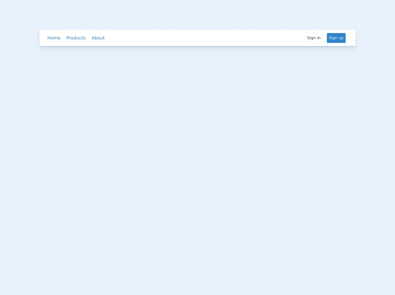
The Preview of Responsive Navbar UI Component
To create a responsive navbar with Tailwind CSS, we will use a combination of HTML and CSS. The resulting UI component will have a simple and clean design, with a logo on the left and navigation links on the right.
Free download of the responsive navbar's source code
The Source Code of Responsive Navbar UI Component
To create the responsive navbar, we will use the following HTML and CSS code.
<nav id="header" class="w-full z-30 top-10 py-1 bg-white shadow-lg border-b border-blue-400 mt-24">
      <div class="w-full flex items-center justify-between mt-0 px-6 py-2">
         <label for="menu-toggle" class="cursor-pointer md:hidden block">
            <svg class="fill-current text-blue-600" xmlns="http://www.w3.org/2000/svg" width="20" height="20" viewBox="0 0 20 20">
               <title>menu</title>
               <path d="M0 3h20v2H0V3zm0 6h20v2H0V9zm0 6h20v2H0v-2z"></path>
            </svg>
         </label>
         <input class="hidden" type="checkbox" id="menu-toggle">

         <div class="hidden md:flex md:items-center md:w-auto w-full order-3 md:order-1" id="menu">
            <nav>
               <ul class="md:flex items-center justify-between text-base text-blue-600 pt-4 md:pt-0">
                  <li><a class="inline-block no-underline hover:text-black font-medium text-lg py-2 px-4 lg:-ml-2" href="#">Home</a></li>
                  <li><a class="inline-block no-underline hover:text-black font-medium text-lg py-2 px-4 lg:-ml-2" href="#">Products</a></li>
                  <li><a class="inline-block no-underline hover:text-black font-medium text-lg py-2 px-4 lg:-ml-2" href="#">About</a></li>
               </ul>
            </nav>
         </div>

         <div class="order-2 md:order-3 flex flex-wrap items-center justify-end mr-0 md:mr-4" id="nav-content">
            <div class="auth flex items-center w-full md:w-full">
               <button class="bg-transparent text-gray-800  p-2 rounded border border-gray-300 mr-4 hover:bg-gray-100 hover:text-gray-700">Sign in</button>
               <button class="bg-blue-600 text-gray-200  p-2 rounded  hover:bg-blue-500 hover:text-gray-100">Sign up</button>
            </div>
         </div>
      </div>
   </nav>
How to Create a Responsive Navbar with Tailwind CSS?
Now that we have seen the preview and source code of the responsive navbar, let's dive into the step-by-step guide on how to create it.
Step 1: Set up the HTML structure
The first step is to set up the HTML structure of the navbar. We will use a nav element with two child elements, a div for the logo and a ul for the navigation links.
<nav class="flex items-center justify-between flex-wrap bg-gray-800 p-6">
  <div class="flex items-center flex-shrink-0 text-white mr-6">
    <svg class="fill-current h-8 w-8 mr-2" xmlns="http://www.w3.org/2000/svg" viewBox="0 0 20 20"><path d="M10.707 1.293a1 1 0 011.414 0l6 6a1 1 0 01-1.414 1.414L12 4.414V15a1 1 0 01-2 0V4.414l-4.293 4.293a1 1 0 01-1.414-1.414l6-6z"/></svg>
    <span class="font-semibold text-xl tracking-tight">Tailwind CSS</span>
  </div>
  <div class="block lg:hidden">
    <button class="flex items-center px-3 py-2 border rounded text-gray-200 border-gray-400 hover:text-white hover:border-white">
      <svg class="fill-current h-3 w-3" viewBox="0 0 20 20" xmlns="http://www.w3.org/2000/svg"><title>Menu</title><path d="M0 3a3 3 0 013-3h14a3 3 0 013 3v2a3 3 0 01-3 3H3a3 3 0 01-3-3V3zm0 8a3 3 0 013-3h14a3 3 0 013 3v2a3 3 0 01-3 3H3a3 3 0 01-3-3v-2z"/></svg>
    </button>
  </div>
  <div class="w-full block flex-grow lg:flex lg:items-center lg:w-auto">
    <div class="text-sm lg:flex-grow">
      <a href="#responsive-header" class="block mt-4 lg:inline-block lg:mt-0 text-gray-200 hover:text-white mr-4">
        Docs
      </a>
      <a href="#responsive-header" class="block mt-4 lg:inline-block lg:mt-0 text-gray-200 hover:text-white mr-4">
        Examples
      </a>
      <a href="#responsive-header" class="block mt-4 lg:inline-block lg:mt-0 text-gray-200 hover:text-white">
        Blog
      </a>
    </div>
    <div>
      <a href="#" class="inline-block text-sm px-4 py-2 leading-none border rounded text-white border-white hover:border-transparent hover:text-gray-500 hover:bg-white mt-4 lg:mt-0">Download</a>
    </div>
  </div>
</nav>
Step 2: Add Tailwind CSS classes
Next, we will add Tailwind CSS classes to the HTML elements to style the navbar. We will use classes like flex, items-center, justify-between, bg-gray-800, p-6, text-white, mr-6, block, lg:hidden, px-3, py-2, border, rounded, text-gray-200, hover:text-white, hover:border-white, w-full, flex-grow, lg:flex, lg:items-center, lg:w-auto, text-sm, lg:flex-grow, block, mt-4, lg:inline-block, hover:text-white, inline-block, leading-none, border-white, hover:border-transparent, hover:text-gray-500, hover:bg-white, mt-4, and lg:mt-0.
<nav class="flex items-center justify-between flex-wrap bg-gray-800 p-6">
  <div class="flex items-center flex-shrink-0 text-white mr-6">
    <svg class="fill-current h-8 w-8 mr-2" xmlns="http://www.w3.org/2000/svg" viewBox="0 0 20 20"><path d="M10.707 1.293a1 1 0 011.414 0l6 6a1 1 0 01-1.414 1.414L12 4.414V15a1 1 0 01-2 0V4.414l-4.293 4.293a1 1 0 01-1.414-1.414l6-6z"/></svg>
    <span class="font-semibold text-xl tracking-tight">Tailwind CSS</span>
  </div>
  <div class="block lg:hidden">
    <button class="flex items-center px-3 py-2 border rounded text-gray-200 border-gray-400 hover:text-white hover:border-white">
      <svg class="fill-current h-3 w-3" viewBox="0 0 20 20" xmlns="http://www.w3.org/2000/svg"><title>Menu</title><path d="M0 3a3 3 0 013-3h14a3 3 0 013 3v2a3 3 0 01-3 3H3a3 3 0 01-3-3V3zm0 8a3 3 0 013-3h14a3 3 0 013 3v2a3 3 0 01-3 3H3a3 3 0 01-3-3v-2z"/></svg>
    </button>
  </div>
  <div class="w-full block flex-grow lg:flex lg:items-center lg:w-auto">
    <div class="text-sm lg:flex-grow">
      <a href="#responsive-header" class="block mt-4 lg:inline-block lg:mt-0 text-gray-200 hover:text-white mr-4">
        Docs
      </a>
      <a href="#responsive-header" class="block mt-4 lg:inline-block lg:mt-0 text-gray-200 hover:text-white mr-4">
        Examples
      </a>
      <a href="#responsive-header" class="block mt-4 lg:inline-block lg:mt-0 text-gray-200 hover:text-white">
        Blog
      </a>
    </div>
    <div>
      <a href="#" class="inline-block text-sm px-4 py-2 leading-none border rounded text-white border-white hover:border-transparent hover:text-gray-500 hover:bg-white mt-4 lg:mt-0">Download</a>
    </div>
  </div>
</nav>
Step 3: Add JavaScript for mobile menu
Finally, we will add some JavaScript code to toggle the mobile menu when the user clicks on the menu button. We will use the classList.toggle method to add or remove the hidden class from the ul element.
<script>
  const button = document.querySelector('button');
  const menu = document.querySelector('ul');

  button.addEventListener('click', () => {
    menu.classList.toggle('hidden');
  });
</script>
And that's it! We have successfully created a responsive navbar with Tailwind CSS in just 60 minutes.
Conclusion
In this article, we have explored the steps to build a responsive navbar with Tailwind CSS. We started by understanding what Tailwind CSS is and why it is a great choice for creating UI components. We then proceeded to the preview and source code of the navbar, followed by a step-by-step guide on how to create it. By following these steps, you can create a responsive navbar quickly and easily.