- Published on
What You Need To Create A responsive navabr With Tailwind CSS
- What is Tailwind CSS?
- The Description of Responsive Navbar UI Component
- Why Use Tailwind CSS to Create a Responsive Navbar UI Component?
- The Preview of Responsive Navbar UI Component
- The Source Code of Responsive Navbar UI Component
- How to Create a Responsive Navbar with Tailwind CSS?
- Conclusion
What is Tailwind CSS?
Tailwind CSS is a utility-first CSS framework that helps you quickly build custom user interfaces. It provides a set of pre-defined CSS classes that you can use to style your HTML elements. With Tailwind CSS, you can create responsive designs that work on different screen sizes without writing any custom CSS.
The Description of Responsive Navbar UI Component
A responsive navbar is a user interface component that allows users to navigate a website. It typically contains links to different pages or sections of the website and may include a logo or other branding elements. A responsive navbar is designed to work on different screen sizes, from desktops to mobile devices.
Why Use Tailwind CSS to Create a Responsive Navbar UI Component?
Tailwind CSS provides a set of pre-defined CSS classes that you can use to create a responsive navbar quickly. It also includes responsive design utilities that allow you to customize the appearance of your navbar for different screen sizes. With Tailwind CSS, you can create a responsive navbar that looks great on all devices without writing any custom CSS.
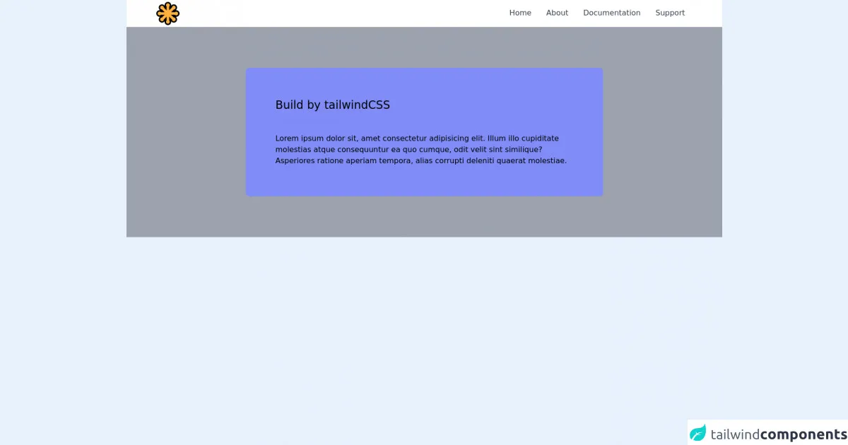
The Preview of Responsive Navbar UI Component
To create a responsive navbar with Tailwind CSS, you can use the following HTML and CSS code:
<nav class="flex items-center justify-between flex-wrap bg-teal-500 p-6">
  <div class="flex items-center flex-shrink-0 text-white mr-6">
    <span class="font-semibold text-xl tracking-tight">My Website</span>
  </div>
  <div class="block lg:hidden">
    <button class="flex items-center px-3 py-2 border rounded text-teal-200 border-teal-400 hover:text-white hover:border-white">
      <svg class="fill-current h-3 w-3" viewBox="0 0 20 20" xmlns="http://www.w3.org/2000/svg"><title>Menu</title><path d="M0 3h20v2H0V3zm0 6h20v2H0V9zm0 6h20v2H0v-2z"/></svg>
    </button>
  </div>
  <div class="w-full block flex-grow lg:flex lg:items-center lg:w-auto">
    <div class="text-sm lg:flex-grow">
      <a href="#responsive-header" class="block mt-4 lg:inline-block lg:mt-0 text-teal-200 hover:text-white mr-4">
        Home
      </a>
      <a href="#responsive-header" class="block mt-4 lg:inline-block lg:mt-0 text-teal-200 hover:text-white mr-4">
        About
      </a>
      <a href="#responsive-header" class="block mt-4 lg:inline-block lg:mt-0 text-teal-200 hover:text-white">
        Contact
      </a>
    </div>
  </div>
</nav>
Free download of the responsive navabr's source code
The Source Code of Responsive Navbar UI Component
To create a responsive navbar with Tailwind CSS, you can use the following HTML and CSS code:
<nav class="flex items-center justify-between flex-wrap bg-teal-500 p-6">
  <div class="flex items-center flex-shrink-0 text-white mr-6">
    <span class="font-semibold text-xl tracking-tight">My Website</span>
  </div>
  <div class="block lg:hidden">
    <button class="flex items-center px-3 py-2 border rounded text-teal-200 border-teal-400 hover:text-white hover:border-white">
      <svg class="fill-current h-3 w-3" viewBox="0 0 20 20" xmlns="http://www.w3.org/2000/svg"><title>Menu</title><path d="M0 3h20v2H0V3zm0 6h20v2H0V9zm0 6h20v2H0v-2z"/></svg>
    </button>
  </div>
  <div class="w-full block flex-grow lg:flex lg:items-center lg:w-auto">
    <div class="text-sm lg:flex-grow">
      <a href="#responsive-header" class="block mt-4 lg:inline-block lg:mt-0 text-teal-200 hover:text-white mr-4">
        Home
      </a>
      <a href="#responsive-header" class="block mt-4 lg:inline-block lg:mt-0 text-teal-200 hover:text-white mr-4">
        About
      </a>
      <a href="#responsive-header" class="block mt-4 lg:inline-block lg:mt-0 text-teal-200 hover:text-white">
        Contact
      </a>
    </div>
  </div>
</nav>
<style>
 #menu-toggle:checked + #menu {
        display: block;
      }
</style>
<div class="antialiased bg-gray-400">
  <header class="lg:px-16 px-6 bg-white flex flex-wrap items-center lg:py-0 py-2">
    <div class="flex-1 flex justify-between items-center">
      <a href="#">
       <svg width="50px" height="50px" viewBox="0 0 256 256" version="1.1" xmlns="http://www.w3.org/2000/svg" xmlns:xlink="http://www.w3.org/1999/xlink" preserveAspectRatio="xMidYMid">
    <g>
        <path d="M245.23538,153.523831 C259.246873,139.512338 259.246423,116.713014 245.23493,102.70107 C238.447775,95.9134648 229.422873,92.1757746 219.823775,92.1757746 C217.544563,92.1757746 215.300507,92.3835493 213.111887,92.7932394 C222.650141,86.2688451 228.831099,75.2978028 228.831099,63.0985915 C228.831099,43.2829296 212.709859,27.1616901 192.894197,27.1616901 C180.670648,27.1616901 169.680676,33.3674366 163.161239,42.9376901 C165.31831,31.5605634 161.934873,19.4010141 153.291718,10.7578592 C146.504563,3.97025352 137.479662,0.232112676 127.880563,0.232112676 C118.281465,0.232112676 109.256563,3.97025352 102.469408,10.7578592 C93.8258028,19.4010141 90.4428169,31.5610141 92.5998873,42.9381408 C86.0804507,33.3678873 75.0900282,27.1616901 62.8664789,27.1616901 C43.0508169,27.1616901 26.9295775,43.2829296 26.9295775,63.0985915 C26.9295775,75.2982535 33.1100845,86.2688451 42.648338,92.7927887 C40.4597183,92.3835493 38.2165634,92.1757746 35.9369014,92.1757746 C26.3378028,92.1757746 17.3133521,95.9139155 10.5257465,102.701521 C3.73814085,109.489127 0,118.514028 0,128.112676 C0,137.711775 3.73814085,146.736225 10.5257465,153.524282 C17.3133521,160.311437 26.3382535,164.049577 35.9369014,164.049577 C38.2161127,164.049577 40.4592676,163.841803 42.648338,163.432113 C33.1100845,169.956507 26.9295775,180.927549 26.9295775,193.126761 C26.9295775,212.942423 43.0508169,229.063211 62.8664789,229.063211 C75.0900282,229.063211 86.0809014,222.857465 92.5998873,213.287211 C90.4428169,224.664789 93.8262535,236.824789 102.469408,245.467944 C109.257014,252.255099 118.281915,255.993239 127.880563,255.993239 C137.479662,255.993239 146.504563,252.255099 153.291718,245.467493 C161.934873,236.824338 165.317859,224.663887 163.160789,213.286761 C169.680225,222.857014 180.670648,229.063211 192.894197,229.063211 C212.709859,229.063211 228.831099,212.942423 228.831099,193.126761 C228.831099,180.927549 222.650141,169.956507 213.112338,163.432113 C215.300958,163.841803 217.544563,164.049577 219.823775,164.049577 C229.422873,164.049577 238.447775,160.311437 245.23538,153.523831" fill="#000000"></path>
        <path d="M234.391437,113.538254 C226.34231,105.489577 213.292169,105.489577 205.243042,113.538254 L163.05893,113.538254 L192.887887,83.7097465 C204.270873,83.7097465 213.498592,74.4820282 213.498592,63.0985915 C213.498592,51.7156056 204.270873,42.4874366 192.887887,42.4874366 C181.504451,42.4874366 172.276732,51.7156056 172.276732,63.0985915 L142.448225,92.9275493 L142.448225,50.7434366 C150.496901,42.6943099 150.496901,29.644169 142.447775,21.5950423 C134.398648,13.5459155 121.348507,13.5459155 113.29938,21.5950423 C105.250254,29.644169 105.250254,42.6943099 113.29938,50.7434366 L113.29938,92.9275493 L83.4708732,63.0985915 C83.4708732,51.7156056 74.2431549,42.4874366 62.8597183,42.4874366 C51.4767324,42.4874366 42.2485634,51.7156056 42.2485634,63.0985915 C42.2485634,74.4820282 51.4767324,83.7097465 62.8597183,83.7097465 L92.6882254,113.538254 L50.5045634,113.538254 C42.4549859,105.489127 29.4048451,105.489577 21.3557183,113.538704 C13.3065915,121.587831 13.3065915,134.637972 21.3557183,142.687099 C29.4048451,150.736225 42.4554366,150.736225 50.5045634,142.687099 L92.6882254,142.687099 L62.8597183,172.515606 C51.4767324,172.515606 42.2485634,181.743324 42.2485634,193.126761 C42.2485634,204.509746 51.4767324,213.737915 62.8597183,213.737915 C74.2431549,213.737915 83.4708732,204.509746 83.4708732,193.126761 L113.29938,163.298254 L113.29938,205.481915 C105.250254,213.531042 105.250254,226.581634 113.29938,234.630761 C121.348507,242.679887 134.399099,242.679887 142.448225,234.630761 C150.496901,226.581634 150.496901,213.531042 142.448225,205.481915 L142.448225,163.298254 L172.276732,193.126761 C172.276732,204.509746 181.504451,213.737915 192.887887,213.737915 C204.270873,213.737915 213.498592,204.509746 213.498592,193.126761 C213.498592,181.743324 204.270873,172.515606 192.887887,172.515606 L163.05893,142.687099 L205.243042,142.687099 C213.292169,150.736225 226.34231,150.736225 234.391437,142.687099 C242.440563,134.637972 242.440563,121.58738 234.391437,113.538254" fill="#FFB13B"></path>
    </g>
</svg>
    </a>
  </div>

   <label for="menu-toggle" class="pointer-cursor lg:hidden block"><svg class="fill-current text-gray-900" xmlns="http://www.w3.org/2000/svg" width="20" height="20" viewBox="0 0 20 20"><title>menu</title><path d="M0 3h20v2H0V3zm0 6h20v2H0V9zm0 6h20v2H0v-2z"></path></svg></label>
  <input class="hidden" type="checkbox" id="menu-toggle" />

  <div class="hidden lg:flex lg:items-center lg:w-auto w-full" id="menu">
    <nav>
      <ul class="lg:flex items-center justify-between text-base text-gray-700 pt-4 lg:pt-0">
        <li><a class="lg:p-4 py-3 px-0 block border-b-2 border-transparent hover:border-indigo-400" href="#">Home</a></li>
        <li><a class="lg:p-4 py-3 px-0 block border-b-2 border-transparent hover:border-indigo-400" href="#">About</a></li>
        <li><a class="lg:p-4 py-3 px-0 block border-b-2 border-transparent hover:border-indigo-400" href="#">Documentation</a></li>
        <li><a class="lg:p-4 py-3 px-0 block border-b-2 border-transparent hover:border-indigo-400 lg:mb-0 mb-2" href="#">Support</a></li>
      </ul>
    </nav>


  </div>

  </header>
  <div class="px-4 py-6">
    <div class="max-w-3xl bg-white rounded-lg mx-auto my-16 p-16 bg-indigo-400">
      <h1 class="text-2xl font-medium mb-2">Build by tailwindCSS</h1>
      <h2 class="font-medium text-sm text-indigo-400 mb-4 uppercase tracking-wide">Responsive Navbar</h2>
      Lorem ipsum dolor sit, amet consectetur adipisicing elit. Illum illo cupiditate molestias atque consequuntur ea quo cumque, odit velit sint similique? Asperiores ratione aperiam tempora, alias corrupti deleniti quaerat molestiae.
    </div>
  </div>

</div>
How to Create a Responsive Navbar with Tailwind CSS?
To create a responsive navbar with Tailwind CSS, you can follow these steps:
- Start by creating a new HTML file and add the following code:
<!DOCTYPE html>
<html>
<head>
  <title>My Website</title>
  <link rel="stylesheet" href="https://cdn.jsdelivr.net/npm/[email protected]/dist/tailwind.min.css">
</head>
<body>
  <nav class="flex items-center justify-between flex-wrap bg-teal-500 p-6">
    <div class="flex items-center flex-shrink-0 text-white mr-6">
      <span class="font-semibold text-xl tracking-tight">My Website</span>
    </div>
    <div class="block lg:hidden">
      <button class="flex items-center px-3 py-2 border rounded text-teal-200 border-teal-400 hover:text-white hover:border-white">
        <svg class="fill-current h-3 w-3" viewBox="0 0 20 20" xmlns="http://www.w3.org/2000/svg"><title>Menu</title><path d="M0 3h20v2H0V3zm0 6h20v2H0V9zm0 6h20v2H0v-2z"/></svg>
      </button>
    </div>
    <div class="w-full block flex-grow lg:flex lg:items-center lg:w-auto">
      <div class="text-sm lg:flex-grow">
        <a href="#responsive-header" class="block mt-4 lg:inline-block lg:mt-0 text-teal-200 hover:text-white mr-4">
          Home
        </a>
        <a href="#responsive-header" class="block mt-4 lg:inline-block lg:mt-0 text-teal-200 hover:text-white mr-4">
          About
        </a>
        <a href="#responsive-header" class="block mt-4 lg:inline-block lg:mt-0 text-teal-200 hover:text-white">
          Contact
        </a>
      </div>
    </div>
  </nav>
</body>
</html>
- Add the Tailwind CSS stylesheet to your HTML file by including the following code in the head section:
<link rel="stylesheet" href="https://cdn.jsdelivr.net/npm/[email protected]/dist/tailwind.min.css">
Customize the appearance of your navbar by adding or modifying the CSS classes in the HTML code. You can use the Tailwind CSS documentation to find the classes you need.
Test your navbar by opening the HTML file in a web browser and resizing the window to see how it looks on different screen sizes.
Conclusion
Creating a responsive navbar with Tailwind CSS is easy and straightforward. By using pre-defined CSS classes and responsive design utilities, you can create a navbar that looks great on all devices without writing any custom CSS. With Tailwind CSS, you can save time and focus on building a great user experience for your website.