- Published on
How To Create A Responsive Mini + One Columns Sidebar With Tailwind CSS In 5 Easy Steps
- What is Tailwind CSS?
- The description of Responsive Mini + One Columns Sidebar ui component
- Why use Tailwind CSS to create a Responsive Mini + One Columns Sidebar ui component?
- The preview of Responsive Mini + One Columns Sidebar ui component.
- The source code of Responsive Mini + One Columns Sidebar ui component.
- How to create a Responsive Mini + One Columns Sidebar with Tailwind CSS?
- Step 1: Set up the HTML structure
- Step 2: Create the navigation bar
- Step 3: Create the sidebar
- Step 4: Create the main content area
- Step 5: Make the component responsive
- Conclusion
What is Tailwind CSS?
Tailwind CSS is a utility-first CSS framework that provides a set of pre-defined classes that can be used to style HTML elements. It is designed to be highly customizable and allows developers to quickly create complex layouts and designs without writing custom CSS.
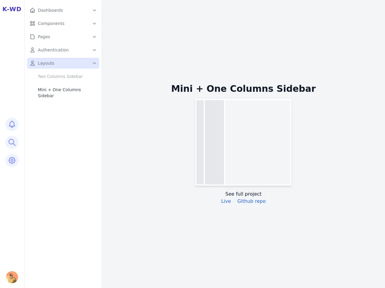
The description of Responsive Mini + One Columns Sidebar ui component
A responsive mini + one columns sidebar is a user interface component that is commonly used in web applications. It consists of a small navigation bar that is fixed to the top of the screen, and a larger content area that is divided into two columns. The first column is a mini sidebar that displays important links or information, while the second column is the main content area.
Why use Tailwind CSS to create a Responsive Mini + One Columns Sidebar ui component?
Tailwind CSS provides a set of pre-defined classes that can be used to quickly create responsive layouts and designs. This makes it an ideal choice for creating a responsive mini + one columns sidebar, as it allows developers to easily customize the layout and style of the component without writing custom CSS.
The preview of Responsive Mini + One Columns Sidebar ui component.
Free download of the Responsive Mini + One Columns Sidebar's source code
The source code of Responsive Mini + One Columns Sidebar ui component.
<style>
/* This example part of kwd-dashboard see https://kamona-wd.github.io/kwd-dashboard/ */
/* So here we will write some classes to simulate dark mode and some of tailwind css config in our project */
:root {
--light: #edf2f9;
--dark: #152e4d;
--darker: #12263f;
}
.dark .dark\:text-light {
color: var(--light);
}
.dark .dark\:bg-dark {
background-color: var(--dark);
}
.dark .dark\:bg-darker {
background-color: var(--darker);
}
.dark .dark\:text-gray-300 {
color: #d1d5db;
}
.dark .dark\:text-indigo-500 {
color: #6366f1;
}
.dark .dark\:text-indigo-100 {
color: #e0e7ff;
}
.dark .dark\:hover\:text-light:hover {
color: var(--light);
}
.dark .dark\:border-indigo-800 {
border-color: #3730a3;
}
.dark .dark\:border-indigo-700 {
border-color: #4338ca;
}
.dark .dark\:bg-indigo-600 {
background-color: #4f46e5;
}
.dark .dark\:hover\:bg-indigo-600:hover {
background-color: #4f46e5;
}
.dark .dark\:border-indigo-500 {
border-color: #6366f1;
}
.hover\:overflow-y-auto:hover {
overflow-y: auto;
}
</style>
<div
x-data="setup()"
x-init="$refs.loading.classList.add('hidden');"
:class="{ 'dark': isDark }"
@resize.window="watchScreen()"
>
<div class="flex h-screen antialiased text-gray-900 bg-gray-100 dark:bg-dark dark:text-light">
<!-- Loading screen -->
<div
x-ref="loading"
class="fixed inset-0 z-50 flex items-center justify-center text-2xl font-semibold text-white bg-indigo-800"
>
Loading.....
</div>
<!-- Sidebar -->
<!-- Backdrop -->
<div
x-show="isSidebarOpen"
@click="isSidebarOpen = false"
class="fixed inset-0 z-10 bg-indigo-800 lg:hidden"
style="opacity: 0.5"
aria-hidden="true"
></div>
<aside
x-show="isSidebarOpen"
x-transition:enter="transition-all transform duration-300 ease-in-out"
x-transition:enter-start="-translate-x-full opacity-0"
x-transition:enter-end="translate-x-0 opacity-100"
x-transition:leave="transition-all transform duration-300 ease-in-out"
x-transition:leave-start="translate-x-0 opacity-100"
x-transition:leave-end="-translate-x-full opacity-0"
x-ref="sidebar"
@keydown.escape="window.innerWidth <= 1024 ? isSidebarOpen = false : ''"
tabindex="-1"
class="fixed inset-y-0 z-10 flex flex-shrink-0 overflow-hidden bg-white border-r lg:static dark:border-indigo-800 dark:bg-darker focus:outline-none"
>
<!-- Mini column -->
<div class="flex flex-col flex-shrink-0 h-full px-2 py-4 border-r dark:border-indigo-800">
<!-- Brand -->
<div class="flex-shrink-0">
<a
href="#"
class="inline-block text-xl font-bold tracking-wider text-indigo-700 uppercase dark:text-light"
>
K-WD
</a>
</div>
<div class="flex flex-col items-center justify-center flex-1 space-y-4">
<!-- Notification button -->
<button
@click="openNotificationsPanel"
class="p-2 text-indigo-400 transition-colors duration-200 rounded-full bg-indigo-50 hover:text-indigo-600 hover:bg-indigo-100 dark:hover:text-light dark:hover:bg-indigo-700 dark:bg-dark focus:outline-none focus:bg-indigo-100 dark:focus:bg-indigo-700 focus:ring-indigo-800"
>
<span class="sr-only">Open Notification panel</span>
<svg
class="w-7 h-7"
xmlns="http://www.w3.org/2000/svg"
fill="none"
viewBox="0 0 24 24"
stroke="currentColor"
aria-hidden="true"
>
<path
stroke-linecap="round"
stroke-linejoin="round"
stroke-width="2"
d="M15 17h5l-1.405-1.405A2.032 2.032 0 0118 14.158V11a6.002 6.002 0 00-4-5.659V5a2 2 0 10-4 0v.341C7.67 6.165 6 8.388 6 11v3.159c0 .538-.214 1.055-.595 1.436L4 17h5m6 0v1a3 3 0 11-6 0v-1m6 0H9"
/>
</svg>
</button>
<!-- Search button -->
<button
@click="openSearchPanel"
class="p-2 text-indigo-400 transition-colors duration-200 rounded-full bg-indigo-50 hover:text-indigo-600 hover:bg-indigo-100 dark:hover:text-light dark:hover:bg-indigo-700 dark:bg-dark focus:outline-none focus:bg-indigo-100 dark:focus:bg-indigo-700 focus:ring-indigo-800"
>
<span class="sr-only">Open search panel</span>
<svg
class="w-7 h-7"
xmlns="http://www.w3.org/2000/svg"
fill="none"
viewBox="0 0 24 24"
stroke="currentColor"
aria-hidden="true"
>
<path
stroke-linecap="round"
stroke-linejoin="round"
stroke-width="2"
d="M21 21l-6-6m2-5a7 7 0 11-14 0 7 7 0 0114 0z"
/>
</svg>
</button>
<!-- Settings button -->
<button
@click="openSettingsPanel"
class="p-2 text-indigo-400 transition-colors duration-200 rounded-full bg-indigo-50 hover:text-indigo-600 hover:bg-indigo-100 dark:hover:text-light dark:hover:bg-indigo-700 dark:bg-dark focus:outline-none focus:bg-indigo-100 dark:focus:bg-indigo-700 focus:ring-indigo-800"
>
<span class="sr-only">Open settings panel</span>
<svg
class="w-7 h-7"
xmlns="http://www.w3.org/2000/svg"
fill="none"
viewBox="0 0 24 24"
stroke="currentColor"
aria-hidden="true"
>
<path
stroke-linecap="round"
stroke-linejoin="round"
stroke-width="2"
d="M10.325 4.317c.426-1.756 2.924-1.756 3.35 0a1.724 1.724 0 002.573 1.066c1.543-.94 3.31.826 2.37 2.37a1.724 1.724 0 001.065 2.572c1.756.426 1.756 2.924 0 3.35a1.724 1.724 0 00-1.066 2.573c.94 1.543-.826 3.31-2.37 2.37a1.724 1.724 0 00-2.572 1.065c-.426 1.756-2.924 1.756-3.35 0a1.724 1.724 0 00-2.573-1.066c-1.543.94-3.31-.826-2.37-2.37a1.724 1.724 0 00-1.065-2.572c-1.756-.426-1.756-2.924 0-3.35a1.724 1.724 0 001.066-2.573c-.94-1.543.826-3.31 2.37-2.37.996.608 2.296.07 2.572-1.065z"
/>
<path
stroke-linecap="round"
stroke-linejoin="round"
stroke-width="2"
d="M15 12a3 3 0 11-6 0 3 3 0 016 0z"
/>
</svg>
</button>
</div>
<!-- Mini column footer -->
<div class="relative flex items-center justify-center flex-shrink-0">
<!-- User avatar button -->
<div class="" x-data="{ open: false }">
<button
@click="open = !open; $nextTick(() => { if(open){ $refs.userMenu.focus() } })"
type="button"
aria-haspopup="true"
:aria-expanded="open ? 'true' : 'false'"
class="block transition-opacity duration-200 rounded-full dark:opacity-75 dark:hover:opacity-100 focus:outline-none focus:ring dark:focus:opacity-100"
>
<span class="sr-only">User menu</span>
<img
class="w-10 h-10 rounded-full"
src="https://avatars.githubusercontent.com/u/57622665?s=460&u=8f581f4c4acd4c18c33a87b3e6476112325e8b38&v=4"
alt="Ahmed Kamel"
/>
</button>
<!-- User dropdown menu -->
<div
x-show="open"
x-ref="userMenu"
x-transition:enter="transition-all transform ease-out"
x-transition:enter-start="-translate-y-1/2 opacity-0"
x-transition:enter-end="translate-y-0 opacity-100"
x-transition:leave="transition-all transform ease-in"
x-transition:leave-start="translate-y-0 opacity-100"
x-transition:leave-end="-translate-y-1/2 opacity-0"
@click.away="open = false"
@keydown.escape="open = false"
class="absolute w-56 py-1 mb-4 bg-white rounded-md shadow-lg min-w-max left-5 bottom-full ring-1 ring-black ring-opacity-5 dark:bg-dark focus:outline-none"
tabindex="-1"
role="menu"
aria-orientation="vertical"
aria-label="User menu"
>
<a
href="#"
role="menuitem"
class="block px-4 py-2 text-sm text-gray-700 transition-colors hover:bg-gray-100 dark:text-light dark:hover:bg-indigo-600"
>
Your Profile
</a>
<a
href="#"
role="menuitem"
class="block px-4 py-2 text-sm text-gray-700 transition-colors hover:bg-gray-100 dark:text-light dark:hover:bg-indigo-600"
>
Settings
</a>
<a
href="#"
role="menuitem"
class="block px-4 py-2 text-sm text-gray-700 transition-colors hover:bg-gray-100 dark:text-light dark:hover:bg-indigo-600"
>
Logout
</a>
</div>
</div>
</div>
</div>
<!-- Sidebar links -->
<nav aria-label="Main" class="flex-1 w-64 px-2 py-4 space-y-2 overflow-y-hidden hover:overflow-y-auto">
<!-- Dashboards links -->
<div x-data="{ isActive: false, open: false}">
<!-- active & hover classes 'bg-indigo-100 dark:bg-indigo-600' -->
<a
href="#"
@click="$event.preventDefault(); open = !open"
class="flex items-center p-2 text-gray-500 transition-colors rounded-md dark:text-light hover:bg-indigo-100 dark:hover:bg-indigo-600"
:class="{'bg-indigo-100 dark:bg-indigo-600': isActive || open}"
role="button"
aria-haspopup="true"
:aria-expanded="(open || isActive) ? 'true' : 'false'"
>
<span aria-hidden="true">
<svg
class="w-5 h-5"
xmlns="http://www.w3.org/2000/svg"
fill="none"
viewBox="0 0 24 24"
stroke="currentColor"
>
<path
stroke-linecap="round"
stroke-linejoin="round"
stroke-width="2"
d="M3 12l2-2m0 0l7-7 7 7M5 10v10a1 1 0 001 1h3m10-11l2 2m-2-2v10a1 1 0 01-1 1h-3m-6 0a1 1 0 001-1v-4a1 1 0 011-1h2a1 1 0 011 1v4a1 1 0 001 1m-6 0h6"
/>
</svg>
</span>
<span class="ml-2 text-sm"> Dashboards </span>
<span class="ml-auto" aria-hidden="true">
<!-- active class 'rotate-180' -->
<svg
class="w-4 h-4 transition-transform transform"
:class="{ 'rotate-180': open }"
xmlns="http://www.w3.org/2000/svg"
fill="none"
viewBox="0 0 24 24"
stroke="currentColor"
>
<path stroke-linecap="round" stroke-linejoin="round" stroke-width="2" d="M19 9l-7 7-7-7" />
</svg>
</span>
</a>
<div role="menu" x-show="open" class="mt-2 space-y-2 px-7" aria-label="Dashboards">
<!-- active & hover classes 'text-gray-700 dark:text-light' -->
<!-- inActive classes 'text-gray-400 dark:text-gray-400' -->
<a
href="#"
role="menuitem"
class="block p-2 text-sm text-gray-400 transition-colors duration-200 rounded-md dark:text-gray-400 dark:hover:text-light hover:text-gray-700"
>
Default
</a>
<a
href="#"
role="menuitem"
class="block p-2 text-sm text-gray-400 transition-colors duration-200 rounded-md dark:hover:text-light hover:text-gray-700"
>
Project Mangement
</a>
<a
href="#"
role="menuitem"
class="block p-2 text-sm text-gray-400 transition-colors duration-200 rounded-md dark:hover:text-light hover:text-gray-700"
>
E-Commerce
</a>
</div>
</div>
<!-- Components links -->
<div x-data="{ isActive: false, open: false }">
<!-- active classes 'bg-indigo-100 dark:bg-indigo-600' -->
<a
href="#"
@click="$event.preventDefault(); open = !open"
class="flex items-center p-2 text-gray-500 transition-colors rounded-md dark:text-light hover:bg-indigo-100 dark:hover:bg-indigo-600"
:class="{ 'bg-indigo-100 dark:bg-indigo-600': isActive || open }"
role="button"
aria-haspopup="true"
:aria-expanded="(open || isActive) ? 'true' : 'false'"
>
<span aria-hidden="true">
<svg
class="w-5 h-5"
xmlns="http://www.w3.org/2000/svg"
fill="none"
viewBox="0 0 24 24"
stroke="currentColor"
>
<path
stroke-linecap="round"
stroke-linejoin="round"
stroke-width="2"
d="M4 6a2 2 0 012-2h2a2 2 0 012 2v2a2 2 0 01-2 2H6a2 2 0 01-2-2V6zM14 6a2 2 0 012-2h2a2 2 0 012 2v2a2 2 0 01-2 2h-2a2 2 0 01-2-2V6zM4 16a2 2 0 012-2h2a2 2 0 012 2v2a2 2 0 01-2 2H6a2 2 0 01-2-2v-2zM14 16a2 2 0 012-2h2a2 2 0 012 2v2a2 2 0 01-2 2h-2a2 2 0 01-2-2v-2z"
/>
</svg>
</span>
<span class="ml-2 text-sm"> Components </span>
<span aria-hidden="true" class="ml-auto">
<!-- active class 'rotate-180' -->
<svg
class="w-4 h-4 transition-transform transform"
:class="{ 'rotate-180': open }"
xmlns="http://www.w3.org/2000/svg"
fill="none"
viewBox="0 0 24 24"
stroke="currentColor"
>
<path stroke-linecap="round" stroke-linejoin="round" stroke-width="2" d="M19 9l-7 7-7-7" />
</svg>
</span>
</a>
<div x-show="open" class="mt-2 space-y-2 px-7" role="menu" arial-label="Components">
<!-- active & hover classes 'text-gray-700 dark:text-light' -->
<!-- inActive classes 'text-gray-400 dark:text-gray-400' -->
<a
href="#"
role="menuitem"
class="block p-2 text-sm text-gray-400 transition-colors duration-200 rounded-md dark:text-gray-400 dark:hover:text-light hover:text-gray-700"
>
Alerts
</a>
<a
href="#"
role="menuitem"
class="block p-2 text-sm text-gray-400 transition-colors duration-200 rounded-md dark:text-gray-400 dark:hover:text-light hover:text-gray-700"
>
Buttons
</a>
<a
href="#"
role="menuitem"
class="block p-2 text-sm text-gray-400 transition-colors duration-200 rounded-md dark:hover:text-light hover:text-gray-700"
>
Cards
</a>
<a
href="#"
role="menuitem"
class="block p-2 text-sm text-gray-400 transition-colors duration-200 rounded-md dark:hover:text-light hover:text-gray-700"
>
Dropdowns
</a>
<a
href="#"
role="menuitem"
class="block p-2 text-sm text-gray-400 transition-colors duration-200 rounded-md dark:hover:text-light hover:text-gray-700"
>
Forms
</a>
<a
href="#"
role="menuitem"
class="block p-2 text-sm text-gray-400 transition-colors duration-200 rounded-md dark:hover:text-light hover:text-gray-700"
>
Lists
</a>
<a
href="#"
role="menuitem"
class="block p-2 text-sm text-gray-400 transition-colors duration-200 rounded-md dark:hover:text-light hover:text-gray-700"
>
Modals
</a>
</div>
</div>
<!-- Pages links -->
<div x-data="{ isActive: false, open: false }">
<!-- active classes 'bg-indigo-100 dark:bg-indigo-600' -->
<a
href="#"
@click="$event.preventDefault(); open = !open"
class="flex items-center p-2 text-gray-500 transition-colors rounded-md dark:text-light hover:bg-indigo-100 dark:hover:bg-indigo-600"
:class="{ 'bg-indigo-100 dark:bg-indigo-600': isActive || open }"
role="button"
aria-haspopup="true"
:aria-expanded="(open || isActive) ? 'true' : 'false'"
>
<span aria-hidden="true">
<svg
class="w-5 h-5"
xmlns="http://www.w3.org/2000/svg"
fill="none"
viewBox="0 0 24 24"
stroke="currentColor"
>
<path
stroke-linecap="round"
stroke-linejoin="round"
stroke-width="2"
d="M7 21h10a2 2 0 002-2V9.414a1 1 0 00-.293-.707l-5.414-5.414A1 1 0 0012.586 3H7a2 2 0 00-2 2v14a2 2 0 002 2z"
/>
</svg>
</span>
<span class="ml-2 text-sm"> Pages </span>
<span aria-hidden="true" class="ml-auto">
<!-- active class 'rotate-180' -->
<svg
class="w-4 h-4 transition-transform transform"
:class="{ 'rotate-180': open }"
xmlns="http://www.w3.org/2000/svg"
fill="none"
viewBox="0 0 24 24"
stroke="currentColor"
>
<path stroke-linecap="round" stroke-linejoin="round" stroke-width="2" d="M19 9l-7 7-7-7" />
</svg>
</span>
</a>
<div x-show="open" class="mt-2 space-y-2 px-7" role="menu" arial-label="Pages">
<!-- active & hover classes 'text-gray-700 dark:text-light' -->
<!-- inActive classes 'text-gray-400 dark:text-gray-400' -->
<a
href="#"
role="menuitem"
class="block p-2 text-sm text-gray-400 transition-colors duration-200 rounded-md dark:text-gray-400 dark:hover:text-light hover:text-gray-700"
>
Blank
</a>
<a
href="#"
role="menuitem"
class="block p-2 text-sm text-gray-400 transition-colors duration-200 rounded-md dark:text-gray-400 dark:hover:text-light hover:text-gray-700"
>
Profile
</a>
<a
href="#"
role="menuitem"
class="block p-2 text-sm text-gray-400 transition-colors duration-200 rounded-md dark:hover:text-light hover:text-gray-700"
>
Pricing
</a>
<a
href="#"
role="menuitem"
class="block p-2 text-sm text-gray-400 transition-colors duration-200 rounded-md dark:hover:text-light hover:text-gray-700"
>
Kanban
</a>
<a
href="#"
role="menuitem"
class="block p-2 text-sm text-gray-400 transition-colors duration-200 rounded-md dark:hover:text-light hover:text-gray-700"
>
Feed
</a>
</div>
</div>
<!-- Authentication links -->
<div x-data="{ isActive: false, open: false}">
<!-- active & hover classes 'bg-indigo-100 dark:bg-indigo-600' -->
<a
href="#"
@click="$event.preventDefault(); open = !open"
class="flex items-center p-2 text-gray-500 transition-colors rounded-md dark:text-light hover:bg-indigo-100 dark:hover:bg-indigo-600"
:class="{'bg-indigo-100 dark:bg-indigo-600': isActive || open}"
role="button"
aria-haspopup="true"
:aria-expanded="(open || isActive) ? 'true' : 'false'"
>
<span aria-hidden="true">
<svg
class="w-5 h-5"
xmlns="http://www.w3.org/2000/svg"
fill="none"
viewBox="0 0 24 24"
stroke="currentColor"
>
<path
stroke-linecap="round"
stroke-linejoin="round"
stroke-width="2"
d="M16 7a4 4 0 11-8 0 4 4 0 018 0zM12 14a7 7 0 00-7 7h14a7 7 0 00-7-7z"
/>
</svg>
</span>
<span class="ml-2 text-sm"> Authentication </span>
<span aria-hidden="true" class="ml-auto">
<!-- active class 'rotate-180' -->
<svg
class="w-4 h-4 transition-transform transform"
:class="{ 'rotate-180': open }"
xmlns="http://www.w3.org/2000/svg"
fill="none"
viewBox="0 0 24 24"
stroke="currentColor"
>
<path stroke-linecap="round" stroke-linejoin="round" stroke-width="2" d="M19 9l-7 7-7-7" />
</svg>
</span>
</a>
<div x-show="open" class="mt-2 space-y-2 px-7" role="menu" aria-label="Authentication">
<!-- active & hover classes 'text-gray-700 dark:text-light' -->
<!-- inActive classes 'text-gray-400 dark:text-gray-400' -->
<a
href="#"
role="menuitem"
class="block p-2 text-sm text-gray-400 transition-colors duration-200 rounded-md dark:hover:text-light hover:text-gray-700"
>
Register
</a>
<a
href="#"
role="menuitem"
class="block p-2 text-sm text-gray-400 transition-colors duration-200 rounded-md dark:hover:text-light hover:text-gray-700"
>
Login
</a>
<a
href="#"
role="menuitem"
class="block p-2 text-sm text-gray-400 transition-colors duration-200 rounded-md dark:hover:text-light hover:text-gray-700"
>
Password Reset
</a>
</div>
</div>
<!-- Layouts links -->
<div x-data="{ isActive: true, open: true}">
<!-- active & hover classes 'bg-indigo-100 dark:bg-indigo-600' -->
<a
href="#"
@click="$event.preventDefault(); open = !open"
class="flex items-center p-2 text-gray-500 transition-colors rounded-md dark:text-light hover:bg-indigo-100 dark:hover:bg-indigo-600"
:class="{'bg-indigo-100 dark:bg-indigo-600': isActive || open}"
role="button"
aria-haspopup="true"
:aria-expanded="(open || isActive) ? 'true' : 'false'"
>
<span aria-hidden="true">
<svg
class="w-5 h-5"
xmlns="http://www.w3.org/2000/svg"
fill="none"
viewBox="0 0 24 24"
stroke="currentColor"
>
<path
stroke-linecap="round"
stroke-linejoin="round"
stroke-width="2"
d="M16 7a4 4 0 11-8 0 4 4 0 018 0zM12 14a7 7 0 00-7 7h14a7 7 0 00-7-7z"
/>
</svg>
</span>
<span class="ml-2 text-sm"> Layouts </span>
<span aria-hidden="true" class="ml-auto">
<!-- active class 'rotate-180' -->
<svg
class="w-4 h-4 transition-transform transform"
:class="{ 'rotate-180': open }"
xmlns="http://www.w3.org/2000/svg"
fill="none"
viewBox="0 0 24 24"
stroke="currentColor"
>
<path stroke-linecap="round" stroke-linejoin="round" stroke-width="2" d="M19 9l-7 7-7-7" />
</svg>
</span>
</a>
<div x-show="open" class="mt-2 space-y-2 px-7" role="menu" aria-label="Authentication">
<!-- active & hover classes 'text-gray-700 dark:text-light' -->
<!-- inActive classes 'text-gray-400 dark:text-gray-400' -->
<a
href="#"
role="menuitem"
class="block p-2 text-sm text-gray-400 transition-colors duration-200 rounded-md dark:text-gray-400 dark:hover:text-light hover:text-gray-700"
>
Two Columns Sidebar
</a>
<a
href="#"
role="menuitem"
class="block p-2 text-sm text-gray-700 transition-colors duration-200 rounded-md dark:text-light dark:hover:text-light hover:text-gray-700"
>
Mini + One Columns Sidebar
</a>
</div>
</div>
</nav>
</aside>
<!-- Sidebars button -->
<div class="fixed flex items-center space-x-4 top-5 right-10 lg:hidden">
<button
@click="isSidebarOpen = true; $nextTick(() => { $refs.sidebar.focus() })"
class="p-1 text-indigo-400 transition-colors duration-200 rounded-md bg-indigo-50 hover:text-indigo-600 hover:bg-indigo-100 dark:hover:text-light dark:hover:bg-indigo-700 dark:bg-dark focus:outline-none focus:ring"
>
<span class="sr-only">Toggle main manu</span>
<span aria-hidden="true">
<svg
x-show="!isSidebarOpen"
class="w-8 h-8"
xmlns="http://www.w3.org/2000/svg"
fill="none"
viewBox="0 0 24 24"
stroke="currentColor"
>
<path stroke-linecap="round" stroke-linejoin="round" stroke-width="2" d="M4 6h16M4 12h16M4 18h16" />
</svg>
<svg
x-show="isSidebarOpen"
class="w-8 h-8"
xmlns="http://www.w3.org/2000/svg"
fill="none"
viewBox="0 0 24 24"
stroke="currentColor"
>
<path stroke-linecap="round" stroke-linejoin="round" stroke-width="2" d="M6 18L18 6M6 6l12 12" />
</svg>
</span>
</button>
</div>
<!-- Main content -->
<main class="flex-1">
<div
class="flex flex-col items-center justify-center flex-1 h-full min-h-screen p-4 overflow-x-hidden overflow-y-auto"
>
<h1 class="mb-4 text-2xl font-semibold text-center md:text-3xl">Mini + One Columns Sidebar</h1>
<div class="mb-4">
<div class="relative flex p-1 space-x-1 bg-white shadow-md w-80 h-72 dark:bg-darker">
<div class="w-6 h-full bg-gray-200 dark:bg-dark"></div>
<div class="w-16 h-full bg-gray-200 dark:bg-dark"></div>
<div class="flex-1 h-full bg-gray-100 dark:bg-dark"></div>
</div>
</div>
<div>
<p class="text-center">See full project</p>
<a
href="https://kamona-wd.github.io/kwd-dashboard/"
target="_blank"
class="text-base text-blue-600 hover:underline"
>Live</a
>
<a
href="https://github.com/Kamona-WD/kwd-dashboard"
target="_blank"
class="ml-4 text-base text-blue-600 hover:underline"
>Github repo</a
>
</div>
</div>
</main>
<!-- Panels -->
<!-- Settings Panel -->
<!-- Backdrop -->
<div
x-transition:enter="transition duration-300 ease-in-out"
x-transition:enter-start="opacity-0"
x-transition:enter-end="opacity-100"
x-transition:leave="transition duration-300 ease-in-out"
x-transition:leave-start="opacity-100"
x-transition:leave-end="opacity-0"
x-show="isSettingsPanelOpen"
@click="isSettingsPanelOpen = false"
class="fixed inset-0 z-10 bg-indigo-800"
style="opacity: 0.5"
aria-hidden="true"
></div>
<!-- Panel -->
<section
x-transition:enter="transition duration-300 ease-in-out transform sm:duration-500"
x-transition:enter-start="translate-x-full"
x-transition:enter-end="translate-x-0"
x-transition:leave="transition duration-300 ease-in-out transform sm:duration-500"
x-transition:leave-start="translate-x-0"
x-transition:leave-end="translate-x-full"
x-ref="settingsPanel"
tabindex="-1"
x-show="isSettingsPanelOpen"
@keydown.escape="isSettingsPanelOpen = false"
class="fixed inset-y-0 right-0 z-20 w-full max-w-xs bg-white shadow-xl dark:bg-darker dark:text-light sm:max-w-md focus:outline-none"
aria-labelledby="settinsPanelLabel"
>
<div class="absolute left-0 p-2 transform -translate-x-full">
<!-- Close button -->
<button
@click="isSettingsPanelOpen = false"
class="p-2 text-white rounded-md focus:outline-none focus:ring"
>
<svg
class="w-5 h-5"
xmlns="http://www.w3.org/2000/svg"
fill="none"
viewBox="0 0 24 24"
stroke="currentColor"
>
<path stroke-linecap="round" stroke-linejoin="round" stroke-width="2" d="M6 18L18 6M6 6l12 12" />
</svg>
</button>
</div>
<!-- Panel content -->
<div class="flex flex-col h-screen">
<!-- Panel header -->
<div
class="flex flex-col items-center justify-center flex-shrink-0 px-4 py-8 space-y-4 border-b dark:border-indigo-700"
>
<span aria-hidden="true" class="text-gray-500 dark:text-indigo-600">
<svg
class="w-8 h-8"
xmlns="http://www.w3.org/2000/svg"
fill="none"
viewBox="0 0 24 24"
stroke="currentColor"
>
<path
stroke-linecap="round"
stroke-linejoin="round"
stroke-width="2"
d="M12 6V4m0 2a2 2 0 100 4m0-4a2 2 0 110 4m-6 8a2 2 0 100-4m0 4a2 2 0 110-4m0 4v2m0-6V4m6 6v10m6-2a2 2 0 100-4m0 4a2 2 0 110-4m0 4v2m0-6V4"
/>
</svg>
</span>
<h2 id="settinsPanelLabel" class="text-xl font-medium text-gray-500 dark:text-light">Settings</h2>
</div>
<!-- Content -->
<div class="flex-1 overflow-hidden hover:overflow-y-auto">
<!-- Theme -->
<div class="p-4 space-y-4 md:p-8">
<h6 class="text-lg font-medium text-gray-400 dark:text-light">Mode</h6>
<div class="flex items-center space-x-8">
<!-- Light button -->
<button
@click="setLightTheme"
class="flex items-center justify-center px-4 py-2 space-x-4 transition-colors border rounded-md hover:text-gray-900 hover:border-gray-900 dark:border-indigo-600 dark:hover:text-indigo-100 dark:hover:border-indigo-500 focus:outline-none focus:ring focus:ring-indigo-400 dark:focus:ring-indigo-700"
:class="{ 'border-gray-900 text-gray-900 dark:border-indigo-500 dark:text-indigo-100': !isDark, 'text-gray-500 dark:text-indigo-500': isDark }"
>
<span>
<svg
class="w-6 h-6"
xmlns="http://www.w3.org/2000/svg"
fill="none"
viewBox="0 0 24 24"
stroke="currentColor"
>
<path
stroke-linecap="round"
stroke-linejoin="round"
stroke-width="2"
d="M11.049 2.927c.3-.921 1.603-.921 1.902 0l1.519 4.674a1 1 0 00.95.69h4.915c.969 0 1.371 1.24.588 1.81l-3.976 2.888a1 1 0 00-.363 1.118l1.518 4.674c.3.922-.755 1.688-1.538 1.118l-3.976-2.888a1 1 0 00-1.176 0l-3.976 2.888c-.783.57-1.838-.197-1.538-1.118l1.518-4.674a1 1 0 00-.363-1.118l-3.976-2.888c-.784-.57-.38-1.81.588-1.81h4.914a1 1 0 00.951-.69l1.519-4.674z"
/>
</svg>
</span>
<span>Light</span>
</button>
<!-- Dark button -->
<button
@click="setDarkTheme"
class="flex items-center justify-center px-4 py-2 space-x-4 transition-colors border rounded-md hover:text-gray-900 hover:border-gray-900 dark:border-indigo-600 dark:hover:text-indigo-100 dark:hover:border-indigo-500 focus:outline-none focus:ring focus:ring-indigo-400 dark:focus:ring-indigo-700"
:class="{ 'border-gray-900 text-gray-900 dark:border-indigo-500 dark:text-indigo-100': isDark, 'text-gray-500 dark:text-indigo-500': !isDark }"
>
<span>
<svg
class="w-6 h-6"
xmlns="http://www.w3.org/2000/svg"
fill="none"
viewBox="0 0 24 24"
stroke="currentColor"
>
<path
stroke-linecap="round"
stroke-linejoin="round"
stroke-width="2"
d="M20.354 15.354A9 9 0 018.646 3.646 9.003 9.003 0 0012 21a9.003 9.003 0 008.354-5.646z"
/>
</svg>
</span>
<span>Dark</span>
</button>
</div>
</div>
</div>
</div>
</section>
<!-- Notification panel -->
<!-- Backdrop -->
<div
x-transition:enter="transition duration-300 ease-in-out"
x-transition:enter-start="opacity-0"
x-transition:enter-end="opacity-100"
x-transition:leave="transition duration-300 ease-in-out"
x-transition:leave-start="opacity-100"
x-transition:leave-end="opacity-0"
x-show="isNotificationsPanelOpen"
@click="isNotificationsPanelOpen = false"
class="fixed inset-0 z-10 bg-indigo-800"
style="opacity: 0.5"
aria-hidden="true"
></div>
<!-- Panel -->
<section
x-transition:enter="transition duration-300 ease-in-out transform sm:duration-500"
x-transition:enter-start="-translate-x-full"
x-transition:enter-end="translate-x-0"
x-transition:leave="transition duration-300 ease-in-out transform sm:duration-500"
x-transition:leave-start="translate-x-0"
x-transition:leave-end="-translate-x-full"
x-rel="notificationsPanel"
x-show="isNotificationsPanelOpen"
@keydown.escape="isNotificationsPanelOpen = false"
tabindex="-1"
aria-labelledby="notificationPanelLabel"
class="fixed inset-y-0 z-20 w-full max-w-xs bg-white dark:bg-darker dark:text-light sm:max-w-md focus:outline-none"
>
<div class="absolute right-0 p-2 transform translate-x-full">
<!-- Close button -->
<button
@click="isNotificationsPanelOpen = false"
class="p-2 text-white rounded-md focus:outline-none focus:ring"
>
<svg
class="w-5 h-5"
xmlns="http://www.w3.org/2000/svg"
fill="none"
viewBox="0 0 24 24"
stroke="currentColor"
>
<path stroke-linecap="round" stroke-linejoin="round" stroke-width="2" d="M6 18L18 6M6 6l12 12" />
</svg>
</button>
</div>
<div class="flex flex-col h-screen" x-data="{ activeTabe: 'action' }">
<!-- Panel header -->
<div class="flex-shrink-0">
<div class="flex items-center justify-between px-4 pt-4 border-b dark:border-indigo-800">
<h2 id="notificationPanelLabel" class="pb-4 font-semibold">Notifications</h2>
<div class="space-x-2">
<button
@click.prevent="activeTabe = 'action'"
class="px-px pb-4 transition-all duration-200 transform translate-y-px border-b focus:outline-none"
:class="{'border-indigo-700 dark:border-indigo-600': activeTabe == 'action', 'border-transparent': activeTabe != 'action'}"
>
Action
</button>
<button
@click.prevent="activeTabe = 'user'"
class="px-px pb-4 transition-all duration-200 transform translate-y-px border-b focus:outline-none"
:class="{'border-indigo-700 dark:border-indigo-600': activeTabe == 'user', 'border-transparent': activeTabe != 'user'}"
>
User
</button>
</div>
</div>
</div>
<!-- Panel content (tabs) -->
<div class="flex-1 pt-4 overflow-y-hidden hover:overflow-y-auto">
<!-- Action tab -->
<div class="space-y-4" x-show.transition.in="activeTabe == 'action'">
<p class="px-4">Action tab content</p>
<!-- -->
<!-- Action tab content -->
<!-- -->
</div>
<!-- User tab -->
<div class="space-y-4" x-show.transition.in="activeTabe == 'user'">
<p class="px-4">User tab content</p>
<!-- -->
<!-- User tab content -->
<!-- -->
</div>
</div>
</div>
</section>
<!-- Search panel -->
<!-- Backdrop -->
<div
x-transition:enter="transition duration-300 ease-in-out"
x-transition:enter-start="opacity-0"
x-transition:enter-end="opacity-100"
x-transition:leave="transition duration-300 ease-in-out"
x-transition:leave-start="opacity-100"
x-transition:leave-end="opacity-0"
x-show="isSearchPanelOpen"
@click="isSearchPanelOpen = false"
class="fixed inset-0 z-10 bg-indigo-800"
style="opacity: 0.5"
aria-hidden="ture"
></div>
<!-- Panel -->
<section
x-transition:enter="transition duration-300 ease-in-out transform sm:duration-500"
x-transition:enter-start="-translate-x-full"
x-transition:enter-end="translate-x-0"
x-transition:leave="transition duration-300 ease-in-out transform sm:duration-500"
x-transition:leave-start="translate-x-0"
x-transition:leave-end="-translate-x-full"
x-show="isSearchPanelOpen"
@keydown.escape="isSearchPanelOpen = false"
class="fixed inset-y-0 z-20 w-full max-w-xs bg-white shadow-xl dark:bg-darker dark:text-light sm:max-w-md focus:outline-none"
>
<div class="absolute right-0 p-2 transform translate-x-full">
<!-- Close button -->
<button @click="isSearchPanelOpen = false" class="p-2 text-white rounded-md focus:outline-none focus:ring">
<svg
class="w-5 h-5"
xmlns="http://www.w3.org/2000/svg"
fill="none"
viewBox="0 0 24 24"
stroke="currentColor"
>
<path stroke-linecap="round" stroke-linejoin="round" stroke-width="2" d="M6 18L18 6M6 6l12 12" />
</svg>
</button>
</div>
<h2 class="sr-only">Search panel</h2>
<!-- Panel content -->
<div class="flex flex-col h-screen">
<!-- Panel header (Search input) -->
<div
class="relative flex-shrink-0 px-4 py-8 text-gray-400 border-b dark:border-indigo-800 dark:focus-within:text-light focus-within:text-gray-700"
>
<span class="absolute inset-y-0 inline-flex items-center px-4">
<svg
class="w-5 h-5"
xmlns="http://www.w3.org/2000/svg"
fill="none"
viewBox="0 0 24 24"
stroke="currentColor"
>
<path
stroke-linecap="round"
stroke-linejoin="round"
stroke-width="2"
d="M21 21l-6-6m2-5a7 7 0 11-14 0 7 7 0 0114 0z"
/>
</svg>
</span>
<input
x-ref="searchInput"
type="text"
class="w-full py-2 pl-10 pr-4 border rounded-full dark:bg-dark dark:border-transparent dark:text-light focus:outline-none focus:ring"
placeholder="Search..."
/>
</div>
<!-- Panel content (Search result) -->
<div class="flex-1 px-4 pb-4 space-y-4 overflow-y-hidden h hover:overflow-y-auto">
<h3 class="py-2 text-sm font-semibold text-gray-600 dark:text-light">History</h3>
<p class="px=4">Search resault</p>
<!-- -->
<!-- Search content -->
<!-- -->
</div>
</div>
</section>
</div>
</div>
<script src="https://cdn.jsdelivr.net/gh/alpine-collective/[email protected]/dist/component.min.js"></script>
<script src="https://cdn.jsdelivr.net/gh/alpinejs/[email protected]/dist/alpine.min.js" defer></script>
<script>
const setup = () => {
const getTheme = () => {
if (window.localStorage.getItem('dark')) {
return JSON.parse(window.localStorage.getItem('dark'))
}
return !!window.matchMedia && window.matchMedia('(prefers-color-scheme: dark)').matches
}
const setTheme = (value) => {
window.localStorage.setItem('dark', value)
}
return {
loading: true,
isDark: getTheme(),
toggleTheme() {
this.isDark = !this.isDark
setTheme(this.isDark)
},
setLightTheme() {
this.isDark = false
setTheme(this.isDark)
},
setDarkTheme() {
this.isDark = true
setTheme(this.isDark)
},
watchScreen() {
if (window.innerWidth <= 1024) {
this.isSidebarOpen = false
} else if (window.innerWidth >= 1024) {
this.isSidebarOpen = true
}
},
isSidebarOpen: window.innerWidth >= 1024 ? true : false,
toggleSidbarMenu() {
this.isSidebarOpen = !this.isSidebarOpen
},
isNotificationsPanelOpen: false,
openNotificationsPanel() {
this.isNotificationsPanelOpen = true
this.$nextTick(() => {
this.$refs.notificationsPanel.focus()
})
},
isSettingsPanelOpen: false,
openSettingsPanel() {
this.isSettingsPanelOpen = true
this.$nextTick(() => {
this.$refs.settingsPanel.focus()
})
},
isSearchPanelOpen: false,
openSearchPanel() {
this.isSearchPanelOpen = true
this.$nextTick(() => {
this.$refs.searchInput.focus()
})
},
}
}
</script>
How to create a Responsive Mini + One Columns Sidebar with Tailwind CSS?
In this tutorial, we will walk through the process of creating a responsive mini + one columns sidebar using Tailwind CSS. We will be using HTML and Tailwind CSS classes to create the component.
Step 1: Set up the HTML structure
The first step is to set up the HTML structure for the component. We will create a container div that will hold the navigation bar and the content area. Inside the container div, we will create two divs for the navigation bar and the content area.
<div class="container mx-auto">
  <div class="flex justify-between items-center bg-gray-800 text-white px-4 py-2 fixed w-full z-10">
    <!-- Navigation bar -->
  </div>
  <div class="flex mt-16">
    <!-- Sidebar -->
    <!-- Main content -->
  </div>
</div>
Step 2: Create the navigation bar
The next step is to create the navigation bar. We will use the flexbox layout to align the navigation links to the left and the user profile to the right. We will also use the bg-gray-800 class to set the background color of the navigation bar to gray.
<div class="container mx-auto">
  <div class="flex justify-between items-center bg-gray-800 text-white px-4 py-2 fixed w-full z-10">
    <div class="flex items-center">
      <a href="#" class="font-bold text-lg">Logo</a>
      <div class="ml-4">
        <a href="#" class="text-gray-400 hover:text-white">Link 1</a>
        <a href="#" class="text-gray-400 hover:text-white ml-4">Link 2</a>
      </div>
    </div>
    <div class="flex items-center">
      <div class="mr-4">
        <span class="text-gray-400">Welcome, John Doe</span>
      </div>
      <img src="https://via.placeholder.com/40" alt="Profile" class="rounded-full">
    </div>
  </div>
  <div class="flex mt-16">
    <!-- Sidebar -->
    <!-- Main content -->
  </div>
</div>
Step 3: Create the sidebar
The next step is to create the sidebar. We will use the w-1/4 class to set the width of the sidebar to one-fourth of the container width. We will also use the bg-gray-200 class to set the background color of the sidebar to light gray.
<div class="container mx-auto">
  <div class="flex justify-between items-center bg-gray-800 text-white px-4 py-2 fixed w-full z-10">
    <div class="flex items-center">
      <a href="#" class="font-bold text-lg">Logo</a>
      <div class="ml-4">
        <a href="#" class="text-gray-400 hover:text-white">Link 1</a>
        <a href="#" class="text-gray-400 hover:text-white ml-4">Link 2</a>
      </div>
    </div>
    <div class="flex items-center">
      <div class="mr-4">
        <span class="text-gray-400">Welcome, John Doe</span>
      </div>
      <img src="https://via.placeholder.com/40" alt="Profile" class="rounded-full">
    </div>
  </div>
  <div class="flex mt-16">
    <div class="w-1/4 bg-gray-200 h-screen">
      <!-- Sidebar content -->
    </div>
    <!-- Main content -->
  </div>
</div>
Step 4: Create the main content area
The next step is to create the main content area. We will use the w-3/4 class to set the width of the main content area to three-fourths of the container width.
<div class="container mx-auto">
  <div class="flex justify-between items-center bg-gray-800 text-white px-4 py-2 fixed w-full z-10">
    <div class="flex items-center">
      <a href="#" class="font-bold text-lg">Logo</a>
      <div class="ml-4">
        <a href="#" class="text-gray-400 hover:text-white">Link 1</a>
        <a href="#" class="text-gray-400 hover:text-white ml-4">Link 2</a>
      </div>
    </div>
    <div class="flex items-center">
      <div class="mr-4">
        <span class="text-gray-400">Welcome, John Doe</span>
      </div>
      <img src="https://via.placeholder.com/40" alt="Profile" class="rounded-full">
    </div>
  </div>
  <div class="flex mt-16">
    <div class="w-1/4 bg-gray-200 h-screen">
      <!-- Sidebar content -->
    </div>
    <div class="w-3/4 bg-white p-4">
      <!-- Main content -->
    </div>
  </div>
</div>
Step 5: Make the component responsive
The final step is to make the component responsive. We will use the sm:flex-col class to switch the layout to a single column on small screens. We will also use the sm:w-full class to set the width of the sidebar and the main content area to full width on small screens.
<div class="container mx-auto">
  <div class="flex justify-between items-center bg-gray-800 text-white px-4 py-2 fixed w-full z-10">
    <div class="flex items-center">
      <a href="#" class="font-bold text-lg">Logo</a>
      <div class="ml-4">
        <a href="#" class="text-gray-400 hover:text-white">Link 1</a>
        <a href="#" class="text-gray-400 hover:text-white ml-4">Link 2</a>
      </div>
    </div>
    <div class="flex items-center">
      <div class="mr-4">
        <span class="text-gray-400">Welcome, John Doe</span>
      </div>
      <img src="https://via.placeholder.com/40" alt="Profile" class="rounded-full">
    </div>
  </div>
  <div class="flex mt-16 sm:flex-col">
    <div class="w-1/4 bg-gray-200 h-screen sm:w-full">
      <!-- Sidebar content -->
    </div>
    <div class="w-3/4 bg-white p-4 sm:w-full">
      <!-- Main content -->
    </div>
  </div>
</div>
Conclusion
In this tutorial, we have learned how to create a responsive mini + one columns sidebar using Tailwind CSS. We have used HTML and Tailwind CSS classes to create the component, and have made it responsive using the sm:flex-col and sm:w-full classes. With Tailwind CSS, creating complex layouts and designs has never been easier.