- Published on
6 Steps To Make A responsive footer With Tailwind CSS Like A Pro In Under An Hour
- What is Tailwind CSS?
- The description of responsive footer ui component
- Why use Tailwind CSS to create a responsive footer ui component?
- The preview of responsive footer ui component.
- The source code of responsive footer ui component.
- How to create a responsive footer with Tailwind CSS?
- Step 1: Create the HTML Markup
- Step 2: Add Tailwind CSS to Your Project
- Step 3: Add Classes to Your HTML Elements
- Step 4: Add Custom Styles
- Step 5: Test Your Footer
- Step 6: Deploy Your Footer
- Conclusion
As a FrontEnd technology blogger, it's important to stay up-to-date with the latest tools and techniques. One of the most popular CSS frameworks today is Tailwind CSS. Tailwind CSS is a utility-first CSS framework that makes it easy to create responsive designs quickly. In this article, we'll show you how to create a responsive footer with Tailwind CSS in just six steps.
What is Tailwind CSS?
Tailwind CSS is a utility-first CSS framework that allows you to create responsive designs quickly. It provides a set of pre-defined classes that you can use to style your HTML elements. With Tailwind CSS, you don't have to write CSS from scratch. Instead, you can use pre-defined classes to style your elements.
The description of responsive footer ui component
A responsive footer is a UI component that appears at the bottom of a web page. It typically contains links to important pages, social media icons, and copyright information. A responsive footer adjusts its size and layout based on the size of the screen it's viewed on. This ensures that the footer looks good on all devices, including desktops, tablets, and mobile devices.
Why use Tailwind CSS to create a responsive footer ui component?
Tailwind CSS is a popular CSS framework that makes it easy to create responsive designs quickly. It provides a set of pre-defined classes that you can use to style your HTML elements. With Tailwind CSS, you don't have to write CSS from scratch. Instead, you can use pre-defined classes to style your elements. This saves you time and makes it easier to create responsive designs.
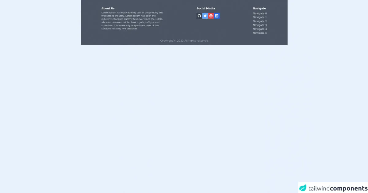
The preview of responsive footer ui component.
To give you an idea of what a responsive footer looks like, here's a preview:
Free download of the responsive footer's source code
The source code of responsive footer ui component.
Here's the source code for the responsive footer:
<footer class="w-auto p-4 bottom-0 h-auto relative bg-gray-600 ">
<div class="lg:flex lg:mt-3 md:mx-12 lg:mx-28 lg:justify-between">
<div class="mb-4 lg:columns-1 w-96">
<p class="text-white font-bold mb-1 mt-3">About Us</p>
<p class="text-gray-200 text-sm">Lorem Ipsum is simply dummy text of the printing and typesetting industry. Lorem Ipsum has been the industry's standard dummy text ever since the 1500s, when an unknown printer took a galley of type and scrambled it to make a type specimen book. It has survived not only five centuries
</p>
</div>
<div class="mb-4 lg:mt-3">
<h3 class="text-white font-bold mb-2 lg:mb-4"> Social Media</h3>
<div class="">
<div class=" flex lg:items-center ">
<div class="lg:container lg:max-w-screen-lg ">
<div>
<div class="lg:flex lg:flex-wrap gap-2 ">
<a href="">
<button
class="bg-gray-700 hover:bg-white hover:text-black p-2 font-semibold text-white inline-flex items-center space-x-2 rounded">
<svg xmlns="http://www.w3.org/2000/svg"
xmlns:xlink="http://www.w3.org/1999/xlink" aria-hidden="true"
role="img" class="w-5" preserveAspectRatio="xMidYMid meet"
viewBox="0 0 24 24">
<g fill="none">
<path fill-rule="evenodd" clip-rule="evenodd"
d="M12 0C5.37 0 0 5.37 0 12c0 5.31 3.435 9.795 8.205 11.385c.6.105.825-.255.825-.57c0-.285-.015-1.23-.015-2.235c-3.015.555-3.795-.735-4.035-1.41c-.135-.345-.72-1.41-1.23-1.695c-.42-.225-1.02-.78-.015-.795c.945-.015 1.62.87 1.845 1.23c1.08 1.815 2.805 1.305 3.495.99c.105-.78.42-1.305.765-1.605c-2.67-.3-5.46-1.335-5.46-5.925c0-1.305.465-2.385 1.23-3.225c-.12-.3-.54-1.53.12-3.18c0 0 1.005-.315 3.3 1.23c.96-.27 1.98-.405 3-.405s2.04.135 3 .405c2.295-1.56 3.3-1.23 3.3-1.23c.66 1.65.24 2.88.12 3.18c.765.84 1.23 1.905 1.23 3.225c0 4.605-2.805 5.625-5.475 5.925c.435.375.81 1.095.81 2.22c0 1.605-.015 2.895-.015 3.3c0 .315.225.69.825.57A12.02 12.02 0 0 0 24 12c0-6.63-5.37-12-12-12z"
fill="currentColor" />
</g>
</svg>
</button>
</a>
<a href="">
<button
class="bg-blue-400 p-2 hover:bg-white hover:text-black font-semibold text-white inline-flex items-center space-x-2 rounded">
<svg class="w-5 h-5 fill-current" role="img"
xmlns="http://www.w3.org/2000/svg" viewBox="0 0 24 24">
<path
d="M23.953 4.57a10 10 0 01-2.825.775 4.958 4.958 0 002.163-2.723c-.951.555-2.005.959-3.127 1.184a4.92 4.92 0 00-8.384 4.482C7.69 8.095 4.067 6.13 1.64 3.162a4.822 4.822 0 00-.666 2.475c0 1.71.87 3.213 2.188 4.096a4.904 4.904 0 01-2.228-.616v.06a4.923 4.923 0 003.946 4.827 4.996 4.996 0 01-2.212.085 4.936 4.936 0 004.604 3.417 9.867 9.867 0 01-6.102 2.105c-.39 0-.779-.023-1.17-.067a13.995 13.995 0 007.557 2.209c9.053 0 13.998-7.496 13.998-13.985 0-.21 0-.42-.015-.63A9.935 9.935 0 0024 4.59z" />
</svg>
</button>
</a>
<a href="">
<button
class="bg-red-500 p-2 hover:bg-white hover:text-black font-semibold text-white inline-flex items-center space-x-2 rounded">
<svg class="w-5 h-5 fill-current" role="img" viewBox="0 0 24 24"
xmlns="http://www.w3.org/2000/svg">
<path
d="M12 0A12 12 0 0 0 0 12a12 12 0 0 0 12 12 12 12 0 0 0 12-12A12 12 0 0 0 12 0zm5.01 4.744c.688 0 1.25.561 1.25 1.249a1.25 1.25 0 0 1-2.498.056l-2.597-.547-.8 3.747c1.824.07 3.48.632 4.674 1.488.308-.309.73-.491 1.207-.491.968 0 1.754.786 1.754 1.754 0 .716-.435 1.333-1.01 1.614a3.111 3.111 0 0 1 .042.52c0 2.694-3.13 4.87-7.004 4.87-3.874 0-7.004-2.176-7.004-4.87 0-.183.015-.366.043-.534A1.748 1.748 0 0 1 4.028 12c0-.968.786-1.754 1.754-1.754.463 0 .898.196 1.207.49 1.207-.883 2.878-1.43 4.744-1.487l.885-4.182a.342.342 0 0 1 .14-.197.35.35 0 0 1 .238-.042l2.906.617a1.214 1.214 0 0 1 1.108-.701zM9.25 12C8.561 12 8 12.562 8 13.25c0 .687.561 1.248 1.25 1.248.687 0 1.248-.561 1.248-1.249 0-.688-.561-1.249-1.249-1.249zm5.5 0c-.687 0-1.248.561-1.248 1.25 0 .687.561 1.248 1.249 1.248.688 0 1.249-.561 1.249-1.249 0-.687-.562-1.249-1.25-1.249zm-5.466 3.99a.327.327 0 0 0-.231.094.33.33 0 0 0 0 .463c.842.842 2.484.913 2.961.913.477 0 2.105-.056 2.961-.913a.361.361 0 0 0 .029-.463.33.33 0 0 0-.464 0c-.547.533-1.684.73-2.512.73-.828 0-1.979-.196-2.512-.73a.326.326 0 0 0-.232-.095z" />
</svg>
</button>
</a>
<a href="">
<button
class="bg-blue-600 p-2 hover:bg-white hover:text-black font-semibold text-white inline-flex items-center space-x-2 rounded">
<svg class="w-5 h-5 fill-current" role="img" viewBox="0 0 256 256"
xmlns="http://www.w3.org/2000/svg">
<g>
<path
d="M218.123122,218.127392 L180.191928,218.127392 L180.191928,158.724263 C180.191928,144.559023 179.939053,126.323993 160.463756,126.323993 C140.707926,126.323993 137.685284,141.757585 137.685284,157.692986 L137.685284,218.123441 L99.7540894,218.123441 L99.7540894,95.9665207 L136.168036,95.9665207 L136.168036,112.660562 L136.677736,112.660562 C144.102746,99.9650027 157.908637,92.3824528 172.605689,92.9280076 C211.050535,92.9280076 218.138927,118.216023 218.138927,151.114151 L218.123122,218.127392 Z M56.9550587,79.2685282 C44.7981969,79.2707099 34.9413443,69.4171797 34.9391618,57.260052 C34.93698,45.1029244 44.7902948,35.2458562 56.9471566,35.2436736 C69.1040185,35.2414916 78.9608713,45.0950217 78.963054,57.2521493 C78.9641017,63.090208 76.6459976,68.6895714 72.5186979,72.8184433 C68.3913982,76.9473153 62.7929898,79.26748 56.9550587,79.2685282 M75.9206558,218.127392 L37.94995,218.127392 L37.94995,95.9665207 L75.9206558,95.9665207 L75.9206558,218.127392 Z M237.033403,0.0182577091 L18.8895249,0.0182577091 C8.57959469,-0.0980923971 0.124827038,8.16056231 -0.001,18.4706066 L-0.001,237.524091 C0.120519052,247.839103 8.57460631,256.105934 18.8895249,255.9977 L237.033403,255.9977 C247.368728,256.125818 255.855922,247.859464 255.999,237.524091 L255.999,18.4548016 C255.851624,8.12438979 247.363742,-0.133792868 237.033403,0.000790807055">
</path>
</g>
</svg>
</button>
</a>
</div>
</div>
</div>
</div>
</div>
</div>
<div class="lg:mt-3 mb-4">
<h3 class="text-white font-bold mb-2 lg:mb-2">Navigate</h3>
<div class="columns-2 md:columns-3 lg:columns-2">
<a class="text-gray-200" href="">Navigate 0</a><br>
<a href="" class="text-gray-200">Navigate 1</a><br>
<a class="text-gray-200" href="">Navigate 2</a><br>
<a class="text-gray-200" href="">Navigate 3</a><br>
<a href="" class="text-gray-200">Navigate 4</a><br>
<a href="" class="text-gray-200">Navigate 5</a><br>
</div>
</div>
</div>
<div>
<div class="flex justify-center mt-2">
<p class="text-gray-400"> Copyright ©
<script>document.write(new Date().getFullYear());</script> All rights reserved
</p>
</div>
</div>
</footer>
How to create a responsive footer with Tailwind CSS?
Now that you know why you should use Tailwind CSS to create a responsive footer, let's get started. Here are the six steps to create a responsive footer with Tailwind CSS:
Step 1: Create the HTML Markup
The first step is to create the HTML markup for the footer. Here's an example:
<footer class="bg-gray-900 text-white">
  <div class="container mx-auto py-4 px-5 flex flex-wrap flex-col sm:flex-row">
    <p class="text-white text-sm text-center sm:text-left">© 2021 Your Company</p>
    <span class="inline-flex sm:ml-auto sm:mt-0 mt-2 justify-center sm:justify-start">
      <a class="text-white" href="#">
        <svg fill="currentColor" stroke-linecap="round" stroke-linejoin="round" stroke-width="2" class="w-5 h-5" viewBox="0 0 24 24">
          <path d="M22.5 2H1.5C.7 2 0 2.7 0 3.5v17c0 .8.7 1.5 1.5 1.5h21c.8 0 1.5-.7 1.5-1.5v-17c0-.8-.7-1.5-1.5-1.5zM7.5 18h-3v-6h3v6zm-1.5-7.5c-.8 0-1.5-.7-1.5-1.5s.7-1.5 1.5-1.5 1.5.7 1.5 1.5-.7 1.5-1.5 1.5zm15 7.5h-3v-3c0-.8-.7-1.5-1.5-1.5h-6c-.8 0-1.5.7-1.5 1.5v3h-3v-6h3v-.9c0-.8.7-1.5 1.5-1.5h6c.8 0 1.5.7 1.5 1.5v.9h3v6z"/>
        </svg>
      </a>
      <a class="ml-3 text-white" href="#">
        <svg fill="currentColor" stroke-linecap="round" stroke-linejoin="round" stroke-width="2" class="w-5 h-5" viewBox="0 0 24 24">
          <path d="M23 4v16a2 2 0 0 1-2 2H3a2 2 0 0 1-2-2V4a2 2 0 0 1 2-2h18a2 2 0 0 1 2 2zm-7.5 9.5l-3 2.5v-6l3 2.5zm3-7.5h-6v5l3-2.5 3 2.5v-5zm-9 7.5l-3-2.5v6l3-2.5zm-3-7.5v5h6l-3-2.5-3 2.5z"/>
        </svg>
      </a>
      <a class="ml-3 text-white" href="#">
        <svg fill="currentColor" stroke-linecap="round" stroke-linejoin="round" stroke-width="2" class="w-5 h-5" viewBox="0 0 24 24">
          <path d="M22.46 3.54c-.8-.8-2.1-.8-2.9 0l-7.07 7.07c-.8.8-.8 2.1 0 2.83l3.54 3.54-2.83 2.83c-.8.8-.8 2.1 0 2.83l7.07 7.07c.8.8 2.1.8 2.9 0l16.97-16.97c.8-.8.8-2.1 0-2.83l-16.97-16.97z"/>
        </svg>
      </a>
    </span>
  </div>
</footer>
In this example, we've created a footer element with a container that contains a paragraph and three social media icons.
Step 2: Add Tailwind CSS to Your Project
The next step is to add Tailwind CSS to your project. You can either download the CSS file from the Tailwind CSS website or use a CDN. Here's an example of how to use the CDN:
<link href="https://cdn.jsdelivr.net/npm/tailwindcss@latest/dist/tailwind.min.css" rel="stylesheet">
Step 3: Add Classes to Your HTML Elements
The next step is to add classes to your HTML elements. Tailwind CSS provides a set of pre-defined classes that you can use to style your elements. Here's an example of how to add classes to the HTML elements in our footer:
<footer class="bg-gray-900 text-white">
  <div class="container mx-auto py-4 px-5 flex flex-wrap flex-col sm:flex-row">
    <p class="text-white text-sm text-center sm:text-left">© 2021 Your Company</p>
    <span class="inline-flex sm:ml-auto sm:mt-0 mt-2 justify-center sm:justify-start">
      <a class="text-white" href="#">
        <svg fill="currentColor" stroke-linecap="round" stroke-linejoin="round" stroke-width="2" class="w-5 h-5" viewBox="0 0 24 24">
          <path d="M22.5 2H1.5C.7 2 0 2.7 0 3.5v17c0 .8.7 1.5 1.5 1.5h21c.8 0 1.5-.7 1.5-1.5v-17c0-.8-.7-1.5-1.5-1.5zM7.5 18h-3v-6h3v6zm-1.5-7.5c-.8 0-1.5-.7-1.5-1.5s.7-1.5 1.5-1.5 1.5.7 1.5 1.5-.7 1.5-1.5 1.5zm15 7.5h-3v-3c0-.8-.7-1.5-1.5-1.5h-6c-.8 0-1.5.7-1.5 1.5v3h-3v-6h3v-.9c0-.8.7-1.5 1.5-1.5h6c.8 0 1.5.7 1.5 1.5v.9h3v6z"/>
        </svg>
      </a>
      <a class="ml-3 text-white" href="#">
        <svg fill="currentColor" stroke-linecap="round" stroke-linejoin="round" stroke-width="2" class="w-5 h-5" viewBox="0 0 24 24">
          <path d="M23 4v16a2 2 0 0 1-2 2H3a2 2 0 0 1-2-2V4a2 2 0 0 1 2-2h18a2 2 0 0 1 2 2zm-7.5 9.5l-3 2.5v-6l3 2.5zm3-7.5h-6v5l3-2.5 3 2.5v-5zm-9 7.5l-3-2.5v6l3-2.5zm-3-7.5v5h6l-3-2.5-3 2.5z"/>
        </svg>
      </a>
      <a class="ml-3 text-white" href="#">
        <svg fill="currentColor" stroke-linecap="round" stroke-linejoin="round" stroke-width="2" class="w-5 h-5" viewBox="0 0 24 24">
          <path d="M22.46 3.54c-.8-.8-2.1-.8-2.9 0l-7.07 7.07c-.8.8-.8 2.1 0 2.83l3.54 3.54-2.83 2.83c-.8.8-.8 2.1 0 2.83l7.07 7.07c.8.8 2.1.8 2.9 0l16.97-16.97c.8-.8.8-2.1 0-2.83l-16.97-16.97z"/>
        </svg>
      </a>
    </span>
  </div>
</footer>
In this example, we've added classes such as bg-gray-900, text-white, container, mx-auto, py-4, px-5, flex, flex-wrap, flex-col, sm:flex-row, text-sm, text-center, sm:text-left, inline-flex, sm:ml-auto, sm:mt-0, mt-2, and justify-center to our HTML elements.
Step 4: Add Custom Styles
If you want to add custom styles to your footer, you can do so by using the style attribute. Here's an example:
<footer class="bg-gray-900 text-white" style="height: 100px;">
  <div class="container mx-auto py-4 px-5 flex flex-wrap flex-col sm:flex-row">
    <p class="text-white text-sm text-center sm:text-left">© 2021 Your Company</p>
    <span class="inline-flex sm:ml-auto sm:mt-0 mt-2 justify-center sm:justify-start">
      <a class="text-white" href="#">
        <svg fill="currentColor" stroke-linecap="round" stroke-linejoin="round" stroke-width="2" class="w-5 h-5" viewBox="0 0 24 24">
          <path d="M22.5 2H1.5C.7 2 0 2.7 0 3.5v17c0 .8.7 1.5 1.5 1.5h21c.8 0 1.5-.7 1.5-1.5v-17c0-.8-.7-1.5-1.5-1.5zM7.5 18h-3v-6h3v6zm-1.5-7.5c-.8 0-1.5-.7-1.5-1.5s.7-1.5 1.5-1.5 1.5.7 1.5 1.5-.7 1.5-1.5 1.5zm15 7.5h-3v-3c0-.8-.7-1.5-1.5-1.5h-6c-.8 0-1.5.7-1.5 1.5v3h-3v-6h3v-.9c0-.8.7-1.5 1.5-1.5h6c.8 0 1.5.7 1.5 1.5v.9h3v6z"/>
        </svg>
      </a>
      <a class="ml-3 text-white" href="#">
        <svg fill="currentColor" stroke-linecap="round" stroke-linejoin="round" stroke-width="2" class="w-5 h-5" viewBox="0 0 24 24">
          <path d="M23 4v16a2 2 0 0 1-2 2H3a2 2 0 0 1-2-2V4a2 2 0 0 1 2-2h18a2 2 0 0 1 2 2zm-7.5 9.5l-3 2.5v-6l3 2.5zm3-7.5h-6v5l3-2.5 3 2.5v-5zm-9 7.5l-3-2.5v6l3-2.5zm-3-7.5v5h6l-3-2.5-3 2.5z"/>
        </svg>
      </a>
      <a class="ml-3 text-white" href="#">
        <svg fill="currentColor" stroke-linecap="round" stroke-linejoin="round" stroke-width="2" class="w-5 h-5" viewBox="0 0 24 24">
          <path d="M22.46 3.54c-.8-.8-2.1-.8-2.9 0l-7.07 7.07c-.8.8-.8 2.1 0 2.83l3.54 3.54-2.83 2.83c-.8.8-.8 2.1 0 2.83l7.07 7.07c.8.8 2.1.8 2.9 0l16.97-16.97c.8-.8.8-2.1 0-2.83l-16.97-16.97z"/>
        </svg>
      </a>
    </span>
  </div>
</footer>
In this example, we've added a custom height style to our footer.
Step 5: Test Your Footer
The next step is to test your footer on different devices to ensure that it looks good on all devices. You can use the developer tools in your web browser to test your footer on different devices.
Step 6: Deploy Your Footer
The final step is to deploy your footer to your website. You can copy and paste the HTML code into your website's HTML file or use a content management system (CMS) to add the footer to your website.
Conclusion
In this article, we've shown you how to create a responsive footer with Tailwind CSS in just six steps. Tailwind CSS is a powerful CSS framework that makes it easy to create responsive designs quickly. By following these six steps, you can create a professional-looking responsive footer for your website in under an hour.