- Published on
6 Critical Skills To Build A Responsive Footer With Tailwind CSS Remarkably Well
- What is Tailwind CSS?
- The description of Responsive Footer ui component
- Why use Tailwind CSS to create a Responsive Footer ui component?
- The preview of Responsive Footer ui component
- The source code of Responsive Footer ui component
- How to create a Responsive Footer with Tailwind CSS?
- Step 1: Install Tailwind CSS
- Step 2: Create HTML markup
- Step 3: Add Tailwind CSS classes
- Step 4: Add custom CSS (optional)
- Conclusion
As a FrontEnd technology blogger, you must be aware of the importance of responsive design. A responsive website not only provides a better user experience but also helps in SEO ranking. While building a responsive website, a responsive footer is an essential component that should not be overlooked. In this article, we will discuss how to build a responsive footer with Tailwind CSS.
What is Tailwind CSS?
Tailwind CSS is a utility-first CSS framework that provides a set of pre-defined CSS classes to style HTML elements. It allows developers to create custom designs without writing any CSS code. Tailwind CSS is gaining popularity among developers because of its simplicity and flexibility.
The description of Responsive Footer ui component
A responsive footer is a UI component that appears at the bottom of a web page and contains links to important pages, copyright information, and social media icons. A responsive footer adjusts its size and layout according to the screen size of the device. It is an essential component of a responsive website that provides easy navigation and enhances the user experience.
Why use Tailwind CSS to create a Responsive Footer ui component?
Tailwind CSS provides a set of pre-defined CSS classes that can be used to create a responsive footer quickly. It eliminates the need to write custom CSS code, which saves time and effort. Tailwind CSS also provides a mobile-first approach, which means that the CSS classes are designed to work on mobile devices first and then scale up to larger screens. This approach ensures that the footer looks good on all devices, from mobile phones to desktops.
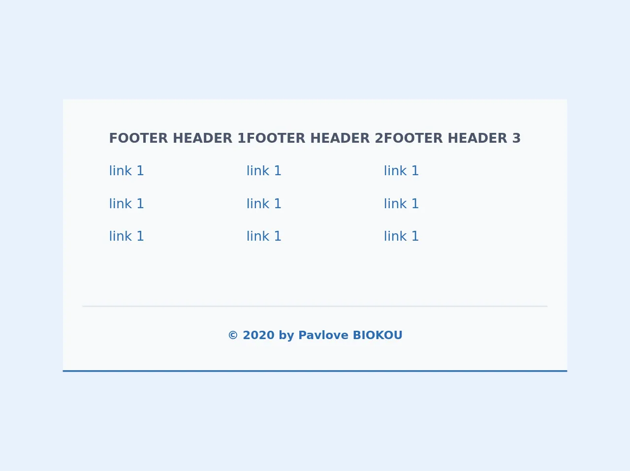
The preview of Responsive Footer ui component
To create a responsive footer with Tailwind CSS, we will use the following CSS classes:
bg-gray-900: sets the background color of the footer to dark gray.text-white: sets the text color of the footer to white.flex: sets the display property of the footer to flex.justify-between: aligns the content of the footer to the left and right.py-4: adds padding to the top and bottom of the footer.px-6: adds padding to the left and right of the footer.
Free download of the Responsive Footer's source code
The source code of Responsive Footer ui component
To create a responsive footer with Tailwind CSS, we will use the following HTML and CSS code:
<footer class="bg-gray-900 text-white">
<div class="container mx-auto flex justify-between py-4 px-6">
<div>
<p>© 2021 FrontEnd Technology Blog</p>
</div>
<div>
<a href="#">Home</a>
<a href="#">Blog</a>
<a href="#">Contact</a>
</div>
</div>
</footer>
.container {
  max-width: 1200px;
}
<footer class="footer bg-white relative pt-1 border-b-2 border-blue-700">
    <div class="container mx-auto px-6">

        <div class="sm:flex sm:mt-8">
            <div class="mt-8 sm:mt-0 sm:w-full sm:px-8 flex flex-col md:flex-row justify-between">
                <div class="flex flex-col">
                    <span class="font-bold text-gray-700 uppercase mb-2">Footer header 1</span>
                    <span class="my-2"><a href="#" class="text-blue-700  text-md hover:text-blue-500">link 1</a></span>
                    <span class="my-2"><a href="#" class="text-blue-700  text-md hover:text-blue-500">link 1</a></span>
                    <span class="my-2"><a href="#" class="text-blue-700  text-md hover:text-blue-500">link 1</a></span>
                </div>
                <div class="flex flex-col">
                    <span class="font-bold text-gray-700 uppercase mt-4 md:mt-0 mb-2">Footer header 2</span>
                    <span class="my-2"><a href="#" class="text-blue-700 text-md hover:text-blue-500">link 1</a></span>
                    <span class="my-2"><a href="#" class="text-blue-700  text-md hover:text-blue-500">link 1</a></span>
                    <span class="my-2"><a href="#" class="text-blue-700 text-md hover:text-blue-500">link 1</a></span>
                </div>
                <div class="flex flex-col">
                    <span class="font-bold text-gray-700 uppercase mt-4 md:mt-0 mb-2">Footer header 3</span>
                    <span class="my-2"><a href="#" class="text-blue-700  text-md hover:text-blue-500">link 1</a></span>
                    <span class="my-2"><a href="#" class="text-blue-700  text-md hover:text-blue-500">link 1</a></span>
                    <span class="my-2"><a href="#" class="text-blue-700  text-md hover:text-blue-500">link 1</a></span>
                </div>
            </div>
        </div>
    </div>
    <div class="container mx-auto px-6">
        <div class="mt-16 border-t-2 border-gray-300 flex flex-col items-center">
            <div class="sm:w-2/3 text-center py-6">
                <p class="text-sm text-blue-700 font-bold mb-2">
                    © 2020 by Pavlove BIOKOU
                </p>
            </div>
        </div>
    </div>
</footer>
How to create a Responsive Footer with Tailwind CSS?
To create a responsive footer with Tailwind CSS, follow these steps:
Step 1: Install Tailwind CSS
To use Tailwind CSS, you need to install it first. You can install it via npm or use the CDN link.
Step 2: Create HTML markup
Create the HTML markup for the footer component. Use the footer tag to wrap the footer content.
<footer class="bg-gray-900 text-white">
<div class="container mx-auto flex justify-between py-4 px-6">
<div>
<p>© 2021 FrontEnd Technology Blog</p>
</div>
<div>
<a href="#">Home</a>
<a href="#">Blog</a>
<a href="#">Contact</a>
</div>
</div>
</footer>
Step 3: Add Tailwind CSS classes
Add the Tailwind CSS classes to the HTML markup. Use the bg-gray-900 class to set the background color of the footer to dark gray. Use the text-white class to set the text color of the footer to white. Use the flex class to set the display property of the footer to flex. Use the justify-between class to align the content of the footer to the left and right. Use the py-4 class to add padding to the top and bottom of the footer. Use the px-6 class to add padding to the left and right of the footer.
<footer class="bg-gray-900 text-white">
<div class="container mx-auto flex justify-between py-4 px-6">
<div>
<p>© 2021 FrontEnd Technology Blog</p>
</div>
<div>
<a href="#">Home</a>
<a href="#">Blog</a>
<a href="#">Contact</a>
</div>
</div>
</footer>
Step 4: Add custom CSS (optional)
If you want to add custom CSS, you can do so by creating a separate CSS file or adding inline styles. In the example below, we have added a custom CSS rule to set the maximum width of the container to 1200px.
.container {
  max-width: 1200px;
}
Conclusion
In this article, we have discussed how to build a responsive footer with Tailwind CSS. We have seen that Tailwind CSS provides a set of pre-defined CSS classes that can be used to create a responsive footer quickly. We have also seen that a responsive footer is an essential component of a responsive website that provides easy navigation and enhances the user experience. By following the steps outlined in this article, you can create a responsive footer that looks good on all devices.