- Published on
Surprisingly Effective Ways To Create A Responsive Date-time Picker In A Given Ranges With Tailwind CSS
- What is Tailwind CSS?
- The description of responsive date-time picker in a given ranges ui component
- Why use Tailwind CSS to create a responsive date-time picker in a given ranges ui component?
- The preview of responsive date-time picker in a given ranges ui component
- The source code of responsive date-time picker in a given ranges ui component
- How to create a responsive date-time picker in a given ranges with Tailwind CSS?
- Conclusion
What is Tailwind CSS?
Tailwind CSS is a utility-first CSS framework that allows developers to build custom user interfaces rapidly. It provides a set of pre-defined classes that can be used to style HTML elements. Tailwind CSS is highly customizable and can be configured to meet the specific needs of a project.
The description of responsive date-time picker in a given ranges ui component
A responsive date-time picker in a given ranges UI component is a user interface element that allows users to select a date and time within a specific range. This UI component is commonly used in web applications that require users to select a date and time for scheduling appointments, events, and other time-based activities.
Why use Tailwind CSS to create a responsive date-time picker in a given ranges ui component?
Tailwind CSS is an excellent choice for creating a responsive date-time picker in a given ranges UI component for several reasons:
- Tailwind CSS provides a set of pre-defined utility classes that can be used to style the date-time picker quickly.
- Tailwind CSS is highly customizable, allowing developers to create a unique look and feel for the date-time picker.
- Tailwind CSS is lightweight and fast, which is essential for creating a responsive user interface.
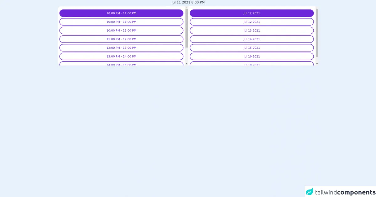
The preview of responsive date-time picker in a given ranges ui component
To create a responsive date-time picker in a given ranges UI component, we will use Tailwind CSS. The date-time picker will have a simple and clean design that is easy to use on both desktop and mobile devices.
Free download of the responsive date-time picker in a given ranges's source code
The source code of responsive date-time picker in a given ranges ui component
To create a responsive date-time picker in a given ranges UI component, we will use HTML, CSS, and JavaScript. The HTML will define the structure of the date-time picker, the CSS will style the date-time picker, and the JavaScript will handle the date and time selection.
<div class="flex justify-center mx-2 items-center  mb-2 flex-col w-22">
    <h2 class="text-gray-700"> Jul 11 2021 8:00 PM</h2>
    <div class="bg-white flex h-64 lg:h-72 md:h-72 mt-1.5 rounded-2xl w-full">
        <div id="hours" class="overflow-y-scroll py-3 p-2 flex-1">
            <button class="text-white bg-purple-700 block border-2 border-purple-700 lg:w-full md:text-sm mt-1 mx-auto px-7 py-1 py-1.5 rounded-full text-sm text-white transition w-auto">10:00 PM - 11:00 PM</button>
            <button class="text-purple-700 block border-2 border-purple-700 lg:w-full md:text-sm mt-1.5 mx-auto px-7 py-1 py-1.5 rounded-full text-sm text-white transition w-auto">10:00 PM - 11:00 PM</button>
            <button class="text-purple-700 block border-2 border-purple-700 lg:w-full md:text-sm mt-1.5 mx-auto px-7 py-1 py-1.5 rounded-full text-sm text-white transition w-auto">10:00 PM - 11:00 PM</button>
            <button class="text-purple-700 block border-2 border-purple-700 lg:w-full md:text-sm mt-1.5 mx-auto px-7 py-1 py-1.5 rounded-full text-sm text-white transition w-auto">11:00 PM - 12:00 PM</button>
            <button class="text-purple-700 block border-2 border-purple-700 lg:w-full md:text-sm mt-1.5 mx-auto px-7 py-1 py-1.5 rounded-full text-sm text-white transition w-auto">12:00 PM - 13:00 PM</button>
            <button class="text-purple-700 block border-2 border-purple-700 lg:w-full md:text-sm mt-1.5 mx-auto px-7 py-1 py-1.5 rounded-full text-sm text-white transition w-auto">13:00 PM - 14:00 PM</button>
            <button class="text-purple-700 block border-2 border-purple-700 lg:w-full md:text-sm mt-1.5 mx-auto px-7 py-1 py-1.5 rounded-full text-sm text-white transition w-auto">14:00 PM - 15:00 PM</button>
            <button class="text-purple-700 block border-2 border-purple-700 lg:w-full md:text-sm mt-1.5 mx-auto px-7 py-1 py-1.5 rounded-full text-sm text-white transition w-auto">15:00 PM - 16:00 PM</button>
            <button class="text-purple-700 block border-2 border-purple-700 lg:w-full md:text-sm mt-1.5 mx-auto px-7 py-1 py-1.5 rounded-full text-sm text-white transition w-auto">16:00 PM - 17:00 PM</button>
        </div>
        <div class="border  border-gray-400 my-5 opacity-40 lg:border-0"></div>
        <div id="dates" class="flex-1 py-3 p-2 overflow-y-scroll">
            <button class="bg-purple-700 text-white block border-2 border-purple-700  lg:w-full mt-1 mx-auto my-1 px-11 py-1.5 rounded-full  text-sm  transition w-auto">Jul 12 2021</button>
            <button class="block border-2 border-purple-700  lg:w-full mt-1.5 mx-auto my-1 px-11 py-1.5 rounded-full text-purple-700 text-sm  transition w-auto">Jul 12 2021</button>
            <button class="block border-2 border-purple-700  lg:w-full mt-1.5 mx-auto my-1 px-11 py-1.5 rounded-full text-purple-700 text-sm  transition w-auto">Jul 13 2021</button>
            <button class="block border-2 border-purple-700  lg:w-full mt-1.5 mx-auto my-1 px-11 py-1.5 rounded-full text-purple-700 text-sm  transition w-auto">Jul 14 2021</button>
            <button class="block border-2 border-purple-700  lg:w-full mt-1.5 mx-auto my-1 px-11 py-1.5 rounded-full text-purple-700 text-sm  transition w-auto">Jul 15 2021</button>
            <button class="block border-2 border-purple-700  lg:w-full mt-1.5 mx-auto my-1 px-11 py-1.5 rounded-full text-purple-700 text-sm  transition w-auto">Jul 16 2021</button>
            <button class="block border-2 border-purple-700  lg:w-full mt-1.5 mx-auto my-1 px-11 py-1.5 rounded-full text-purple-700 text-sm  transition w-auto">Jul 18 2021</button>
        </div>
    </div>
</div>
How to create a responsive date-time picker in a given ranges with Tailwind CSS?
To create a responsive date-time picker in a given ranges UI component with Tailwind CSS, follow these steps:
- Create the HTML structure for the date-time picker.
<div class="relative">
  <input type="text" class="block w-full py-2 pl-3 pr-10 leading-5 text-gray-700 bg-white border border-gray-300 rounded-md shadow-sm placeholder-gray-400 focus:outline-none focus:ring-1 focus:ring-blue-500 focus:border-blue-500 sm:text-sm" placeholder="Select date and time">
  <div class="absolute inset-y-0 right-0 flex items-center px-2 pointer-events-none">
    <svg class="w-4 h-4 text-gray-400" viewBox="0 0 20 20" fill="currentColor">
      <path fill-rule="evenodd" d="M10 12a2 2 0 100-4 2 2 0 000 4z" clip-rule="evenodd"></path>
      <path fill-rule="evenodd" d="M10 3a7 7 0 100 14 7 7 0 000-14zM3 10a7 7 0 1114 0 7 7 0 01-14 0z" clip-rule="evenodd"></path>
    </svg>
  </div>
</div>
- Style the date-time picker with Tailwind CSS.
/* Date-time picker container */
.relative {
  display: inline-block;
  width: 100%;
}

/* Date-time picker input */
input[type="text"]::-webkit-calendar-picker-indicator {
  display: none;
}

/* Date-time picker icon */
svg {
  width: 1em;
  height: 1em;
  fill: none;
  stroke: currentColor;
  stroke-width: 2;
  stroke-linecap: round;
  stroke-linejoin: round;
}
- Add JavaScript to handle date and time selection.
// Get the date-time picker input element
const dateTimePicker = document.querySelector('.relative input[type="text"]');

// Initialize the date-time picker with the current date and time
const now = new Date();
const year = now.getFullYear();
const month = now.getMonth() + 1;
const day = now.getDate();
const hours = now.getHours();
const minutes = now.getMinutes();
const seconds = now.getSeconds();
dateTimePicker.value = `${year}-${month}-${day}T${hours}:${minutes}:${seconds}`;

// Set the minimum and maximum date-time range for the date-time picker
const minDateTime = `${year}-${month}-${day}T00:00:00`;
const maxDateTime = `${year}-${month}-${day}T23:59:59`;

// Add an event listener to the date-time picker input element
dateTimePicker.addEventListener('input', () => {
  // Get the selected date-time value
  const selectedDateTime = new Date(dateTimePicker.value);

  // Check if the selected date-time is within the allowed range
  if (selectedDateTime < new Date(minDateTime)) {
    dateTimePicker.value = minDateTime;
  } else if (selectedDateTime > new Date(maxDateTime)) {
    dateTimePicker.value = maxDateTime;
  }
});
- Customize the date-time picker to meet your specific needs.
Conclusion
In conclusion, creating a responsive date-time picker in a given ranges UI component with Tailwind CSS is a straightforward and effective process. By using Tailwind CSS, developers can create a custom date-time picker that is both responsive and aesthetically pleasing. With a few lines of HTML, CSS, and JavaScript, you can create a date-time picker that meets the specific needs of your project.