- Published on
6 Ideas To Help You Make A Responsive Card With Tailwind CSS Like A Pro
- What is Tailwind CSS?
- The description of Responsive Card UI component
- Why use Tailwind CSS to create a Responsive Card UI component?
- The preview of Responsive Card UI component
- The source code of Responsive Card UI component
- How to create a Responsive Card with Tailwind CSS?
- Step 1: Set up your project
- Step 2: Create the HTML structure
- Step 3: Style the card with Tailwind CSS
- Step 4: Make the card responsive
- Conclusion
What is Tailwind CSS?
Tailwind CSS is a utility-first CSS framework that helps you create custom designs quickly and easily. It provides a set of pre-defined classes that you can use to style your HTML elements without writing any CSS code. Tailwind CSS is highly customizable, and you can easily configure it to fit your project's needs.
The description of Responsive Card UI component
A responsive card is a UI component that is commonly used in web design. It is a container that displays information in a structured and organized way. A responsive card is designed to be responsive, meaning that it adjusts its layout and size based on the device's screen size. This makes it an ideal component for creating a mobile-friendly website.
Why use Tailwind CSS to create a Responsive Card UI component?
Tailwind CSS is an excellent choice for creating a responsive card UI component. It provides a set of pre-defined classes that you can use to style your card quickly and easily. Tailwind CSS also has built-in responsive design features that allow you to create a responsive card that looks great on any device.
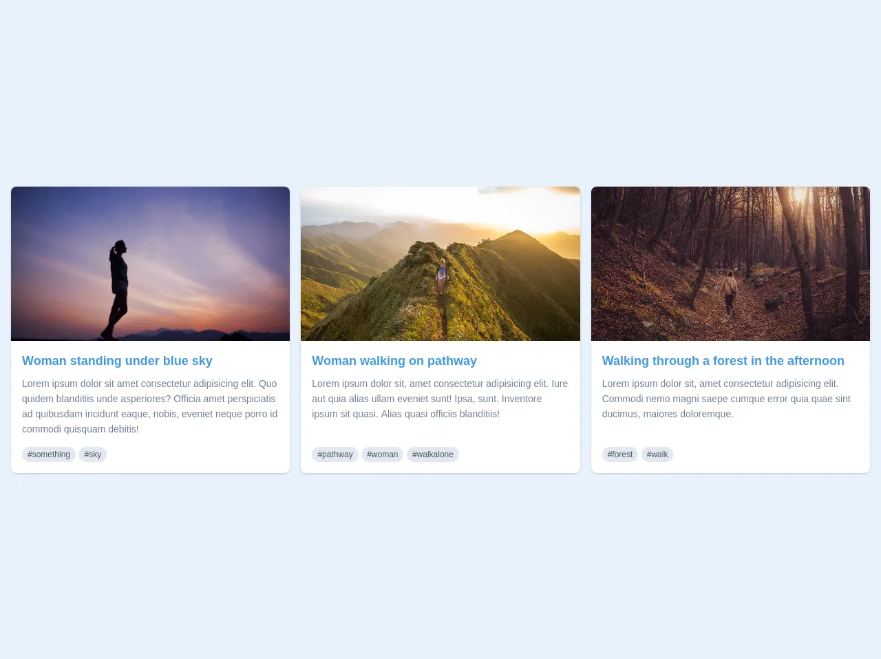
The preview of Responsive Card UI component
In this article, we will show you how to create a responsive card UI component using Tailwind CSS. The card will have a header, an image, a title, a description, and a button.
Free download of the Responsive Card's source code
The source code of Responsive Card UI component
To create a responsive card UI component using Tailwind CSS, you need to write HTML and CSS code. The HTML code defines the structure of the card, and the CSS code styles it.
<main class="py-4">
  <div class="px-4">
    <div class="block md:flex justify-between md:-mx-2">
      <div class="w-full lg:w-1/3 md:mx-2 mb-4 md:mb-0">
        <div class="bg-white rounded-lg overflow-hidden shadow relative">
          <img class="h-56 w-full object-cover object-center" src="https://images.unsplash.com/photo-1457282367193-e3b79e38f207?ixlib=rb-1.2.1&ixid=eyJhcHBfaWQiOjEyMDd9&auto=format&fit=crop&w=1654&q=80" alt="">
          <div class="p-4 h-auto md:h-40 lg:h-48">
            <a href="#" class="block text-blue-500 hover:text-blue-600 font-semibold mb-2 text-lg md:text-base lg:text-lg">
              Woman standing under blue sky
            </a>
            <div class="text-gray-600 text-sm leading-relaxed block md:text-xs lg:text-sm">
              Lorem ipsum dolor sit amet consectetur adipisicing elit. Quo quidem blanditiis unde asperiores? Officia amet perspiciatis ad quibusdam incidunt eaque, nobis, eveniet neque porro id commodi quisquam debitis!
            </div>
            <div class="relative mt-2 lg:absolute bottom-0 mb-4 md:hidden lg:block">
              <a class="inline bg-gray-300 py-1 px-2 rounded-full text-xs lowercase text-gray-700" href="#">#something</a>
              <a class="inline bg-gray-300 py-1 px-2 rounded-full text-xs lowercase text-gray-700" href="#">#sky</a>
            </div>
          </div>
        </div>
      </div>
      <div class="w-full lg:w-1/3 md:mx-2 mb-4 md:mb-0">
        <div class="bg-white rounded-lg overflow-hidden shadow relative">
          <img class="h-56 w-full object-cover object-center" src="https://images.unsplash.com/photo-1465188162913-8fb5709d6d57?ixlib=rb-1.2.1&ixid=eyJhcHBfaWQiOjEyMDd9&auto=format&fit=crop&w=800&q=60" alt="">
          <div class="p-4 h-auto md:h-40 lg:h-48">
            <a href="#" class="block text-blue-500 hover:text-blue-600 font-semibold mb-2 text-lg md:text-base lg:text-lg">
              Woman walking on pathway
            </a>
            <div class="text-gray-600 text-sm leading-relaxed block md:text-xs lg:text-sm">
              Lorem ipsum dolor sit, amet consectetur adipisicing elit. Iure aut quia alias ullam eveniet sunt! Ipsa, sunt. Inventore ipsum sit quasi. Alias quasi officiis blanditiis!
            </div>
            <div class="relative mt-2 lg:absolute bottom-0 mb-4 md:hidden lg:block">
              <a class="inline bg-gray-300 py-1 px-2 rounded-full text-xs lowercase text-gray-700" href="#">#pathway</a>
              <a class="inline bg-gray-300 py-1 px-2 rounded-full text-xs lowercase text-gray-700" href="#">#woman</a>
              <a class="inline bg-gray-300 py-1 px-2 rounded-full text-xs lowercase text-gray-700" href="#">#walkalone</a>
            </div>
          </div>
        </div>
      </div>
      <div class="w-full lg:w-1/3 md:mx-2 mb-4 md:mb-0">
        <div class="bg-white rounded-lg overflow-hidden shadow relative">
          <img class="h-56 w-full object-cover object-center" src="https://images.unsplash.com/photo-1467238307002-480ffdd260f2?ixlib=rb-1.2.1&ixid=eyJhcHBfaWQiOjEyMDd9&auto=format&fit=crop&w=800&q=60" alt="">
          <div class="p-4 h-auto md:h-40 lg:h-48">
            <a href="#" class="block text-blue-500 hover:text-blue-600 font-semibold mb-2 text-lg md:text-base lg:text-lg">
              Walking through a forest in the afternoon
            </a>
            <div class="text-gray-600 text-sm leading-relaxed block md:text-xs lg:text-sm">
              Lorem ipsum dolor sit, amet consectetur adipisicing elit. Commodi nemo magni saepe cumque error quia quae sint ducimus, maiores doloremque.
            </div>
            <div class="relative mt-2 lg:absolute bottom-0 mb-4 md:hidden lg:block">
              <a class="inline bg-gray-300 py-1 px-2 rounded-full text-xs lowercase text-gray-700" href="#">#forest</a>
              <a class="inline bg-gray-300 py-1 px-2 rounded-full text-xs lowercase text-gray-700" href="#">#walk</a>
            </div>
          </div>
        </div>
      </div>
    </div>
  </div>
</main>
How to create a Responsive Card with Tailwind CSS?
Now that you have an understanding of what Tailwind CSS is and why it's an excellent choice for creating a responsive card UI component, let's dive into the steps to create one.
Step 1: Set up your project
Before you start creating your responsive card UI component, you need to set up your project. You can download Tailwind CSS from their official website or use a CDN. You can also use a tool like CodePen or JSFiddle to create your project.
Step 2: Create the HTML structure
The first step in creating a responsive card UI component is to create the HTML structure. The HTML structure defines the layout of the card. Here's an example of the HTML structure for a responsive card UI component:
<div class="card">
  <div class="card-header">
    <img src="image.jpg" alt="Card image">
  </div>
  <div class="card-body">
    <h2 class="card-title">Card Title</h2>
    <p class="card-description">Card description goes here.</p>
    <button class="card-button">Learn More</button>
  </div>
</div>
Step 3: Style the card with Tailwind CSS
Once you have created the HTML structure, it's time to style the card with Tailwind CSS. Tailwind CSS provides a set of pre-defined classes that you can use to style your card. Here's an example of the CSS code for a responsive card UI component:
.card {
  max-width: 500px;
  margin: 0 auto;
  border: 1px solid #ccc;
  border-radius: 5px;
  overflow: hidden;
}

.card-header img {
  width: 100%;
  height: auto;
}

.card-body {
  padding: 1rem;
}

.card-title {
  font-size: 1.5rem;
  margin-bottom: 0.5rem;
}

.card-description {
  font-size: 1rem;
  margin-bottom: 1rem;
}

.card-button {
  background-color: #4caf50;
  color: #fff;
  border: none;
  padding: 0.5rem 1rem;
  border-radius: 5px;
  cursor: pointer;
  transition: all 0.3s ease;
}

.card-button:hover {
  background-color: #3e8e41;
}
Step 4: Make the card responsive
The final step in creating a responsive card UI component is to make the card responsive. Tailwind CSS provides built-in responsive design features that allow you to adjust the card's layout and size based on the device's screen size. Here's an example of how to make the card responsive:
@media (min-width: 640px) {
  .card {
    display: flex;
  }

  .card-header {
    width: 50%;
  }

  .card-body {
    width: 50%;
    padding: 1rem;
  }
}
This code makes the card display as a flex container when the screen size is at least 640px wide. It also sets the width of the card header and body to 50% each.
Conclusion
Creating a responsive card UI component with Tailwind CSS is easy and straightforward. With the pre-defined classes and built-in responsive design features, you can create a responsive card that looks great on any device. Use the steps outlined in this article to create your responsive card UI component and take your web design skills to the next level.