- Published on
Imagine You Create A Responsive Page Layout With Tailwind CSS Like An Expert. Follow These 6 Steps To Get There
- What is Tailwind CSS?
- The description of responsive page layout ui component
- Why use Tailwind CSS to create a responsive page layout ui component?
- The preview of responsive page layout ui component.
- The source code of responsive page layout ui component.
- How to create a responsive page layout with Tailwind CSS?
- Step 1: Set up your HTML file
- Step 2: Add the header
- Step 3: Add the navigation menu
- Step 4: Add the content area
- Step 5: Add the footer
- Step 6: Add responsive classes
- Conclusion
Are you looking to create a responsive page layout for your website? Look no further than Tailwind CSS. Tailwind CSS is a utility-first CSS framework that makes it easy to create responsive page layouts with minimal effort. In this article, we will walk you through the steps to create a responsive page layout with Tailwind CSS.
What is Tailwind CSS?
Tailwind CSS is a utility-first CSS framework that provides a set of pre-defined classes that can be used to style HTML elements. It is designed to make it easy to create responsive page layouts and UI components without having to write custom CSS code. Tailwind CSS provides a wide range of utility classes that can be used to style typography, colors, spacing, and more.
The description of responsive page layout ui component
A responsive page layout is a UI component that adjusts its layout based on the size of the screen. It is designed to provide an optimal user experience on different devices, including desktops, tablets, and smartphones. A responsive page layout typically consists of a header, a navigation menu, a content area, and a footer. The header and footer are usually fixed, while the content area adjusts its width and height based on the screen size.
Why use Tailwind CSS to create a responsive page layout ui component?
Tailwind CSS provides a set of pre-defined utility classes that can be used to create a responsive page layout with minimal effort. It eliminates the need to write custom CSS code, which can be time-consuming and error-prone. With Tailwind CSS, you can create a responsive page layout that looks great on all devices in a fraction of the time it would take to write custom CSS code.
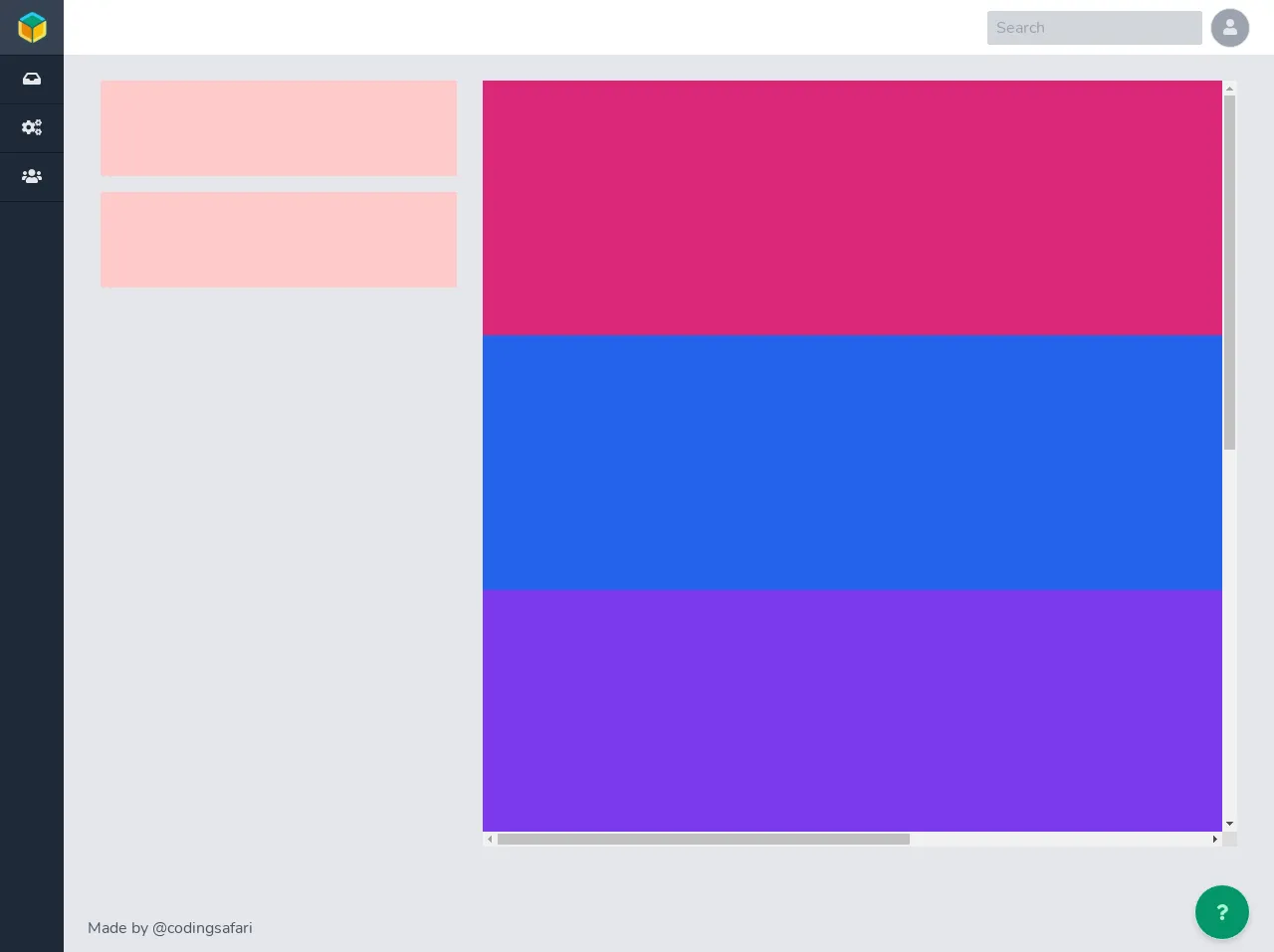
The preview of responsive page layout ui component.
Creating a responsive page layout with Tailwind CSS is easy. Here is a preview of what the final layout will look like:
Free download of the responsive page layout's source code
The source code of responsive page layout ui component.
To create a responsive page layout with Tailwind CSS, you will need to write HTML code and apply Tailwind CSS classes to style the layout. Here is the source code for the responsive page layout:
<script defer src="https://use.fontawesome.com/releases/v5.14.0/js/all.js"></script>


<section class="h-screen w-screen bg-gray-200 flex flex-col-reverse sm:flex-row min-h-0 min-w-0 overflow-hidden">
  <aside class="sm:h-full sm:w-16 w-full h-12 bg-gray-800 text-gray-200">
    <ul class="text-center flex flex-row sm:flex-col w-full">
      <li class="h-14 border-b border-gray-900 hidden sm:block">
        <a id="page-icon" href="/" class="h-full w-full hover:bg-gray-700 block p-3">
          <img class="object-contain h-full w-full" src="https://avatars1.githubusercontent.com/u/6157842?v=4"
            alt="open-source" />
        </a>
      </li>
      <li class="sm:border-b border-gray-900 flex-1 sm:w-full" title="Inbox">
        <a id="page-icon" href="/" class="h-full w-full hover:bg-gray-700 block p-3">
          <i class="fas fa-inbox fill-current"> </i>
        </a>
      </li>
      <li class="sm:border-b border-gray-900 flex-1 sm:w-full" title="Settings">
        <a id="page-icon" href="/" class="h-full w-full hover:bg-gray-700 block p-3">
          <i class="fas fa-cogs fill-current"> </i>
        </a>
      </li>
      <li class="sm:border-b border-gray-900 flex-1 sm:w-full" title="Users">
        <a id="page-icon" href="/" class="h-full  w-full hover:bg-gray-700 block p-3">
          <i class="fas fa-users fill-current"> </i>
        </a>
      </li>
    </ul>
  </aside>
  <main class="sm:h-full flex-1 flex flex-col min-h-0 min-w-0 overflow-auto">
    <nav class="border-b bg-white px-6 py-2 flex items-center min-w-0 h-14">
      <h1 class="font-semibold text-lg"></h1>
      <span class="flex-1"></span>
      <span class="mr-2">
        <input type="text" placeholder="Search"
          class="w-full border-2 px-2 py-1 border border-gray-300 rounded-sm focus:outline-none focus:ring-2 focus:ring-blue-600 focus:border-transparent bg-gray-300 focus:bg-gray-100" />
      </span>
      <button
        class="ml-auto border rounded-full ml-2 w-10 h-10 text-center leading-none text-gray-200 bg-gray-400 focus:outline-none focus:ring-2 focus:ring-blue-600 focus:border-transparent">
        <i class="fas fa-user fill-current"></i>
      </button>
    </nav>
    <section class="flex-1 pt-3 md:p-6 lg:mb-0 lg:min-h-0 lg:min-w-0">
      <div class="flex flex-col lg:flex-row h-full w-full">

        <div class="border pb-2 lg:pb-0 w-full lg:max-w-sm px-3 flex flex-row lg:flex-col flex-wrap lg:flex-nowrap">

          <!-- control content left -->
          <div class="bg-red-200 w-full h-24 min-h-0 min-w-0 mb-4"></div>
          <div class="bg-red-200 w-full h-24 min-h-0 min-w-0 mb-4"></div>

        </div>

        <div class="border h-full w-full lg:flex-1 px-3 min-h-0 min-w-0">

          <!-- overflow content right -->
          <div class="bg-green-200 w-full h-full min-h-0 min-w-0 overflow-auto">
            <div class="bg-pink-600 w-screen h-64"></div>
            <div class="bg-blue-600 w-full h-64"></div>
            <div class="bg-purple-600 w-screen h-64"></div>
            <div class="bg-red-600 w-full h-64"></div>
            <div class="bg-yellow-600 w-screen h-64"></div>
            <div class="bg-green-600 w-full h-64"></div>
          </div>

        </div>

      </div>
    </section>
    <footer class="px-6 py-3 border-t flex w-full items-end">
      <p class="text-gray-600">Made by @codingsafari</p>
      <div class="flex-1"></div>
      <button
        class="shadow-md ml-auto border rounded-full ml-2 w-14 h-14 text-center leading-none text-green-200 bg-green-600 hover:bg-green-500 focus:outline-none focus:ring-2 focus:ring-blue-600 focus:border-transparent">
        <i class="fas fa-question fill-current"></i>
      </button>
    </footer>
  </main>
</section>

<style>
  @import url("https://fonts.googleapis.com/css2?family=Nunito&display=swap");

body {
  font-family: "Nunito", sans-serif;
}

main {
  font-size: clamp(0.9rem, 3vw, 1rem);
}

#page-icon img {
  -webkit-animation: cssfilter 3s infinite;
}


@-webkit-keyframes cssfilter {
  0%, 100%  {
    filter: invert(75%) drop-shadow(0px 0px 2px blue)
  }

  50% {
    filter: invert(0%) drop-shadow(0px 0px 1px teal);
  }
}
</style>
How to create a responsive page layout with Tailwind CSS?
Now that you understand the benefits of using Tailwind CSS to create a responsive page layout, let's dive into the steps to create one.
Step 1: Set up your HTML file
Create an HTML file and add the basic structure of a web page. This includes the <!DOCTYPE html> declaration, the <html> element, the <head> element, and the <body> element.
Step 2: Add the header
Add a header element to your HTML file and apply the necessary Tailwind CSS classes to style it. Use the fixed class to make the header fixed at the top of the screen.
Step 3: Add the navigation menu
Add a navigation menu element to your HTML file and apply the necessary Tailwind CSS classes to style it. Use the flex and justify-between classes to align the menu items to the left and right of the screen.
Step 4: Add the content area
Add a content area element to your HTML file and apply the necessary Tailwind CSS classes to style it. Use the flex class to make the content area flexible and adjust its width and height based on the screen size.
Step 5: Add the footer
Add a footer element to your HTML file and apply the necessary Tailwind CSS classes to style it. Use the fixed class to make the footer fixed at the bottom of the screen.
Step 6: Add responsive classes
Tailwind CSS provides a set of responsive classes that can be used to adjust the layout based on the screen size. Use the sm, md, lg, and xl classes to adjust the layout for small, medium, large, and extra-large screens, respectively.
Conclusion
Creating a responsive page layout with Tailwind CSS is easy and straightforward. By following the steps outlined in this article, you can create a responsive page layout that looks great on all devices in no time. With Tailwind CSS, you can focus on creating great content for your website, rather than spending time writing custom CSS code.