- Published on
Learn How To Make A React Feedback Traversy Media With Tailwind CSS from the Pros
- What is Tailwind CSS?
- The description of React Feedback Traversy Media ui component
- Why use Tailwind CSS to create a React Feedback Traversy Media ui component?
- The preview of React Feedback Traversy Media ui component.
- The source code of React Feedback Traversy Media ui component.
- How to create a React Feedback Traversy Media with Tailwind CSS?
- Step 1: Create a new React project
- Step 2: Install Tailwind CSS
- Step 3: Configure Tailwind CSS
- Step 4: Create the Feedback component
- Step 5: Import the Feedback component
- Step 6: Run your app
- Conclusion
As a FrontEnd developer, you might have heard of Tailwind CSS and its popularity in the web development community. Tailwind CSS is a utility-first CSS framework that allows you to create custom designs quickly and efficiently. In this article, we will learn how to make a React Feedback Traversy Media with Tailwind CSS from the pros.
What is Tailwind CSS?
Tailwind CSS is a utility-first CSS framework that allows you to create custom designs quickly and efficiently. It provides a set of pre-defined classes that you can use to style your HTML elements. Tailwind CSS is highly customizable and allows you to create your own classes to fit your design needs.
The description of React Feedback Traversy Media ui component
React Feedback Traversy Media is a UI component that allows users to provide feedback on a website or application. It is a simple and elegant component that can be easily integrated into any web application. The component consists of a feedback form with options for rating the website or application, leaving comments, and submitting the feedback.
Why use Tailwind CSS to create a React Feedback Traversy Media ui component?
Tailwind CSS provides a set of pre-defined classes that can be used to quickly style the React Feedback Traversy Media UI component. This saves time and effort in designing and styling the component. Additionally, Tailwind CSS is highly customizable, allowing you to create your own classes to fit your design needs.
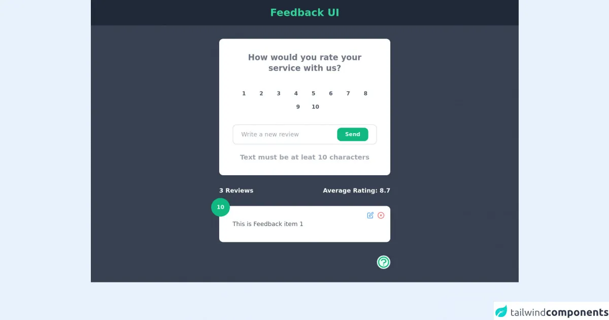
The preview of React Feedback Traversy Media ui component.
Free download of the React Feedback Traversy Media's source code
The source code of React Feedback Traversy Media ui component.
<div class="flex-col items-center bg-gray-700">
		<header class="w-full bg-gray-800">
			<h1 class="text-center py-5 text-green-400 text-3xl font-bold">Feedback UI</h1>
		</header>
		<div class="w-3/4 md:w-2/5 mx-auto mt-10 ">
			<div class="bg-white p-10 rounded-xl">
				<h1 class="text-center text-2xl font-semibold text-gray-500">How would you rate your service with us?
				</h1>
				<div class="flex flex-wrap justify-center mt-10 space-x-3">
					<option value="1"
						class="flex items-center justify-center w-10 h-10 bg-gray--100 text-gray-600 hover:bg-green-500 transition duration-150 rounded-full font-bold hover:text-green-50 cursor-pointer">
						1</option>
					<option value="2"
						class="flex items-center justify-center w-10 h-10 bg-gray--100 text-gray-600 hover:bg-green-500 transition duration-150 rounded-full font-bold hover:text-green-50 cursor-pointer">
						2</option>
					<option value="3"
						class="flex items-center justify-center w-10 h-10 bg-gray--100 text-gray-600 hover:bg-green-500 transition duration-150 rounded-full font-bold hover:text-green-50 cursor-pointer">
						3</option>
					<option value="4"
						class="flex items-center justify-center w-10 h-10 bg-gray--100 text-gray-600 hover:bg-green-500 transition duration-150 rounded-full font-bold hover:text-green-50 cursor-pointer">
						4</option>
					<option value="5"
						class="flex items-center justify-center w-10 h-10 bg-gray--100 text-gray-600 hover:bg-green-500 transition duration-150 rounded-full font-bold hover:text-green-50 cursor-pointer">
						5</option>
					<option value="6"
						class="flex items-center justify-center w-10 h-10 bg-gray--100 text-gray-600 hover:bg-green-500 transition duration-150 rounded-full font-bold hover:text-green-50 cursor-pointer">
						6</option>
					<option value="7"
						class="flex items-center justify-center w-10 h-10 bg-gray--100 text-gray-600 hover:bg-green-500 transition duration-150 rounded-full font-bold hover:text-green-50 cursor-pointer">
						7</option>
					<option value="8"
						class="flex items-center justify-center w-10 h-10 bg-gray--100 text-gray-600 hover:bg-green-500 transition duration-150 rounded-full font-bold hover:text-green-50 cursor-pointer">
						8</option>
					<option value="9"
						class="flex items-center justify-center w-10 h-10 bg-gray--100 text-gray-600 hover:bg-green-500 transition duration-150 rounded-full font-bold hover:text-green-50 cursor-pointer">
						9</option>
					<ophover:tion value="10"
						class="flex items-center justify-center w-10 h-10 bg-gray--100 text-gray-600 hover:bg-green-500 transition duration-150 rounded-full font-bold hover:text-green-50 cursor-pointer">
						10</option>
				</div>
				<form class="mt-8">
					<div class="flex justify-center border-2 py-2 px-6 rounded-xl">
						<input type="text" placeholder="Write a new review" class="w-full outline-none text-gray-700 text-lg" />
						<button type="submit" class="bg-green-500 text-green-50 font-semibold px-6 py-2 rounded-xl text-md">Send</button>
					</div>
					<span class="text-center block mt-6 text-gray-400 text-xl font-semibold">Text must be at leat 10 characters</span>
				</form>
			</div>
			<div class="flex justify-between my-8">
				<p class="text-white text-lg font-semibold">3 Reviews</p>
				<p class="text-white text-lg font-semibold">Average Rating: 8.7</p>
			</div>
			<div class="space-y-6 pb-10">
				<div>
					<div class="relative bg-white p-10 rounded-xl">
						<p class="text-lg text-gray-600">This is Feedback item 1</p>
						<span class="absolute bg-green-500 w-14 h-14 flex items-center justify-center font-bold text-green-50 rounded-full -top-6 -left-6">10</span>
						<div class="absolute top-0 right-0 flex space-x-2 p-4">
							<svg xmlns="http://www.w3.org/2000/svg" class="h-6 w-6 cursor-pointer text-blue-400"
								fill="none" viewBox="0 0 24 24" stroke="currentColor">
								<path stroke-linecap="round" stroke-linejoin="round" stroke-width="2"
									d="M11 5H6a2 2 0 00-2 2v11a2 2 0 002 2h11a2 2 0 002-2v-5m-1.414-9.414a2 2 0 112.828 2.828L11.828 15H9v-2.828l8.586-8.586z" />
							</svg>
							<svg xmlns="http://www.w3.org/2000/svg" class="h-6 w-6 cursor-pointer text-red-400"
								fill="none" viewBox="0 0 24 24" stroke="currentColor">
								<path stroke-linecap="round" stroke-linejoin="round" stroke-width="2"
									d="M10 14l2-2m0 0l2-2m-2 2l-2-2m2 2l2 2m7-2a9 9 0 11-18 0 9 9 0 0118 0z" />
							</svg>
						</div>
					</div>
				</div>
			</div>
			<div class="flex justify-end">
				<spnn><svg xmlns="http://www.w3.org/2000/svg" class="h-10 w-10 bg-green-50 rounded-full text-green-500 mb-10" fill="none" viewBox="0 0 24 24"
						stroke="currentColor">
						<path stroke-linecap="round" stroke-linejoin="round" stroke-width="2"
							d="M8.228 9c.549-1.165 2.03-2 3.772-2 2.21 0 4 1.343 4 3 0 1.4-1.278 2.575-3.006 2.907-.542.104-.994.54-.994 1.093m0 3h.01M21 12a9 9 0 11-18 0 9 9 0 0118 0z" />
					</svg></spnn>
			</div>
		</div>
	</div>
How to create a React Feedback Traversy Media with Tailwind CSS?
To create a React Feedback Traversy Media with Tailwind CSS, follow these steps:
Step 1: Create a new React project
Create a new React project using the create-react-app command in your terminal.
npx create-react-app feedback-component
Step 2: Install Tailwind CSS
Install Tailwind CSS using the following command:
npm install tailwindcss
Step 3: Configure Tailwind CSS
Create a new file named tailwind.config.js in the root directory of your project and add the following code:
module.exports = {
  purge: [],
  darkMode: false, // or 'media' or 'class'
  theme: {
    extend: {},
  },
  variants: {
    extend: {},
  },
  plugins: [],
}
This file is used to configure Tailwind CSS for your project.
Step 4: Create the Feedback component
Create a new file named Feedback.js in the src directory of your project and add the following code:
import React from 'react'

const Feedback = () => {
  return (
    <div className="max-w-md mx-auto bg-white rounded-xl shadow-md overflow-hidden md:max-w-2xl">
      <div className="md:flex">
        <div className="md:flex-shrink-0">
          <img
            className="h-48 w-full object-cover md:w-48"
            src="https://images.unsplash.com/photo-1622833248488-4e6f3d7e9d6d?ixid=MnwxMjA3fDB8MHxlZGl0b3JpYWwtZmVlZHwzNnx8fGVufDB8fHx8MTYyNDYwNzY2Mg&ixlib=rb-1.2.1&auto=format&fit=crop&w=500&q=60"
            alt="Feedback"
          />
        </div>
        <div className="p-8">
          <div className="uppercase tracking-wide text-sm text-indigo-500 font-semibold">
            Feedback
          </div>
          <a
            href="#"
            className="block mt-1 text-lg leading-tight font-medium text-black hover:underline"
          >
            Leave your feedback
          </a>
          <p className="mt-2 text-gray-500">
            We would love to hear your thoughts, suggestions, concerns or
            problems with anything so we can improve!
          </p>
        </div>
      </div>
    </div>
  )
}

export default Feedback
This code creates the Feedback component using Tailwind CSS classes.
Step 5: Import the Feedback component
Import the Feedback component in your App.js file and use it in your app.
import React from 'react'
import Feedback from './Feedback'

const App = () => {
  return (
    <div className="container mx-auto">
      <Feedback />
    </div>
  )
}

export default App
This code imports the Feedback component and uses it in your app.
Step 6: Run your app
Run your app using the following command:
npm start
This command starts your app and opens it in your default browser.
Conclusion
In this article, we learned how to make a React Feedback Traversy Media with Tailwind CSS from the pros. We discussed the benefits of using Tailwind CSS and how to create the Feedback component using Tailwind CSS classes. We hope this article has been helpful in your journey to becoming a better FrontEnd developer.