- Published on
Practical Guide: Create A React Budged Transactions With Tailwind CSS
- What is Tailwind CSS?
- The Description of React Budget Transactions UI Component
- Why Use Tailwind CSS to Create a React Budget Transactions UI Component?
- The Preview of React Budget Transactions UI Component
- The Source Code of React Budget Transactions UI Component
- How to Create a React Budget Transactions with Tailwind CSS?
- Step 1: Set up the React project
- Step 2: Install Tailwind CSS
- Step 3: Create a Tailwind CSS configuration file
- Step 4: Configure Tailwind CSS
- Step 5: Create the React Budget Transactions UI component
- Step 6: Add Tailwind CSS classes
- Step 7: Preview the React Budget Transactions UI component
- Conclusion
As a FrontEnd technology blogger, I am always looking for ways to create beautiful and functional UI components. In this article, we will explore how to create a React Budget Transactions UI component using Tailwind CSS. We will cover the basics of Tailwind CSS, the description of the React Budget Transactions UI component, why we should use Tailwind CSS to create this component, and a practical guide on how to create it.
What is Tailwind CSS?
Tailwind CSS is a utility-first CSS framework that provides a set of pre-defined classes to style your HTML elements. It allows you to create complex designs quickly by combining these classes. Unlike other CSS frameworks, Tailwind CSS does not come with pre-designed components, but rather provides you with a set of building blocks to create your own custom components.
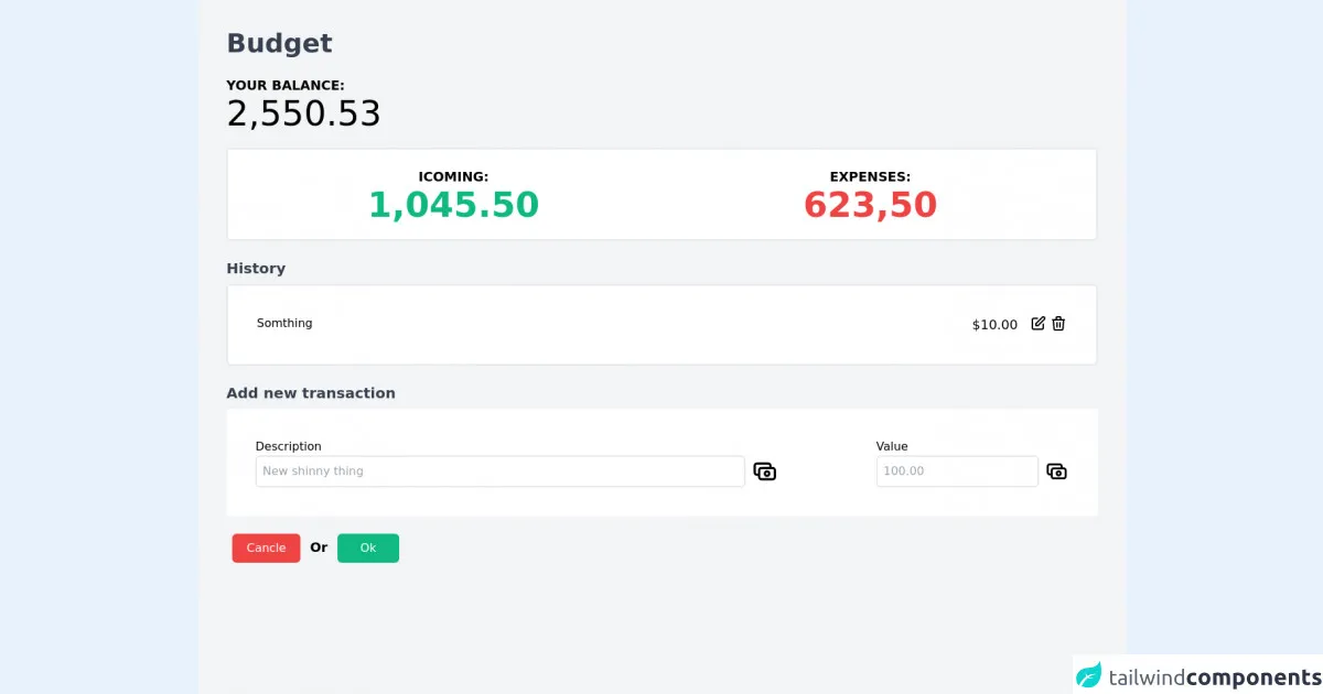
The Description of React Budget Transactions UI Component
The React Budget Transactions UI component is a simple component that displays a list of transactions. Each transaction has a description, an amount, and a type (income or expense). The component also displays the total income and expenses, as well as the remaining balance.
Why Use Tailwind CSS to Create a React Budget Transactions UI Component?
Tailwind CSS is an excellent choice for creating UI components because it provides a set of pre-defined classes that you can use to style your components quickly. This means that you don't have to spend time writing custom CSS for every component you create. Additionally, Tailwind CSS is highly customizable, which means that you can easily modify the styles of your components to match your design requirements.
The Preview of React Budget Transactions UI Component
Free download of the React Budged Transactions's source code
The Source Code of React Budget Transactions UI Component
<div class=" bg-gray-100 min-h-screen">
	<div class="container p-10 mx-auto">
		<h1 class="text-4xl font-bold text-gray-700 mb-6">Budget</h1>
		<div>
			<h3 class="text-lg font-semibold">YOUR BALANCE:</h3>
			<p class="text-5xl mb-6">2,550.53</p>
			<div class="grid grid-cols-2 bg-white mb-6 border-2 p-6 rounded-md">
				<div class="flex flex-col items-center">
					<p class="text-lg font-semibold">ICOMING:</p>
					<p class="text-5xl font-semibold text-green-500">1,045.50</p>
				</div>
				<div class="flex flex-col items-center">
					<p class="text-lg font-semibold">EXPENSES:</p>
					<p class="text-5xl font-semibold text-red-500">623,50</p>
				</div>
			</div>
			<div>
				<h2 class="text-xl font-semibold text-gray-700 mb-2">History</h2>
				<div class="flex justify-between border-2 p-10 bg-white rounded-md">
					<p class="text-md">Somthing</p>
					<div class="flex space-x-4">
						<p class="text-lg">$10.00</p>
						<div class="flex space-x-1">
							<svg xmlns="http://www.w3.org/2000/svg" class="h-6 w-6" fill="none" viewBox="0 0 24 24"
								stroke="currentColor">
								<path stroke-linecap="round" stroke-linejoin="round" stroke-width="2"
									d="M11 5H6a2 2 0 00-2 2v11a2 2 0 002 2h11a2 2 0 002-2v-5m-1.414-9.414a2 2 0 112.828 2.828L11.828 15H9v-2.828l8.586-8.586z" />
							</svg>
							<svg xmlns="http://www.w3.org/2000/svg" class="h-6 w-6" fill="none" viewBox="0 0 24 24"
								stroke="currentColor">
								<path stroke-linecap="round" stroke-linejoin="round" stroke-width="2"
									d="M19 7l-.867 12.142A2 2 0 0116.138 21H7.862a2 2 0 01-1.995-1.858L5 7m5 4v6m4-6v6m1-10V4a1 1 0 00-1-1h-4a1 1 0 00-1 1v3M4 7h16" />
							</svg>
						</div>
					</div>
				</div>

				<Form class="my-6">
					<h2 class="text-xl font-semibold text-gray-700 mb-2">Add new transaction</h3>
						<div class=" flex justify-between bg-white items-center">
							<div class=" md:p-10 py-2 px-4 w-2/3">
								<p class="text-md ">Description</p>
								<div class="flex items-center">
									<input type="text" placeholder="New shinny thing" class="p-2 w-full border-2 rounded-md outline-none">
									<svg xmlns="http://www.w3.org/2000/svg" class="h-10 w-10 ml-2" fill="none"
										viewBox="0 0 24 24" stroke="currentColor">
										<path stroke-linecap="round" stroke-linejoin="round" stroke-width="2"
											d="M17 9V7a2 2 0 00-2-2H5a2 2 0 00-2 2v6a2 2 0 002 2h2m2 4h10a2 2 0 002-2v-6a2 2 0 00-2-2H9a2 2 0 00-2 2v6a2 2 0 002 2zm7-5a2 2 0 11-4 0 2 2 0 014 0z" />
									</svg>
								</div>
							</div>
							<div class=" md:p-10 py-2 px-4">
								<p class="text-md ">Value</p>
								<div class="flex items-center">
									<input type="text" placeholder="100.00" class="p-2 border-2 w-full rounded-md outline-none">
									<svg xmlns="http://www.w3.org/2000/svg" class="h-10 w-10 ml-2" fill="none"
										viewBox="0 0 24 24" stroke="currentColor">
										<path stroke-linecap="round" stroke-linejoin="round" stroke-width="2"
											d="M17 9V7a2 2 0 00-2-2H5a2 2 0 00-2 2v6a2 2 0 002 2h2m2 4h10a2 2 0 002-2v-6a2 2 0 00-2-2H9a2 2 0 00-2 2v6a2 2 0 002 2zm7-5a2 2 0 11-4 0 2 2 0 014 0z" />
									</svg>
								</div>
							</div>
						</div>
						<div class="mt-4 p-2 space-x-2">
							<button class="text-md bg-red-500 px-5 py-2 rounded-md text-white">Cancle</button>
							<sapan class="text-lg font-semibold">Or</sapan>
							<button class="text-md bg-green-500 px-8 py-2 rounded-md text-white">Ok</button>
						</div>
				</Form>
			</div>
		</div>
How to Create a React Budget Transactions with Tailwind CSS?
To create a React Budget Transactions UI component with Tailwind CSS, we will follow these steps:
Step 1: Set up the React project
First, we need to set up a new React project. We can do this by running the following command in our terminal:
npx create-react-app react-budget-transactions
Step 2: Install Tailwind CSS
Next, we need to install Tailwind CSS. We can do this by running the following command in our terminal:
npm install tailwindcss
Step 3: Create a Tailwind CSS configuration file
We need to create a Tailwind CSS configuration file to customize the default styles. We can do this by running the following command in our terminal:
npx tailwindcss init
This will create a tailwind.config.js file in our project directory.
Step 4: Configure Tailwind CSS
In the tailwind.config.js file, we can modify the default styles by adding or removing classes. For example, we can add the following code to add a custom color:
module.exports = {
  theme: {
    extend: {
      colors: {
        custom: '#123456',
      },
    },
  },
  variants: {},
  plugins: [],
}
Step 5: Create the React Budget Transactions UI component
Now, we can create the React Budget Transactions UI component. We will create a new file called BudgetTransactions.js in the src directory and add the following code:
import React from 'react'

const BudgetTransactions = () => {
  return (
    <div>
      <h1 className="text-2xl font-bold mb-4">Budget Transactions</h1>
      {/* Add transaction items here */}
      <div className="bg-gray-200 p-4 rounded-lg mt-4">
        <h2 className="text-lg font-bold mb-2">Total Income</h2>
        <p className="text-green-500 text-2xl font-bold">$0.00</p>
      </div>
      <div className="bg-gray-200 p-4 rounded-lg mt-4">
        <h2 className="text-lg font-bold mb-2">Total Expenses</h2>
        <p className="text-red-500 text-2xl font-bold">$0.00</p>
      </div>
      <div className="bg-gray-200 p-4 rounded-lg mt-4">
        <h2 className="text-lg font-bold mb-2">Remaining Balance</h2>
        <p className="text-2xl font-bold">$0.00</p>
      </div>
    </div>
  )
}

export default BudgetTransactions
In this code, we have added a title, transaction items, and total income, expenses, and remaining balance sections.
Step 6: Add Tailwind CSS classes
We can now add Tailwind CSS classes to style our component. For example, we can add the text-2xl class to make the title larger, the bg-gray-200 class to add a background color, and the p-4 class to add padding. We can also use the text-green-500 and text-red-500 classes to add colors to the income and expense sections, respectively.
Step 7: Preview the React Budget Transactions UI component
We can now preview the React Budget Transactions UI component by running the following command in our terminal:
npm start
This will start a development server, and we can view our component in the browser at http://localhost:3000.
Conclusion
In this article, we have explored how to create a React Budget Transactions UI component using Tailwind CSS. We have covered the basics of Tailwind CSS, the description of the React Budget Transactions UI component, why we should use Tailwind CSS to create this component, and a practical guide on how to create it. By following these steps, you can create beautiful and functional UI components quickly and easily.