- Published on
A Complete Guide To Create A Range Slider With Tailwind CSS
- What is Tailwind CSS?
- The description of Range slider ui component
- Why use Tailwind CSS to create a Range slider ui component?
- The preview of Range slider ui component
- The source code of Range slider ui component
- How to create a Range slider with Tailwind CSS?
- Step 1: Create the HTML markup
- Step 2: Apply Tailwind CSS classes
- Step 3: Style the slider handle
- Step 4: Style the slider track
- Step 5: Style the slider range
- Step 6: Add labels
- Conclusion
What is Tailwind CSS?
Tailwind CSS is a utility-first CSS framework that provides a set of pre-defined CSS classes to create responsive and customizable user interfaces. It allows developers to create complex layouts and designs without writing any custom CSS code. Tailwind CSS is gaining popularity among developers due to its ease of use and flexibility.
The description of Range slider ui component
A range slider is a UI component that allows users to select a range of values by dragging a slider handle. Range sliders are commonly used in web applications to filter data or set a price range.
Why use Tailwind CSS to create a Range slider ui component?
Tailwind CSS provides a set of pre-defined CSS classes that can be used to create a range slider UI component without writing any custom CSS code. This saves time and effort for developers and ensures a consistent design across the application.
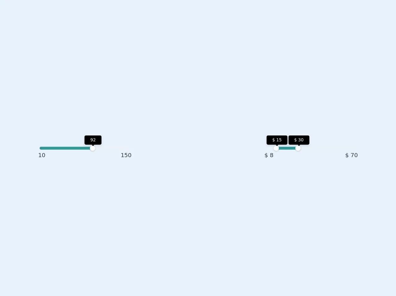
The preview of Range slider ui component
To create a range slider with Tailwind CSS, we will use the range input type and apply Tailwind CSS classes to style it. The preview of the range slider UI component is shown below.
Free download of the Range slider's source code
The source code of Range slider ui component
The source code for the range slider UI component is shown below.
<div class="flex  w-64 m-auto items-center h-32 justify-center">
    <div class="py-1 relative min-w-full">
        <div class="h-2 bg-gray-200 rounded-full">
            <div class="absolute h-2 rounded-full bg-teal-600 w-0" style="width: 58.5714%;"></div>
            <div class="absolute h-4 flex items-center justify-center w-4 rounded-full bg-white shadow border border-gray-300 -ml-2 top-0 cursor-pointer" unselectable="on" onselectstart="return false;" style="left: 58.5714%;">
                <div class="relative -mt-2 w-1">
                    <div class="absolute z-40 opacity-100 bottom-100 mb-2 left-0 min-w-full" style="margin-left: -20.5px;">
                        <div class="relative shadow-md">
                            <div class="bg-black -mt-8 text-white truncate text-xs rounded py-1 px-4">92</div>
                            <svg class="absolute text-black w-full h-2 left-0 top-100" x="0px" y="0px" viewBox="0 0 255 255" xml:space="preserve">
                                <polygon class="fill-current" points="0,0 127.5,127.5 255,0"></polygon>
                            </svg>
                        </div>
                    </div>
                </div>
            </div>
            <div class="absolute text-gray-800 -ml-1 bottom-0 left-0 -mb-6">10</div>
            <div class="absolute text-gray-800 -mr-1 bottom-0 right-0 -mb-6">150</div>
        </div>
    </div>
</div>

<!-- between two numbers -->

<div class="flex w-64 m-auto items-center h-32 justify-center">
    <div class="py-1 relative min-w-full">
        <div class="h-2 bg-gray-200 rounded-full">
            <div class="absolute h-2 rounded-full bg-teal-600 w-0" style="width: 24.1935%; left: 11.2903%;"></div>
            <div class="absolute h-4 flex items-center justify-center w-4 rounded-full bg-white shadow border border-gray-300 -ml-2 top-0 cursor-pointer" unselectable="on" onselectstart="return false;" style="left: 11.2903%;">
                <div class="relative -mt-2 w-1">
                    <div class="absolute z-40 opacity-100 bottom-100 mb-2 left-0 min-w-full" style="margin-left: -25px;">
                        <div class="relative shadow-md">
                            <div class="bg-black -mt-8 text-white truncate text-xs rounded py-1 px-4">$ 15</div>
                            <svg class="absolute text-black w-full h-2 left-0 top-100" x="0px" y="0px" viewBox="0 0 255 255" xml:space="preserve">
                                <polygon class="fill-current" points="0,0 127.5,127.5 255,0"></polygon>
                            </svg>
                        </div>
                    </div>
                </div>
            </div>
            <div class="absolute h-4 flex items-center justify-center w-4 rounded-full bg-white shadow border border-gray-300 -ml-2 top-0 cursor-pointer" unselectable="on" onselectstart="return false;" style="left: 35.4839%;">
                <div class="relative -mt-2 w-1">
                    <div class="absolute z-40 opacity-100 bottom-100 mb-2 left-0 min-w-full" style="margin-left: -25px;">
                        <div class="relative shadow-md">
                            <div class="bg-black -mt-8 text-white truncate text-xs rounded py-1 px-4">$ 30</div>
                            <svg class="absolute text-black w-full h-2 left-0 top-100" x="0px" y="0px" viewBox="0 0 255 255" xml:space="preserve">
                                <polygon class="fill-current" points="0,0 127.5,127.5 255,0"></polygon>
                            </svg>
                        </div>
                    </div>
                </div>
            </div>
            <div class="absolute text-gray-800 -ml-1 bottom-0 left-0 -mb-6">$ 8</div>
            <div class="absolute text-gray-800 -mr-1 bottom-0 right-0 -mb-6">$ 70</div>
        </div>
    </div>
</div>
How to create a Range slider with Tailwind CSS?
To create a range slider with Tailwind CSS, follow the steps below:
Step 1: Create the HTML markup
Create an HTML element with the range input type and add the min, max, and step attributes to specify the range of values and the increment value.
<input type="range" min="0" max="100" step="1">
Step 2: Apply Tailwind CSS classes
Apply Tailwind CSS classes to style the range slider. The h-4 class sets the height of the slider, while the bg-gray-300 class sets the background color. The appearance-none class removes the default appearance of the slider.
<input type="range" min="0" max="100" step="1" class="h-4 bg-gray-300 appearance-none">
Step 3: Style the slider handle
Style the slider handle using the thumb pseudo-class. The w-4 and h-4 classes set the width and height of the handle, while the bg-white class sets the background color.
<input type="range" min="0" max="100" step="1" class="h-4 bg-gray-300 appearance-none
    thumb:w-4 thumb:h-4 thumb:bg-white">
Step 4: Style the slider track
Style the slider track using the track pseudo-class. The bg-blue-500 class sets the background color of the track.
<input type="range" min="0" max="100" step="1" class="h-4 bg-gray-300 appearance-none
    thumb:w-4 thumb:h-4 thumb:bg-white track:bg-blue-500">
Step 5: Style the slider range
Style the slider range using the range pseudo-class. The bg-blue-500 class sets the background color of the range.
<input type="range" min="0" max="100" step="1" class="h-4 bg-gray-300 appearance-none
    thumb:w-4 thumb:h-4 thumb:bg-white track:bg-blue-500 range:bg-blue-500">
Step 6: Add labels
Add labels to indicate the minimum and maximum values of the range slider.
<div class="flex justify-between">
  <span>0</span>
  <span>100</span>
</div>
<input type="range" min="0" max="100" step="1" class="h-4 bg-gray-300 appearance-none
    thumb:w-4 thumb:h-4 thumb:bg-white track:bg-blue-500 range:bg-blue-500">
Conclusion
Creating a range slider with Tailwind CSS is easy and requires minimal CSS code. By using pre-defined CSS classes, developers can create a range slider UI component that is responsive and customizable. Tailwind CSS is a great choice for developers who want to create complex UI components without writing custom CSS code.