- Published on
6 Critical Skills To Make A Radio Buttons With Tailwind CSS Remarkably Well
- What is Tailwind CSS?
- The description of radio buttons ui component
- Why use Tailwind CSS to create a radio buttons ui component?
- The preview of radio buttons ui component
- The source code of radio buttons ui component
- How to create a radio buttons with Tailwind CSS?
- 1. Understand the HTML structure of radio buttons
- 2. Use the form-radio class to style radio buttons
- 3. Use the form-radio-label class to style radio button labels
- 4. Use the form-radio-checked class to style the selected radio button
- 5. Use the form-radio-group class to group radio buttons together
- 6. Customize the styles using Tailwind CSS utilities
- Conclusion
What is Tailwind CSS?
Tailwind CSS is a utility-first CSS framework that helps you design custom user interfaces quickly. It provides a set of pre-defined CSS classes that you can use to build responsive and accessible designs without writing any CSS code.
The description of radio buttons ui component
Radio buttons are a type of input element that allows users to select one option from a list of options. They are commonly used in forms, surveys, and quizzes to collect user input.
Why use Tailwind CSS to create a radio buttons ui component?
Tailwind CSS makes it easy to create radio buttons that are responsive, accessible, and customizable. With Tailwind CSS, you can style radio buttons using pre-defined classes, or you can create your own custom classes to match your design requirements.
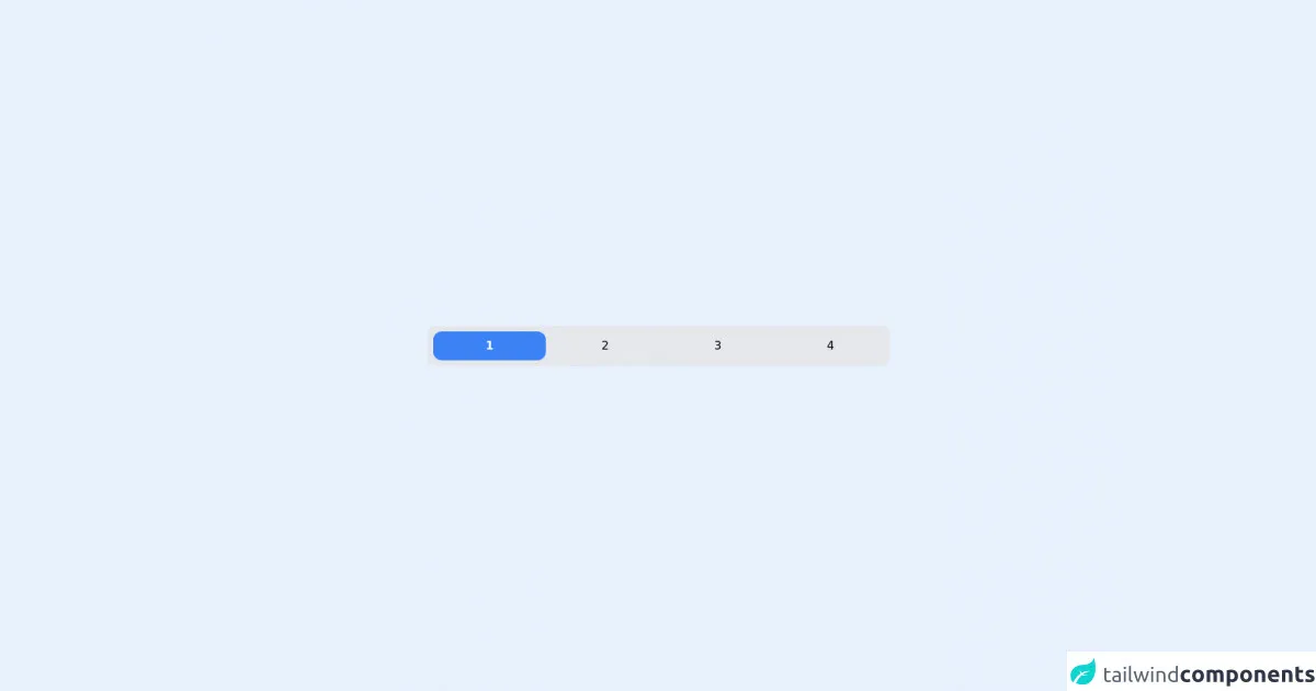
The preview of radio buttons ui component
Radio buttons are an essential part of any form. They allow users to select one option from a list of options. Here's a preview of what the radio buttons UI component looks like:
Free download of the radio buttons's source code
The source code of radio buttons ui component
Here's the source code for the radio buttons UI component:
<!-- entire page -->
<main class="flex min-h-screen w-full items-center justify-center">
  <!-- tabs -->
  <div
    class="grid w-[40rem] grid-cols-4 space-x-2 rounded-xl bg-gray-200 p-2"
    x-data="app"
  >
    <div>
      <input type="radio" name="option" id="1" class="peer hidden" checked />
      <label
        for="1"
        class="block cursor-pointer select-none rounded-xl p-2 text-center peer-checked:bg-blue-500 peer-checked:font-bold peer-checked:text-white"
        >1</label
      >
    </div>

    <div>
      <input type="radio" name="option" id="2" class="peer hidden" />
      <label
        for="2"
        class="block cursor-pointer select-none rounded-xl p-2 text-center peer-checked:bg-blue-500 peer-checked:font-bold peer-checked:text-white"
        >2</label
      >
    </div>

    <div>
      <input type="radio" name="option" id="3" class="peer hidden" />
      <label
        for="3"
        class="block cursor-pointer select-none rounded-xl p-2 text-center peer-checked:bg-blue-500 peer-checked:font-bold peer-checked:text-white"
        >3</label
      >
    </div>

    <div>
      <input type="radio" name="option" id="4" class="peer hidden" />
      <label
        for="4"
        class="block cursor-pointer select-none rounded-xl p-2 text-center peer-checked:bg-blue-500 peer-checked:font-bold peer-checked:text-white"
        >4</label
      >
    </div>
  </div>
</main>
How to create a radio buttons with Tailwind CSS?
To create radio buttons with Tailwind CSS, you need to follow these six critical skills:
1. Understand the HTML structure of radio buttons
Radio buttons are created using the <input> element with the type="radio" attribute. Each radio button should have a unique id attribute and a name attribute that groups them together.
2. Use the form-radio class to style radio buttons
Tailwind CSS provides a form-radio class that you can use to style radio buttons. You can apply this class to the <input> element to style the radio button itself.
3. Use the form-radio-label class to style radio button labels
Radio buttons should always be accompanied by a label that describes the option. You can use the form-radio-label class to style the label.
4. Use the form-radio-checked class to style the selected radio button
When a user selects a radio button, it should be visually highlighted to indicate that it is selected. You can use the form-radio-checked class to style the selected radio button.
5. Use the form-radio-group class to group radio buttons together
Radio buttons should be grouped together using the name attribute. You can use the form-radio-group class to style the group of radio buttons.
6. Customize the styles using Tailwind CSS utilities
Tailwind CSS provides a wide range of utilities that you can use to customize the styles of your radio buttons. You can use utilities like bg-color, text-color, border-color, font-size, and padding to create unique designs.
Conclusion
Radio buttons are an essential part of any form, and Tailwind CSS makes it easy to create responsive, accessible, and customizable radio buttons. By following these six critical skills, you can create radio buttons that match your design requirements and provide a great user experience.