- Published on
6 Tips To Build A Question Listing Item Card With Tailwind CSS
- What is Tailwind CSS?
- The description of Question Listing Item Card ui component
- Why use Tailwind CSS to create a Question Listing Item Card ui component?
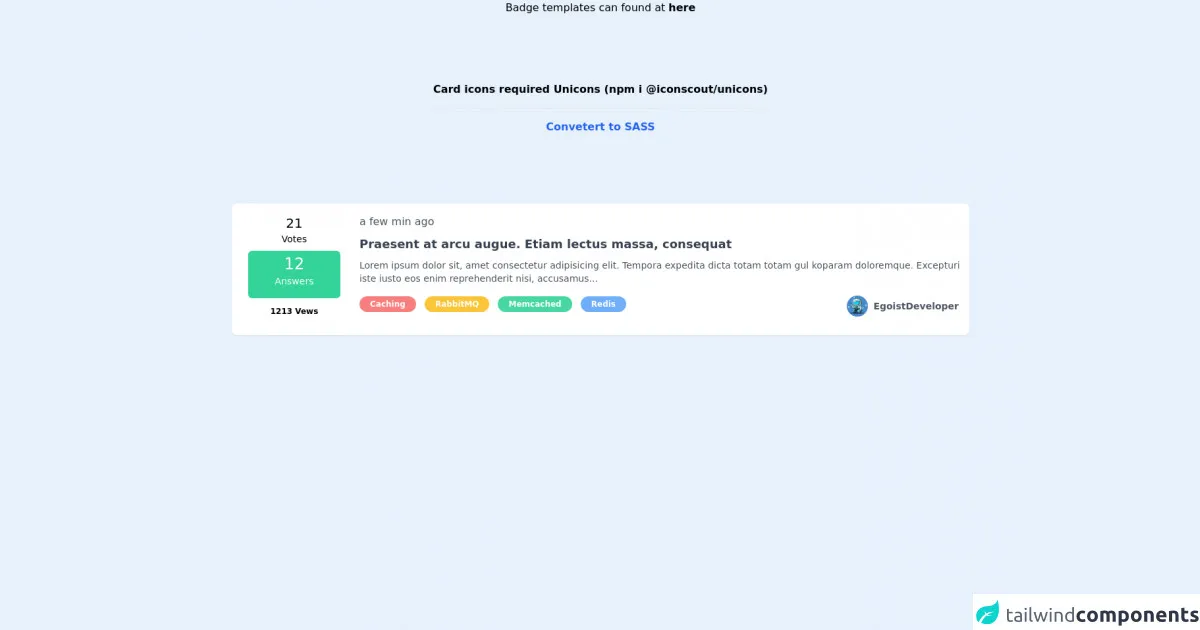
- The preview of Question Listing Item Card ui component
- The source code of Question Listing Item Card ui component
- How to create a Question Listing Item Card with Tailwind CSS?
- Conclusion
As a FrontEnd technology blogger, it is important to keep up with the latest trends and tools in web development. One such tool that has gained popularity in recent times is Tailwind CSS. It is a utility-first CSS framework that allows developers to quickly build responsive and customizable user interfaces. In this article, we will discuss how to use Tailwind CSS to create a Question Listing Item Card ui component.
What is Tailwind CSS?
Tailwind CSS is a CSS framework that provides a set of pre-defined classes that can be used to style HTML elements. It is a utility-first framework, which means that it focuses on providing small, single-purpose classes that can be combined to create complex styles. This approach allows developers to write less CSS code and achieve more with it.
The description of Question Listing Item Card ui component
A Question Listing Item Card is a UI component that is commonly used in websites that have a Q&A section. It is used to display a question along with its summary and other relevant information. The card usually contains a thumbnail image, the title of the question, the name of the user who asked the question, the date it was asked, and the number of answers it has received.
Why use Tailwind CSS to create a Question Listing Item Card ui component?
Tailwind CSS provides a set of utility classes that can be used to create complex styles without writing any custom CSS code. This makes it an ideal choice for creating UI components like the Question Listing Item Card. It also provides a responsive design system that allows the card to adapt to different screen sizes and devices.
The preview of Question Listing Item Card ui component
To create a Question Listing Item Card with Tailwind CSS, we will use a combination of utility classes to style the HTML elements. The card will have a thumbnail image on the left, and the question details on the right. The card will also have a hover effect that will change the background color and add a shadow.
Free download of the Question Listing Item Card's source code
The source code of Question Listing Item Card ui component
To create the Question Listing Item Card, we will use HTML and Tailwind CSS classes. The HTML structure will consist of a div element with a class of "card". Inside the card div, we will have an image element with a class of "card-image", and a div element with a class of "card-content". The card-content div will contain the question details.
<!-- Unicons -->
<link rel="stylesheet" href="https://cdn.jsdelivr.net/npm/@iconscout/[email protected]/css/line.css">


<div class="grid mx-20">
    <p class="text-center mb-5">
        Badge templates can found at
        <a href="https://www.tailwindcsscomponent.com/labelbadges" class="font-bold" target="_blank">
            here
        </a>
    </p>

    <div class="flex">
        <span class="text-center font-bold my-20 mx-auto">
            Card icons required Unicons (npm i @iconscout/unicons)

            <hr class="my-4">

            <a href="https://egoistdeveloper.github.io/twcss-to-sass-playground/" target="_blank" class="text-blue-600">
                Convetert to SASS
            </a>
        </span>
    </div>

    <!-- Question Listing Item Card -->
    <div class="bg-white rounded-lg shadow-sm hover:shadow-lg duration-500 px-2 sm:px-6 md:px-2 py-4 my-6">
        <div class="grid grid-cols-12 gap-3">
            <!-- Meta Column -->
            <div class="col-span-0 sm:col-span-2 text-center hidden sm:block">
                <!-- Vote Counts -->
                <div class="grid grid-rows-2">
                    <div class="inline-block font-medium text-xl">
                        21
                    </div>

                    <div class="inline-block font-medium text-sm">
                        Votes
                    </div>
                </div>

                <!-- Answer Counts -->
                <a href="#" class="grid grid-rows-2 mx-auto mb-3 py-1 w-4/5 2lg:w-3/5 rounded-md bg-green-400">
                    <div class="inline-block font-medium text-2xl text-white">
                        12
                    </div>

                    <div class="inline-block font-medium text-white mx-1 text-sm lg:text-md">
                        Answers
                    </div>
                </a>

                <!-- View Counts -->
                <div class="grid my-3">
                    <span class="inline-block font-bold text-xs">
                        1213 Vews
                    </span>
                </div>
            </div>

            <!-- Summary Column -->
            <div class="col-span-12 sm:col-start-3 sm:col-end-13 px-3 sm:px-0">
                <div class="grid block sm:hidden">
                    <div class="flex flex-wrap">
                        <div class="mr-2">
                            <div class="inline-block font-light capitalize">
                                <i class="uil uil-arrow-circle-up mr-1"></i>
                                <span class="text-sm">
                                    21 Votes
                                </span>
                            </div>
                        </div>
                        <div class="mr-2">
                            <div class="inline-block font-light capitalize">
                                <i class="uil uil-check-circle mr-1"></i>
                                <span class="text-sm">
                                    21 Answers
                                </span>
                            </div>
                        </div>
                        <div class="mr-2">
                            <div class="inline-block">
                                <i class="uil uil-eye mr-1"></i>
                                <span class="text-sm capitalize font-light">
                                    21 Views
                                </span>
                            </div>
                        </div>

                        <div class="mr-2">
                            <div class="inline-block">
                                <i class="uil uil-clock mr-1"></i>
                                <span class="text-sm font-light">
                                    a few mins ago ago
                                </span>
                            </div>
                        </div>
                    </div>
                </div>

                <div class="flex justify-between items-center hidden sm:block">
                    <span class="font-light text-gray-600">
                        a few min ago
                    </span>
                </div>

                <div class="mt-2">
                    <a href="#" class="sm:text-sm md:text-md lg:text-lg text-gray-700 font-bold hover:underline">
                        Praesent at arcu augue. Etiam lectus massa, consequat
                    </a>

                    <p class="mt-2 text-gray-600 text-sm md:text-md">
                        Lorem ipsum dolor sit, amet consectetur adipisicing elit.
                        Tempora expedita dicta totam totam gul koparam doloremque. Excepturi iste iusto eos enim
                        reprehenderit nisi, accusamus...
                    </p>
                </div>

                <!-- Question Labels -->
                <div class="grid grid-cols-2 mt-4 my-auto">
                    <!-- Categories  -->
                    <div class="col-span-12 lg:col-span-8">
                        <a href="#" class="inline-block rounded-full text-white
                            bg-red-400 hover:bg-red-500 duration-300
                            text-xs font-bold
                            mr-1 md:mr-2 mb-2 px-2 md:px-4 py-1
                            opacity-90 hover:opacity-100">
                            Caching
                        </a>
                        <a href="#" class="inline-block rounded-full text-white
                            bg-yellow-400 hover:bg-yellow-500 duration-300
                            text-xs font-bold
                            mr-1 md:mr-2 mb-2 px-2 md:px-4 py-1
                            opacity-90 hover:opacity-100">
                            RabbitMQ
                        </a>
                        <a href="#" class="inline-block rounded-full text-white
                            bg-green-400 hover:bg-green-500 duration-300
                            text-xs font-bold
                            mr-1 md:mr-2 mb-2 px-2 md:px-4 py-1
                            opacity-90 hover:opacity-100">
                            Memcached
                        </a>
                        <a href="#" class="inline-block rounded-full text-white
                            bg-blue-400 hover:bg-blue-500 duration-300
                            text-xs font-bold
                            mr-1 md:mr-2 mb-2 px-2 md:px-4 py-1
                            opacity-90 hover:opacity-100">
                            Redis
                        </a>
                    </div>

                    <!-- User -->
                    <div class="col-none hidden mr-2 lg:block lg:col-start-9 lg:col-end-12">
                        <a href="#" class="flex items-center">
                            <img src="https://avatarfiles.alphacoders.com/165/thumb-1920-165285.png" alt="avatar"
                                class="mr-2 w-8 h-8 rounded-full">

                            <div class="text-gray-600 font-bold text-sm hover:underline">
                                EgoistDeveloper
                            </div>
                        </a>
                    </div>
                </div>
            </div>
        </div>
    </div>
</div>
How to create a Question Listing Item Card with Tailwind CSS?
Here are the steps to create a Question Listing Item Card with Tailwind CSS:
- Create a div element with a class of "card".
- Inside the card div, create an image element with a class of "card-image". Set the src attribute to the URL of the thumbnail image.
- Create a div element with a class of "card-content".
- Inside the card-content div, create a h2 element with a class of "card-title". Set the text content to the title of the question.
- Create a p element with a class of "card-summary". Set the text content to the summary of the question.
- Create a div element with a class of "card-footer".
- Inside the card-footer div, create a span element with a class of "card-author". Set the text content to the name of the user who asked the question.
- Create a span element with a class of "card-date". Set the text content to the date the question was asked.
- Create a span element with a class of "card-answers". Set the text content to the number of answers the question has received.
- Add Tailwind CSS classes to style the card, card-image, card-content, card-title, card-summary, card-footer, card-author, card-date, and card-answers elements.
Conclusion
In this article, we discussed how to use Tailwind CSS to create a Question Listing Item Card ui component. We learned that Tailwind CSS provides a set of utility classes that can be used to create complex styles without writing any custom CSS code. We also learned that the Question Listing Item Card is a UI component that is commonly used in websites that have a Q&A section. By following the steps outlined in this article, you can easily create a Question Listing Item Card with Tailwind CSS.