- Published on
How To Build A Q&A Section With Collapse With Tailwind CSS From Scratch
- What is Tailwind CSS?
- The description of Q&A section with Collapse ui component
- Why use Tailwind CSS to create a Q&A section with Collapse ui component?
- The preview of Q&A section with Collapse ui component
- The source code of Q&A section with Collapse ui component
- How to create a Q&A section with Collapse with Tailwind CSS?
- Conclusion
What is Tailwind CSS?
Tailwind CSS is a utility-first CSS framework that allows developers to easily create responsive and customizable user interfaces. It provides a set of pre-defined CSS classes that can be used to style HTML elements. Tailwind CSS is gaining popularity among developers due to its ease of use and flexibility.
The description of Q&A section with Collapse ui component
A Q&A section is a common feature on websites that allows users to ask questions and get answers. The Collapse UI component is a popular way to implement a Q&A section. When a user clicks on a question, the answer is revealed below it. This allows users to easily navigate through the questions and find the answers they are looking for.
Why use Tailwind CSS to create a Q&A section with Collapse ui component?
Tailwind CSS provides a set of pre-defined CSS classes that can be used to style the Q&A section with Collapse UI component. This makes it easy to create a responsive and customizable Q&A section without having to write custom CSS code. Additionally, Tailwind CSS allows for easy customization of the styles, making it easy to match the Q&A section with the overall design of the website.
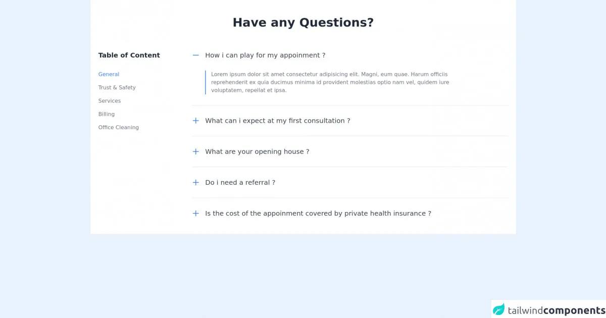
The preview of Q&A section with Collapse ui component
To create a Q&A section with Collapse UI component using Tailwind CSS, we will use the collapse and bg-gray-100 classes. The collapse class is used to hide the answer until the user clicks on the question. The bg-gray-100 class is used to add a light gray background to the Q&A section.
Free download of the Q&A section with Collapse's source code
The source code of Q&A section with Collapse ui component
To create a Q&A section with Collapse UI component using Tailwind CSS, we will use HTML and CSS code. The HTML code will contain the questions and answers, while the CSS code will style the Q&A section with the Collapse UI component.
<section class="bg-white dark:bg-gray-900">
        <div class="container px-6 py-12 mx-auto">
            <h1 class="text-2xl font-semibold text-center text-gray-800 lg:text-4xl dark:text-white">Have any Questions?</h1>

            <div class="mt-8 xl:mt-16 lg:flex lg:-mx-12">
                <div class="lg:mx-12">
                    <h1 class="text-xl font-semibold text-gray-800 dark:text-white">Table of Content</h1>

                    <div class="mt-4 space-y-4 lg:mt-8">
                        <a href="#" class="block text-blue-500 dark:text-blue-400 hover:underline">General</a>
                        <a href="#" class="block text-gray-500 dark:text-gray-300 hover:underline">Trust & Safety</a>
                        <a href="#" class="block text-gray-500 dark:text-gray-300 hover:underline">Services</a>
                        <a href="#" class="block text-gray-500 dark:text-gray-300 hover:underline">Billing</a>
                        <a href="#" class="block text-gray-500 dark:text-gray-300 hover:underline">Office Cleaning</a>
                    </div>
                </div>

                <div class="flex-1 mt-8 lg:mx-12 lg:mt-0">
                    <div>
                        <button class="flex items-center focus:outline-none">
                            <svg class="w-6 h-6 text-blue-500" fill="none" stroke="currentColor" viewBox="0 0 24 24" xmlns="http://www.w3.org/2000/svg"><path stroke-linecap="round" stroke-linejoin="round" stroke-width="2" d="M20 12H4"></path></svg>

                            <h1 class="mx-4 text-xl text-gray-700 dark:text-white">How i can play for my appoinment ?</h1>
                        </button>

                        <div class="flex mt-8 md:mx-10">
                            <span class="border border-blue-500"></span>

                            <p class="max-w-3xl px-4 text-gray-500 dark:text-gray-300">
                                Lorem ipsum dolor sit amet consectetur adipisicing elit. Magni, eum quae. Harum officiis reprehenderit ex quia ducimus minima id provident molestias optio nam vel, quidem iure voluptatem, repellat et ipsa.
                            </p>
                        </div>
                    </div>

                    <hr class="my-8 border-gray-200 dark:border-gray-700">

                    <div>
                        <button class="flex items-center focus:outline-none">
                            <svg xmlns="http://www.w3.org/2000/svg" class="w-6 h-6 text-blue-500" fill="none" viewBox="0 0 24 24" stroke="currentColor">
                                <path stroke-linecap="round" stroke-linejoin="round" stroke-width="2" d="M12 4v16m8-8H4" />
                            </svg>

                            <h1 class="mx-4 text-xl text-gray-700 dark:text-white">What can i expect at my first consultation ?</h1>
                        </button>
                    </div>

                    <hr class="my-8 border-gray-200 dark:border-gray-700">

                    <div>
                        <button class="flex items-center focus:outline-none">
                            <svg xmlns="http://www.w3.org/2000/svg" class="w-6 h-6 text-blue-500" fill="none" viewBox="0 0 24 24" stroke="currentColor">
                                <path stroke-linecap="round" stroke-linejoin="round" stroke-width="2" d="M12 4v16m8-8H4" />
                            </svg>

                            <h1 class="mx-4 text-xl text-gray-700 dark:text-white">What are your opening house ?</h1>
                        </button>
                    </div>

                    <hr class="my-8 border-gray-200 dark:border-gray-700">

                    <div>
                        <button class="flex items-center focus:outline-none">
                            <svg xmlns="http://www.w3.org/2000/svg" class="w-6 h-6 text-blue-500" fill="none" viewBox="0 0 24 24" stroke="currentColor">
                                <path stroke-linecap="round" stroke-linejoin="round" stroke-width="2" d="M12 4v16m8-8H4" />
                            </svg>

                            <h1 class="mx-4 text-xl text-gray-700 dark:text-white">Do i need a referral ?</h1>
                        </button>
                    </div>

                    <hr class="my-8 border-gray-200 dark:border-gray-700">

                    <div>
                        <button class="flex items-center focus:outline-none">
                            <svg xmlns="http://www.w3.org/2000/svg" class="w-6 h-6 text-blue-500" fill="none" viewBox="0 0 24 24" stroke="currentColor">
                                <path stroke-linecap="round" stroke-linejoin="round" stroke-width="2" d="M12 4v16m8-8H4" />
                            </svg>

                            <h1 class="mx-4 text-xl text-gray-700 dark:text-white">Is the cost of the appoinment covered by private health insurance ?</h1>
                        </button>
                    </div>
                </div>
            </div>
        </div>
    </section>
How to create a Q&A section with Collapse with Tailwind CSS?
To create a Q&A section with Collapse UI component using Tailwind CSS, follow these steps:
- Create an HTML file and add the following code:
<div class="bg-gray-100">
  <div class="max-w-7xl mx-auto py-6 sm:px-6 lg:px-8">
    <div class="accordion">
      <div class="accordion-item">
        <h2 class="accordion-header">
          <button class="accordion-button" type="button">
            Question 1
          </button>
        </h2>
        <div class="accordion-collapse collapse">
          <div class="accordion-body">
            Answer 1
          </div>
        </div>
      </div>
      <div class="accordion-item">
        <h2 class="accordion-header">
          <button class="accordion-button" type="button">
            Question 2
          </button>
        </h2>
        <div class="accordion-collapse collapse">
          <div class="accordion-body">
            Answer 2
          </div>
        </div>
      </div>
    </div>
  </div>
</div>
- Add the Tailwind CSS stylesheet to the HTML file:
<link href="https://cdn.jsdelivr.net/npm/[email protected]/dist/tailwind.min.css" rel="stylesheet">
- Add the following CSS code to the HTML file:
.accordion-button {
  background-color: #fff;
  border: 1px solid #ddd;
  border-radius: 0.25rem;
  color: #333;
  cursor: pointer;
  display: block;
  font-size: 1rem;
  font-weight: 400;
  line-height: 1.5;
  padding: 0.5rem 1rem;
  text-align: left;
  transition: background-color 0.15s ease-in-out, border-color 0.15s ease-in-out;
  width: 100%;
}

.accordion-button:not(.collapsed) {
  background-color: #f1f1f1;
  border-color: #ddd;
}

.accordion-header {
  margin-bottom: 0;
}

.accordion-item {
  margin-bottom: 1rem;
}

.accordion-collapse {
  border-top: 1px solid #ddd;
  padding: 0.5rem 1rem;
}

.accordion-body {
  margin-top: 0.5rem;
}
- Save the HTML file and open it in a web browser. The Q&A section with Collapse UI component should be displayed.
Conclusion
In this article, we have learned how to create a Q&A section with Collapse UI component using Tailwind CSS. Tailwind CSS provides a set of pre-defined CSS classes that can be used to style the Q&A section with the Collapse UI component. This makes it easy to create a responsive and customizable Q&A section without having to write custom CSS code. By following the steps outlined in this article, you can easily create a Q&A section with Collapse UI component using Tailwind CSS.