- Published on
Beginners Guide: Build A Pure CSS Dropdown Using Focus-within (with Animation) With Tailwind CSS
- What is Tailwind CSS?
- The description of Pure CSS Dropdown using Focus-within (with Animation) ui component
- Why use Tailwind CSS to create a Pure CSS Dropdown using Focus-within (with Animation) ui component?
- The preview of Pure CSS Dropdown using Focus-within (with Animation) ui component
- The source code of Pure CSS Dropdown using Focus-within (with Animation) ui component
- How to create a Pure CSS Dropdown using Focus-within (with Animation) with Tailwind CSS?
- Step 1: Create the HTML structure
- Step 2: Style the dropdown button
- Step 3: Style the dropdown menu
- Step 4: Show the dropdown menu when the dropdown button is in focus
- Step 5: Hide the dropdown menu when the dropdown button is not in focus
- Conclusion
What is Tailwind CSS?
Tailwind CSS is a utility-first CSS framework that provides a set of pre-defined classes to style HTML elements. It allows developers to build responsive and customizable user interfaces quickly and efficiently, without having to write custom CSS code from scratch.
The description of Pure CSS Dropdown using Focus-within (with Animation) ui component
A Pure CSS Dropdown using Focus-within (with Animation) is a user interface component that allows users to select an option from a list of choices. When the user clicks on the dropdown button, a list of options appears, and the user can select one of them. This dropdown is built purely with CSS, and it uses the :focus-within pseudo-class to apply styles when the dropdown is in focus.
Why use Tailwind CSS to create a Pure CSS Dropdown using Focus-within (with Animation) ui component?
Tailwind CSS provides a set of pre-defined classes that can be used to style HTML elements quickly and efficiently. It also allows developers to customize the styles easily by overriding the default classes or creating new ones. By using Tailwind CSS, developers can create a Pure CSS Dropdown using Focus-within (with Animation) ui component quickly and efficiently, without having to write custom CSS code from scratch.
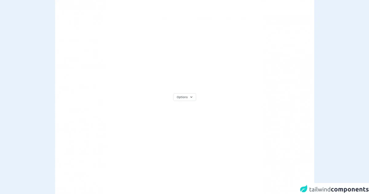
The preview of Pure CSS Dropdown using Focus-within (with Animation) ui component
To create a Pure CSS Dropdown using Focus-within (with Animation) ui component, we will use the :focus-within pseudo-class to apply styles to the dropdown when it is in focus. We will also use CSS transitions to add animation effects to the dropdown.
Free download of the Pure CSS Dropdown using Focus-within (with Animation)'s source code
The source code of Pure CSS Dropdown using Focus-within (with Animation) ui component
To create a Pure CSS Dropdown using Focus-within (with Animation) ui component, we will use HTML and CSS code. The HTML code will define the structure of the dropdown, and the CSS code will style it. We will use Tailwind CSS classes to style the dropdown quickly and efficiently.
<!--
    =======================================================================
    Name    :   Pure CSS Dropdown Menu
    Author  :   Surjith S M
    Twitter :   @surjithctly

    Get more components here 👉 https://web3templates.com/components

    Copyright © 2021
    =======================================================================
 -->

<div class="min-h-screen bg-white py-6 flex flex-col justify-center sm:py-12">
<div class="flex items-center justify-center p-12">
  <div class=" relative inline-block text-left dropdown">
    <span class="rounded-md shadow-sm"
      ><button class="inline-flex justify-center w-full px-4 py-2 text-sm font-medium leading-5 text-gray-700 transition duration-150 ease-in-out bg-white border border-gray-300 rounded-md hover:text-gray-500 focus:outline-none focus:border-blue-300 focus:shadow-outline-blue active:bg-gray-50 active:text-gray-800"
       type="button" aria-haspopup="true" aria-expanded="true" aria-controls="headlessui-menu-items-117">
        <span>Options</span>
        <svg class="w-5 h-5 ml-2 -mr-1" viewBox="0 0 20 20" fill="currentColor"><path fill-rule="evenodd" d="M5.293 7.293a1 1 0 011.414 0L10 10.586l3.293-3.293a1 1 0 111.414 1.414l-4 4a1 1 0 01-1.414 0l-4-4a1 1 0 010-1.414z" clip-rule="evenodd"></path></svg>
        </button
    ></span>
    <div class="opacity-0 invisible dropdown-menu transition-all duration-300 transform origin-top-right -translate-y-2 scale-95">
      <div class="absolute right-0 w-56 mt-2 origin-top-right bg-white border border-gray-200 divide-y divide-gray-100 rounded-md shadow-lg outline-none" aria-labelledby="headlessui-menu-button-1" id="headlessui-menu-items-117" role="menu">
        <div class="px-4 py-3">
          <p class="text-sm leading-5">Signed in as</p>
          <p class="text-sm font-medium leading-5 text-gray-900 truncate">[email protected]</p>
        </div>
        <div class="py-1">
          <a href="javascript:void(0)" tabindex="0" class="text-gray-700 flex justify-between w-full px-4 py-2 text-sm leading-5 text-left"  role="menuitem" >Account settings</a>
          <a href="javascript:void(0)" tabindex="1" class="text-gray-700 flex justify-between w-full px-4 py-2 text-sm leading-5 text-left"  role="menuitem" >Support</a>
          <span role="menuitem" tabindex="-1" class="flex justify-between w-full px-4 py-2 text-sm leading-5 text-left text-gray-700 cursor-not-allowed opacity-50" aria-disabled="true">New feature (soon)</span>
          <a href="javascript:void(0)" tabindex="2" class="text-gray-700 flex justify-between w-full px-4 py-2 text-sm leading-5 text-left" role="menuitem" >License</a></div>
        <div class="py-1">
          <a href="javascript:void(0)" tabindex="3" class="text-gray-700 flex justify-between w-full px-4 py-2 text-sm leading-5 text-left"  role="menuitem" >Sign out</a></div>
      </div>
    </div>
  </div>
</div>
</div>

<style>
.dropdown:focus-within .dropdown-menu {
  opacity:1;
  transform: translate(0) scale(1);
  visibility: visible;
}
    </style>
How to create a Pure CSS Dropdown using Focus-within (with Animation) with Tailwind CSS?
To create a Pure CSS Dropdown using Focus-within (with Animation) with Tailwind CSS, we will follow the steps below:
Step 1: Create the HTML structure
The first step is to create the HTML structure of the dropdown. We will use a div element to wrap the dropdown button and the dropdown menu. Inside the div element, we will create a button element to act as the dropdown button, and a ul element to contain the dropdown menu options.
<div class="dropdown">
  <button class="dropdown-button">Select an option</button>
  <ul class="dropdown-menu">
    <li><a href="#">Option 1</a></li>
    <li><a href="#">Option 2</a></li>
    <li><a href="#">Option 3</a></li>
  </ul>
</div>
Step 2: Style the dropdown button
The next step is to style the dropdown button. We will use Tailwind CSS classes to style the button. We will also add a border and border-gray-300 class to the button to give it a border.
.dropdown-button {
  @apply px-4 py-2 rounded-md bg-white border border-gray-300;
}
Step 3: Style the dropdown menu
The next step is to style the dropdown menu. We will use Tailwind CSS classes to style the menu. We will also add a hidden class to the menu to hide it by default.
.dropdown-menu {
  @apply absolute z-10 hidden py-1 bg-white rounded-md shadow-lg;
}
Step 4: Show the dropdown menu when the dropdown button is in focus
The next step is to show the dropdown menu when the dropdown button is in focus. We will use the :focus-within pseudo-class to apply styles to the dropdown menu when the dropdown button is in focus. We will also use CSS transitions to add animation effects to the dropdown menu.
.dropdown:focus-within .dropdown-menu {
  @apply block transition ease-out duration-100 transform opacity-100 scale-100;
}
Step 5: Hide the dropdown menu when the dropdown button is not in focus
The final step is to hide the dropdown menu when the dropdown button is not in focus. We will use the :not(:focus-within) pseudo-class to apply styles to the dropdown menu when the dropdown button is not in focus. We will also use CSS transitions to add animation effects to the dropdown menu.
.dropdown:not(:focus-within) .dropdown-menu {
  @apply hidden transition ease-in duration-75 transform opacity-0 scale-95;
}
Conclusion
In this article, we have learned how to create a Pure CSS Dropdown using Focus-within (with Animation) with Tailwind CSS. We have seen how Tailwind CSS can be used to style HTML elements quickly and efficiently, and how the :focus-within pseudo-class can be used to apply styles to the dropdown when it is in focus. We have also seen how CSS transitions can be used to add animation effects to the dropdown. By following the steps outlined in this article, developers can create a Pure CSS Dropdown using Focus-within (with Animation) ui component quickly and efficiently, without having to write custom CSS code from scratch.