- Published on
How To Create A Pure CSS Accordion With Tailwind CSS In 6 Easy Steps?
- What is Tailwind CSS?
- The description of Pure CSS Accordion ui component
- Why use Tailwind CSS to create a Pure CSS Accordion ui component?
- The preview of Pure CSS Accordion ui component.
- The source code of Pure CSS Accordion ui component.
- How to create a Pure CSS Accordion with Tailwind CSS?
- Step 1: Set up the HTML structure
- Step 2: Style the headers
- Step 3: Style the content
- Step 4: Add the transition effect
- Step 5: Add the JavaScript
- Step 6: Add Tailwind CSS to your project
- Conclusion
What is Tailwind CSS?
Tailwind CSS is a utility-first CSS framework that allows you to quickly build custom user interfaces. It provides a set of pre-defined classes that you can use to style your HTML elements without writing any CSS code. With Tailwind CSS, you can create beautiful and responsive designs in a fraction of the time it would take with traditional CSS.
The description of Pure CSS Accordion ui component
An accordion is a UI component that allows you to toggle the visibility of content by clicking on a header. When you click on a header, the content associated with that header is revealed, and all other content is hidden. This is a great way to organize large amounts of content on a web page without overwhelming the user.
Why use Tailwind CSS to create a Pure CSS Accordion ui component?
Tailwind CSS is an excellent choice for creating a pure CSS accordion UI component because it provides a set of utility classes that make it easy to style the different parts of the accordion. With Tailwind CSS, you can quickly create the styles for the headers, content, and transitions, without having to write any custom CSS code.
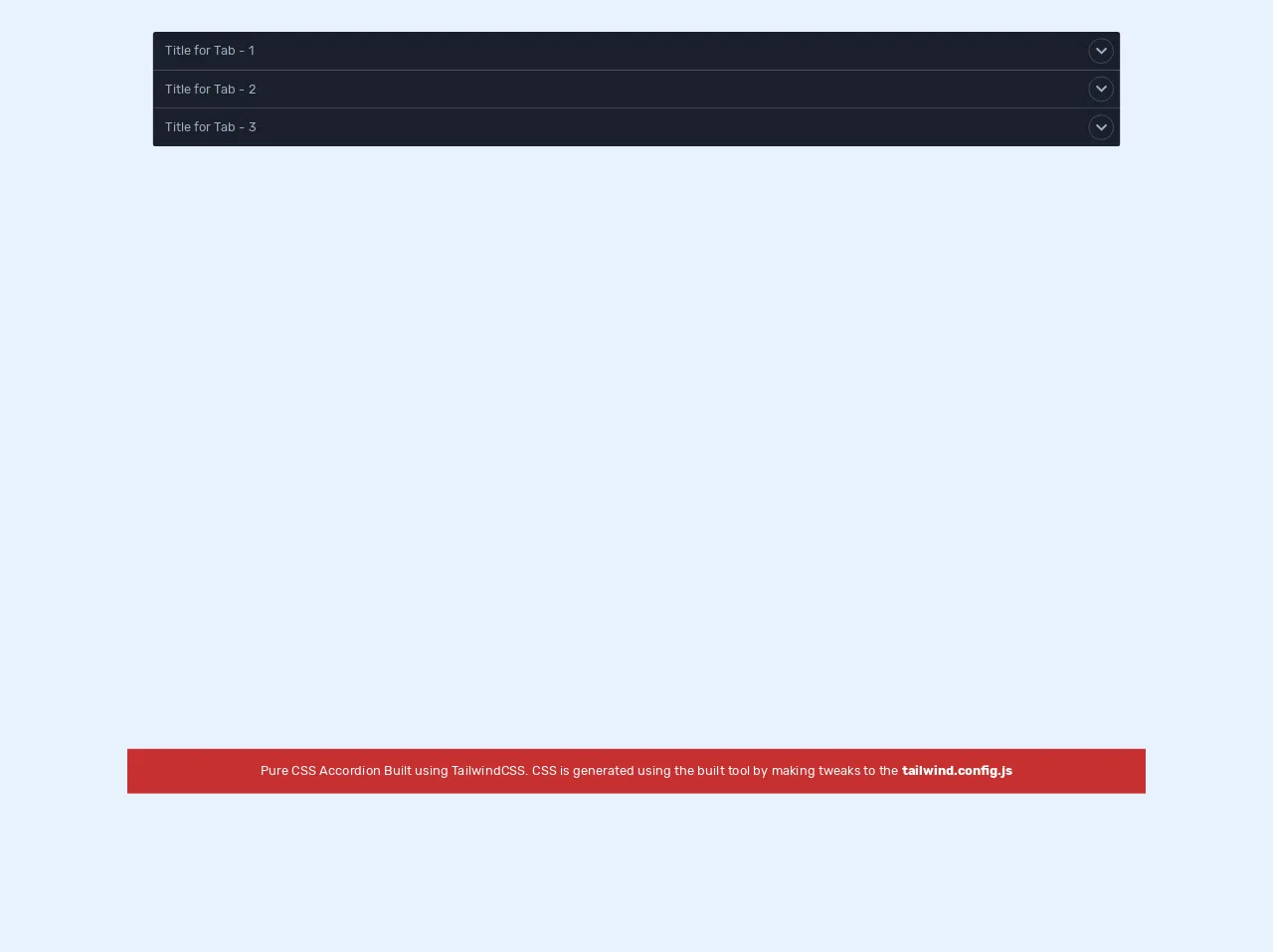
The preview of Pure CSS Accordion ui component.
In this tutorial, we will create a pure CSS accordion UI component using Tailwind CSS. The accordion will have multiple sections, each with a header and content. When you click on a header, the associated content will be revealed, and all other content will be hidden.
Free download of the Pure CSS Accordion's source code
The source code of Pure CSS Accordion ui component.
In this section, we will provide the source code for the pure CSS accordion UI component. We will use HTML and Tailwind CSS to create the accordion. The code is straightforward and easy to understand, making it easy to customize and adapt to your needs.
<!DOCTYPE html>
<html lang="en">
  <head>
    <meta charset="UTF-8" />
    <meta name="viewport" content="width=device-width, initial-scale=1.0" />
    <title>Tailwind Setup</title>
    <link
      rel="stylesheet"
      href="https://cdnjs.cloudflare.com/ajax/libs/font-awesome/5.14.0/css/all.min.css"
    />
    <style type="text/css">
      @import url("https://fonts.googleapis.com/css2?family=Rubik:wght@400;500;700;900&display=swap");
body {
  font-family: "Rubik", sans-serif;
}

// -------------------------------- code generated using the build tool ---------------------------

/*! normalize.css v8.0.1 | MIT License | github.com/necolas/normalize.css */
html {
  line-height: 1.15;
  -webkit-text-size-adjust: 100%;
}
body {
  margin: 0;
}
main {
  display: block;
}
h1 {
  font-size: 2em;
  margin: 0.67em 0;
}
hr {
  box-sizing: content-box;
  height: 0;
  overflow: visible;
}
pre {
  font-family: monospace, monospace;
  font-size: 1em;
}
a {
  background-color: transparent;
}
abbr[title] {
  border-bottom: none;
  text-decoration: underline;
  -webkit-text-decoration: underline dotted;
  text-decoration: underline dotted;
}
b,
strong {
  font-weight: bolder;
}
code,
kbd,
samp {
  font-family: monospace, monospace;
  font-size: 1em;
}
small {
  font-size: 80%;
}
sub,
sup {
  font-size: 75%;
  line-height: 0;
  position: relative;
  vertical-align: baseline;
}
sub {
  bottom: -0.25em;
}
sup {
  top: -0.5em;
}
img {
  border-style: none;
}
button,
input,
optgroup,
select,
textarea {
  font-family: inherit;
  font-size: 100%;
  line-height: 1.15;
  margin: 0;
}
button,
input {
  overflow: visible;
}
button,
select {
  text-transform: none;
}
[type="button"],
[type="reset"],
[type="submit"],
button {
  -webkit-appearance: button;
}
[type="button"]::-moz-focus-inner,
[type="reset"]::-moz-focus-inner,
[type="submit"]::-moz-focus-inner,
button::-moz-focus-inner {
  border-style: none;
  padding: 0;
}
[type="button"]:-moz-focusring,
[type="reset"]:-moz-focusring,
[type="submit"]:-moz-focusring,
button:-moz-focusring {
  outline: 1px dotted ButtonText;
}
fieldset {
  padding: 0.35em 0.75em 0.625em;
}
legend {
  box-sizing: border-box;
  color: inherit;
  display: table;
  max-width: 100%;
  padding: 0;
  white-space: normal;
}
progress {
  vertical-align: baseline;
}
textarea {
  overflow: auto;
}
[type="checkbox"],
[type="radio"] {
  box-sizing: border-box;
  padding: 0;
}
[type="number"]::-webkit-inner-spin-button,
[type="number"]::-webkit-outer-spin-button {
  height: auto;
}
[type="search"] {
  -webkit-appearance: textfield;
  outline-offset: -2px;
}
[type="search"]::-webkit-search-decoration {
  -webkit-appearance: none;
}
::-webkit-file-upload-button {
  -webkit-appearance: button;
  font: inherit;
}
details {
  display: block;
}
summary {
  display: list-item;
}
[hidden],
template {
  display: none;
}
blockquote,
dd,
dl,
figure,
h1,
h2,
h3,
h4,
h5,
h6,
hr,
p,
pre {
  margin: 0;
}
button {
  background-color: transparent;
  background-image: none;
}
button:focus {
  outline: 1px dotted;
  outline: 5px auto -webkit-focus-ring-color;
}
fieldset,
ol,
ul {
  margin: 0;
  padding: 0;
}
ol,
ul {
  list-style: none;
}
html {
  font-family: system-ui, -apple-system, BlinkMacSystemFont, Segoe UI, Roboto,
    Helvetica Neue, Arial, Noto Sans, sans-serif, Apple Color Emoji,
    Segoe UI Emoji, Segoe UI Symbol, Noto Color Emoji;
  line-height: 1.5;
}
*,
:after,
:before {
  box-sizing: border-box;
  border: 0 solid #e2e8f0;
}
hr {
  border-top-width: 1px;
}
img {
  border-style: solid;
}
textarea {
  resize: vertical;
}
input::-moz-placeholder,
textarea::-moz-placeholder {
  color: #a0aec0;
}
input:-ms-input-placeholder,
textarea:-ms-input-placeholder {
  color: #a0aec0;
}
input::-ms-input-placeholder,
textarea::-ms-input-placeholder {
  color: #a0aec0;
}
input::placeholder,
textarea::placeholder {
  color: #a0aec0;
}
[role="button"],
button {
  cursor: pointer;
}
table {
  border-collapse: collapse;
}
h1,
h2,
h3,
h4,
h5,
h6 {
  font-size: inherit;
  font-weight: inherit;
}
a {
  color: inherit;
  text-decoration: inherit;
}
button,
input,
optgroup,
select,
textarea {
  padding: 0;
  line-height: inherit;
  color: inherit;
}
code,
kbd,
pre,
samp {
  font-family: Menlo, Monaco, Consolas, Liberation Mono, Courier New, monospace;
}
audio,
canvas,
embed,
iframe,
img,
object,
svg,
video {
  display: block;
  vertical-align: middle;
}
img,
video {
  max-width: 100%;
  height: auto;
}
.container {
  width: 100%;
}
@media (min-width: 640px) {
  .container {
    max-width: 640px;
  }
}
@media (min-width: 768px) {
  .container {
    max-width: 768px;
  }
}
@media (min-width: 1024px) {
  .container {
    max-width: 1024px;
  }
}
@media (min-width: 1280px) {
  .container {
    max-width: 1280px;
  }
}
.bg-gray-100 {
  --bg-opacity: 1;
  background-color: #f7fafc;
  background-color: rgba(247, 250, 252, var(--bg-opacity));
}
.bg-gray-800 {
  --bg-opacity: 1;
  background-color: #2d3748;
  background-color: rgba(45, 55, 72, var(--bg-opacity));
}
.bg-gray-900 {
  --bg-opacity: 1;
  background-color: #1a202c;
  background-color: rgba(26, 32, 44, var(--bg-opacity));
}
.bg-red-700 {
  --bg-opacity: 1;
  background-color: #c53030;
  background-color: rgba(197, 48, 48, var(--bg-opacity));
}
.border-gray-700 {
  --border-opacity: 1;
  border-color: #4a5568;
  border-color: rgba(74, 85, 104, var(--border-opacity));
}
.rounded {
  border-radius: 0.25rem;
}
.rounded-full {
  border-radius: 9999px;
}
.border {
  border-width: 1px;
}
.cursor-pointer {
  cursor: pointer;
}
.flex {
  display: flex;
}
.inline-flex {
  display: inline-flex;
}
.items-center {
  align-items: center;
}
.justify-center {
  justify-content: center;
}
.justify-between {
  justify-content: space-between;
}
.h-8 {
  height: 2rem;
}
.m-8 {
  margin: 2rem;
}
.mx-auto {
  margin-left: auto;
  margin-right: auto;
}
.mt-2 {
  margin-top: 0.5rem;
}
.mr-2 {
  margin-right: 0.5rem;
}
.mb-auto {
  margin-bottom: auto;
}
.ml-auto {
  margin-left: auto;
}
.max-h-0 {
  max-height: 0;
}
.group:focus .group-focus\:max-h-screen {
  max-height: 100vh;
}
.outline-none {
  outline: 0;
}
.overflow-hidden {
  overflow: hidden;
}
.p-2 {
  padding: 0.5rem;
}
.py-3 {
  padding-top: 0.75rem;
  padding-bottom: 0.75rem;
}
.py-4 {
  padding-top: 1rem;
  padding-bottom: 1rem;
}
.px-4 {
  padding-left: 1rem;
  padding-right: 1rem;
}
.pr-10 {
  padding-right: 2.5rem;
}
.fixed {
  position: fixed;
}
.absolute {
  position: absolute;
}
.relative {
  position: relative;
}
.top-0 {
  top: 0;
}
.right-0 {
  right: 0;
}
.bottom-0 {
  bottom: 0;
}
.text-center {
  text-align: center;
}
.text-justify {
  text-align: justify;
}
.text-white {
  --text-opacity: 1;
  color: #fff;
  color: rgba(255, 255, 255, var(--text-opacity));
}
.text-gray-400 {
  --text-opacity: 1;
  color: #cbd5e0;
  color: rgba(203, 213, 224, var(--text-opacity));
}
.text-gray-500 {
  --text-opacity: 1;
  color: #a0aec0;
  color: rgba(160, 174, 192, var(--text-opacity));
}
.group:focus .group-focus\:text-white {
  --text-opacity: 1;
  color: #fff;
  color: rgba(255, 255, 255, var(--text-opacity));
}
.w-8 {
  width: 2rem;
}
.w-full {
  width: 100%;
}
.transform {
  --transform-translate-x: 0;
  --transform-translate-y: 0;
  --transform-rotate: 0;
  --transform-skew-x: 0;
  --transform-skew-y: 0;
  --transform-scale-x: 1;
  --transform-scale-y: 1;
  transform: translateX(var(--transform-translate-x))
    translateY(var(--transform-translate-y)) rotate(var(--transform-rotate))
    skewX(var(--transform-skew-x)) skewY(var(--transform-skew-y))
    scaleX(var(--transform-scale-x)) scaleY(var(--transform-scale-y));
}
.group:focus .group-focus\:-rotate-180 {
  --transform-rotate: -180deg;
}
.transition {
  transition-property: background-color, border-color, color, fill, stroke,
    opacity, box-shadow, transform;
}
.duration-500 {
  transition-duration: 0.5s;
}
@media (min-width: 640px) {
  .sm\:container {
    width: 100%;
    max-width: 640px;
  }
  @media (min-width: 768px) {
    .sm\:container {
      max-width: 768px;
    }
  }
  @media (min-width: 1024px) {
    .sm\:container {
      max-width: 1024px;
    }
  }
  @media (min-width: 1280px) {
    .sm\:container {
      max-width: 1280px;
    }
  }
}
@media (min-width: 768px) {
  .md\:container {
    width: 100%;
  }
  @media (min-width: 640px) {
    .md\:container {
      max-width: 640px;
    }
  }
  @media (min-width: 768px) {
    .md\:container {
      max-width: 768px;
    }
  }
  @media (min-width: 1024px) {
    .md\:container {
      max-width: 1024px;
    }
  }
  @media (min-width: 1280px) {
    .md\:container {
      max-width: 1280px;
    }
  }
}
@media (min-width: 1024px) {
  .lg\:container {
    width: 100%;
  }
  @media (min-width: 640px) {
    .lg\:container {
      max-width: 640px;
    }
  }
  @media (min-width: 768px) {
    .lg\:container {
      max-width: 768px;
    }
  }
  @media (min-width: 1024px) {
    .lg\:container {
      max-width: 1024px;
    }
  }
  @media (min-width: 1280px) {
    .lg\:container {
      max-width: 1280px;
    }
  }
}
@media (min-width: 1280px) {
  .xl\:container {
    width: 100%;
  }
  @media (min-width: 640px) {
    .xl\:container {
      max-width: 640px;
    }
  }
  @media (min-width: 768px) {
    .xl\:container {
      max-width: 768px;
    }
  }
  @media (min-width: 1024px) {
    .xl\:container {
      max-width: 1024px;
    }
  }
  @media (min-width: 1280px) {
    .xl\:container {
      max-width: 1280px;
    }
  }
}

    </style>
  </head>
  <body class="bg-gray-100">
    <div class="container mx-auto">
      <div class="m-8 rounded overflow-hidden">
        <!-- accordion-tab  -->
        <div class="group outline-none accordion-section" tabindex="1">
          <div
            class="group bg-gray-900 flex justify-between px-4 py-3 items-center text-gray-500 transition ease duration-500 cursor-pointer pr-10 relative"
          >
            <div class="group-focus:text-white transition ease duration-500">
              Title for Tab - 1
            </div>
            <div
              class="h-8 w-8 border border-gray-700 rounded-full items-center inline-flex justify-center transform transition ease duration-500 group-focus:text-white group-focus:-rotate-180 absolute top-0 right-0 mb-auto ml-auto mt-2 mr-2"
            >
              <i class="fas fa-chevron-down"></i>
            </div>
          </div>
          <div
            class="group-focus:max-h-screen max-h-0 bg-gray-800 px-4 overflow-hidden ease duration-500"
          >
            <p class="p-2 text-gray-400 text-justify">
              Lorem ipsum dolor sit amet consectetur adipisicing elit. Fugiat,
              repellat amet doloribus consequuntur eos similique provident
              tempora voluptates iure quia fuga dicta voluptatibus culpa
              mollitia recusandae delectus id suscipit labore?
            </p>
          </div>
        </div>
        <!-- accordion-tab -->
        <!-- accordion-tab  -->
        <div class="group outline-none accordion-section" tabindex="2">
          <div
            class="group bg-gray-900 flex justify-between px-4 py-3 items-center text-gray-500 transition ease duration-500 cursor-pointer pr-10 relative"
          >
            <div class="group-focus:text-white transition ease duration-500">
              Title for Tab - 2
            </div>
            <div
              class="h-8 w-8 border border-gray-700 rounded-full items-center inline-flex justify-center transform transition ease duration-500 group-focus:text-white group-focus:-rotate-180 absolute top-0 right-0 mb-auto ml-auto mt-2 mr-2"
            >
              <i class="fas fa-chevron-down"></i>
            </div>
          </div>
          <div
            class="group-focus:max-h-screen max-h-0 bg-gray-800 px-4 overflow-hidden ease duration-500"
          >
            <p class="p-2 text-gray-400 text-justify">
              Lorem ipsum dolor sit amet consectetur adipisicing elit. Fugiat,
              repellat amet doloribus consequuntur eos similique provident
              tempora voluptates iure quia fuga dicta voluptatibus culpa
              mollitia recusandae delectus id suscipit labore?
            </p>
          </div>
        </div>
        <!-- accordion-tab -->
        <!-- accordion-tab  -->
        <div class="group outline-none accordion-section" tabindex="3">
          <div
            class="group bg-gray-900 flex justify-between px-4 py-3 items-center text-gray-500 transition ease duration-500 cursor-pointer pr-10 relative"
          >
            <div class="group-focus:text-white transition ease duration-500">
              Title for Tab - 3
            </div>
            <div
              class="h-8 w-8 border border-gray-700 rounded-full items-center inline-flex justify-center transform transition ease duration-500 group-focus:text-white group-focus:-rotate-180 absolute top-0 right-0 mb-auto ml-auto mt-2 mr-2"
            >
              <i class="fas fa-chevron-down"></i>
            </div>
          </div>
          <div
            class="group-focus:max-h-screen max-h-0 bg-gray-800 px-4 overflow-hidden ease duration-500"
          >
            <p class="p-2 text-gray-400 text-justify">
              Lorem ipsum dolor sit amet consectetur adipisicing elit. Fugiat,
              repellat amet doloribus consequuntur eos similique provident
              tempora voluptates iure quia fuga dicta voluptatibus culpa
              mollitia recusandae delectus id suscipit labore?
            </p>
          </div>
        </div>
        <!-- accordion-tab -->
      </div>
    </div>

    <!-- message -->
    <div class="w-full fixed bottom-0 text-center bg-red-700 py-4 text-white">
      Pure CSS Accordion Built using TailwindCSS. CSS is generated using the
      built tool by making tweaks to the <strong>tailwind.config.js</strong>
    </div>
    <!-- message -->

  </body>
</html>
How to create a Pure CSS Accordion with Tailwind CSS?
Now that we have an overview of what we are going to create let's get started with the tutorial. We will create a pure CSS accordion UI component using Tailwind CSS in six easy steps.
Step 1: Set up the HTML structure
The first step is to create the HTML structure for the accordion. We will use a list to create the different sections of the accordion. Each section will have a header and content. Here is the HTML code for the accordion:
<div class="accordion">
  <ul>
    <li>
      <button class="accordion-header">Section 1</button>
      <div class="accordion-content">
        <p>Content for section 1 goes here.</p>
      </div>
    </li>
    <li>
      <button class="accordion-header">Section 2</button>
      <div class="accordion-content">
        <p>Content for section 2 goes here.</p>
      </div>
    </li>
    <li>
      <button class="accordion-header">Section 3</button>
      <div class="accordion-content">
        <p>Content for section 3 goes here.</p>
      </div>
    </li>
  </ul>
</div>
Step 2: Style the headers
The next step is to style the headers of the accordion. We will use Tailwind CSS to create a button that will serve as the header for each section. We will also add some padding and margin to make the accordion look more visually appealing.
.accordion-header {
  background-color: #f5f5f5;
  border: none;
  border-bottom: 1px solid #ddd;
  color: #333;
  cursor: pointer;
  font-size: 16px;
  font-weight: 600;
  padding: 10px 20px;
  text-align: left;
  transition: background-color 0.3s ease;
}

.accordion-header:hover {
  background-color: #ddd;
}

.accordion-header:focus {
  outline: none;
}
Step 3: Style the content
The next step is to style the content of the accordion. We will use Tailwind CSS to create a div that will contain the content for each section. We will also add some padding and margin to make the accordion look more visually appealing.
.accordion-content {
  background-color: #fff;
  border: 1px solid #ddd;
  border-top: none;
  padding: 20px;
  margin-bottom: 10px;
  transition: max-height 0.3s ease;
  max-height: 0;
  overflow: hidden;
}

.accordion li:last-child .accordion-content {
  margin-bottom: 0;
}
Step 4: Add the transition effect
The next step is to add the transition effect to the accordion. We will use Tailwind CSS to create a transition effect that will animate the opening and closing of the accordion.
.accordion li.open .accordion-content {
  max-height: 500px;
}
Step 5: Add the JavaScript
The next step is to add the JavaScript to the accordion. We will use JavaScript to toggle the open and close state of the accordion when the user clicks on a header.
const accordionHeaders = document.querySelectorAll('.accordion-header');

accordionHeaders.forEach(header => {
  header.addEventListener('click', () => {
    const accordionContent = header.nextElementSibling;
    const accordionItem = header.parentNode;

    accordionItem.classList.toggle('open');

    if (accordionItem.classList.contains('open')) {
      accordionContent.style.maxHeight = accordionContent.scrollHeight + 'px';
    } else {
      accordionContent.style.maxHeight = 0;
    }
  });
});
Step 6: Add Tailwind CSS to your project
The final step is to add Tailwind CSS to your project. You can either download the CSS file and link to it in your HTML, or you can install it using a package manager like npm or Yarn.
<link href="https://cdn.jsdelivr.net/npm/tailwindcss@latest/dist/tailwind.min.css" rel="stylesheet">
Conclusion
In this tutorial, we learned how to create a pure CSS accordion UI component using Tailwind CSS. We covered the HTML structure, the styles for the headers and content, the transition effect, and the JavaScript to toggle the open and close state of the accordion. With Tailwind CSS, you can create beautiful and responsive designs in a fraction of the time it would take with traditional CSS.