- Published on
Best Ways To Create A Progress Slider Component With Tailwind CSS
- What is Tailwind CSS?
- The description of Progress Slider Component UI component
- Why use Tailwind CSS to create a Progress Slider Component UI component?
- The preview of Progress Slider Component UI component
- The source code of Progress Slider Component UI component
- How to create a Progress Slider Component with Tailwind CSS?
- Step 1: Create the HTML structure
- Step 2: Style the component using Tailwind CSS
- Step 3: Add JavaScript code to handle the interaction with the slider control
- Conclusion
As a FrontEnd technology blogger, I am always on the lookout for the best ways to create UI components that are both functional and visually appealing. One such component is the Progress Slider, which is commonly used in web applications to display progress or completion of a task. In this article, I will show you how to create a Progress Slider Component using Tailwind CSS.
What is Tailwind CSS?
Tailwind CSS is a utility-first CSS framework that provides a set of pre-defined CSS classes that can be used to style HTML elements. It is designed to be highly customizable and allows developers to create complex UI components with minimal effort. Tailwind CSS is gaining popularity among developers due to its ease of use and flexibility.
The description of Progress Slider Component UI component
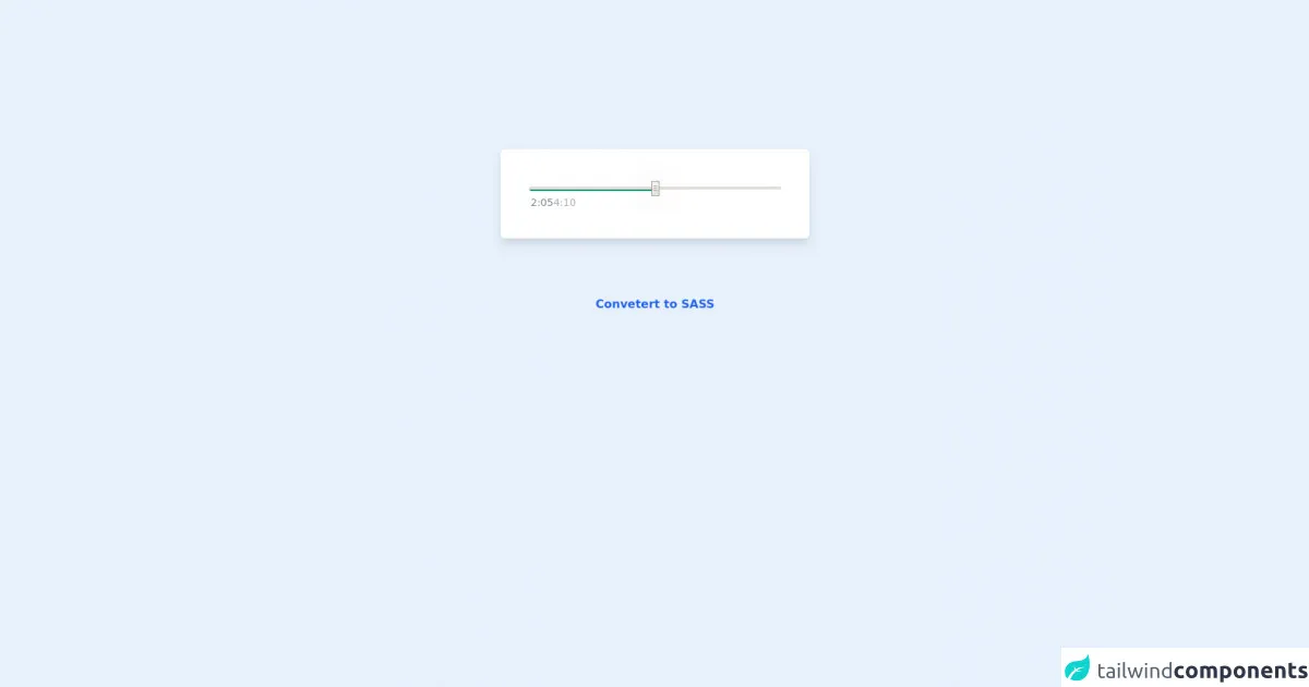
A Progress Slider Component is a UI component that displays progress or completion of a task. It typically consists of a slider control and a progress bar that shows the percentage of completion. The user can interact with the slider control to adjust the progress of the task.
Why use Tailwind CSS to create a Progress Slider Component UI component?
Tailwind CSS provides a set of pre-defined CSS classes that can be used to style the Progress Slider Component. This makes it easy to create a visually appealing component without writing any custom CSS. Additionally, Tailwind CSS is highly customizable, which means that developers can easily modify the component to meet their specific requirements.
The preview of Progress Slider Component UI component
To create a Progress Slider Component with Tailwind CSS, we will use a combination of HTML, CSS, and JavaScript. The HTML code will define the structure of the component, while the CSS code will style the component. The JavaScript code will handle the interaction with the slider control.
Free download of the Progress Slider Component's source code
The source code of Progress Slider Component UI component
The source code for the Progress Slider Component can be found below. This code defines the structure of the component, styles it using Tailwind CSS classes, and adds JavaScript code to handle the interaction with the slider control.
<!-- AlpineJS -->
<script src="https://cdnjs.cloudflare.com/ajax/libs/alpinejs/3.8.1/cdn.min.js" defer></script>

<style>
        /* Slider */

        .x-slider * {
            width: 350px !important;
        }

        .x-slider input::-webkit-slider-thumb {
            width: 20px;
            height: 20px;
            border-radius: 50%;
            background-color: #636363;
            border: 5px solid #24c55d;
            box-shadow: 0px 0px 40px -4px rgba(0, 0, 0, 0.76);
            transition: all 0.1s ease-in-out;
            outline: none;
            appearance: none;
        }

        .x-slider input::-webkit-slider-thumb:hover {
            border-color: #1bb350;
        }
</style>

<!-- Story Bar Container -->
<div class="flex flex-col items-center justify-center mt-52">
    <!-- App -->
    <div class="bg-white p-10 rounded-md shadow-lg" x-cloak x-data="appData()" x-init="appInit()">
        <!-- Player -->
        <div class="relative">
            <!-- Player Slider Container -->
            <div class="x-slider flex relative my-3">
                <!-- Player Slider -->
                <div class="x-slider inline justify-center rounded-md">
                    <!-- Range Input -->
                    <input class="absolute bg-transparent rounded-md
                        z-10 h-1 w-80 outline-0 appearance-none" type="range"
                        step="1" min='0' max="100" value="0"
                        x-model="sliderValue"
                        x-on:change.debounce="sliderProgressTime = sliderProgressToTime(sliderValue, songLength)">

                    <!-- Slider Placeholder -->
                    <div class="absolute z-0 w-80 h-0.5 mt-0.5 rounded-md bg-gray-500/70"></div>

                    <!-- Progress -->
                    <div class="absolute z-0 w-80 h-1.5 rounded-md bg-green-600
                        bg-gradient-to-r from-emerald-700 to-green-500"
                        x-bind:style="'width: ' + (sliderValue * 3.5) + 'px !important; '"></div>
                    <!-- x-slider is width 350px -->
                </div>
            </div>

            <!-- Duration Container -->
            <div class="flex flex-row flex-grow justify-start px-0.5">
                <!-- Current Time -->
                <div class="text-gray-500/90 text-sm select-none" x-text="sliderProgressTime"></div>

                <!-- Grow Space -->
                <div class="grow"></div>

                <!-- Total Time -->
                <div class="text-gray-400/90 text-sm select-none pr-1" x-text="secondsToDuration(songLength)"></div>
            </div>
        </div>
    </div>

    <!-- Notes -->
    <span class="text-center font-bold my-20">
        <a href="https://egoistdeveloper.github.io/twcss-to-sass-playground/" target="_blank" class="text-blue-600">
            Convetert to SASS
        </a>
    </span>
</div>

<script>
    function appData() {
        return {
            sliderValue: 50,
            songLength: 250,
            sliderProgressTime: '00:00',

            appInit() {
                this.sliderProgressTime = this.sliderProgressToTime(this.sliderValue, this.songLength);
            },

            /*
            * Convert slider value to time
            */
            secondsToDuration(seconds) {
                var minutes = Math.floor(seconds / 60).toFixed(0),
                    seconds = Math.floor(seconds % 60).toFixed(0);

                return minutes + ":" + (seconds < 10 ? "0" : "") + seconds;
            },

            /*
            * Slider progress value to time
            */
            sliderProgressToTime(sliderValue, songLength) {
                return this.secondsToDuration((songLength / 100) * sliderValue);
            }
        }
    }
</script>
How to create a Progress Slider Component with Tailwind CSS?
To create a Progress Slider Component with Tailwind CSS, follow the steps below:
Step 1: Create the HTML structure
The first step is to create the HTML structure of the Progress Slider Component. This can be done using the following code:
<div class="w-full h-12 bg-gray-300 rounded-full">
  <div class="h-full bg-blue-500 rounded-full"></div>
  <input type="range" min="0" max="100" value="50" class="absolute w-full h-full opacity-0 cursor-pointer">
</div>
This code creates a container element with a gray background and a rounded shape. Inside the container, we create a progress bar element with a blue background and a rounded shape. We also add an input element of type range to create the slider control.
Step 2: Style the component using Tailwind CSS
Next, we need to style the component using Tailwind CSS classes. We can do this by adding the following classes to the HTML elements:
<div class="w-full h-12 bg-gray-300 rounded-full">
  <div class="h-full bg-blue-500 rounded-full" style="width: 50%"></div>
  <input type="range" min="0" max="100" value="50" class="absolute w-full h-full opacity-0 cursor-pointer">
</div>
In this code, we add the w-full, h-12, bg-gray-300, and rounded-full classes to the container element. We also add the h-full, bg-blue-500, and rounded-full classes to the progress bar element. Finally, we add the absolute, w-full, h-full, opacity-0, and cursor-pointer classes to the slider control.
Step 3: Add JavaScript code to handle the interaction with the slider control
The final step is to add JavaScript code to handle the interaction with the slider control. We can do this by adding the following code:
const slider = document.querySelector('input[type="range"]');
const progress = document.querySelector('.bg-blue-500');

slider.addEventListener('input', (event) => {
  const value = event.target.value;
  progress.style.width = `${value}%`;
});
In this code, we first select the slider control and the progress bar element using the querySelector method. We then add an event listener to the slider control that listens for changes to its value. When the value changes, we update the width of the progress bar element to reflect the new value.
Conclusion
In this article, we have learned how to create a Progress Slider Component using Tailwind CSS. We have seen that Tailwind CSS provides a set of pre-defined CSS classes that can be used to style the component, making it easy to create a visually appealing component without writing any custom CSS. Additionally, we have seen that Tailwind CSS is highly customizable, which means that developers can easily modify the component to meet their specific requirements.