- Published on
3 Things You Must Know To Make A Progress Bar With Tailwind CSS
- What is Tailwind CSS?
- The description of progress bar ui component
- Why use Tailwind CSS to create a progress bar ui component?
- The preview of progress bar ui component
- The source code of progress bar ui component
- How to create a progress bar with Tailwind CSS?
- Step 1: Create the HTML markup
- Step 2: Set the width of the progress bar
- Step 3: Set the progress value
- Conclusion
What is Tailwind CSS?
Tailwind CSS is a utility-first CSS framework that provides a set of pre-defined CSS classes to create user interfaces. It is a popular choice among developers because it allows them to create custom designs without writing CSS from scratch.
The description of progress bar ui component
A progress bar is a graphical user interface element that displays the progress of a task. It is commonly used in web applications to show the status of a file upload, download, or any other task that takes time to complete.
Why use Tailwind CSS to create a progress bar ui component?
Tailwind CSS provides a set of pre-defined CSS classes that can be used to create a progress bar ui component without writing CSS from scratch. This saves time and effort for developers who want to create custom designs.
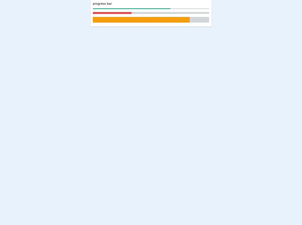
The preview of progress bar ui component
To create a progress bar ui component with Tailwind CSS, we need to use the progress class. This class provides a container for the progress bar and the progress-bar class provides the actual progress bar.
Free download of the progress bar's source code
The source code of progress bar ui component
To create a progress bar ui component with Tailwind CSS, we need to use the progress class. This class provides a container for the progress bar and the progress-bar class provides the actual progress bar.
<!-- This is an example component -->
<div>
    <div class="flex flex-col bg-white shadow-md w-1/2 mx-auto px-3 py-2">
        <div>
            progress bar
        </div>
        <div class="py-3">
            <div class='bg-gray-300 w-full mb-4' style="height: 4px">
                <div class='bg-green-500 w-4/6 h-full'></div>
            </div>

            <div class='bg-gray-300 w-full mb-4' style="height: 10px">
                <div class='bg-red-500 w-2/6 h-full'></div>
            </div>

            <div class='bg-gray-300 w-full' style="height: 30px">
                <div class='bg-yellow-500 w-5/6 h-full'></div>
            </div>
        </div>
    </div>
</div>
How to create a progress bar with Tailwind CSS?
To create a progress bar with Tailwind CSS, we need to follow these three steps:
Step 1: Create the HTML markup
The first step is to create the HTML markup for the progress bar. We need to create a div element with the progress class and another div element with the progress-bar class. The progress-bar class also requires the bg-blue-500 class to set the color of the progress bar.
<div class="progress">
  <div class="progress-bar bg-blue-500"></div>
</div>
Step 2: Set the width of the progress bar
The second step is to set the width of the progress bar. We can do this by adding the w-1/2 class to the progress-bar element. This will set the width of the progress bar to 50%.
<div class="progress">
  <div class="progress-bar bg-blue-500 w-1/2"></div>
</div>
Step 3: Set the progress value
The final step is to set the progress value. We can do this by adding the style attribute to the progress-bar element and setting the width property to the desired percentage value.
<div class="progress">
  <div class="progress-bar bg-blue-500 w-1/2" style="width: 75%"></div>
</div>
Conclusion
In conclusion, creating a progress bar ui component with Tailwind CSS is easy and efficient. By using pre-defined CSS classes, developers can save time and effort in creating custom designs. With these three steps, anyone can create a progress bar ui component with Tailwind CSS.