- Published on
The Ultimate Guide To Help You Make A Progress Bar With Tailwind CSS
- What is Tailwind CSS?
- The description of Progress Bar ui component
- Why use Tailwind CSS to create a Progress Bar ui component?
- The preview of Progress Bar ui component.
- The source code of Progress Bar ui component.
- How to create a Progress Bar with Tailwind CSS?
- Step 1: Set up your HTML
- Step 2: Set up your JavaScript
- Step 3: Customize your progress bar
- Conclusion
Are you looking for a way to create a progress bar for your website or application? Look no further than Tailwind CSS! In this guide, we'll walk you through everything you need to know to create a sleek and functional progress bar using Tailwind CSS.
What is Tailwind CSS?
Tailwind CSS is a utility-first CSS framework that allows you to quickly and easily style your website or application using pre-defined classes. It's designed to be highly customizable and flexible, making it a popular choice for developers who want to create unique and responsive designs.
The description of Progress Bar ui component
A progress bar is a visual indicator that shows the progress of a task or process. It's often used in web applications to give users feedback on how long a task will take to complete, or to show how much of a process has been completed.
Why use Tailwind CSS to create a Progress Bar ui component?
Tailwind CSS makes it easy to create a progress bar that's both functional and visually appealing. With pre-defined classes for colors, widths, and animations, you can create a progress bar that matches your website or application's design in just a few lines of code.
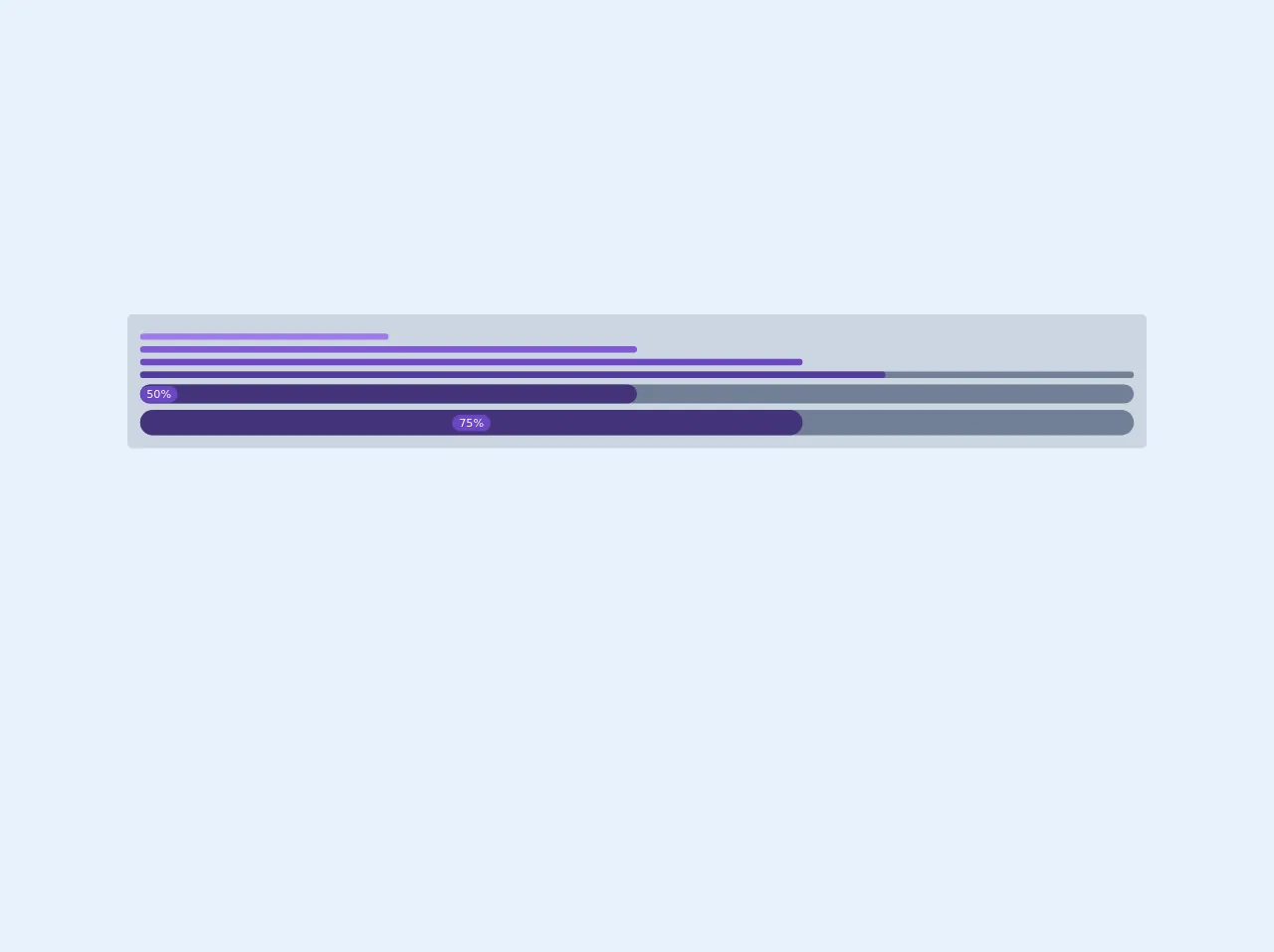
The preview of Progress Bar ui component.
To give you an idea of what a progress bar created with Tailwind CSS looks like, here's a preview:
Free download of the Progress Bar's source code
The source code of Progress Bar ui component.
If you're interested in seeing the code used to create the progress bar previewed above, here's an example:
<div class="w-screen bg-gray-400 p-4 rounded-md">
  <div class="w-3/12 mt-2 bg-purple-500 py-1 rounded-full"></div>
  <div class="w-6/12 mt-2 bg-purple-600 py-1 rounded-full"></div>
  <div class="w-8/12 mt-2 bg-purple-700 py-1 rounded-full"></div>

  <div class="mt-2 bg-gray-600 rounded-full">
    <div class="w-9/12 mt-2 bg-purple-800 py-1 rounded-full"></div>
  </div>

  <div class="mt-2 bg-gray-600 rounded-full">
    <div class="w-6/12 mt-2 bg-purple-900 py-0 rounded-full"><div class=" text-white text-sm inline-block bg-purple-700 px-2 rounded-full">50%</div></div>
  </div>

  <div class="mt-2 bg-gray-600 rounded-full">
    <div class="w-8/12 mt-2 bg-purple-900 py-1 text-center rounded-full"><div class="text-white text-sm inline-block bg-purple-700 px-2 rounded-full">75%</div></div>
  </div>
</div>
How to create a Progress Bar with Tailwind CSS?
Now that you've seen what a progress bar created with Tailwind CSS looks like, let's walk through the steps to create one yourself.
Step 1: Set up your HTML
To create a progress bar, you'll first need to set up your HTML. Here's an example:
<div class="relative pt-1">
  <div class="overflow-hidden h-2 mb-4 text-xs flex rounded bg-gray-200">
    <div style="width:{{progress}}%" class="shadow-none flex flex-col text-center whitespace-nowrap text-white justify-center bg-green-500"></div>
  </div>
</div>
In this example, we're using a div element with the class relative to create a container for our progress bar. Inside that container, we have another div element with the classes overflow-hidden h-2 mb-4 text-xs flex rounded bg-gray-200. This element creates the background of our progress bar.
We've also added another div element inside the background element with the classes shadow-none flex flex-col text-center whitespace-nowrap text-white justify-center bg-green-500. This element creates the actual progress bar, and we'll use JavaScript to update its width based on the progress of our task or process.
Step 2: Set up your JavaScript
Next, you'll need to set up your JavaScript to update the width of your progress bar. Here's an example:
const progressBar = document.querySelector('.bg-green-500');
const progress = 50; // Update this value to reflect the progress of your task or process

progressBar.style.width = `${progress}%`;
In this example, we're using document.querySelector to select the progress bar element we created in Step 1. We're also setting a progress variable to 50, which represents the progress of our task or process. You'll need to update this value based on your specific use case.
Finally, we're using progressBar.style.width to update the width of our progress bar element based on the progress variable.
Step 3: Customize your progress bar
Once you have your basic progress bar set up, you can customize it using Tailwind CSS classes. Here are a few examples:
- To change the color of your progress bar, you can use the
bg-prefix followed by a color name or hex code. For example,bg-red-500would create a red progress bar. - To change the width of your progress bar, you can use the
w-prefix followed by a width value. For example,w-1/2would make your progress bar half as wide as its container. - To add animations to your progress bar, you can use the
animate-pulseoranimate-progressclasses.
Conclusion
Creating a progress bar with Tailwind CSS is a simple and effective way to give your website or application a professional look and feel. By following the steps outlined in this guide, you can create a progress bar that's both functional and visually appealing in just a few lines of code.