- Published on
Practical Guide: Make A Tailwind CSS Profile Card With Overlap Button With Tailwind CSS
- What is Tailwind CSS?
- The description of Tailwind CSS Profile Card with Overlap Button ui component
- Why use Tailwind CSS to create a Tailwind CSS Profile Card with Overlap Button ui component?
- The preview of Tailwind CSS Profile Card with Overlap Button ui component.
- The source code of Tailwind CSS Profile Card with Overlap Button ui component.
- How to create a Tailwind CSS Profile Card with Overlap Button with Tailwind CSS?
- Step 1: Set up the HTML structure
- Step 2: Add Tailwind CSS classes
- Step 3: Add custom styles
- Conclusion
What is Tailwind CSS?
Tailwind CSS is a utility-first CSS framework that provides a set of pre-defined classes to style HTML elements. It allows developers to quickly and easily create custom designs without having to write CSS from scratch. Tailwind CSS is highly customizable and can be used with any front-end framework or library.
The description of Tailwind CSS Profile Card with Overlap Button ui component
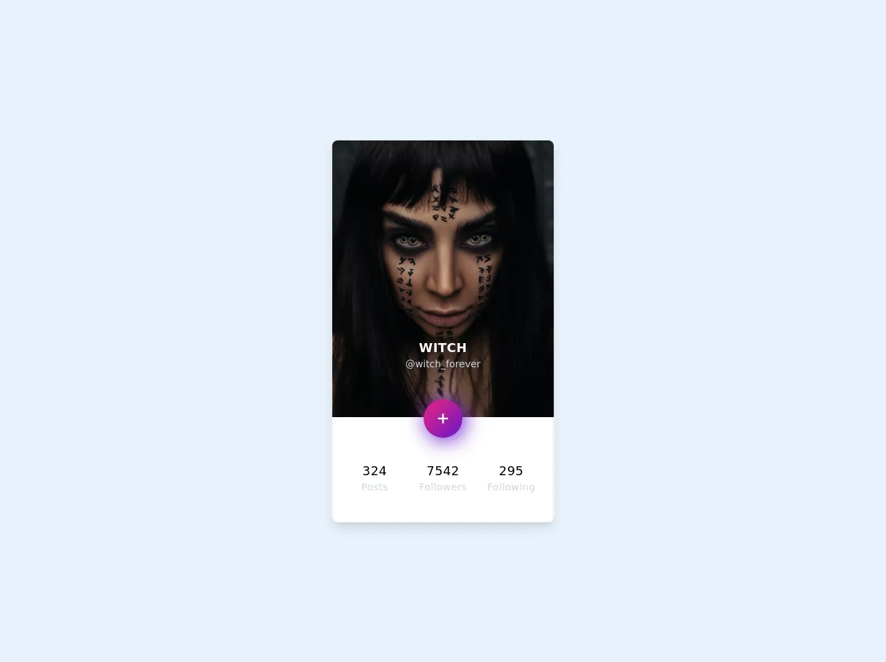
A profile card is a common UI component used on many websites and applications. It typically displays a user's profile picture, name, and other relevant information. The Tailwind CSS Profile Card with Overlap Button UI component is a modern and stylish version of the traditional profile card. It features an overlap button that allows users to perform actions related to the profile, such as following or messaging the user.
Why use Tailwind CSS to create a Tailwind CSS Profile Card with Overlap Button ui component?
Tailwind CSS provides a quick and easy way to create custom UI components without having to write CSS from scratch. It also allows developers to easily customize the design of the component using pre-defined classes. This makes it an ideal choice for creating a Tailwind CSS Profile Card with Overlap Button UI component.
The preview of Tailwind CSS Profile Card with Overlap Button ui component.
Free download of the Tailwind CSS Profile Card with Overlap Button's source code
The source code of Tailwind CSS Profile Card with Overlap Button ui component.
<div class="w-screen h-screen flex justify-center items-center">
      <style>
      button {
      background-color: #6617cb;
      background-image: linear-gradient(315deg, #6617cb 0%, #cb218e 74%);
      box-shadow: 0 0 0 0 #ec008c, 0.2rem 0.2rem 30px #6617cb;
      }
      button:hover {
      box-shadow: 0 0 0 0 #ec008c, 0.2rem 0.2rem 60px #6617cb;
      }
   </style>
   <div class="container mx-auto max-w-xs rounded-lg overflow-hidden shadow-lg my-2 bg-white">
      <div class="relative mb-6">
         <img class="w-full" src="https://unsplash.com/photos/PElJMFWV3kk/download?force=true&w=640"
            alt="Profile picture" />
         <div class="text-center absolute w-full" style="bottom: -30px">
            <div class="mb-10">
               <p class="text-white tracking-wide uppercase text-lg font-bold">Witch</p>
               <p class="text-gray-400 text-sm">@witch_forever</p>
            </div>
            <button class="p-4 rounded-full transition ease-in duration-200 focus:outline-none">
               <svg viewBox="0 0 20 20" enable-background="new 0 0 20 20" class="w-6 h-6">
                  <path fill="#FFFFFF" d="M16,10c0,0.553-0.048,1-0.601,1H11v4.399C11,15.951,10.553,16,10,16c-0.553,0-1-0.049-1-0.601V11H4.601
                     C4.049,11,4,10.553,4,10c0-0.553,0.049-1,0.601-1H9V4.601C9,4.048,9.447,4,10,4c0.553,0,1,0.048,1,0.601V9h4.399
                     C15.952,9,16,9.447,16,10z" />
               </svg>
            </button>
         </div>
      </div>
      <div class="py-10 px-6 text-center tracking-wide grid grid-cols-3 gap-6">
         <div class="posts">
            <p class="text-lg">324</p>
            <p class="text-gray-400 text-sm">Posts</p>
         </div>
         <div class="followers">
            <p class="text-lg">7542</p>
            <p class="text-gray-400 text-sm">Followers</p>
         </div>
         <div class="following">
            <p class="text-lg">295</p>
            <p class="text-gray-400 text-sm">Following</p>
         </div>
      </div>
   </div>
</div>
How to create a Tailwind CSS Profile Card with Overlap Button with Tailwind CSS?
To create a Tailwind CSS Profile Card with Overlap Button, follow these steps:
Step 1: Set up the HTML structure
The first step is to set up the HTML structure for the profile card. This can be done using standard HTML tags such as div, img, and p. Here's an example of what the HTML structure might look like:
<div class="profile-card">
  <img src="profile-picture.jpg" alt="Profile Picture" class="profile-picture">
  <p class="profile-name">John Doe</p>
  <p class="profile-description">Lorem ipsum dolor sit amet, consectetur adipiscing elit.</p>
  <button class="overlap-button">Follow</button>
</div>
Step 2: Add Tailwind CSS classes
Next, we need to add Tailwind CSS classes to style the profile card. We can use classes such as bg-gray-100, rounded-lg, and shadow-lg to create a modern and stylish design. Here's an example of what the Tailwind CSS classes might look like:
<div class="profile-card bg-gray-100 rounded-lg shadow-lg">
  <img src="profile-picture.jpg" alt="Profile Picture" class="profile-picture rounded-full">
  <p class="profile-name text-xl font-bold">John Doe</p>
  <p class="profile-description text-gray-500">Lorem ipsum dolor sit amet, consectetur adipiscing elit.</p>
  <button class="overlap-button bg-blue-500 text-white font-bold py-2 px-4 rounded-full absolute bottom-0 right-0 mr-4 mb-4">Follow</button>
</div>
Step 3: Add custom styles
Finally, we can add custom styles to further customize the design of the profile card. We can use classes such as absolute, bottom-0, right-0, mr-4, and mb-4 to position the overlap button in the bottom right corner of the card. Here's an example of what the custom styles might look like:
<div class="profile-card bg-gray-100 rounded-lg shadow-lg relative">
  <img src="profile-picture.jpg" alt="Profile Picture" class="profile-picture rounded-full">
  <p class="profile-name text-xl font-bold">John Doe</p>
  <p class="profile-description text-gray-500">Lorem ipsum dolor sit amet, consectetur adipiscing elit.</p>
  <button class="overlap-button bg-blue-500 text-white font-bold py-2 px-4 rounded-full absolute bottom-0 right-0 mr-4 mb-4">Follow</button>
</div>
Conclusion
In conclusion, the Tailwind CSS Profile Card with Overlap Button UI component is a modern and stylish version of the traditional profile card. It can be easily created using Tailwind CSS and customized to fit any design. By following the steps outlined in this article, you can create your own Tailwind CSS Profile Card with Overlap Button in no time!