- Published on
6 Easy Ways To Make A Tailwind CSS Profile Card Angled With Tailwind CSS
- What is Tailwind CSS?
- The description of Tailwind CSS Profile Card Angled ui component
- Why use Tailwind CSS to create a Tailwind CSS Profile Card Angled ui component?
- The preview of Tailwind CSS Profile Card Angled ui component
- The source code of Tailwind CSS Profile Card Angled ui component
- How to create a Tailwind CSS Profile Card Angled with Tailwind CSS?
- 1. Create a basic HTML structure
- 2. Add an angled design
- 3. Add a background color
- 4. Add an image
- 5. Add social icons
- 6. Add a hover effect
- Conclusion
What is Tailwind CSS?
Tailwind CSS is a utility-first CSS framework that helps developers to create responsive and customizable user interfaces. It provides a set of pre-defined CSS classes that can be used to style HTML elements without writing custom CSS code.
The description of Tailwind CSS Profile Card Angled ui component
Tailwind CSS Profile Card Angled is a UI component that can be used to display user profiles in a card format. It has an angled design that gives it a modern and stylish look. The component can be easily customized using Tailwind CSS classes.
Why use Tailwind CSS to create a Tailwind CSS Profile Card Angled ui component?
Tailwind CSS provides a set of pre-defined CSS classes that can be used to create complex UI components without writing custom CSS code. This saves time and effort and allows developers to focus on the functionality of the application rather than the UI design.
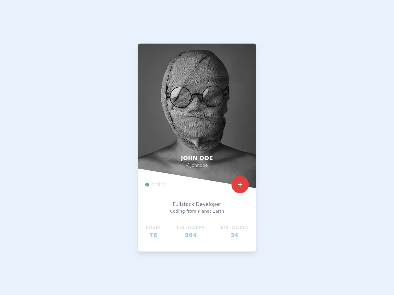
The preview of Tailwind CSS Profile Card Angled ui component
The Tailwind CSS Profile Card Angled UI component has an angled design that gives it a modern and stylish look. It can be easily customized using Tailwind CSS classes.
Free download of the Tailwind CSS Profile Card Angled's source code
The source code of Tailwind CSS Profile Card Angled ui component
The source code for the Tailwind CSS Profile Card Angled UI component can be easily created using Tailwind CSS classes.
<div class="w-screen h-screen flex justify-center items-center">
  <div class="container mx-auto max-w-sm rounded-lg overflow-hidden shadow-lg my-2 bg-white">
    <div class="relative z-10" style="clip-path: polygon(0 0, 100% 0, 100% 100%, 0 calc(100% - 5vw));">
      <img class="w-full" src="https://unsplash.com/photos/xNdldoBUECo/download?force=true&w=640"
           alt="Profile image" />
      <div class="text-center absolute w-full" style="bottom: 4rem">
        <p class="text-white tracking-wide uppercase text-lg font-bold">John Doe</p>
        <p class="text-gray-400 text-sm">@johndoe</p>
      </div>
    </div>
    <div class="relative flex justify-between items-center flex-row px-6 z-50 -mt-10">
      <p class="flex items-center text-gray-400"><span
                                                       class="inline-block w-3 h-3 bg-green-500 rounded-full mr-2"></span>online</p>
      <button
              class="p-4 bg-red-600 rounded-full hover:bg-red-500 focus:bg-red-700 transition ease-in duration-200 focus:outline-none">
        <svg viewBox="0 0 20 20" enable-background="new 0 0 20 20" class="w-6 h-6">
          <path fill="#FFFFFF" d="M16,10c0,0.553-0.048,1-0.601,1H11v4.399C11,15.951,10.553,16,10,16c-0.553,0-1-0.049-1-0.601V11H4.601
                                  C4.049,11,4,10.553,4,10c0-0.553,0.049-1,0.601-1H9V4.601C9,4.048,9.447,4,10,4c0.553,0,1,0.048,1,0.601V9h4.399
                                  C15.952,9,16,9.447,16,10z" />
        </svg>
      </button>
    </div>
    <div class="pt-6 pb-8 text-gray-600 text-center">
      <p>Fullstack Developer </p>
      <p class="text-sm">Coding from Planet Earth</p>
    </div>

    <div class="pb-10 uppercase text-center tracking-wide flex justify-around">
      <div class="posts">
        <p class="text-gray-400 text-sm">Posts</p>
        <p class="text-lg font-semibold text-blue-300">76</p>
      </div>
      <div class="followers">
        <p class="text-gray-400 text-sm">Followers</p>
        <p class="text-lg font-semibold text-blue-300">964</p>
      </div>
      <div class="following">
        <p class="text-gray-400 text-sm">Following</p>
        <p class="text-lg font-semibold text-blue-300">34</p>
      </div>
    </div>
  </div>
</div>
How to create a Tailwind CSS Profile Card Angled with Tailwind CSS?
Here are 6 easy ways to create a Tailwind CSS Profile Card Angled with Tailwind CSS:
1. Create a basic HTML structure
The first step is to create a basic HTML structure for the profile card. This can be done using the following code:
<div class="bg-white rounded-lg overflow-hidden shadow-lg">
  <div class="px-6 py-4">
    <div class="font-bold text-xl mb-2">John Doe</div>
    <p class="text-gray-700 text-base">
      Lorem ipsum dolor sit amet, consectetur adipiscing elit. Sed non risus.
    </p>
  </div>
</div>
This code creates a basic card structure with a white background, rounded corners, and a shadow effect.
2. Add an angled design
To add an angled design to the card, we can use the transform property in CSS. This property can be used to rotate an element by a specified angle. Here's the code to add an angled design to the card:
<div class="bg-white rounded-lg overflow-hidden shadow-lg transform -skew-y-3">
  <div class="px-6 py-4">
    <div class="font-bold text-xl mb-2">John Doe</div>
    <p class="text-gray-700 text-base">
      Lorem ipsum dolor sit amet, consectetur adipiscing elit. Sed non risus.
    </p>
  </div>
</div>
This code adds an angled design to the card by skewing it by 3 degrees on the Y-axis.
3. Add a background color
To add a background color to the angled section of the card, we can use the bg-indigo-500 class in Tailwind CSS. This class sets the background color to indigo-500. Here's the code to add a background color to the angled section of the card:
<div class="bg-white rounded-lg overflow-hidden shadow-lg transform -skew-y-3">
  <div class="bg-indigo-500 px-6 py-4">
    <div class="font-bold text-xl mb-2 text-white">John Doe</div>
    <p class="text-gray-700 text-base">
      Lorem ipsum dolor sit amet, consectetur adipiscing elit. Sed non risus.
    </p>
  </div>
</div>
This code sets the background color of the angled section to indigo-500 and changes the text color to white.
4. Add an image
To add an image to the profile card, we can use the w-full h-64 object-cover classes in Tailwind CSS. These classes set the width and height of the image and ensure that it covers the entire container. Here's the code to add an image to the profile card:
<div class="bg-white rounded-lg overflow-hidden shadow-lg transform -skew-y-3">
  <img class="w-full h-64 object-cover" src="https://source.unsplash.com/random" alt="Profile image">
  <div class="bg-indigo-500 px-6 py-4">
    <div class="font-bold text-xl mb-2 text-white">John Doe</div>
    <p class="text-gray-700 text-base">
      Lorem ipsum dolor sit amet, consectetur adipiscing elit. Sed non risus.
    </p>
  </div>
</div>
This code adds an image to the profile card with a random source and sets the width and height of the image.
5. Add social icons
To add social icons to the profile card, we can use the flex and justify-end classes in Tailwind CSS. These classes align the social icons to the right of the card. Here's the code to add social icons to the profile card:
<div class="bg-white rounded-lg overflow-hidden shadow-lg transform -skew-y-3">
  <img class="w-full h-64 object-cover" src="https://source.unsplash.com/random" alt="Profile image">
  <div class="bg-indigo-500 px-6 py-4 flex justify-between items-center">
    <div>
      <div class="font-bold text-xl mb-2 text-white">John Doe</div>
      <p class="text-gray-700 text-base">
        Lorem ipsum dolor sit amet, consectetur adipiscing elit. Sed non risus.
      </p>
    </div>
    <div>
      <a href="#" class="text-white hover:text-gray-200"><i class="fab fa-twitter"></i></a>
      <a href="#" class="text-white hover:text-gray-200"><i class="fab fa-facebook"></i></a>
      <a href="#" class="text-white hover:text-gray-200"><i class="fab fa-instagram"></i></a>
    </div>
  </div>
</div>
This code adds social icons to the profile card using Font Awesome icons and aligns them to the right of the card.
6. Add a hover effect
To add a hover effect to the profile card, we can use the hover:shadow-xl class in Tailwind CSS. This class adds a shadow effect to the card when it is hovered over. Here's the final code for the Tailwind CSS Profile Card Angled UI component:
<div class="bg-white rounded-lg overflow-hidden shadow-lg transform -skew-y-3 hover:shadow-xl">
  <img class="w-full h-64 object-cover" src="https://source.unsplash.com/random" alt="Profile image">
  <div class="bg-indigo-500 px-6 py-4 flex justify-between items-center">
    <div>
      <div class="font-bold text-xl mb-2 text-white">John Doe</div>
      <p class="text-gray-700 text-base">
        Lorem ipsum dolor sit amet, consectetur adipiscing elit. Sed non risus.
      </p>
    </div>
    <div>
      <a href="#" class="text-white hover:text-gray-200"><i class="fab fa-twitter"></i></a>
      <a href="#" class="text-white hover:text-gray-200"><i class="fab fa-facebook"></i></a>
      <a href="#" class="text-white hover:text-gray-200"><i class="fab fa-instagram"></i></a>
    </div>
  </div>
</div>
Conclusion
Tailwind CSS Profile Card Angled is a stylish and modern UI component that can be easily customized using Tailwind CSS classes. By following the 6 easy steps outlined in this article, you can create your own Tailwind CSS Profile Card Angled UI component and add it to your web application.