- Published on
Here Are 6 Ways To Create A Profile Card With Tailwind CSS
- What is Tailwind CSS?
- The description of Profile Card ui component
- Why use Tailwind CSS to create a Profile Card ui component?
- The preview of Profile Card ui component
- The source code of Profile Card ui component
- How to create a Profile Card with Tailwind CSS?
- 1. Basic Profile Card
- 2. Profile Card with Social Media Links
- 3. Profile Card with a Gradient Background
- 4. Profile Card with a Hover Effect
- 5. Profile Card with a Border
- 6. Profile Card with an Image Overlay
- Conclusion
As a FrontEnd technology blogger, it's important to stay up-to-date with the latest trends and tools in the industry. One of the most popular tools for creating beautiful and responsive user interfaces is Tailwind CSS. In this article, we'll explore how to use Tailwind CSS to create a Profile Card ui component in 6 different ways.
What is Tailwind CSS?
Tailwind CSS is a utility-first CSS framework that allows you to design and build responsive user interfaces quickly and easily. It provides a set of pre-defined classes that you can use to style your HTML elements without having to write custom CSS. With Tailwind CSS, you can create beautiful and responsive UI components in a fraction of the time it would take with traditional CSS.
The description of Profile Card ui component
A Profile Card is a UI component that displays information about a user or a person. It usually includes a profile picture, a name, a title, and some additional information such as social media links or a short bio. Profile Cards are commonly used in social media platforms, job portals, and personal websites.
Why use Tailwind CSS to create a Profile Card ui component?
Tailwind CSS provides a set of pre-defined classes that you can use to style your HTML elements. This makes it easy to create a Profile Card ui component without having to write custom CSS. Tailwind CSS also provides a responsive grid system that allows you to create a layout that works well on different screen sizes.
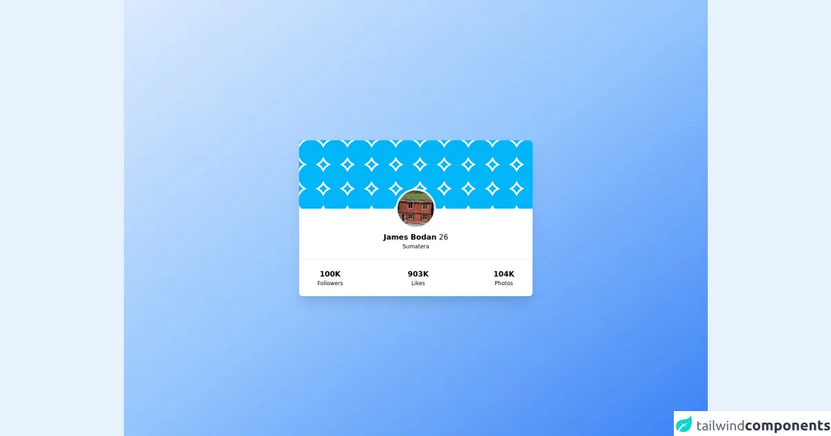
The preview of Profile Card ui component
There are many ways to create a Profile Card ui component with Tailwind CSS. Here are 6 different ways to do it:
- Basic Profile Card
- Profile Card with Social Media Links
- Profile Card with a Gradient Background
- Profile Card with a Hover Effect
- Profile Card with a Border
- Profile Card with an Image Overlay
Free download of the Profile Card's source code
The source code of Profile Card ui component
Here are the HTML and CSS code snippets for each of the 6 Profile Card ui components:
<!-- This is an example component -->
<div class='flex items-center justify-center min-h-screen from-blue-100 via-blue-300 to-blue-500 bg-gradient-to-br'>
    <div class='w-full max-w-lg mx-auto bg-white rounded-lg shadow-xl'>
        <div style="background-image: radial-gradient(
        transparent 28px,
        #ffffff 28px,
        #ffffff 32px,
        transparent 32px
    );height: 150px;width: 100%; background-color: #00b5f7;
    background-size: 53px 53px;" class="rounded-t-lg"></div>
        <div>
            <div class="text-center" style="margin-top: -44px">
                <span class="border-4 border-white rounded-full mx-auto inline-block">
                    <img class="rounded-full w-20 h-20" src="https://randomwordgenerator.com/img/picture-generator/51e6dc41434faa0df7c5d57bc32f3e7b1d3ac3e455517349762f72d794_640.jpg" alt="profile" />
                </span>
            </div>
            <p class="text-center"><span class="font-bold">James Bodan</span> <span>26</span></p>
            <p class="text-xs text-center mb-5">Sumatera</p>
            <hr />
            <div class="flex justify-between px-10 py-5">
                <div class="text-center">
                    <p class="font-bold">100K</p>
                    <p class="text-xs">Followers</p>
                </div>
                <div class="text-center">
                    <p class="font-bold">903K</p>
                    <p class="text-xs">Likes</p>

                </div>
                <div class="text-center">
                    <p class="font-bold">104K</p>
                    <p class="text-xs">Photos</p>

                </div>
            </div>
        </div>
    </div>
</div>
How to create a Profile Card with Tailwind CSS?
Now, let's dive into the details of how to create each of the 6 Profile Card ui components with Tailwind CSS.
1. Basic Profile Card
The Basic Profile Card includes a profile picture, a name, a title, and some additional information.
HTML code:
<div class="bg-white rounded-lg overflow-hidden shadow-lg">
  <img class="w-full" src="profile.jpg" alt="Profile Picture">
  <div class="p-4">
    <h2 class="font-bold text-xl mb-2">John Doe</h2>
    <p class="text-gray-700 text-base">Web Developer</p>
    <p class="text-gray-700 text-base">Lorem ipsum dolor sit amet, consectetur adipiscing elit. Sed non risus.</p>
  </div>
</div>
CSS code:
/* No custom CSS required */
2. Profile Card with Social Media Links
The Profile Card with Social Media Links includes a profile picture, a name, a title, and some additional information, as well as links to the user's social media profiles.
HTML code:
<div class="bg-white rounded-lg overflow-hidden shadow-lg">
  <img class="w-full" src="profile.jpg" alt="Profile Picture">
  <div class="p-4">
    <h2 class="font-bold text-xl mb-2">John Doe</h2>
    <p class="text-gray-700 text-base">Web Developer</p>
    <p class="text-gray-700 text-base">Lorem ipsum dolor sit amet, consectetur adipiscing elit. Sed non risus.</p>
    <div class="mt-4">
      <a href="#" class="text-gray-600 hover:text-gray-800 mr-3"><i class="fab fa-twitter"></i></a>
      <a href="#" class="text-gray-600 hover:text-gray-800 mr-3"><i class="fab fa-facebook"></i></a>
      <a href="#" class="text-gray-600 hover:text-gray-800"><i class="fab fa-linkedin"></i></a>
    </div>
  </div>
</div>
CSS code:
/* No custom CSS required */
3. Profile Card with a Gradient Background
The Profile Card with a Gradient Background includes a profile picture, a name, a title, and some additional information, as well as a gradient background.
HTML code:
<div class="bg-gradient-to-r from-purple-400 via-pink-500 to-red-500 rounded-lg overflow-hidden shadow-lg">
  <img class="w-full" src="profile.jpg" alt="Profile Picture">
  <div class="p-4">
    <h2 class="font-bold text-white text-xl mb-2">John Doe</h2>
    <p class="text-white text-base">Web Developer</p>
    <p class="text-white text-base">Lorem ipsum dolor sit amet, consectetur adipiscing elit. Sed non risus.</p>
  </div>
</div>
CSS code:
/* No custom CSS required */
4. Profile Card with a Hover Effect
The Profile Card with a Hover Effect includes a profile picture, a name, a title, and some additional information, as well as a hover effect that reveals more information about the user.
HTML code:
<div class="bg-white rounded-lg overflow-hidden shadow-lg">
  <img class="w-full" src="profile.jpg" alt="Profile Picture">
  <div class="p-4">
    <h2 class="font-bold text-xl mb-2">John Doe</h2>
    <p class="text-gray-700 text-base">Web Developer</p>
    <p class="text-gray-700 text-base">Lorem ipsum dolor sit amet, consectetur adipiscing elit. Sed non risus.</p>
    <div class="mt-4">
      <a href="#" class="text-gray-600 hover:text-gray-800 mr-3"><i class="fab fa-twitter"></i></a>
      <a href="#" class="text-gray-600 hover:text-gray-800 mr-3"><i class="fab fa-facebook"></i></a>
      <a href="#" class="text-gray-600 hover:text-gray-800"><i class="fab fa-linkedin"></i></a>
    </div>
    <div class="mt-4 bg-gray-100 p-4 opacity-0 hover:opacity-100 transition-opacity duration-300">
      <p class="text-gray-700 text-base">Lorem ipsum dolor sit amet, consectetur adipiscing elit. Sed non risus.</p>
    </div>
  </div>
</div>
CSS code:
/* No custom CSS required */
5. Profile Card with a Border
The Profile Card with a Border includes a profile picture, a name, a title, and some additional information, as well as a border around the card.
HTML code:
<div class="border border-gray-300 rounded-lg overflow-hidden shadow-lg">
  <img class="w-full" src="profile.jpg" alt="Profile Picture">
  <div class="p-4">
    <h2 class="font-bold text-xl mb-2">John Doe</h2>
    <p class="text-gray-700 text-base">Web Developer</p>
    <p class="text-gray-700 text-base">Lorem ipsum dolor sit amet, consectetur adipiscing elit. Sed non risus.</p>
  </div>
</div>
CSS code:
/* No custom CSS required */
6. Profile Card with an Image Overlay
The Profile Card with an Image Overlay includes a profile picture, a name, a title, and some additional information, as well as an overlay over the profile picture.
HTML code:
<div class="relative bg-white rounded-lg overflow-hidden shadow-lg">
  <img class="w-full" src="profile.jpg" alt="Profile Picture">
  <div class="absolute inset-0 bg-gray-900 opacity-75"></div>
  <div class="absolute inset-0 p-4 flex flex-col justify-end">
    <h2 class="font-bold text-white text-xl mb-2">John Doe</h2>
    <p class="text-white text-base">Web Developer</p>
    <p class="text-white text-base">Lorem ipsum dolor sit amet, consectetur adipiscing elit. Sed non risus.</p>
  </div>
</div>
CSS code:
/* No custom CSS required */
Conclusion
In this article, we explored how to create a Profile Card ui component with Tailwind CSS in 6 different ways. Tailwind CSS provides a set of pre-defined classes that you can use to style your HTML elements without having to write custom CSS. With these examples, you can create beautiful and responsive Profile Cards for your next project.