- Published on
Create A Profile Card With Tailwind CSS Like A Pro With The Help Of These 6 Tips
- What is Tailwind CSS?
- The description of Profile card ui component
- Why use Tailwind CSS to create a Profile card ui component?
- The preview of Profile card ui component
- The source code of Profile card ui component
- How to create a Profile card with Tailwind CSS?
- Step 1: Set up the HTML structure
- Step 2: Add Tailwind CSS classes
- Step 3: Customize the design
- Conclusion
What is Tailwind CSS?
Tailwind CSS is a utility-first CSS framework that allows developers to easily create custom designs without the need for writing custom CSS. It provides a set of pre-defined classes that can be used to style HTML elements. Tailwind CSS is highly customizable and can be used to create any type of UI component.
The description of Profile card ui component
A profile card is a UI component that displays a user's profile information, such as their name, profile picture, and social media links. It is commonly used on social media platforms and websites to provide a quick overview of a user's profile.
Why use Tailwind CSS to create a Profile card ui component?
Tailwind CSS provides a set of pre-defined classes that can be used to create a profile card UI component quickly and easily. It eliminates the need for writing custom CSS, which can save developers a lot of time and effort. Additionally, Tailwind CSS is highly customizable, which means that developers can easily modify the design of the profile card to fit their specific needs.
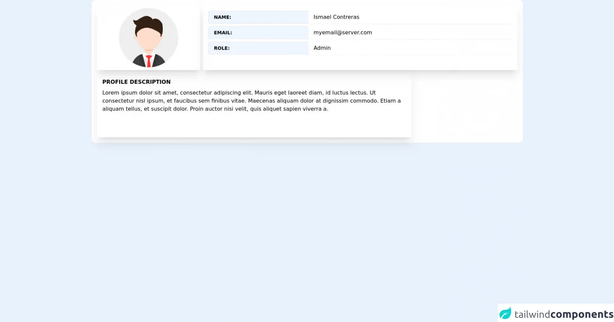
The preview of Profile card ui component
To create a profile card with Tailwind CSS, we will be using a combination of HTML and CSS. Here is a preview of what the final profile card will look like:
Free download of the Profile card's source code
The source code of Profile card ui component
Here is the source code for the profile card UI component:
<!-- Profile Card -->
<div>
   <div class="md:grid grid-cols-4 grid-rows-2  bg-white gap-2 p-4 rounded-xl">
        <div class="md:col-span-1 h-48 shadow-xl ">
                <div class="flex w-full h-full relative">
                    <img src="https://res.cloudinary.com/dboafhu31/image/upload/v1625318266/imagen_2021-07-03_091743_vtbkf8.png" class="w-44 h-44 m-auto" alt="">

                </div>
        </div>
        <div class="md:col-span-3 h-48 shadow-xl p-4 space-y-2 p-3">
                <div class="flex ">
                    <span
                        class="text-sm border bg-blue-50 font-bold uppercase border-2 rounded-l px-4 py-2 bg-gray-50 whitespace-no-wrap w-2/6">Name:</span>
                    <input
                        class="px-4 border-l-0 cursor-default border-gray-300 focus:outline-none  rounded-md rounded-l-none shadow-sm -ml-1 w-4/6"
                        type="text" value="Ismael Contreras"  readonly/>
                </div>
                <div class="flex ">
                    <span
                        class="text-sm border bg-blue-50 font-bold uppercase border-2 rounded-l px-4 py-2 bg-gray-50 whitespace-no-wrap w-2/6">Email:</span>
                    <input
                        class="px-4 border-l-0 cursor-default border-gray-300 focus:outline-none  rounded-md rounded-l-none shadow-sm -ml-1 w-4/6"
                        type="text" value="[email protected]"  readonly/>
                </div>
                 <div class="flex ">
                    <span
                        class="text-sm border bg-blue-50 font-bold uppercase border-2 rounded-l px-4 py-2 bg-gray-50 whitespace-no-wrap w-2/6">Role:</span>
                    <input
                        class="px-4 border-l-0 cursor-default border-gray-300 focus:outline-none  rounded-md rounded-l-none shadow-sm -ml-1 w-4/6"
                        type="text" value="Admin"  readonly/>
                </div>
        </div>
        <div class="md:col-span-3 h-48 shadow-xl p-4 space-y-2 hidden md:block">
            <h3 class="font-bold uppercase"> Profile Description</h3>
            <p class="">
                Lorem ipsum dolor sit amet, consectetur adipiscing elit. Mauris eget laoreet diam, id luctus lectus. Ut consectetur nisl ipsum, et faucibus sem finibus vitae. Maecenas aliquam dolor at dignissim commodo. Etiam a aliquam tellus, et suscipit dolor. Proin auctor nisi velit, quis aliquet sapien viverra a.
            </p>
        </div>

    </div>
</div>
How to create a Profile card with Tailwind CSS?
Now that we have a basic understanding of Tailwind CSS and the profile card UI component, let's dive into the steps to create a profile card with Tailwind CSS.
Step 1: Set up the HTML structure
The first step is to set up the HTML structure for the profile card. Here is an example of what the HTML structure should look like:
<div class="profile-card">
  <div class="profile-image">
    <img src="profile-image.jpg" alt="Profile Image">
  </div>
  <div class="profile-info">
    <h2 class="profile-name">John Doe</h2>
    <p class="profile-bio">Lorem ipsum dolor sit amet, consectetur adipiscing elit. Sed non risus.</p>
    <div class="profile-links">
      <a href="#" class="profile-link">Facebook</a>
      <a href="#" class="profile-link">Twitter</a>
      <a href="#" class="profile-link">LinkedIn</a>
    </div>
  </div>
</div>
Step 2: Add Tailwind CSS classes
Next, we need to add Tailwind CSS classes to the HTML elements to style the profile card. Here is an example of what the HTML structure with Tailwind CSS classes should look like:
<div class="flex flex-col items-center justify-center w-64 h-96 bg-white rounded-lg shadow-lg">
  <div class="w-32 h-32 rounded-full overflow-hidden">
    <img src="profile-image.jpg" alt="Profile Image" class="w-full h-full object-cover">
  </div>
  <div class="mt-4">
    <h2 class="text-gray-800 text-lg font-medium">John Doe</h2>
    <p class="text-gray-600 text-sm mt-1">Lorem ipsum dolor sit amet, consectetur adipiscing elit. Sed non risus.</p>
    <div class="flex mt-4">
      <a href="#" class="text-gray-600 hover:text-gray-800 font-medium">Facebook</a>
      <a href="#" class="ml-4 text-gray-600 hover:text-gray-800 font-medium">Twitter</a>
      <a href="#" class="ml-4 text-gray-600 hover:text-gray-800 font-medium">LinkedIn</a>
    </div>
  </div>
</div>
Step 3: Customize the design
Finally, we can customize the design of the profile card by modifying the Tailwind CSS classes. Here are some tips to help you customize the design:
- Use the
bg-*classes to change the background color of the profile card. - Use the
text-*classes to change the text color of the profile card. - Use the
font-*classes to change the font family and font size of the profile card. - Use the
rounded-*classes to change the border radius of the profile card. - Use the
shadow-*classes to add a shadow to the profile card.
Conclusion
In this article, we have learned how to create a profile card UI component with Tailwind CSS. By following these 6 tips, you can create a professional-looking profile card quickly and easily. Tailwind CSS is a powerful CSS framework that can help you save time and effort when creating custom designs.