- Published on
Learn How To Create A Profile Card With Tailwind CSS Like an Expert
- What is Tailwind CSS?
- The description of Profile card ui component
- Why use Tailwind CSS to create a Profile card ui component?
- The preview of Profile card ui component.
- The source code of Profile card ui component.
- How to create a Profile card with Tailwind CSS?
- Step 1: Set up your HTML structure
- Step 2: Add an image to the card
- Step 3: Add a title and description to the card
- Step 4: Add tags to the card
- Step 5: Customize the profile card
- Conclusion
What is Tailwind CSS?
Tailwind CSS is a utility-first CSS framework that provides a set of pre-defined classes to help you quickly build custom designs. It allows you to create responsive, scalable, and maintainable designs with minimal effort.
The description of Profile card ui component
A profile card is a UI component that displays a user's information, such as their name, profile picture, job title, and social media links. It is commonly used on websites and applications to showcase user profiles, team members, or contacts.
Why use Tailwind CSS to create a Profile card ui component?
Tailwind CSS provides a set of pre-defined classes that make it easy to create a profile card UI component. You don't need to write custom CSS or use complex frameworks to achieve the desired result. With Tailwind CSS, you can quickly create a responsive and customizable profile card that fits your design requirements.
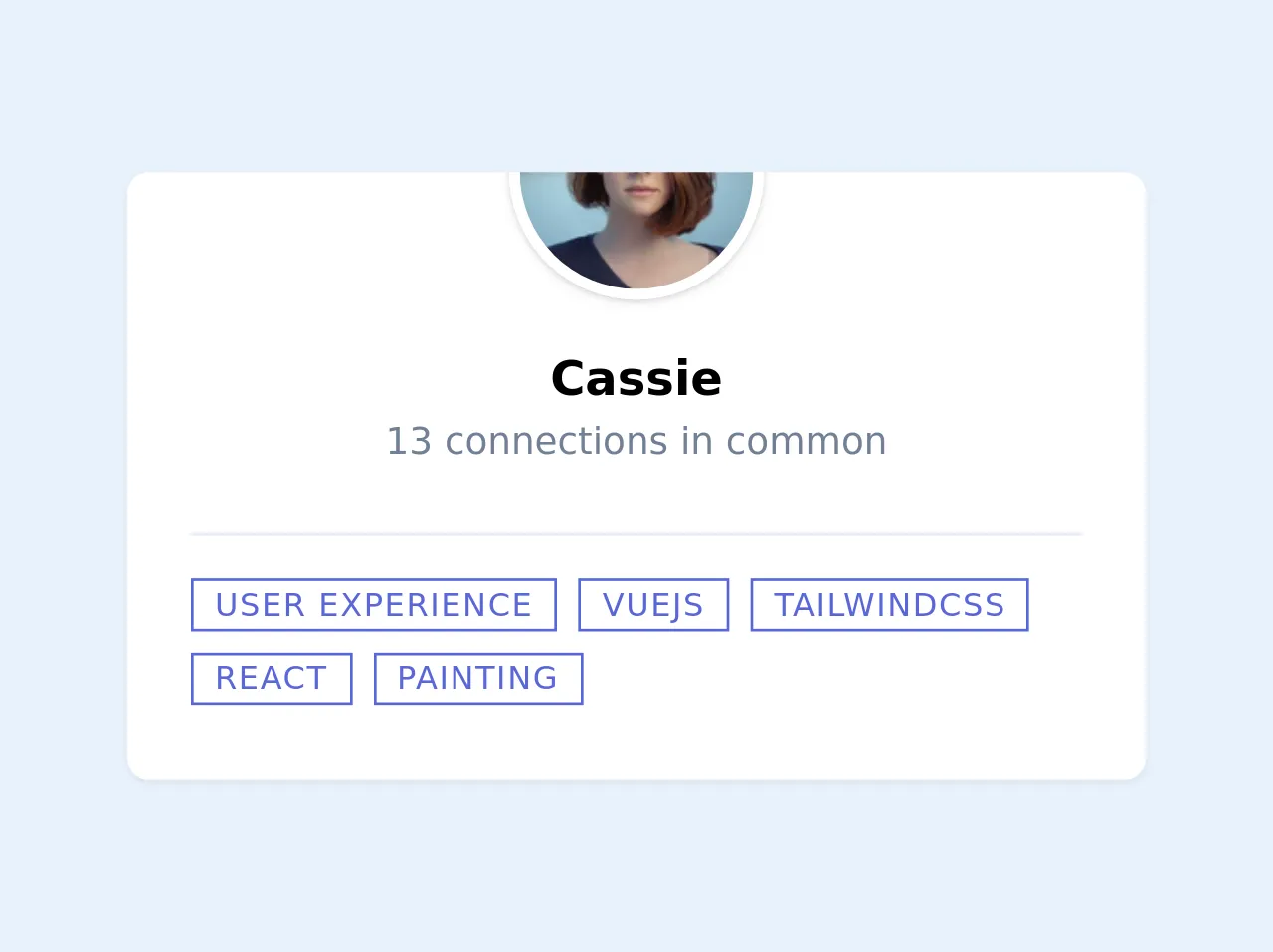
The preview of Profile card ui component.
To create a profile card with Tailwind CSS, we will use a combination of pre-defined classes to style our HTML elements. Here's a preview of what our profile card will look like:
Free download of the Profile card's source code
The source code of Profile card ui component.
To create a profile card with Tailwind CSS, we will use HTML and Tailwind CSS classes. Here's the source code for our profile card:
<!-- eslint-disable -->

    <div class="bg-white my-12 pb-6 w-full justify-center items-center overflow-hidden md:max-w-sm rounded-lg shadow-sm mx-auto">
      <div class="relative h-40">
        <img class="absolute h-full w-full object-cover" src="https://images.unsplash.com/photo-1448932133140-b4045783ed9e?ixlib=rb-1.2.1&auto=format&fit=crop&w=400&q=80">
      </div>
      <div class="relative shadow mx-auto h-24 w-24 -my-12 border-white rounded-full overflow-hidden border-4">
        <img class="object-cover w-full h-full" src="https://images.unsplash.com/photo-1438761681033-6461ffad8d80?ixlib=rb-1.2.1&ixid=eyJhcHBfaWQiOjEyMDd9&auto=format&fit=crop&w=200&q=80">
      </div>
      <div class="mt-16">
        <h1 class="text-lg text-center font-semibold">
          Cassie
        </h1>
        <p class="text-sm text-gray-600 text-center">
          13 connections in common
        </p>
      </div>
      <div class="mt-6 pt-3 flex flex-wrap mx-6 border-t">
        <div class="text-xs mr-2 my-1 uppercase tracking-wider border px-2 text-indigo-600 border-indigo-600 hover:bg-indigo-600 hover:text-indigo-100 cursor-default">
          User experience
        </div>
        <div class="text-xs mr-2 my-1 uppercase tracking-wider border px-2 text-indigo-600 border-indigo-600 hover:bg-indigo-600 hover:text-indigo-100 cursor-default">
          VueJS
        </div>
        <div class="text-xs mr-2 my-1 uppercase tracking-wider border px-2 text-indigo-600 border-indigo-600 hover:bg-indigo-600 hover:text-indigo-100 cursor-default">
          TailwindCSS
        </div>
        <div class="text-xs mr-2 my-1 uppercase tracking-wider border px-2 text-indigo-600 border-indigo-600 hover:bg-indigo-600 hover:text-indigo-100 cursor-default">
          React
        </div>
        <div class="text-xs mr-2 my-1 uppercase tracking-wider border px-2 text-indigo-600 border-indigo-600 hover:bg-indigo-600 hover:text-indigo-100 cursor-default">
          Painting
        </div>
      </div>
    </div>
How to create a Profile card with Tailwind CSS?
To create a profile card with Tailwind CSS, follow these steps:
Step 1: Set up your HTML structure
The first step is to set up your HTML structure. Here's an example of what your HTML code should look like:
<div class="max-w-sm rounded overflow-hidden shadow-lg">
  <img class="w-full" src="https://source.unsplash.com/random/400x200" alt="Sunset in the mountains">
  <div class="px-6 py-4">
    <div class="font-bold text-xl mb-2">John Doe</div>
    <p class="text-gray-700 text-base">
      Lorem ipsum dolor sit amet, consectetur adipiscing elit. Vestibulum in nisi commodo, tempus odio a, vestibulum nibh.
    </p>
  </div>
  <div class="px-6 pt-4 pb-2">
    <a href="#" class="inline-block bg-gray-200 rounded-full px-3 py-1 text-sm font-semibold text-gray-700 mr-2">#photography</a>
    <a href="#" class="inline-block bg-gray-200 rounded-full px-3 py-1 text-sm font-semibold text-gray-700 mr-2">#travel</a>
    <a href="#" class="inline-block bg-gray-200 rounded-full px-3 py-1 text-sm font-semibold text-gray-700">#winter</a>
  </div>
</div>
In the above code, we have used the max-w-sm class to set the maximum width of the profile card to sm (small) size. We have also used the rounded, overflow-hidden, and shadow-lg classes to add rounded corners, hide overflow, and add a shadow effect to the card.
Step 2: Add an image to the card
To add an image to the profile card, we can use the img tag and the w-full class to make the image responsive. Here's an example:
<img class="w-full" src="https://source.unsplash.com/random/400x200" alt="Sunset in the mountains">
In the above code, we have used the src attribute to specify the image URL and the alt attribute to provide an alternative text description for the image.
Step 3: Add a title and description to the card
To add a title and description to the profile card, we can use the px-6 and py-4 classes to add padding to the card's content. We can also use the font-bold and text-xl classes to make the title bold and larger. Here's an example:
<div class="px-6 py-4">
  <div class="font-bold text-xl mb-2">John Doe</div>
  <p class="text-gray-700 text-base">
    Lorem ipsum dolor sit amet, consectetur adipiscing elit. Vestibulum in nisi commodo, tempus odio a, vestibulum nibh.
  </p>
</div>
In the above code, we have used the text-gray-700 class to set the text color to gray and the text-base class to set the font size to the base size.
Step 4: Add tags to the card
To add tags to the profile card, we can use the px-6, pt-4, and pb-2 classes to add padding to the tags section. We can also use the inline-block, bg-gray-200, rounded-full, px-3, py-1, text-sm, font-semibold, and text-gray-700 classes to style the tags. Here's an example:
<div class="px-6 pt-4 pb-2">
  <a href="#" class="inline-block bg-gray-200 rounded-full px-3 py-1 text-sm font-semibold text-gray-700 mr-2">#photography</a>
  <a href="#" class="inline-block bg-gray-200 rounded-full px-3 py-1 text-sm font-semibold text-gray-700 mr-2">#travel</a>
  <a href="#" class="inline-block bg-gray-200 rounded-full px-3 py-1 text-sm font-semibold text-gray-700">#winter</a>
</div>
In the above code, we have used the href attribute to specify the link URL and the # symbol to indicate that the link is not functional.
Step 5: Customize the profile card
To customize the profile card, you can use Tailwind CSS classes to change the colors, fonts, and sizes of the card's elements. For example, you can use the bg-red-500 class to set the background color to red, the text-white class to set the text color to white, and the text-lg class to set the font size to large. Here's an example:
<div class="max-w-sm rounded overflow-hidden shadow-lg bg-red-500">
  <img class="w-full" src="https://source.unsplash.com/random/400x200" alt="Sunset in the mountains">
  <div class="px-6 py-4">
    <div class="font-bold text-xl mb-2 text-white">John Doe</div>
    <p class="text-gray-200 text-base">
      Lorem ipsum dolor sit amet, consectetur adipiscing elit. Vestibulum in nisi commodo, tempus odio a, vestibulum nibh.
    </p>
  </div>
  <div class="px-6 pt-4 pb-2">
    <a href="#" class="inline-block bg-gray-200 rounded-full px-3 py-1 text-sm font-semibold text-gray-700 mr-2">#photography</a>
    <a href="#" class="inline-block bg-gray-200 rounded-full px-3 py-1 text-sm font-semibold text-gray-700 mr-2">#travel</a>
    <a href="#" class="inline-block bg-gray-200 rounded-full px-3 py-1 text-sm font-semibold text-gray-700">#winter</a>
  </div>
</div>
In the above code, we have used the bg-red-500 class to set the background color to red, the text-white class to set the text color to white, and the text-lg class to set the font size to large.
Conclusion
In this article, we have learned how to create a profile card with Tailwind CSS. We have seen how Tailwind CSS provides a set of pre-defined classes that make it easy to create responsive and customizable UI components. We have also seen how to use HTML and Tailwind CSS classes to create a profile card with an image, title, description, and tags. With this knowledge, you can now create your own profile cards and customize them to fit your design requirements.