- Published on
Ways To Create A Products Page With Side Links With Tailwind CSS In 60 Minutes
- What is Tailwind CSS?
- The description of Products page with Side Links ui component
- Why use Tailwind CSS to create a Products page with Side Links ui component?
- The preview of Products page with Side Links ui component.
- The source code of Products page with Side Links ui component.
- How to create a Products page with Side Links with Tailwind CSS?
- Step 1: Set up your HTML file
- Step 2: Add the Side Links
- Step 3: Add the Products List
- Step 4: Add Responsive Styles
- Conclusion
What is Tailwind CSS?
Tailwind CSS is a utility-first CSS framework that helps you quickly build custom designs without having to write any CSS code. It provides a set of pre-defined classes that you can use to style your HTML elements. With Tailwind CSS, you can create responsive layouts, typography, forms, buttons, and more.
The description of Products page with Side Links ui component
A Products page with Side Links ui component is a common design pattern used in e-commerce websites. It consists of a list of products on the left side of the page, and a set of links on the right side of the page that allow users to filter the products by category, price range, or other criteria. When a user clicks on a link, the list of products updates to show only the products that match the selected criteria.
Why use Tailwind CSS to create a Products page with Side Links ui component?
Tailwind CSS is an excellent choice for creating a Products page with Side Links ui component because it provides a set of pre-defined classes that you can use to style your HTML elements. This means that you don't have to write any CSS code from scratch, which can save you a lot of time. Additionally, Tailwind CSS is highly customizable, so you can easily modify the styles to match your brand's colors and typography.
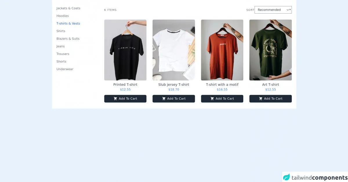
The preview of Products page with Side Links ui component.
To create a Products page with Side Links ui component, we will use Tailwind CSS to style the HTML elements. The final result will look something like this:
Free download of the Products page with Side Links's source code
The source code of Products page with Side Links ui component.
Here is the source code for the Products page with Side Links ui component:
<section class="bg-white dark:bg-gray-900">
        <div class="container px-6 py-8 mx-auto">
            <div class="lg:flex lg:-mx-2">
                <div class="space-y-3 lg:w-1/5 lg:px-2 lg:space-y-4">
                    <a href="#" class="block font-medium text-gray-500 dark:text-gray-300 hover:underline">Jackets & Coats</a>
                    <a href="#" class="block font-medium text-gray-500 dark:text-gray-300 hover:underline">Hoodies</a>
                    <a href="#" class="block font-medium text-blue-600 dark:text-blue-500 hover:underline">T-shirts & Vests</a>
                    <a href="#" class="block font-medium text-gray-500 dark:text-gray-300 hover:underline">Shirts</a>
                    <a href="#" class="block font-medium text-gray-500 dark:text-gray-300 hover:underline">Blazers & Suits</a>
                    <a href="#" class="block font-medium text-gray-500 dark:text-gray-300 hover:underline">Jeans</a>
                    <a href="#" class="block font-medium text-gray-500 dark:text-gray-300 hover:underline">Trousers</a>
                    <a href="#" class="block font-medium text-gray-500 dark:text-gray-300 hover:underline">Shorts</a>
                    <a href="#" class="block font-medium text-gray-500 dark:text-gray-300 hover:underline">Underwear</a>
                </div>

                <div class="mt-6 lg:mt-0 lg:px-2 lg:w-4/5 ">
                    <div class="flex items-center justify-between text-sm tracking-widest uppercase ">
                        <p class="text-gray-500 dark:text-gray-300">6 Items</p>
                        <div class="flex items-center">
                            <p class="text-gray-500 dark:text-gray-300">Sort</p>
                            <select class="font-medium text-gray-700 bg-transparent dark:text-gray-500 focus:outline-none">
                                <option value="#">Recommended</option>
                                <option value="#">Size</option>
                                <option value="#">Price</option>
                            </select>
                        </div>
                    </div>

                    <div class="grid grid-cols-1 gap-8 mt-8 md:grid-cols-2 lg:grid-cols-3 xl:grid-cols-4">
                        <div class="flex flex-col items-center justify-center w-full max-w-lg mx-auto">
                            <img class="object-cover w-full rounded-md h-72 xl:h-80" src="https://images.unsplash.com/photo-1583743814966-8936f5b7be1a?ixlib=rb-1.2.1&ixid=MnwxMjA3fDB8MHxwaG90by1wYWdlfHx8fGVufDB8fHx8&auto=format&fit=crop&w=634&q=80" alt="T-Shirt">
                            <h4 class="mt-2 text-lg font-medium text-gray-700 dark:text-gray-200">Printed T-shirt</h4>
                            <p class="text-blue-500">$12.55</p>

                            <button class="flex items-center justify-center w-full px-2 py-2 mt-4 font-medium tracking-wide text-white capitalize transition-colors duration-200 transform bg-gray-800 rounded-md hover:bg-gray-700 focus:outline-none focus:bg-gray-700">
                                <svg xmlns="http://www.w3.org/2000/svg" class="w-5 h-5 mx-1" viewBox="0 0 20 20" fill="currentColor">
                                    <path d="M3 1a1 1 0 000 2h1.22l.305 1.222a.997.997 0 00.01.042l1.358 5.43-.893.892C3.74 11.846 4.632 14 6.414 14H15a1 1 0 000-2H6.414l1-1H14a1 1 0 00.894-.553l3-6A1 1 0 0017 3H6.28l-.31-1.243A1 1 0 005 1H3zM16 16.5a1.5 1.5 0 11-3 0 1.5 1.5 0 013 0zM6.5 18a1.5 1.5 0 100-3 1.5 1.5 0 000 3z" />
                                </svg>
                                <span class="mx-1">Add to cart</span>
                            </button>
                        </div>

                        <div class="flex flex-col items-center justify-center w-full max-w-lg mx-auto">
                            <img class="object-cover w-full rounded-md h-72 xl:h-80" src="https://images.unsplash.com/photo-1620799139507-2a76f79a2f4d?ixid=MnwxMjA3fDB8MHxwaG90by1wYWdlfHx8fGVufDB8fHx8&ixlib=rb-1.2.1&auto=format&fit=crop&w=966&q=80" alt="T-Shirt">
                            <h4 class="mt-2 text-lg font-medium text-gray-700 dark:text-gray-200"> Slub jersey T-shirt</h4>
                            <p class="text-blue-500">$18.70</p>

                            <button class="flex items-center justify-center w-full px-2 py-2 mt-4 font-medium tracking-wide text-white capitalize transition-colors duration-200 transform bg-gray-800 rounded-md hover:bg-gray-700 focus:outline-none focus:bg-gray-700">
                                <svg xmlns="http://www.w3.org/2000/svg" class="w-5 h-5 mx-1" viewBox="0 0 20 20" fill="currentColor">
                                    <path d="M3 1a1 1 0 000 2h1.22l.305 1.222a.997.997 0 00.01.042l1.358 5.43-.893.892C3.74 11.846 4.632 14 6.414 14H15a1 1 0 000-2H6.414l1-1H14a1 1 0 00.894-.553l3-6A1 1 0 0017 3H6.28l-.31-1.243A1 1 0 005 1H3zM16 16.5a1.5 1.5 0 11-3 0 1.5 1.5 0 013 0zM6.5 18a1.5 1.5 0 100-3 1.5 1.5 0 000 3z" />
                                </svg>
                                <span class="mx-1">Add to cart</span>
                            </button>
                        </div>

                        <div class="flex flex-col items-center justify-center w-full max-w-lg mx-auto">
                            <img class="object-cover w-full rounded-md h-72 xl:h-80" src="https://images.unsplash.com/photo-1603320409990-02d834987237?ixid=MnwxMjA3fDB8MHxwaG90by1wYWdlfHx8fGVufDB8fHx8&ixlib=rb-1.2.1&auto=format&fit=crop&w=634&q=80" alt="T-Shirt">
                            <h4 class="mt-2 text-lg font-medium text-gray-700 dark:text-gray-200">T-shirt with a motif</h4>
                            <p class="text-blue-500">$16.55</p>

                            <button class="flex items-center justify-center w-full px-2 py-2 mt-4 font-medium tracking-wide text-white capitalize transition-colors duration-200 transform bg-gray-800 rounded-md hover:bg-gray-700 focus:outline-none focus:bg-gray-700">
                                <svg xmlns="http://www.w3.org/2000/svg" class="w-5 h-5 mx-1" viewBox="0 0 20 20" fill="currentColor">
                                    <path d="M3 1a1 1 0 000 2h1.22l.305 1.222a.997.997 0 00.01.042l1.358 5.43-.893.892C3.74 11.846 4.632 14 6.414 14H15a1 1 0 000-2H6.414l1-1H14a1 1 0 00.894-.553l3-6A1 1 0 0017 3H6.28l-.31-1.243A1 1 0 005 1H3zM16 16.5a1.5 1.5 0 11-3 0 1.5 1.5 0 013 0zM6.5 18a1.5 1.5 0 100-3 1.5 1.5 0 000 3z" />
                                </svg>
                                <span class="mx-1">Add to cart</span>
                            </button>
                        </div>

                        <div class="flex flex-col items-center justify-center w-full max-w-lg mx-auto">
                            <img class="object-cover w-full rounded-md h-72 xl:h-80" src="https://images.unsplash.com/photo-1603320410149-db26b12d5c2b?ixlib=rb-1.2.1&ixid=MnwxMjA3fDB8MHxwaG90by1wYWdlfHx8fGVufDB8fHx8&auto=format&fit=crop&w=634&q=80" alt="T-Shirt">
                            <h4 class="mt-2 text-lg font-medium text-gray-700 dark:text-gray-200">Art T-shirt</h4>
                            <p class="text-blue-500">$12.55</p>

                            <button class="flex items-center justify-center w-full px-2 py-2 mt-4 font-medium tracking-wide text-white capitalize transition-colors duration-200 transform bg-gray-800 rounded-md hover:bg-gray-700 focus:outline-none focus:bg-gray-700">
                                <svg xmlns="http://www.w3.org/2000/svg" class="w-5 h-5 mx-1" viewBox="0 0 20 20" fill="currentColor">
                                    <path d="M3 1a1 1 0 000 2h1.22l.305 1.222a.997.997 0 00.01.042l1.358 5.43-.893.892C3.74 11.846 4.632 14 6.414 14H15a1 1 0 000-2H6.414l1-1H14a1 1 0 00.894-.553l3-6A1 1 0 0017 3H6.28l-.31-1.243A1 1 0 005 1H3zM16 16.5a1.5 1.5 0 11-3 0 1.5 1.5 0 013 0zM6.5 18a1.5 1.5 0 100-3 1.5 1.5 0 000 3z" />
                                </svg>
                                <span class="mx-1">Add to cart</span>
                            </button>
                        </div>
                    </div>
                </div>
            </div>
        </div>
    </section>
How to create a Products page with Side Links with Tailwind CSS?
To create a Products page with Side Links with Tailwind CSS, follow these steps:
Step 1: Set up your HTML file
Create an HTML file and add the following code:
<!DOCTYPE html>
<html lang="en">
<head>
  <meta charset="UTF-8">
  <meta name="viewport" content="width=device-width, initial-scale=1.0">
  <title>Products Page</title>
  <link rel="stylesheet" href="https://cdn.jsdelivr.net/npm/[email protected]/dist/tailwind.min.css">
</head>
<body>
  <div class="flex">
    <div class="w-1/4">
      <!-- Side Links -->
    </div>
    <div class="w-3/4">
      <!-- Products List -->
    </div>
  </div>
</body>
</html>
In this code, we have created a basic HTML file with a title and a link to the Tailwind CSS stylesheet. We have also added a div element with a class of flex to create a flex container. Inside the flex container, we have added two div elements: one with a class of w-1/4 to hold the side links, and one with a class of w-3/4 to hold the products list.
Step 2: Add the Side Links
To add the side links, we will use a ul element with a list of li elements. We will also use Tailwind CSS classes to style the links and add hover effects.
<div class="w-1/4">
  <ul class="py-4">
    <li class="mb-2">
      <a href="#" class="block px-4 py-2 rounded hover:bg-gray-200">All Products</a>
    </li>
    <li class="mb-2">
      <a href="#" class="block px-4 py-2 rounded hover:bg-gray-200">Category 1</a>
    </li>
    <li class="mb-2">
      <a href="#" class="block px-4 py-2 rounded hover:bg-gray-200">Category 2</a>
    </li>
    <li class="mb-2">
      <a href="#" class="block px-4 py-2 rounded hover:bg-gray-200">Category 3</a>
    </li>
  </ul>
</div>
In this code, we have added a ul element with a class of py-4 to add some padding. We have also added four li elements with links inside. Each link has a class of block to make it a block-level element, and px-4 py-2 to add some padding. We have also added a class of rounded to make the links rounded, and hover:bg-gray-200 to add a gray background color on hover.
Step 3: Add the Products List
To add the products list, we will use a ul element with a list of li elements. We will also use Tailwind CSS classes to style the products and add hover effects.
<div class="w-3/4">
  <ul class="grid grid-cols-2 gap-4">
    <li>
      <a href="#" class="block rounded hover:shadow-md">
        <img src="https://via.placeholder.com/150" alt="Product Image" class="w-full">
        <h3 class="text-lg font-medium mt-2">Product 1</h3>
        <p class="text-gray-500 mt-1">$19.99</p>
      </a>
    </li>
    <li>
      <a href="#" class="block rounded hover:shadow-md">
        <img src="https://via.placeholder.com/150" alt="Product Image" class="w-full">
        <h3 class="text-lg font-medium mt-2">Product 2</h3>
        <p class="text-gray-500 mt-1">$29.99</p>
      </a>
    </li>
    <li>
      <a href="#" class="block rounded hover:shadow-md">
        <img src="https://via.placeholder.com/150" alt="Product Image" class="w-full">
        <h3 class="text-lg font-medium mt-2">Product 3</h3>
        <p class="text-gray-500 mt-1">$39.99</p>
      </a>
    </li>
    <li>
      <a href="#" class="block rounded hover:shadow-md">
        <img src="https://via.placeholder.com/150" alt="Product Image" class="w-full">
        <h3 class="text-lg font-medium mt-2">Product 4</h3>
        <p class="text-gray-500 mt-1">$49.99</p>
      </a>
    </li>
  </ul>
</div>
In this code, we have added a ul element with a class of grid to create a grid layout with two columns. We have also added a class of gap-4 to add some spacing between the products. Inside each li element, we have added a link with a class of block to make it a block-level element, and rounded to make it rounded. We have also added hover:shadow-md to add a shadow effect on hover. Inside each link, we have added an img element with a class of w-full to make it responsive, and a h3 element with a class of text-lg font-medium to add the product name. We have also added a p element with a class of text-gray-500 to add the product price.
Step 4: Add Responsive Styles
To make the Products page with Side Links ui component responsive, we will use Tailwind CSS classes to adjust the layout on smaller screens.
<div class="flex flex-col md:flex-row">
  <div class="w-full md:w-1/4">
    <!-- Side Links -->
  </div>
  <div class="w-full md:w-3/4">
    <!-- Products List -->
  </div>
</div>
In this code, we have added a class of flex-col md:flex-row to the main div element to create a column layout on smaller screens and a row layout on larger screens. We have also changed the w-1/4 and w-3/4 classes to w-full md:w-1/4 and w-full md:w-3/4 to make the side links and products list take up the full width on smaller screens and a quarter of the width on larger screens.
Conclusion
In this article, we have learned how to create a Products page with Side Links ui component using Tailwind CSS. We have seen how Tailwind CSS can help us quickly style our HTML elements without having to write any CSS code from scratch. We have also seen how to use Tailwind CSS classes to create a responsive layout that works well on different screen sizes. With these skills, you can create beautiful and functional e-commerce websites that provide a great user experience.