- Published on
What You Need To Create A Product Card With Evaluation With Tailwind CSS
- The description of Product card with evaluation ui component
- Why use Tailwind CSS to create a Product card with evaluation ui component?
- The preview of Product card with evaluation ui component.
- The source code of Product card with evaluation ui component.
- How to create a Product card with evaluation with Tailwind CSS?
- Conclusion
Tailwind CSS is a utility-first CSS framework that allows developers to rapidly build custom user interfaces. It provides a set of pre-defined classes that can be used to style HTML elements without writing any CSS code. Tailwind CSS is highly customizable and can be used to create complex layouts and designs.
The description of Product card with evaluation ui component
A product card with evaluation is a user interface component that displays information about a product, including its name, image, description, and rating. It is commonly used in e-commerce websites and applications to showcase products and allow users to evaluate them.
Why use Tailwind CSS to create a Product card with evaluation ui component?
Tailwind CSS provides a set of pre-defined classes that can be used to style the product card with evaluation ui component quickly and easily. It allows developers to create a responsive and visually appealing design without writing any custom CSS code. Additionally, Tailwind CSS is highly customizable, allowing developers to modify the design to fit their specific needs.
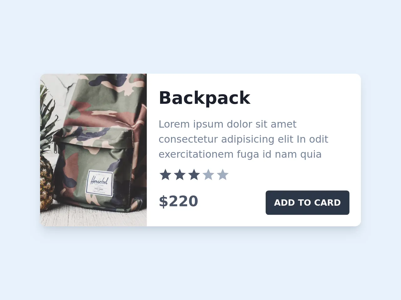
The preview of Product card with evaluation ui component.
To create a product card with evaluation ui component, we will use Tailwind CSS classes to style the HTML elements. The final result will be a visually appealing and responsive product card with evaluation ui component.
Free download of the Product card with evaluation's source code
The source code of Product card with evaluation ui component.
To create a product card with evaluation ui component, we will use HTML and Tailwind CSS classes. The following code shows the HTML structure and Tailwind CSS classes used to create the product card with evaluation ui component.
<div class="py-6">
  <div class="flex max-w-md bg-white shadow-lg rounded-lg overflow-hidden">
    <div class="w-1/3 bg-cover" style="background-image: url('https://images.unsplash.com/photo-1494726161322-5360d4d0eeae?ixlib=rb-1.2.1&ixid=eyJhcHBfaWQiOjEyMDd9&auto=format&fit=crop&w=334&q=80')">
    </div>
    <div class="w-2/3 p-4">
      <h1 class="text-gray-900 font-bold text-2xl">Backpack</h1>
      <p class="mt-2 text-gray-600 text-sm">Lorem ipsum dolor sit amet consectetur adipisicing elit In odit exercitationem fuga id nam quia</p>
      <div class="flex item-center mt-2">
        <svg class="w-5 h-5 fill-current text-gray-700" viewBox="0 0 24 24">
          <path d="M12 17.27L18.18 21L16.54 13.97L22 9.24L14.81 8.63L12 2L9.19 8.63L2 9.24L7.46 13.97L5.82 21L12 17.27Z"/>
        </svg>
        <svg class="w-5 h-5 fill-current text-gray-700" viewBox="0 0 24 24">
          <path d="M12 17.27L18.18 21L16.54 13.97L22 9.24L14.81 8.63L12 2L9.19 8.63L2 9.24L7.46 13.97L5.82 21L12 17.27Z"/>
        </svg>
        <svg class="w-5 h-5 fill-current text-gray-700" viewBox="0 0 24 24">
          <path d="M12 17.27L18.18 21L16.54 13.97L22 9.24L14.81 8.63L12 2L9.19 8.63L2 9.24L7.46 13.97L5.82 21L12 17.27Z"/>
        </svg>
        <svg class="w-5 h-5 fill-current text-gray-500" viewBox="0 0 24 24">
          <path d="M12 17.27L18.18 21L16.54 13.97L22 9.24L14.81 8.63L12 2L9.19 8.63L2 9.24L7.46 13.97L5.82 21L12 17.27Z"/>
        </svg>
        <svg class="w-5 h-5 fill-current text-gray-500" viewBox="0 0 24 24">
          <path d="M12 17.27L18.18 21L16.54 13.97L22 9.24L14.81 8.63L12 2L9.19 8.63L2 9.24L7.46 13.97L5.82 21L12 17.27Z"/>
        </svg>
      </div>
      <div class="flex item-center justify-between mt-3">
        <h1 class="text-gray-700 font-bold text-xl">$220</h1>
        <button class="px-3 py-2 bg-gray-800 text-white text-xs font-bold uppercase rounded">Add to Card</button>
      </div>
    </div>
  </div>
</div>
How to create a Product card with evaluation with Tailwind CSS?
To create a product card with evaluation ui component with Tailwind CSS, follow these steps:
Create the HTML structure for the product card with evaluation ui component. This includes the product name, image, description, and rating.
Add the necessary Tailwind CSS classes to style the HTML elements. This includes classes for the product card container, product image, product name, product description, and product rating.
Customize the design to fit your specific needs. This includes modifying the colors, fonts, and spacing.
Test the product card with evaluation ui component on different screen sizes to ensure it is responsive.
Conclusion
In conclusion, Tailwind CSS is an excellent choice for creating a product card with evaluation ui component. It provides a set of pre-defined classes that can be used to style the HTML elements quickly and easily, allowing developers to create a visually appealing and responsive design without writing any custom CSS code. Additionally, Tailwind CSS is highly customizable, allowing developers to modify the design to fit their specific needs. By following the steps outlined above, you can create a product card with evaluation ui component with Tailwind CSS in no time.