- Published on
6 Tips To Make A Product Card With Tailwind CSS
- What is Tailwind CSS?
- The description of Product Card UI component
- Why use Tailwind CSS to create a Product Card UI component?
- The preview of Product Card UI component
- The source code of Product Card UI component
- How to create a Product Card with Tailwind CSS?
- 1. Choose the right background color
- 2. Add a shadow effect
- 3. Round the corners
- 4. Hide overflowing content
- 5. Add a hover effect
- 6. Use responsive classes
- Conclusion
What is Tailwind CSS?
Tailwind CSS is a utility-first CSS framework that provides a set of pre-defined CSS classes to help you quickly build custom user interfaces. It is designed to be highly customizable and allows developers to create unique designs without writing custom CSS code.
The description of Product Card UI component
A product card is a UI component that is commonly used on e-commerce websites to display product information. It typically includes an image of the product, a title, a description, and a price. Product cards are an essential part of any e-commerce website, and they play a crucial role in driving sales.
Why use Tailwind CSS to create a Product Card UI component?
Tailwind CSS provides a set of pre-defined CSS classes that can be used to create a product card UI component quickly. It saves developers time and effort by eliminating the need to write custom CSS code. Additionally, Tailwind CSS is highly customizable, which means that developers can easily modify the pre-defined classes to create unique designs.
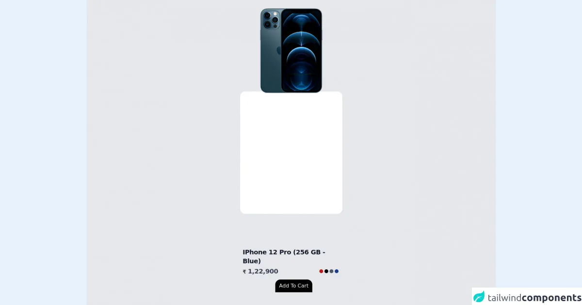
The preview of Product Card UI component
To create a product card UI component with Tailwind CSS, we will use the following classes:
bg-white: Sets the background color of the card to white.shadow-md: Adds a shadow effect to the card.rounded-lg: Rounds the corners of the card.overflow-hidden: Hides any content that overflows the card.hover:shadow-lg: Adds a larger shadow effect to the card when the user hovers over it.
Free download of the Product Card's source code
The source code of Product Card UI component
To create a product card UI component with Tailwind CSS, we will use the following HTML code:
<div class="bg-white shadow-md rounded-lg overflow-hidden hover:shadow-lg">
  <img src="product-image.jpg" alt="Product Image" class="w-full h-64 object-cover">
  <div class="p-4">
    <h2 class="text-lg font-medium text-gray-900">Product Title</h2>
    <p class="text-gray-700 mt-2">Product Description</p>
    <div class="mt-4">
      <span class="text-gray-900 font-medium">$19.99</span>
      <span class="ml-2 text-sm text-gray-600">Free Shipping</span>
    </div>
  </div>
</div>
<div class="container h-screen bg-gray-200 flex justify-center items-center">
<div class="bg-white h-96 w-80 rounded-2xl">
<img class="fixed top-0 w-80" src="https://imagineonline.store/rails/active_storage/representations/eyJfcmFpbHMiOnsibWVzc2FnZSI6IkJBaHBBZzgrIiwiZXhwIjpudWxsLCJwdXIiOiJibG9iX2lkIn19--12b3113481cd074f57e83f57d0f8534b6b946480/eyJfcmFpbHMiOnsibWVzc2FnZSI6IkJBaDdCam9MY21WemFYcGxTU0lQTVRBd01IZ3hNREF3UGdZNkJrVlUiLCJleHAiOm51bGwsInB1ciI6InZhcmlhdGlvbiJ9fQ==--3847b42f42b1c45c616f0212496bf183b1d8c25d/MGMT3HN_A_2.png" alt="">
<div class="absolute bottom-8 mt-2 text-gray-900 p-2">
<h2 class="text-xl font-semibold tracking-tight w-80">IPhone 12 Pro (256 GB - Blue)</h2>
<h4 class="mt-1 flex justify-between items-center">
<span class="text-gray-700">
<span class="font-bold text-base">₹</span>
<span class="font-semibold text-xl tracking-tight">1,22,900</span>
<p></p>
</span>
<span class="flex items-center mr-5">
<div class="bg-red-700 rounded-full h-3 w-3 mr-1"></div>
<div class="bg-black rounded-full h-3 w-3 mr-1"></div>
<div class="bg-gray-600 rounded-full h-3 w-3 mr-1"></div>
<div class="bg-blue-900 rounded-full h-3 w-3"></div>
</span>
</h4>
<div class="text-center mt-3">
<button class="bg-black text-gray-50 px-3 py-2 rounded-2xl rounded-b-none">
Add To Cart
</button>
</div>
</div>
</div>
</div>
How to create a Product Card with Tailwind CSS?
Here are six tips to create a product card UI component with Tailwind CSS:
1. Choose the right background color
The background color of the card should be chosen carefully to ensure that it complements the product image. In most cases, a white background works well as it allows the product image to stand out.
2. Add a shadow effect
Adding a shadow effect to the card can make it look more visually appealing. The shadow-md class can be used to add a subtle shadow effect to the card.
3. Round the corners
Rounding the corners of the card can make it look more polished and professional. The rounded-lg class can be used to round the corners of the card.
4. Hide overflowing content
If the product description is too long, it may overflow the card and make it look unappealing. The overflow-hidden class can be used to hide any content that overflows the card.
5. Add a hover effect
Adding a hover effect to the card can make it look more interactive and engaging. The hover:shadow-lg class can be used to add a larger shadow effect to the card when the user hovers over it.
6. Use responsive classes
It is important to use responsive classes to ensure that the product card looks good on all screen sizes. The w-full class can be used to make the product image fill the width of the card, and the h-64 class can be used to set the height of the product image. Additionally, the text-lg class can be used to set the font size of the product title.
Conclusion
Creating a product card UI component with Tailwind CSS is easy and straightforward. By following the six tips mentioned above, you can create a visually appealing and engaging product card that will help drive sales on your e-commerce website. Tailwind CSS provides a set of pre-defined CSS classes that can be used to create unique designs without writing custom CSS code, making it an excellent choice for developers who want to save time and effort.