- Published on
How To Build A Product Card With Tailwind CSS In 5 Easy Steps
- What is Tailwind CSS?
- The description of Product Card ui component
- Why use Tailwind CSS to create a Product Card ui component?
- The preview of Product Card ui component.
- The source code of Product Card ui component.
- How to create a Product Card with Tailwind CSS?
- Step 1: Set up your HTML
- Step 2: Add Tailwind CSS to your project
- Step 3: Customize your Tailwind CSS configuration
- Step 4: Apply Tailwind CSS classes to your HTML
- Step 5: Preview and refine your product card
- Conclusion
What is Tailwind CSS?
Tailwind CSS is a utility-first CSS framework that provides a set of pre-defined CSS classes to help you build custom user interfaces quickly. It's a popular choice for developers who want to create responsive, mobile-first designs without having to write a lot of custom CSS.
The description of Product Card ui component
A product card is a UI component that displays information about a product, such as its name, price, and image. It's commonly used in e-commerce websites and can help users quickly browse and compare products.
Why use Tailwind CSS to create a Product Card ui component?
Tailwind CSS provides a set of pre-defined CSS classes that can help you quickly create a product card UI component. By using Tailwind CSS, you can save time and effort by not having to write custom CSS from scratch.
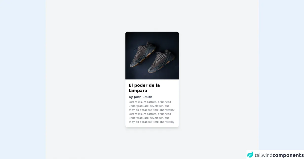
The preview of Product Card ui component.
To create a product card with Tailwind CSS, you'll need to follow a few easy steps. Here's a preview of what the final product card will look like:
Free download of the Product Card's source code
The source code of Product Card ui component.
Here's the source code for the product card UI component created with Tailwind CSS:
<!-- Create By Joker Banny -->
<div class="min-h-screen bg-gray-100 flex items-center justify-center">
  <div class=" w-80 bg-white rounded-xl overflow-hidden shadow-lg hover:shadow-xl hover:scale-105 duration-500 transform transition cursor-pointer">
    <img src="https://images.unsplash.com/photo-1577982787983-e07c6730f2d3?ixlib=rb-1.2.1&ixid=MnwxMjA3fDB8MHxwaG90by1wYWdlfHx8fGVufDB8fHx8&auto=format&fit=crop&w=859&q=80" alt="">
    <div class="p-5">
      <h1 class="text-2xl font-bold">El poder de la lampara</h1>
      <p class="mt-2 text-lg font-semibold text-gray-600">by John Smith</p>
      <p class="mt-1 text-gray-500 font-">Lorem ipsum carrots, enhanced undergraduate developer,
        but they do occaecat time and vitality, Lorem ipsum carrots,
        enhanced undergraduate developer, but they do occaecat time
        and vitality</pa>
    </div>
  </div>
</div>
How to create a Product Card with Tailwind CSS?
Now that you know why you should use Tailwind CSS to create a product card UI component, let's dive into the steps to create one.
Step 1: Set up your HTML
First, you'll need to set up your HTML structure for the product card. Here's an example:
<div class="max-w-sm rounded overflow-hidden shadow-lg">
  <img class="w-full" src="product-image.jpg" alt="Product Image">
  <div class="px-6 py-4">
    <div class="font-bold text-xl mb-2">Product Name</div>
    <p class="text-gray-700 text-base">
      Product Description
    </p>
  </div>
  <div class="px-6 py-4">
    <span class="inline-block bg-gray-200 rounded-full px-3 py-1 text-sm font-semibold text-gray-700 mr-2">#tag1</span>
    <span class="inline-block bg-gray-200 rounded-full px-3 py-1 text-sm font-semibold text-gray-700">#tag2</span>
  </div>
</div>
In this example, we're using a div element with a set of pre-defined Tailwind CSS classes to create the product card UI component. We're also using an img element to display the product image.
Step 2: Add Tailwind CSS to your project
Next, you'll need to add Tailwind CSS to your project. You can do this by installing it via npm or by including it in your HTML file via a CDN. Here's an example of how to include it via a CDN:
<link href="https://cdn.jsdelivr.net/npm/[email protected]/dist/tailwind.min.css" rel="stylesheet">
Step 3: Customize your Tailwind CSS configuration
Tailwind CSS provides a default configuration file that you can customize to fit your project's needs. You can do this by creating a tailwind.config.js file in your project's root directory and adding your customizations.
For example, you might want to customize the colors used in your product card. Here's an example of how to do this:
// tailwind.config.js
module.exports = {
  theme: {
    extend: {
      colors: {
        'primary': '#FF0000',
        'secondary': '#00FF00',
        'tertiary': '#0000FF',
      }
    }
  },
  variants: {},
  plugins: [],
}
In this example, we're adding three new custom colors to our Tailwind CSS configuration: primary, secondary, and tertiary.
Step 4: Apply Tailwind CSS classes to your HTML
Now that you've set up your HTML structure and added Tailwind CSS to your project, you can start applying Tailwind CSS classes to your HTML elements.
For example, you might want to add a custom background color to your product card. Here's an example of how to do this:
<div class="max-w-sm rounded overflow-hidden shadow-lg bg-primary">
  ...
</div>
In this example, we're adding the bg-primary class to our product card div element to set the background color to our custom primary color.
Step 5: Preview and refine your product card
Finally, you can preview your product card and make any necessary refinements to the design. You can do this by opening your HTML file in a web browser and making adjustments to your Tailwind CSS classes as needed.
Conclusion
In this article, we've shown you how to create a product card UI component with Tailwind CSS in just five easy steps. By using Tailwind CSS, you can save time and effort by not having to write custom CSS from scratch, and you can create responsive, mobile-first designs quickly and easily.