- Published on
Surprisingly Effective Ways To Create A Product Card With Tailwind CSS
- What is Tailwind CSS?
- The description of Product Card ui component
- Why use Tailwind CSS to create a Product Card ui component?
- The preview of Product Card ui component
- The source code of Product Card ui component
- How to create a Product Card with Tailwind CSS?
- Step 1: Set up your HTML
- Step 2: Add Tailwind CSS to your project
- Step 3: Style your Product Card with Tailwind CSS
- Step 4: Customize your Product Card
- Conclusion
As a FrontEnd technology blogger, you may have heard of Tailwind CSS. It is a utility-first CSS framework that allows you to quickly build custom designs without writing any CSS. In this article, we will explore the surprisingly effective ways to create a Product Card with Tailwind CSS.
What is Tailwind CSS?
Tailwind CSS is a utility-first CSS framework that provides a set of pre-defined CSS classes that you can use to style your HTML elements. It is designed to be highly customizable and flexible, allowing you to create custom designs without writing any CSS.
The description of Product Card ui component
A Product Card is a UI component that is commonly used in e-commerce websites to display products. It usually includes an image of the product, a title, a description, and a price. The purpose of a Product Card is to provide users with a quick overview of the product and entice them to click through to the product page.
Why use Tailwind CSS to create a Product Card ui component?
Tailwind CSS provides a set of pre-defined CSS classes that you can use to quickly style your Product Card. This means that you don't have to write any CSS from scratch, which can save you a lot of time and effort. Additionally, Tailwind CSS is highly customizable, so you can easily tweak the styles to match your design requirements.
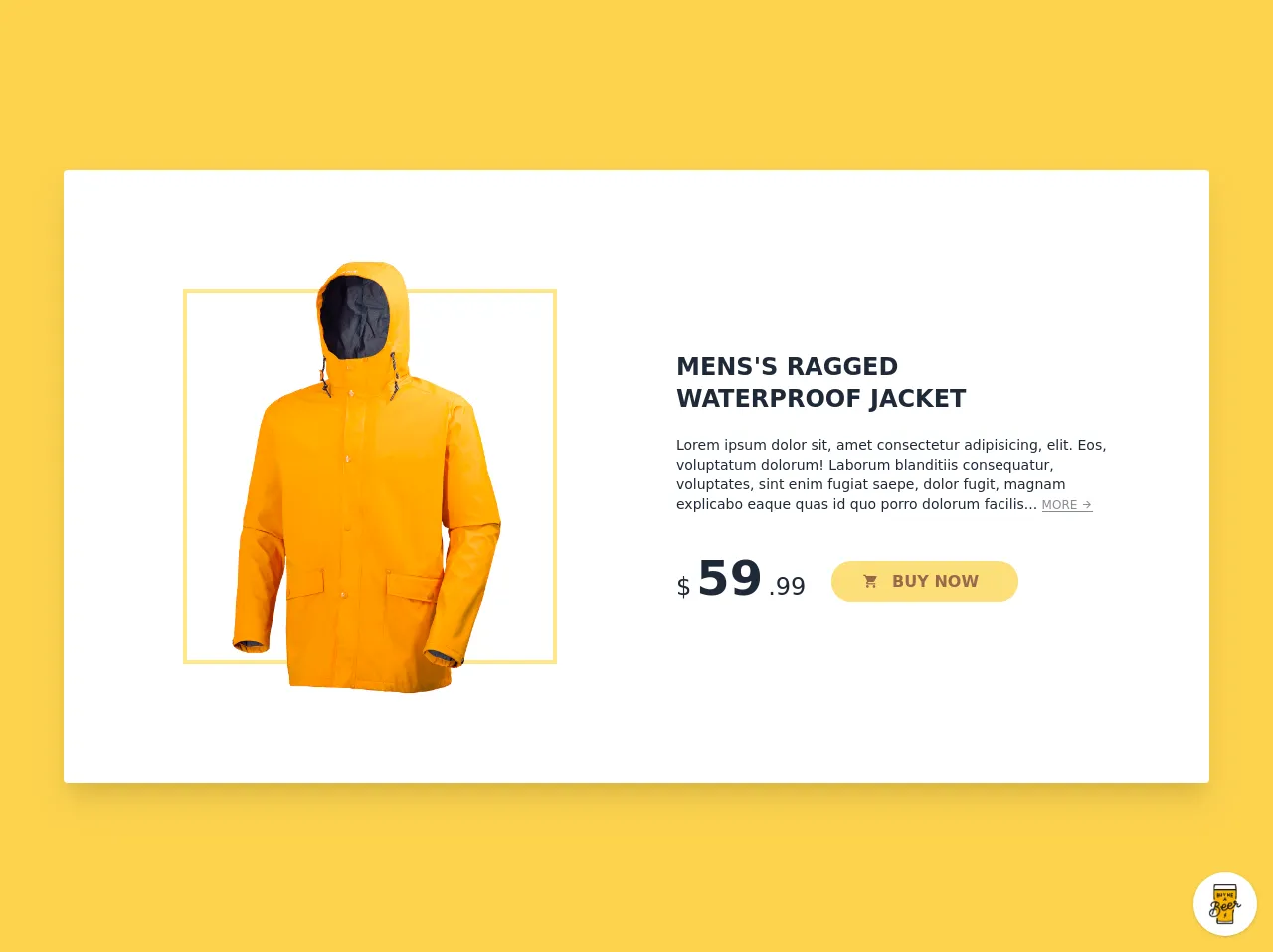
The preview of Product Card ui component
To give you an idea of what a Product Card looks like, here is a preview of what we will be creating:
Free download of the Product Card's source code
The source code of Product Card ui component
Here is the source code for our Product Card:
<style>@import url(https://cdnjs.cloudflare.com/ajax/libs/MaterialDesign-Webfont/5.3.45/css/materialdesignicons.min.css);</style>
<div class="min-w-screen min-h-screen bg-yellow-300 flex items-center p-5 lg:p-10 overflow-hidden relative">
    <div class="w-full max-w-6xl rounded bg-white shadow-xl p-10 lg:p-20 mx-auto text-gray-800 relative md:text-left">
        <div class="md:flex items-center -mx-10">
            <div class="w-full md:w-1/2 px-10 mb-10 md:mb-0">
                <div class="relative">
                    <img src="https://pngimg.com/uploads/raincoat/raincoat_PNG53.png" class="w-full relative z-10" alt="">
                    <div class="border-4 border-yellow-200 absolute top-10 bottom-10 left-10 right-10 z-0"></div>
                </div>
            </div>
            <div class="w-full md:w-1/2 px-10">
                <div class="mb-10">
                    <h1 class="font-bold uppercase text-2xl mb-5">Mens's Ragged <br>Waterproof Jacket</h1>
                    <p class="text-sm">Lorem ipsum dolor sit, amet consectetur adipisicing, elit. Eos, voluptatum dolorum! Laborum blanditiis consequatur, voluptates, sint enim fugiat saepe, dolor fugit, magnam explicabo eaque quas id quo porro dolorum facilis... <a href="#" class="opacity-50 text-gray-900 hover:opacity-100 inline-block text-xs leading-none border-b border-gray-900">MORE <i class="mdi mdi-arrow-right"></i></a></p>
                </div>
                <div>
                    <div class="inline-block align-bottom mr-5">
                        <span class="text-2xl leading-none align-baseline">$</span>
                        <span class="font-bold text-5xl leading-none align-baseline">59</span>
                        <span class="text-2xl leading-none align-baseline">.99</span>
                    </div>
                    <div class="inline-block align-bottom">
                        <button class="bg-yellow-300 opacity-75 hover:opacity-100 text-yellow-900 hover:text-gray-900 rounded-full px-10 py-2 font-semibold"><i class="mdi mdi-cart -ml-2 mr-2"></i> BUY NOW</button>
                    </div>
                </div>
            </div>
        </div>
    </div>
</div>

<!-- BUY ME A BEER AND HELP SUPPORT OPEN-SOURCE RESOURCES -->
<div class="flex items-end justify-end fixed bottom-0 right-0 mb-4 mr-4 z-10">
    <div>
        <a title="Buy me a beer" href="https://www.buymeacoffee.com/scottwindon" target="_blank" class="block w-16 h-16 rounded-full transition-all shadow hover:shadow-lg transform hover:scale-110 hover:rotate-12">
            <img class="object-cover object-center w-full h-full rounded-full" src="https://i.pinimg.com/originals/60/fd/e8/60fde811b6be57094e0abc69d9c2622a.jpg"/>
        </a>
    </div>
</div>
How to create a Product Card with Tailwind CSS?
Now that we have a basic understanding of what a Product Card is and why we should use Tailwind CSS to create it, let's dive into the steps to create a Product Card with Tailwind CSS.
Step 1: Set up your HTML
The first step is to set up your HTML. Here is the basic structure of a Product Card:
<div class="product-card">
  <img src="product-image.jpg" alt="Product Image">
  <h2>Product Title</h2>
  <p>Product Description</p>
  <span class="price">$99.99</span>
</div>
Step 2: Add Tailwind CSS to your project
The next step is to add Tailwind CSS to your project. You can either download the CSS file from the official website or install it via npm. Once you have added Tailwind CSS to your project, you can start using the pre-defined CSS classes to style your Product Card.
Step 3: Style your Product Card with Tailwind CSS
Now that we have set up our HTML and added Tailwind CSS to our project, we can start styling our Product Card. Here are some of the most commonly used Tailwind CSS classes for styling a Product Card:
<div class="product-card bg-white rounded-lg shadow-md overflow-hidden">
  <img src="product-image.jpg" alt="Product Image" class="w-full h-64 object-cover">
  <div class="p-4">
    <h2 class="font-bold text-xl mb-2">Product Title</h2>
    <p class="text-gray-700 text-base">Product Description</p>
    <div class="mt-3">
      <span class="text-gray-700 font-bold">$99.99</span>
    </div>
  </div>
</div>
Let's break down the above code:
- We have added the
bg-whiteclass to set the background color of the Product Card to white. - We have added the
rounded-lgclass to give the Product Card rounded corners. - We have added the
shadow-mdclass to give the Product Card a shadow effect. - We have added the
overflow-hiddenclass to hide any overflow content. - We have added the
w-fullandh-64classes to set the width and height of the image to full and 64 pixels respectively. - We have added the
object-coverclass to ensure that the image covers the entire container. - We have added the
p-4class to add padding to the Product Card. - We have added the
font-boldandtext-xlclasses to make the title bold and larger. - We have added the
text-gray-700andtext-baseclasses to set the color and font size of the description. - We have added the
mt-3class to add margin to the price. - We have added the
text-gray-700andfont-boldclasses to set the color and weight of the price.
Step 4: Customize your Product Card
Tailwind CSS is highly customizable, so you can easily tweak the styles to match your design requirements. For example, you can change the background color, font size, and padding of the Product Card by modifying the corresponding CSS classes.
Conclusion
In this article, we have explored the surprisingly effective ways to create a Product Card with Tailwind CSS. We have learned what a Product Card is, why we should use Tailwind CSS to create it, and how to style it using pre-defined CSS classes. With Tailwind CSS, you can quickly create custom designs without writing any CSS from scratch, which can save you a lot of time and effort.