- Published on
Make A Pricing Table With Tailwind CSS Like A Pro With The Help Of These 6 Tips
- What is Tailwind CSS?
- The description of Pricing table ui component
- Why use Tailwind CSS to create a Pricing table ui component?
- The preview of Pricing table ui component.
- The source code of Pricing table ui component.
- How to create a Pricing table with Tailwind CSS?
- 1. Use the grid system to create a responsive layout
- 2. Use the flexbox system to align content
- 3. Use the border and shadow classes to add depth
- 4. Use the text and font classes to style text
- 5. Use the color classes to add color
- 6. Use the hover classes to add interactivity
- Conclusion
Are you looking to create a pricing table for your website or application? Look no further than Tailwind CSS! With its extensive library of pre-built classes, Tailwind CSS makes it easy to create beautiful and responsive pricing tables. In this article, we'll walk through the process of creating a pricing table with Tailwind CSS, and provide you with 6 tips to help you do it like a pro.
What is Tailwind CSS?
Tailwind CSS is a utility-first CSS framework that provides a set of pre-built classes that you can use to style your HTML elements. Instead of writing CSS from scratch, you can use Tailwind CSS classes to quickly and easily style your elements. Tailwind CSS also provides a responsive grid system, making it easy to create responsive designs.
The description of Pricing table ui component
A pricing table is a user interface component that displays the pricing options for a product or service. It typically includes features, pricing, and a call-to-action button. A well-designed pricing table can help users make informed decisions about which pricing plan is right for them.
Why use Tailwind CSS to create a Pricing table ui component?
Tailwind CSS provides a set of pre-built classes that make it easy to create a beautiful and responsive pricing table. With Tailwind CSS, you can quickly and easily add styles to your pricing table without having to write CSS from scratch. Additionally, Tailwind CSS provides a responsive grid system, making it easy to create a pricing table that looks great on any device.
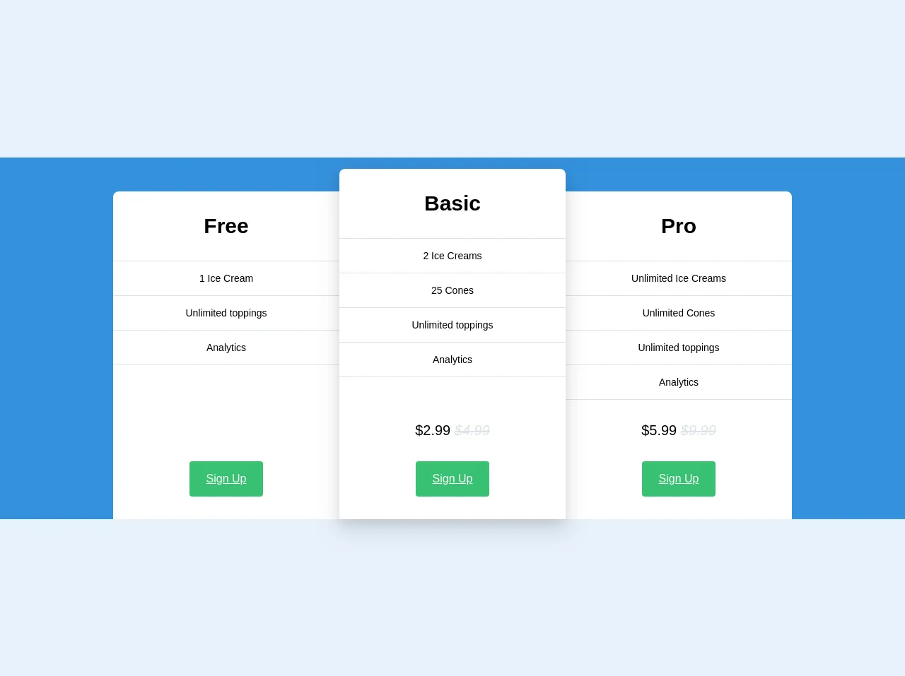
The preview of Pricing table ui component.
Creating a pricing table with Tailwind CSS is easy. With just a few lines of code, you can create a beautiful and responsive pricing table that looks great on any device. Here's a preview of what our pricing table will look like:
Free download of the Pricing table's source code
The source code of Pricing table ui component.
To create our pricing table, we'll use a combination of HTML and Tailwind CSS classes. Here's the source code for our pricing table:
<div class="w-full bg-blue pt-8">
  <div class="flex flex-col sm:flex-row justify-center mb-6 sm:mb-0">
    <div class="sm:flex-1 lg:flex-initial lg:w-1/4 rounded-t-lg rounded-tr-none bg-white mt-4 flex flex-col">
      <div class="p-8 text-3xl font-bold text-center">Free</div>
      <div class="border-0 border-grey-light border-t border-solid text-sm">
        <div class="text-center border-0 border-grey-light border-b border-solid py-4">
          1 Ice Cream
        </div>
        <div class="text-center border-0 border-grey-light border-b border-solid py-4">
          Unlimited toppings
        </div>
        <div class="text-center border-0 border-grey-light border-b border-solid py-4">
          Analytics
        </div>
      </div>
      <div class="text-center mt-8 mb-8 mt-auto">
        <a href="#" class="inline-block bg-green text-white px-6 py-4 rounded hover:bg-green-darker hover:text-white hover:no-underline">Sign Up</a>
      </div>
    </div>
    <div class="flex-1 lg:flex-initial lg:w-1/4 rounded-t-lg bg-white mt-4 sm:-mt-4 shadow-lg z-30 flex flex-col">
      <div class="w-full p-8 text-3xl font-bold text-center">Basic</div>
      <div class="w-full border-0 border-grey-light border-t border-solid text-sm">
        <div class="text-center border-0 border-grey-light border-b border-solid py-4">
          2 Ice Creams
        </div>
        <div class="text-center border-0 border-grey-light border-b border-solid py-4">
          25 Cones
        </div>
        <div class="text-center border-0 border-grey-light border-b border-solid py-4">
          Unlimited toppings
        </div>
        <div class="text-center border-0 border-grey-light border-b border-solid py-4">
          Analytics
        </div>
      </div>
      <div class="w-full text-center px-8 pt-8 text-xl mt-auto">
        $2.99
        <span class="text-grey-light italic line-through">
          $4.99
        </span>
      </div>
      <div class="w-full text-center mb-8 mt-auto">
        <a href="#" class="inline-block bg-green text-white px-6 py-4 rounded hover:bg-green-darker hover:text-white hover:no-underline">Sign Up</a>
      </div>
    </div>
    <div class="flex-1 lg:flex-initial lg:w-1/4 rounded-t-lg rounded-tl-none bg-white mt-4 flex flex-col">
      <div class="p-8 text-3xl font-bold text-center">Pro</div>
      <div class="border-0 border-grey-light border-t border-solid text-sm">
        <div class="text-center border-0 border-grey-light border-b border-solid py-4">
          Unlimited Ice Creams
        </div>
        <div class="text-center border-0 border-grey-light border-b border-solid py-4">
          Unlimited Cones
        </div>
        <div class="text-center border-0 border-grey-light border-b border-solid py-4">
          Unlimited toppings
        </div>
        <div class="text-center border-0 border-grey-light border-b border-solid py-4">
          Analytics
        </div>
      </div>
      <div class="text-center px-8 pt-8 text-xl mt-auto">
        $5.99
        <span class="text-grey-light italic line-through">
          $9.99
        </span>
      </div>
      <div class="text-center pt-8 mb-8 mt-auto">
        <a href="#" class="inline-block bg-green text-white px-6 py-4 rounded hover:bg-green-darker hover:text-white hover:no-underline">Sign Up</a>
      </div>
    </div>
  </div>
</div>
How to create a Pricing table with Tailwind CSS?
Now that we've covered the basics of Tailwind CSS and pricing tables, let's dive into the process of creating a pricing table with Tailwind CSS. Here are 6 tips to help you create a pricing table like a pro:
1. Use the grid system to create a responsive layout
Tailwind CSS provides a responsive grid system that makes it easy to create a pricing table that looks great on any device. To create a grid, we'll use the grid and grid-cols classes. Here's an example:
<div class="grid grid-cols-3">
  <!-- Pricing table items go here -->
</div>
In this example, we're creating a grid with 3 columns. We'll add our pricing table items inside the grid.
2. Use the flexbox system to align content
Tailwind CSS also provides a flexbox system that makes it easy to align content within a container. To align content horizontally, we'll use the justify-between class. Here's an example:
<div class="flex justify-between">
  <!-- Pricing table item content goes here -->
</div>
In this example, we're using the justify-between class to align our pricing table item content to the left and right edges of the container.
3. Use the border and shadow classes to add depth
To add depth to our pricing table, we can use the border and shadow classes. Here's an example:
<div class="border border-gray-300 shadow-md">
  <!-- Pricing table item content goes here -->
</div>
In this example, we're using the border class to add a border around our pricing table item, and the shadow-md class to add a shadow to the item.
4. Use the text and font classes to style text
To style the text in our pricing table, we can use the text and font classes. Here's an example:
<div class="text-lg font-medium">
  <!-- Pricing table item content goes here -->
</div>
In this example, we're using the text-lg class to set the font size of our text, and the font-medium class to set the font weight.
5. Use the color classes to add color
Tailwind CSS provides a set of color classes that make it easy to add color to our pricing table. Here's an example:
<div class="bg-blue-500 text-white">
  <!-- Pricing table item content goes here -->
</div>
In this example, we're using the bg-blue-500 class to set the background color of our pricing table item, and the text-white class to set the text color to white.
6. Use the hover classes to add interactivity
Finally, we can use the hover classes to add interactivity to our pricing table. Here's an example:
<div class="hover:bg-gray-100">
  <!-- Pricing table item content goes here -->
</div>
In this example, we're using the hover:bg-gray-100 class to change the background color of our pricing table item when the user hovers over it.
Conclusion
Creating a pricing table with Tailwind CSS is easy and fun. With its extensive library of pre-built classes, Tailwind CSS makes it easy to create beautiful and responsive pricing tables. By following these 6 tips, you'll be able to create a pricing table like a pro in no time. Happy coding!