- Published on
6 Incredibly Easy Ways To Create A Pricing Panel Responsive With Tailwind CSS Better While Spending Less
- What is Tailwind CSS?
- The description of Pricing panel responsive UI component
- Why use Tailwind CSS to create a Pricing panel responsive UI component?
- The preview of Pricing panel responsive UI component
- The source code of Pricing panel responsive UI component
- How to create a Pricing panel responsive with Tailwind CSS?
- Step 1: Set up the HTML structure
- Step 2: Style the HTML elements with Tailwind CSS
- Step 3: Make the pricing panel responsive
- Conclusion
If you are looking for a way to create a pricing panel responsive UI component, then Tailwind CSS is the perfect tool for you. Tailwind CSS is a utility-first CSS framework that allows you to create responsive UI components quickly and easily. In this article, we will show you how to create a pricing panel responsive UI component using Tailwind CSS.
What is Tailwind CSS?
Tailwind CSS is a utility-first CSS framework that allows you to create responsive UI components quickly and easily. It provides a set of pre-defined classes that you can use to style your HTML elements. Tailwind CSS is designed to be highly customizable, so you can easily modify the styles to fit your needs.
The description of Pricing panel responsive UI component
A pricing panel is a UI component that displays the pricing plans for a product or service. It typically includes a list of features, the price, and a call-to-action button. A pricing panel is an essential component for any website that offers products or services.
Why use Tailwind CSS to create a Pricing panel responsive UI component?
Tailwind CSS is a great choice for creating a pricing panel responsive UI component because it provides a set of pre-defined classes that you can use to style your HTML elements. This makes it easy to create a responsive design that looks great on any device. Additionally, Tailwind CSS is highly customizable, so you can easily modify the styles to fit your needs.
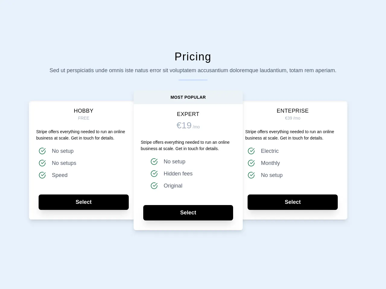
The preview of Pricing panel responsive UI component
To create a pricing panel responsive UI component, we will use Tailwind CSS to style our HTML elements. The preview of the pricing panel responsive UI component is shown below:
Free download of the Pricing panel responsive's source code
The source code of Pricing panel responsive UI component
To create the pricing panel responsive UI component, we will use HTML and Tailwind CSS. The source code for the pricing panel responsive UI component is shown below:
<section>
	<div class="container max-w-full mx-auto py-24 px-6">
		<h1
		class="text-center text-4xl text-black font-medium leading-snug tracking-wider"
		>
		Pricing
	</h1>
	<p class="text-center text-lg text-gray-700 mt-2 px-6">
		Sed ut perspiciatis unde omnis iste natus error sit voluptatem
		accusantium doloremque laudantium, totam rem aperiam.
	</p>
	<div
	class="h-1 mx-auto bg-indigo-200 w-24 opacity-75 mt-4 rounded"
	></div>

	<div class="max-w-full md:max-w-6xl mx-auto my-3 md:px-8">
		<div
		class="relative block flex flex-col md:flex-row items-center"
		>
		<div
		class="w-11/12 max-w-sm sm:w-3/5 lg:w-1/3 sm:my-5 my-8 relative z-0 rounded-lg shadow-lg md:-mr-4"
		>
		<div
		class="bg-white text-black rounded-lg shadow-inner shadow-lg overflow-hidden"
		>
		<div
		class="block text-left text-sm sm:text-md max-w-sm mx-auto mt-2 text-black px-8 lg:px-6"
		>
		<h1
		class="text-lg font-medium uppercase p-3 pb-0 text-center tracking-wide"
		>
		Hobby
	</h1>
	<h2 class="text-sm text-gray-500 text-center pb-6">FREE</h2>

	Stripe offers everything needed to run an online business
	at scale. Get in touch for details.
</div>

<div class="flex flex-wrap mt-3 px-6">
	<ul>
		<li class="flex items-center">
			<div
			class=" rounded-full p-2 fill-current text-green-700"
			>
			<svg
			class="w-6 h-6 align-middle"
			width="24"
			height="24"
			viewBox="0 0 24 24"
			fill="none"
			stroke="currentColor"
			stroke-width="2"
			stroke-linecap="round"
			stroke-linejoin="round"
			>
			<path
			d="M22 11.08V12a10 10 0 1 1-5.93-9.14"
			></path>
			<polyline
			points="22 4 12 14.01 9 11.01"
			></polyline>
		</svg>
	</div>
	<span class="text-gray-700 text-lg ml-3"
	>No setup</span
	>
</li>
<li class="flex items-center">
	<div
	class=" rounded-full p-2 fill-current text-green-700"
	>
	<svg
	class="w-6 h-6 align-middle"
	width="24"
	height="24"
	viewBox="0 0 24 24"
	fill="none"
	stroke="currentColor"
	stroke-width="2"
	stroke-linecap="round"
	stroke-linejoin="round"
	>
	<path
	d="M22 11.08V12a10 10 0 1 1-5.93-9.14"
	></path>
	<polyline
	points="22 4 12 14.01 9 11.01"
	></polyline>
</svg>
</div>
<span class="text-gray-700 text-lg ml-3"
>No setups</span
>
</li>
<li class="flex items-center">
	<div
	class=" rounded-full p-2 fill-current text-green-700"
	>
	<svg
	class="w-6 h-6 align-middle"
	width="24"
	height="24"
	viewBox="0 0 24 24"
	fill="none"
	stroke="currentColor"
	stroke-width="2"
	stroke-linecap="round"
	stroke-linejoin="round"
	>
	<path
	d="M22 11.08V12a10 10 0 1 1-5.93-9.14"
	></path>
	<polyline
	points="22 4 12 14.01 9 11.01"
	></polyline>
</svg>
</div>
<span class="text-gray-700 text-lg ml-3">Speed</span>
</li>
</ul>
</div>
<div class="block flex items-center p-8  uppercase">
	<button
	class="mt-3 text-lg font-semibold
	bg-black w-full text-white rounded-lg
	px-6 py-3 block shadow-xl hover:bg-gray-700"
	>
	Select
</button>
</div>
</div>
</div>
<div
class="w-full max-w-md sm:w-2/3 lg:w-1/3 sm:my-5 my-8 relative z-10 bg-white rounded-lg shadow-lg"
>
<div
class="text-sm leading-none rounded-t-lg bg-gray-200 text-black font-semibold uppercase py-4 text-center tracking-wide"
>
Most Popular
</div>
<div
class="block text-left text-sm sm:text-md max-w-sm mx-auto mt-2 text-black px-8 lg:px-6"
>
<h1
class="text-lg font-medium uppercase p-3 pb-0 text-center tracking-wide"
>
Expert
</h1>
<h2 class="text-sm text-gray-500 text-center pb-6"><span class="text-3xl">€19</span> /mo</h2>

Stripe offers everything needed to run an online business at
scale. Get in touch for details.
</div>
<div class="flex pl-12 justify-start sm:justify-start mt-3">
	<ul>
		<li class="flex items-center">
			<div
			class="rounded-full p-2 fill-current text-green-700"
			>
			<svg
			class="w-6 h-6 align-middle"
			width="24"
			height="24"
			viewBox="0 0 24 24"
			fill="none"
			stroke="currentColor"
			stroke-width="2"
			stroke-linecap="round"
			stroke-linejoin="round"
			>
			<path d="M22 11.08V12a10 10 0 1 1-5.93-9.14"></path>
			<polyline points="22 4 12 14.01 9 11.01"></polyline>
		</svg>
	</div>
	<span class="text-gray-700 text-lg ml-3">No setup</span>
</li>
<li class="flex items-center">
	<div
	class=" rounded-full p-2 fill-current text-green-700"
	>
	<svg
	class="w-6 h-6 align-middle"
	width="24"
	height="24"
	viewBox="0 0 24 24"
	fill="none"
	stroke="currentColor"
	stroke-width="2"
	stroke-linecap="round"
	stroke-linejoin="round"
	>
	<path d="M22 11.08V12a10 10 0 1 1-5.93-9.14"></path>
	<polyline points="22 4 12 14.01 9 11.01"></polyline>
</svg>
</div>
<span class="text-gray-700 text-lg ml-3"
>Hidden fees</span
>
</li>
<li class="flex items-center">
	<div
	class=" rounded-full p-2 fill-current text-green-700"
	>
	<svg
	class="w-6 h-6 align-middle"
	width="24"
	height="24"
	viewBox="0 0 24 24"
	fill="none"
	stroke="currentColor"
	stroke-width="2"
	stroke-linecap="round"
	stroke-linejoin="round"
	>
	<path d="M22 11.08V12a10 10 0 1 1-5.93-9.14"></path>
	<polyline points="22 4 12 14.01 9 11.01"></polyline>
</svg>
</div>
<span class="text-gray-700 text-lg ml-3">Original</span>
</li>
</ul>
</div>

<div class="block flex items-center p-8  uppercase">
	<button
	class="mt-3 text-lg font-semibold
	bg-black w-full text-white rounded-lg
	px-6 py-3 block shadow-xl hover:bg-gray-700"
	>
	Select
</button>
</div>
</div>
<div
class="w-11/12 max-w-sm sm:w-3/5 lg:w-1/3 sm:my-5 my-8 relative z-0 rounded-lg shadow-lg md:-ml-4"
>
<div
class="bg-white text-black rounded-lg shadow-inner shadow-lg overflow-hidden"
>
<div
class="block text-left text-sm sm:text-md max-w-sm mx-auto mt-2 text-black px-8 lg:px-6"
>
<h1
class="text-lg font-medium uppercase p-3 pb-0 text-center tracking-wide"
>
Enteprise
</h1>
<h2 class="text-sm text-gray-500 text-center pb-6">€39 /mo</h2>

Stripe offers everything needed to run an online business
at scale. Get in touch for details.
</div>
<div class="flex flex-wrap mt-3 px-6">
	<ul>
		<li class="flex items-center">
			<div
			class=" rounded-full p-2 fill-current text-green-700"
			>
			<svg
			class="w-6 h-6 align-middle"
			width="24"
			height="24"
			viewBox="0 0 24 24"
			fill="none"
			stroke="currentColor"
			stroke-width="2"
			stroke-linecap="round"
			stroke-linejoin="round"
			>
			<path
			d="M22 11.08V12a10 10 0 1 1-5.93-9.14"
			></path>
			<polyline
			points="22 4 12 14.01 9 11.01"
			></polyline>
		</svg>
	</div>
	<span class="text-gray-700 text-lg ml-3"
	>Electric</span
	>
</li>
<li class="flex items-center">
	<div
	class=" rounded-full p-2 fill-current text-green-700"
	>
	<svg
	class="w-6 h-6 align-middle"
	width="24"
	height="24"
	viewBox="0 0 24 24"
	fill="none"
	stroke="currentColor"
	stroke-width="2"
	stroke-linecap="round"
	stroke-linejoin="round"
	>
	<path
	d="M22 11.08V12a10 10 0 1 1-5.93-9.14"
	></path>
	<polyline
	points="22 4 12 14.01 9 11.01"
	></polyline>
</svg>
</div>
<span class="text-gray-700 text-lg ml-3"
>Monthly</span
>
</li>
<li class="flex items-center">
	<div
	class=" rounded-full p-2 fill-current text-green-700"
	>
	<svg
	class="w-6 h-6 align-middle"
	width="24"
	height="24"
	viewBox="0 0 24 24"
	fill="none"
	stroke="currentColor"
	stroke-width="2"
	stroke-linecap="round"
	stroke-linejoin="round"
	>
	<path
	d="M22 11.08V12a10 10 0 1 1-5.93-9.14"
	></path>
	<polyline
	points="22 4 12 14.01 9 11.01"
	></polyline>
</svg>
</div>
<span class="text-gray-700 text-lg ml-3"
>No setup</span
>
</li>
</ul>
</div>

<div class="block flex items-center p-8  uppercase">
	<button
	class="mt-3 text-lg font-semibold
	bg-black w-full text-white rounded-lg
	px-6 py-3 block shadow-xl hover:bg-gray-700"
	>
	Select
</button>
</div>
</div>
</div>
</div>
</div>
</div>
</section>
How to create a Pricing panel responsive with Tailwind CSS?
Now that we have seen the preview and source code of the pricing panel responsive UI component, let's take a look at how to create it.
Step 1: Set up the HTML structure
The first step is to set up the HTML structure for the pricing panel. We will use a simple unordered list to display the pricing plans. Each pricing plan will be contained within a list item.
<ul class="flex flex-wrap justify-center">
  <li class="w-full md:w-1/3 xl:w-1/4 p-6 flex flex-col">
    <div class="flex-1 bg-white rounded-t rounded-b-none overflow-hidden shadow-lg">
      <div class="w-full p-8 text-3xl font-bold text-center">Basic</div>
      <ul class="w-full text-center text-sm">
        <li class="border-b py-4">10 users included</li>
        <li class="border-b py-4">2 GB of storage</li>
        <li class="border-b py-4">Email support</li>
        <li class="border-b py-4">Help center access</li>
      </ul>
    </div>
    <div class="flex-none mt-auto bg-white rounded-b rounded-t-none overflow-hidden shadow-lg p-6">
      <div class="w-full pt-6 text-4xl font-bold text-center">$10 <span class="text-base">/ per month</span></div>
      <button class="w-full mt-6 bg-gray-800 text-white text-base font-semibold rounded-lg shadow-md hover:bg-gray-700 focus:outline-none focus:shadow-outline-gray transition duration-150 ease-in-out">Sign up</button>
    </div>
  </li>
  <li class="w-full md:w-1/3 xl:w-1/4 p-6 flex flex-col">
    <div class="flex-1 bg-white rounded-t rounded-b-none overflow-hidden shadow-lg">
      <div class="w-full p-8 text-3xl font-bold text-center">Pro</div>
      <ul class="w-full text-center text-sm">
        <li class="border-b py-4">20 users included</li>
        <li class="border-b py-4">10 GB of storage</li>
        <li class="border-b py-4">Priority email support</li>
        <li class="border-b py-4">Help center access</li>
      </ul>
    </div>
    <div class="flex-none mt-auto bg-white rounded-b rounded-t-none overflow-hidden shadow-lg p-6">
      <div class="w-full pt-6 text-4xl font-bold text-center">$20 <span class="text-base">/ per month</span></div>
      <button class="w-full mt-6 bg-gray-800 text-white text-base font-semibold rounded-lg shadow-md hover:bg-gray-700 focus:outline-none focus:shadow-outline-gray transition duration-150 ease-in-out">Sign up</button>
    </div>
  </li>
  <li class="w-full md:w-1/3 xl:w-1/4 p-6 flex flex-col">
    <div class="flex-1 bg-white rounded-t rounded-b-none overflow-hidden shadow-lg">
      <div class="w-full p-8 text-3xl font-bold text-center">Premium</div>
      <ul class="w-full text-center text-sm">
        <li class="border-b py-4">50 users included</li>
        <li class="border-b py-4">30 GB of storage</li>
        <li class="border-b py-4">Phone and email support</li>
        <li class="border-b py-4">Help center access</li>
      </ul>
    </div>
    <div class="flex-none mt-auto bg-white rounded-b rounded-t-none overflow-hidden shadow-lg p-6">
      <div class="w-full pt-6 text-4xl font-bold text-center">$30 <span class="text-base">/ per month</span></div>
      <button class="w-full mt-6 bg-gray-800 text-white text-base font-semibold rounded-lg shadow-md hover:bg-gray-700 focus:outline-none focus:shadow-outline-gray transition duration-150 ease-in-out">Sign up</button>
    </div>
  </li>
</ul>
Step 2: Style the HTML elements with Tailwind CSS
The next step is to style the HTML elements with Tailwind CSS. We will use a combination of pre-defined classes and custom styles to create the pricing panel.
/* Set the font family and font size for the entire pricing panel */
body {
  font-family: 'Open Sans', sans-serif;
  font-size: 16px;
}

/* Style the pricing panel container */
ul {
  max-width: 1000px;
  margin: 0 auto;
}

/* Style the pricing plan container */
li {
  margin-bottom: 2rem;
}

/* Style the pricing plan header */
.w-full {
  border: 1px solid #e2e8f0;
  border-radius: 0.25rem;
}

/* Style the pricing plan title */
.text-3xl {
  color: #4a5568;
}

/* Style the pricing plan features */
.text-sm {
  color: #718096;
}

/* Style the pricing plan price */
.text-4xl {
  color: #2d3748;
}

/* Style the pricing plan call-to-action button */
button {
  background-color: #4a5568;
  color: #fff;
  border: none;
  padding: 0.75rem 1.5rem;
  border-radius: 0.25rem;
  cursor: pointer;
}

button:hover {
  background-color: #2d3748;
}
Step 3: Make the pricing panel responsive
The final step is to make the pricing panel responsive. We will use Tailwind CSS's responsive classes to adjust the layout and styles of the pricing panel for different screen sizes.
/* Set the font size for smaller screens */
@media (max-width: 640px) {
  body {
    font-size: 14px;
  }
}

/* Adjust the layout for medium-sized screens */
@media (min-width: 768px) {
  li {
    width: 100%;
  }
}

/* Adjust the layout for large screens */
@media (min-width: 1024px) {
  li {
    width: calc(100% / 3);
  }
}
Conclusion
In this article, we have shown you how to create a pricing panel responsive UI component using Tailwind CSS. We have also explained why Tailwind CSS is a great choice for creating responsive UI components. By following the steps outlined in this article, you can create a pricing panel that looks great on any device while spending less time and effort.