- Published on
Most Effective Ways To Make A Pricing Cards With Tailwind CSS
- What is Tailwind CSS?
- The description of Pricing cards ui component
- Why use Tailwind CSS to create a Pricing cards ui component?
- The preview of Pricing cards ui component
- The source code of Pricing cards ui component
- How to create a Pricing cards with Tailwind CSS?
- Conclusion
What is Tailwind CSS?
Tailwind CSS is a popular utility-first CSS framework that allows developers to quickly and easily create responsive and customizable user interfaces. It provides a set of pre-defined classes that can be used to style HTML elements without writing any custom CSS code. Tailwind CSS is highly customizable and can be configured to meet the specific needs of a project.
The description of Pricing cards ui component
Pricing cards are a common UI component used on e-commerce and subscription-based websites to display pricing plans. They typically include information such as the price, features, and benefits of each plan. Pricing cards are an important part of the user experience because they help users make informed decisions about which plan to choose.
Why use Tailwind CSS to create a Pricing cards ui component?
Tailwind CSS is an excellent choice for creating pricing cards because it provides a wide range of pre-defined classes that can be used to style the cards. This makes it easy to create a consistent and professional-looking design. Additionally, Tailwind CSS is highly customizable, which means that developers can easily modify the styles to match the branding and design of their website.
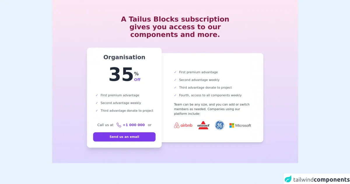
The preview of Pricing cards ui component
To create a pricing card with Tailwind CSS, we will use a combination of flexbox and grid layout. The card will include a header, a body, and a footer. The header will contain the plan name, the body will include the plan features, and the footer will include the price and a call-to-action button.
Free download of the Pricing cards's source code
The source code of Pricing cards ui component
To create the pricing card, we will use the following HTML and CSS code.
<div class="bg-gradient-to-b from-pink-100 to-purple-200">
<div class="container m-auto px-6 py-20 md:px-12 lg:px-20">
<div class="m-auto text-center lg:w-8/12 xl:w-7/12">
<h2 class="text-2xl text-pink-900 font-bold md:text-4xl">A Tailus Blocks subscription gives you access to our components and more.</h2>
</div>
<div class="mt-12 m-auto -space-y-4 items-center justify-center md:flex md:space-y-0 md:-space-x-4 xl:w-10/12">
<div class="relative z-10 -mx-4 group md:w-6/12 md:mx-0 lg:w-5/12">
<div aria-hidden="true" class="absolute top-0 w-full h-full rounded-2xl bg-white shadow-xl transition duration-500 group-hover:scale-105 lg:group-hover:scale-110"></div>
<div class="relative p-6 space-y-6 lg:p-8">
<h3 class="text-3xl text-gray-700 font-semibold text-center">Organisation</h3>
<div>
<div class="relative flex justify-around">
<div class="flex items-end">
<span class="text-8xl text-gray-800 font-bold leading-0">35</span>
<div class="pb-2">
<span class="block text-2xl text-gray-700 font-bold">%</span>
<span class="block text-xl text-purple-500 font-bold">Off</span>
</div>
</div>
</div>
</div>
<ul role="list" class="w-max space-y-4 py-6 m-auto text-gray-600">
<li class="space-x-2">
<span class="text-purple-500 font-semibold">✓</span>
<span>First premium advantage</span>
</li>
<li class="space-x-2">
<span class="text-purple-500 font-semibold">✓</span>
<span>Second advantage weekly</span>
</li>
<li class="space-x-2">
<span class="text-purple-500 font-semibold">✓</span>
<span>Third advantage donate to project</span>
</li>
</ul>
<p class="flex items-center justify-center space-x-4 text-lg text-gray-600 text-center">
<span>Call us at</span>
<a href="tel:+24300" class="flex space-x-2 items-center text-purple-600">
<svg xmlns="http://www.w3.org/2000/svg" fill="currentColor" class="w-6" viewBox="0 0 16 16">
<path d="M3.654 1.328a.678.678 0 0 0-1.015-.063L1.605 2.3c-.483.484-.661 1.169-.45 1.77a17.568 17.568 0 0 0 4.168 6.608 17.569 17.569 0 0 0 6.608 4.168c.601.211 1.286.033 1.77-.45l1.034-1.034a.678.678 0 0 0-.063-1.015l-2.307-1.794a.678.678 0 0 0-.58-.122l-2.19.547a1.745 1.745 0 0 1-1.657-.459L5.482 8.062a1.745 1.745 0 0 1-.46-1.657l.548-2.19a.678.678 0 0 0-.122-.58L3.654 1.328zM1.884.511a1.745 1.745 0 0 1 2.612.163L6.29 2.98c.329.423.445.974.315 1.494l-.547 2.19a.678.678 0 0 0 .178.643l2.457 2.457a.678.678 0 0 0 .644.178l2.189-.547a1.745 1.745 0 0 1 1.494.315l2.306 1.794c.829.645.905 1.87.163 2.611l-1.034 1.034c-.74.74-1.846 1.065-2.877.702a18.634 18.634 0 0 1-7.01-4.42 18.634 18.634 0 0 1-4.42-7.009c-.362-1.03-.037-2.137.703-2.877L1.885.511z"/>
</svg>
<span class="font-semibold">+1 000 000</span>
</a>
<span>or</span>
</p>
<button type="submit" title="Submit" class="block w-full py-3 px-6 text-center rounded-xl transition bg-purple-600 hover:bg-purple-700 active:bg-purple-800 focus:bg-indigo-600">
<span class="text-white font-semibold">
Send us an email
</span>
</button>
</div>
</div>
<div class="relative group md:w-6/12 lg:w-7/12">
<div aria-hidden="true" class="absolute top-0 w-full h-full rounded-2xl bg-white shadow-lg transition duration-500 group-hover:scale-105"></div>
<div class="relative p-6 pt-16 md:p-8 md:pl-12 md:rounded-r-2xl lg:pl-20 lg:p-16">
<ul role="list" class="space-y-4 py-6 text-gray-600">
<li class="space-x-2">
<span class="text-purple-500 font-semibold">✓</span>
<span>First premium advantage</span>
</li>
<li class="space-x-2">
<span class="text-purple-500 font-semibold">✓</span>
<span>Second advantage weekly</span>
</li>
<li class="space-x-2">
<span class="text-purple-500 font-semibold">✓</span>
<span>Third advantage donate to project</span>
</li>
<li class="space-x-2">
<span class="text-purple-500 font-semibold">✓</span>
<span>Fourth, access to all components weekly</span>
</li>
</ul>
<p class="text-gray-700">Team can be any size, and you can add or switch members as needed. Companies using our platform include:</p>
<div class="mt-6 flex justify-between gap-6">
<img class="w-16 lg:w-24" src="https://tailus.io/sources/blocks/organization/preview/images/clients/airbnb.svg" loading="lazy" alt="airbnb">
<img class="w-8 lg:w-16" src="https://tailus.io/sources/blocks/organization/preview/images/clients/bissell.svg" loading="lazy" alt="bissell">
<img class="w-6 lg:w-12" src="https://tailus.io/sources/blocks/organization/preview/images/clients/ge.svg" loading="lazy" alt="ge">
<img class="w-20 lg:w-28" src="https://tailus.io/sources/blocks/organization/preview/images/clients/microsoft.svg" loading="lazy" alt="microsoft">
</div>
</div>
</div>
</div>
</div>
</div>
How to create a Pricing cards with Tailwind CSS?
Step 1: Set up a new HTML file and include the Tailwind CSS stylesheet.
<!DOCTYPE html>
<html lang="en">
<head>
  <meta charset="UTF-8">
  <title>Pricing Cards with Tailwind CSS</title>
  <link rel="stylesheet" href="https://cdn.jsdelivr.net/npm/[email protected]/dist/tailwind.min.css">
</head>
<body>
  <div class="container mx-auto">
    <!-- Pricing Cards -->
  </div>
</body>
</html>
Step 2: Create a container div to hold the pricing cards.
<div class="container mx-auto">
  <div class="grid grid-cols-3 gap-4">
    <!-- Pricing Cards -->
  </div>
</div>
Step 3: Create a card div and apply the necessary styles.
<div class="bg-white rounded-lg shadow-lg p-6">
  <!-- Card Content -->
</div>
Step 4: Add the header section to the card.
<div class="bg-white rounded-lg shadow-lg p-6">
  <h2 class="text-lg font-bold mb-4">Basic Plan</h2>
  <!-- Card Content -->
</div>
Step 5: Add the body section to the card.
<div class="bg-white rounded-lg shadow-lg p-6">
  <h2 class="text-lg font-bold mb-4">Basic Plan</h2>
  <ul class="list-disc ml-4 mb-4">
    <li>5 GB Storage</li>
    <li>10 Email Accounts</li>
    <li>24/7 Support</li>
  </ul>
  <!-- Card Content -->
</div>
Step 6: Add the footer section to the card.
<div class="bg-white rounded-lg shadow-lg p-6">
  <h2 class="text-lg font-bold mb-4">Basic Plan</h2>
  <ul class="list-disc ml-4 mb-4">
    <li>5 GB Storage</li>
    <li>10 Email Accounts</li>
    <li>24/7 Support</li>
  </ul>
  <div class="flex justify-between items-center">
    <span class="text-gray-500 text-sm">$9.99/month</span>
    <button class="bg-blue-500 hover:bg-blue-700 text-white font-bold py-2 px-4 rounded">
      Sign Up
    </button>
  </div>
</div>
Step 7: Repeat steps 3-6 for each pricing plan.
<div class="bg-white rounded-lg shadow-lg p-6">
  <h2 class="text-lg font-bold mb-4">Basic Plan</h2>
  <ul class="list-disc ml-4 mb-4">
    <li>5 GB Storage</li>
    <li>10 Email Accounts</li>
    <li>24/7 Support</li>
  </ul>
  <div class="flex justify-between items-center">
    <span class="text-gray-500 text-sm">$9.99/month</span>
    <button class="bg-blue-500 hover:bg-blue-700 text-white font-bold py-2 px-4 rounded">
      Sign Up
    </button>
  </div>
</div>

<div class="bg-white rounded-lg shadow-lg p-6">
  <h2 class="text-lg font-bold mb-4">Pro Plan</h2>
  <ul class="list-disc ml-4 mb-4">
    <li>10 GB Storage</li>
    <li>20 Email Accounts</li>
    <li>24/7 Support</li>
    <li>Priority Support</li>
  </ul>
  <div class="flex justify-between items-center">
    <span class="text-gray-500 text-sm">$19.99/month</span>
    <button class="bg-blue-500 hover:bg-blue-700 text-white font-bold py-2 px-4 rounded">
      Sign Up
    </button>
  </div>
</div>

<div class="bg-white rounded-lg shadow-lg p-6">
  <h2 class="text-lg font-bold mb-4">Premium Plan</h2>
  <ul class="list-disc ml-4 mb-4">
    <li>20 GB Storage</li>
    <li>50 Email Accounts</li>
    <li>24/7 Support</li>
    <li>Priority Support</li>
    <li>Free Domain Name</li>
  </ul>
  <div class="flex justify-between items-center">
    <span class="text-gray-500 text-sm">$29.99/month</span>
    <button class="bg-blue-500 hover:bg-blue-700 text-white font-bold py-2 px-4 rounded">
      Sign Up
    </button>
  </div>
</div>
Step 8: Add custom styles to the pricing cards as needed.
<div class="bg-white rounded-lg shadow-lg p-6">
  <h2 class="text-lg font-bold mb-4">Basic Plan</h2>
  <ul class="list-disc ml-4 mb-4">
    <li>5 GB Storage</li>
    <li>10 Email Accounts</li>
    <li>24/7 Support</li>
  </ul>
  <div class="flex justify-between items-center">
    <span class="text-gray-500 text-sm">$9.99/month</span>
    <button class="bg-blue-500 hover:bg-blue-700 text-white font-bold py-2 px-4 rounded">
      Sign Up
    </button>
  </div>
</div>
Conclusion
In conclusion, Tailwind CSS is an excellent choice for creating pricing cards because it provides a wide range of pre-defined classes that can be used to style the cards. By following the steps outlined in this article, you can easily create professional-looking pricing cards that will enhance the user experience on your website. With Tailwind CSS, the possibilities are endless!