- Published on
Ultimate Guide: Make A Pricing Page With Tailwind CSS
- What is Tailwind CSS?
- The Description of Pricing Page UI Component
- Why Use Tailwind CSS to Create a Pricing Page UI Component?
- The Preview of Pricing Page UI Component
- The Source Code of Pricing Page UI Component
- How to Create a Pricing Page with Tailwind CSS?
- Step 1: Set Up Your HTML
- Step 2: Install Tailwind CSS
- Step 3: Customize Your Tailwind CSS Configuration
- Step 4: Add Tailwind CSS Classes to Your HTML
- Step 5: Preview and Refine Your Pricing Page
- Conclusion
Are you looking to create a pricing page for your website? Do you want it to be visually appealing and easy to navigate? Look no further than Tailwind CSS. In this ultimate guide, we will walk you through the process of creating a pricing page using Tailwind CSS.
What is Tailwind CSS?
Tailwind CSS is a utility-first CSS framework that allows you to quickly and easily create custom designs for your website. It provides a set of pre-defined classes that you can use to style your HTML elements. With Tailwind CSS, you can create complex layouts and designs without having to write custom CSS.
The Description of Pricing Page UI Component
A pricing page is an essential component of any website that offers products or services. It is a page that displays the different pricing plans available to users. A pricing page typically includes the following elements:
- A header that displays the name of the product or service
- A section that displays the different pricing plans available
- A section that displays the features included in each pricing plan
- A call-to-action button that encourages users to sign up for a plan
Why Use Tailwind CSS to Create a Pricing Page UI Component?
Tailwind CSS is an excellent choice for creating a pricing page UI component for several reasons:
- Tailwind CSS provides a set of pre-defined classes that you can use to style your pricing page quickly and easily.
- Tailwind CSS allows you to create complex layouts and designs without having to write custom CSS.
- Tailwind CSS is highly customizable, allowing you to create a pricing page that matches your brand's style and aesthetic.
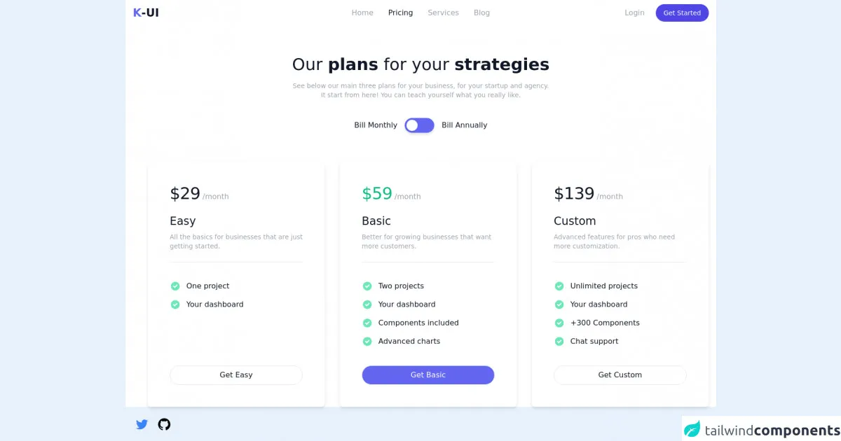
The Preview of Pricing Page UI Component
To give you an idea of what your pricing page could look like, here is a preview of a pricing page created using Tailwind CSS:
Free download of the Pricing page's source code
The Source Code of Pricing Page UI Component
Here is the source code for the pricing page UI component:
<style>
    [x-cloak] {
    display: none;
    }
</style>

<script src="https://cdn.jsdelivr.net/gh/alpinejs/[email protected]/dist/alpine.min.js" defer></script>

<div class="container mx-auto antialiased text-gray-900 bg-white" x-data="setup()">
  <!-- Navbar -->
  <nav>
    <div class="flex items-center justify-between px-4 py-2">
      <!-- Logo -->
      <div class="flex items-center justify-start w-1/4">
        <a href="#">
          <span class="sr-only">Home</span>
          <span class="text-2xl font-semibold"><span class="text-indigo-500">K</span>-UI </span>
        </a>
      </div>

      <!-- Mobile menu button -->
      <button
              @click="isNavOpen = !isNavOpen"
              x-cloak
              class="inline-flex items-center justify-center text-gray-400 rounded-md lg:hidden focus:outline-none focus:ring-2 focus:ring-indigo-500"
              type="button"
              aria-controls="mobile-menu"
              :aria-expanded="isNavOpen ? 'true' : 'false'"
              >
        <span class="sr-only">Open main menu</span>

        <!-- Menu icon -->
        <svg
             x-show="!isNavOpen"
             class="w-8 h-8"
             xmlns="http://www.w3.org/2000/svg"
             fill="none"
             viewBox="0 0 24 24"
             stroke="currentColor"
             aria-hidden="true"
             >
          <path stroke-linecap="round" stroke-linejoin="round" stroke-width="2" d="M4 6h16M4 12h16M4 18h16" />
        </svg>

        <!-- X icon -->
        <svg
             x-show="isNavOpen"
             class="w-8 h-8"
             xmlns="http://www.w3.org/2000/svg"
             fill="none"
             viewBox="0 0 24 24"
             stroke="currentColor"
             aria-hidden="true"
             >
          <path stroke-linecap="round" stroke-linejoin="round" stroke-width="2" d="M6 18L18 6M6 6l12 12" />
        </svg>
      </button>

      <!-- Desktop Middle links -->
      <div class="items-center justify-center hidden w-1/2 lg:flex">
        <a
           href="#"
           class="px-4 py-2 text-base font-medium text-gray-400 transition-colors rounded-full hover:text-gray-900 focus:outline-none focus:ring-2 focus:ring-indigo-700"
           >
          Home
        </a>
        <a
           href="#"
           class="px-4 py-2 text-base font-medium text-gray-900 transition-colors rounded-full hover:text-gray-900 focus:outline-none focus:ring-2 focus:ring-indigo-700"
           >
          Pricing
        </a>
        <a
           href="#"
           class="px-4 py-2 text-base font-medium text-gray-400 transition-colors rounded-full hover:text-gray-900 focus:outline-none focus:ring-2 focus:ring-indigo-700"
           >
          Services
        </a>
        <a
           href="#"
           class="px-4 py-2 text-base font-medium text-gray-400 transition-colors rounded-full hover:text-gray-900 focus:outline-none focus:ring-2 focus:ring-indigo-700"
           >
          Blog
        </a>
      </div>

      <!-- Desktop Right links -->
      <div class="items-center justify-end hidden w-1/4 space-x-2 lg:flex">
        <a
           href="#"
           class="px-4 py-2 text-base font-medium text-gray-400 transition-colors rounded-full hover:text-gray-900 focus:outline-none focus:ring-2 focus:ring-indigo-500"
           >
          Login
        </a>
        <a
           href="#"
           class="inline-flex justify-center px-4 py-2 text-sm font-medium text-white bg-indigo-600 border border-transparent rounded-full shadow-sm whitespace-nowrap hover:bg-indigo-700 focus:outline-none focus:ring-2 focus:ring-offset-2 focus:ring-indigo-500"
           >
          Get Started
        </a>
      </div>
    </div>

    <!-- Mobile menu -->
    <div id="mobile-menu" class="flex flex-col items-center space-y-3 lg:hidden" x-cloak x-show="isNavOpen" @click.away="isNavOpen = false">
      <a
         href="#"
         class="px-4 py-2 text-base font-medium text-gray-400 transition-colors rounded-full hover:text-gray-900 focus:outline-none focus:ring-2 focus:ring-indigo-700"
         >
        Home
      </a>
      <a
         href="#"
         class="px-4 py-2 text-base font-medium text-gray-900 transition-colors rounded-full hover:text-gray-900 focus:outline-none focus:ring-2 focus:ring-indigo-700"
         >
        Pricing
      </a>
      <a
         href="#"
         class="px-4 py-2 text-base font-medium text-gray-400 transition-colors rounded-full hover:text-gray-900 focus:outline-none focus:ring-2 focus:ring-indigo-700"
         >
        Services
      </a>
      <a
         href="#"
         class="px-4 py-2 text-base font-medium text-gray-400 transition-colors rounded-full hover:text-gray-900 focus:outline-none focus:ring-2 focus:ring-indigo-700"
         >
        Blog
      </a>
      <a
         href="#"
         class="px-4 py-2 text-base font-medium text-gray-400 transition-colors rounded-full hover:text-gray-900 focus:outline-none focus:ring-2 focus:ring-indigo-500"
         >
        Login
      </a>
      <a
         href="#"
         class="inline-flex justify-center px-4 py-2 text-sm font-medium text-white bg-indigo-600 border border-transparent rounded-full shadow-sm whitespace-nowrap hover:bg-indigo-700 focus:outline-none focus:ring-2 focus:ring-offset-2 focus:ring-indigo-500"
         >
        Get Started
      </a>
    </div>
  </nav>

  <main class="mx-4 my-16">
    <div class="text-center">
      <h1 class="mb-4 text-2xl font-normal md:text-3xl lg:text-4xl">
        Our <span class="font-semibold">plans</span> for your <span class="font-semibold">strategies</span>
      </h1>
      <p class="text-sm font-normal text-gray-400">
        See below our main three plans for your business, for your startup and agency.
      </p>
      <p class="text-sm font-normal text-gray-400">
        It start from here! You can teach yourself what you really like.
      </p>
    </div>

    <!-- Plan switch -->
    <div class="flex items-center justify-center mt-10 space-x-4">
      <span class="text-base font-medium">Bill Monthly</span>
      <button
              class="relative rounded-full focus:outline-none focus:ring-2 focus:ring-offset-2 focus:ring-indigo-500"
              x-cloak
              @click="billPlan == 'monthly' ? billPlan = 'annually' : billPlan = 'monthly'"
              >
        <div class="w-16 h-8 transition bg-indigo-500 rounded-full shadow-md outline-none"></div>
        <div
             class="absolute inline-flex items-center justify-center w-6 h-6 transition-all duration-200 ease-in-out transform bg-white rounded-full shadow-sm top-1 left-1"
             :class="{ 'translate-x-0': billPlan == 'monthly', 'translate-x-8': billPlan == 'annually' }"
             ></div>
      </button>
      <span class="text-base font-medium">Bill Annually</span>
    </div>

    <!-- Plans -->
    <div
         class="flex flex-col items-center justify-center mt-16 space-y-8 lg:flex-row lg:items-stretch lg:space-x-8 lg:space-y-0"
         >
      <template x-for="(plan, i) in plans" x-key="i">
        <section class="flex flex-col w-full max-w-sm p-12 space-y-6 bg-white rounded-lg shadow-md">
          <!-- Price -->
          <div class="flex-shrink-0">
            <span
                  class="text-4xl font-medium tracking-tight"
                  :class="plan.name == 'Basic' ? 'text-green-500' : ''"
                  x-text="`${billPlan == 'monthly' ? plan.price.monthly : plan.price.annually}`"
                  ></span>
            <span class="text-gray-400" x-text="billPlan == 'monthly' ? '/month' : '/year'"></span>
          </div>

          <!--  -->
          <div class="flex-shrink-0 pb-6 space-y-2 border-b">
            <h2 class="text-2xl font-normal" x-text="plan.name"></h2>
            <p class="text-sm text-gray-400" x-text="plan.discretion"></p>
          </div>

          <!-- Features -->
          <ul class="flex-1 space-y-4">
            <template x-for="(feature, i) in plan.features" x-key="i">
              <li class="flex items-start">
                <svg
                     class="w-6 h-6 text-green-300"
                     aria-hidden="true"
                     xmlns="http://www.w3.org/2000/svg"
                     viewBox="0 0 20 20"
                     fill="currentColor"
                     >
                  <path
                        fill-rule="evenodd"
                        d="M10 18a8 8 0 100-16 8 8 0 000 16zm3.707-9.293a1 1 0 00-1.414-1.414L9 10.586 7.707 9.293a1 1 0 00-1.414 1.414l2 2a1 1 0 001.414 0l4-4z"
                        clip-rule="evenodd"
                        />
                </svg>
                <span class="ml-3 text-base font-medium" x-text="feature"></span>
              </li>
            </template>
          </ul>

          <!-- Button -->
          <div class="flex-shrink-0 pt-4">
            <button
                    class="inline-flex items-center justify-center w-full max-w-xs px-4 py-2 transition-colors border rounded-full focus:outline-none focus:ring-2 focus:ring-offset-2 focus:ring-indigo-500"
                    :class="plan.name == 'Basic' ? 'bg-indigo-500 text-white hover:bg-indigo-700' : 'hover:bg-indigo-500 hover:text-white'"
                    x-text="`Get ${plan.name}`"
                    ></button>
          </div>
        </section>
      </template>
    </div>
  </main>

  <!-- Author links -->
  <div class="fixed flex items-center space-x-4 bottom-5 left-5">
    <a href="https://twitter.com/ak_kamona" target="_blank" class="transition-transform transform hover:scale-125">
      <span class="sr-only">Twitter</span>
      <svg
           aria-hidden="true"
           class="w-8 h-8 text-blue-500"
           fill="currentColor"
           xmlns="http://www.w3.org/2000/svg"
           viewBox="0 0 24 24"
           >
        <path
              d="M19.633,7.997c0.013,0.175,0.013,0.349,0.013,0.523c0,5.325-4.053,11.461-11.46,11.461c-2.282,0-4.402-0.661-6.186-1.809 c0.324,0.037,0.636,0.05,0.973,0.05c1.883,0,3.616-0.636,5.001-1.721c-1.771-0.037-3.255-1.197-3.767-2.793 c0.249,0.037,0.499,0.062,0.761,0.062c0.361,0,0.724-0.05,1.061-0.137c-1.847-0.374-3.23-1.995-3.23-3.953v-0.05 c0.537,0.299,1.16,0.486,1.82,0.511C3.534,9.419,2.823,8.184,2.823,6.787c0-0.748,0.199-1.434,0.548-2.032 c1.983,2.443,4.964,4.04,8.306,4.215c-0.062-0.3-0.1-0.611-0.1-0.923c0-2.22,1.796-4.028,4.028-4.028 c1.16,0,2.207,0.486,2.943,1.272c0.91-0.175,1.782-0.512,2.556-0.973c-0.299,0.935-0.936,1.721-1.771,2.22 c0.811-0.088,1.597-0.312,2.319-0.624C21.104,6.712,20.419,7.423,19.633,7.997z"
              ></path>
      </svg>
    </a>
    <a href="https://github.com/Kamona-WD" target="_blank" class="transition-transform transform hover:scale-125">
      <span class="sr-only">Github</span>
      <svg
           aria-hidden="true"
           class="w-8 h-8 text-black"
           fill="currentColor"
           xmlns="http://www.w3.org/2000/svg"
           viewBox="0 0 24 24"
           >
        <path
              fill-rule="evenodd"
              clip-rule="evenodd"
              d="M12.026,2c-5.509,0-9.974,4.465-9.974,9.974c0,4.406,2.857,8.145,6.821,9.465 c0.499,0.09,0.679-0.217,0.679-0.481c0-0.237-0.008-0.865-0.011-1.696c-2.775,0.602-3.361-1.338-3.361-1.338 c-0.452-1.152-1.107-1.459-1.107-1.459c-0.905-0.619,0.069-0.605,0.069-0.605c1.002,0.07,1.527,1.028,1.527,1.028 c0.89,1.524,2.336,1.084,2.902,0.829c0.091-0.645,0.351-1.085,0.635-1.334c-2.214-0.251-4.542-1.107-4.542-4.93 c0-1.087,0.389-1.979,1.024-2.675c-0.101-0.253-0.446-1.268,0.099-2.64c0,0,0.837-0.269,2.742,1.021 c0.798-0.221,1.649-0.332,2.496-0.336c0.849,0.004,1.701,0.115,2.496,0.336c1.906-1.291,2.742-1.021,2.742-1.021 c0.545,1.372,0.203,2.387,0.099,2.64c0.64,0.696,1.024,1.587,1.024,2.675c0,3.833-2.33,4.675-4.552,4.922 c0.355,0.308,0.675,0.916,0.675,1.846c0,1.334-0.012,2.41-0.012,2.737c0,0.267,0.178,0.577,0.687,0.479 C19.146,20.115,22,16.379,22,11.974C22,6.465,17.535,2,12.026,2z"
              ></path>
      </svg>
    </a>
  </div>
</div>

<script>
    const setup = () => {
    return {
        isNavOpen: false,

        billPlan: 'monthly',

        plans: [
        {
            name: 'Easy',
            discretion: 'All the basics for businesses that are just getting started.',
            price: {
            monthly: 29,
            annually: 29 * 12 - 199,
            },
            features: ['One project', 'Your dashboard'],
        },
        {
            name: 'Basic',
            discretion: 'Better for growing businesses that want more customers.',
            price: {
            monthly: 59,
            annually: 59 * 12 - 100,
            },
            features: ['Two projects', 'Your dashboard', 'Components included', 'Advanced charts'],
        },
        {
            name: 'Custom',
            discretion: 'Advanced features for pros who need more customization.',
            price: {
            monthly: 139,
            annually: 139 * 12 - 100,
            },
            features: ['Unlimited projects', 'Your dashboard', '+300 Components', 'Chat support'],
        },
        ],
    }
}
</script>
How to Create a Pricing Page with Tailwind CSS?
Now that you understand the benefits of using Tailwind CSS to create a pricing page UI component let's walk through the process of creating a pricing page using Tailwind CSS.
Step 1: Set Up Your HTML
The first step is to set up your HTML. Create a new HTML file and add the necessary elements for your pricing page. This will typically include a header, a section for your pricing plans, a section for your plan features, and a call-to-action button.
Step 2: Install Tailwind CSS
The next step is to install Tailwind CSS. You can install Tailwind CSS using npm or by including the pre-built CSS file in your HTML.
Step 3: Customize Your Tailwind CSS Configuration
Tailwind CSS comes with a default configuration file that you can customize to match your brand's style and aesthetic. You can customize your Tailwind CSS configuration by editing the tailwind.config.js file.
Step 4: Add Tailwind CSS Classes to Your HTML
Once you have set up your HTML and customized your Tailwind CSS configuration, you can start adding Tailwind CSS classes to your HTML elements. Tailwind CSS provides a set of pre-defined classes that you can use to style your HTML elements.
Step 5: Preview and Refine Your Pricing Page
After adding Tailwind CSS classes to your HTML, preview your pricing page in the browser and refine it until you are satisfied with the design.
Conclusion
Creating a pricing page using Tailwind CSS is a straightforward process that can save you time and effort. With Tailwind CSS, you can quickly and easily create a visually appealing pricing page that matches your brand's style and aesthetic. Follow the steps outlined in this ultimate guide, and you'll have a beautiful pricing page up and running in no time.