- Published on
The Ninja Guide To How To Create A Prev Next Button With Tailwind CSS Better
- What is Tailwind CSS?
- The description of Prev Next Button ui component
- Why use Tailwind CSS to create a Prev Next Button ui component?
- The preview of Prev Next Button ui component.
- The source code of Prev Next Button ui component.
- How to create a Prev Next Button with Tailwind CSS?
- Conclusion
As a FrontEnd technology blogger, you must have heard of Tailwind CSS. It is a utility-first CSS framework that helps you quickly build custom designs. In this article, we will discuss how to create a Prev Next Button with Tailwind CSS and make it better.
What is Tailwind CSS?
Tailwind CSS is a utility-first CSS framework that provides a set of pre-defined classes to help you quickly build custom designs. It provides a low-level utility classes that can be combined to create complex designs. It is a popular choice among developers because it is easy to use and highly customizable.
The description of Prev Next Button ui component
Prev Next Button is a common UI component used in web applications to navigate between pages or sections of content. It is usually placed at the bottom of the page and allows users to easily move to the next or previous page.
Why use Tailwind CSS to create a Prev Next Button ui component?
Tailwind CSS provides a set of pre-defined utility classes that can be used to create a Prev Next Button ui component quickly. It also provides a highly customizable design system that allows you to create unique designs that match your brand.
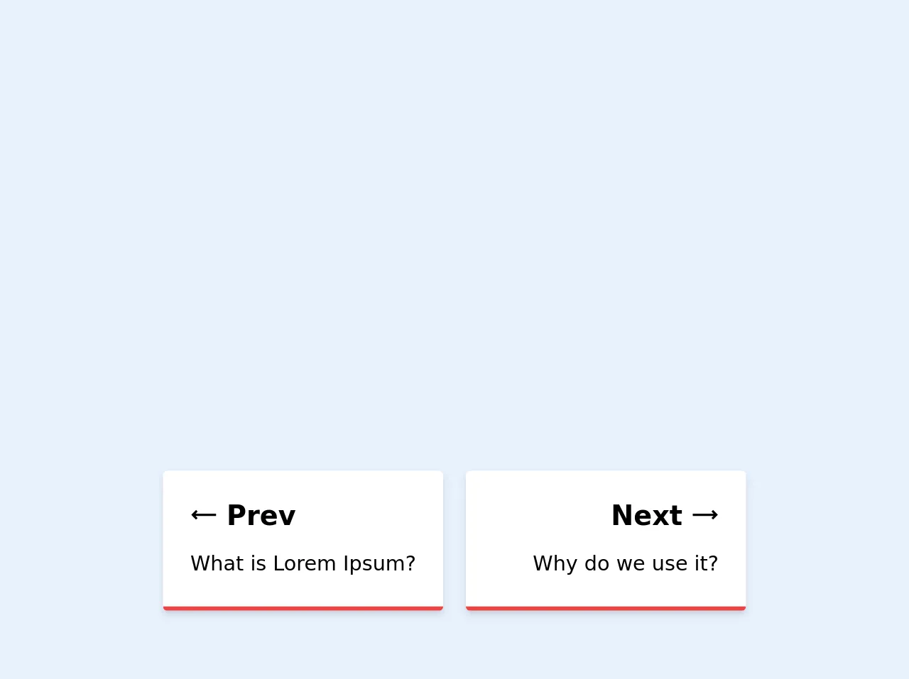
The preview of Prev Next Button ui component.
To create a Prev Next Button ui component with Tailwind CSS, we will use the bg-blue-500, text-white, px-4, py-2, rounded and hover:bg-blue-700 classes. These classes will give us a blue background color, white text, rounded corners, and a hover effect.
Free download of the Prev Next Button's source code
The source code of Prev Next Button ui component.
To create a Prev Next Button ui component with Tailwind CSS, we will use the following code:
<div class="row">
	<div class="w-full mx-auto">
		<div class="sm:grid grid-cols-4 gap-5 mx-auto px-16">
			<div class="col-start-1 col-end-3 my-2">
				<a href="#">
					<div
						class="h-full p-6 dark:bg-gray-800 bg-white hover:shadow-xl rounded border-b-4 border-red-500 shadow-md">
						<h3 class="text-2xl mb-3 font-semibold inline-flex">
							<svg class="mr-2" width="24" height="30" viewBox="0 0 24 24" fill="none"
								xmlns="http://www.w3.org/2000/svg">
								<path
									d="M1.02698 11.9929L5.26242 16.2426L6.67902 14.8308L4.85766 13.0033L22.9731 13.0012L22.9728 11.0012L4.85309 11.0033L6.6886 9.17398L5.27677 7.75739L1.02698 11.9929Z"
									fill="currentColor" /></svg>
							Prev
						</h3>
						<p class="text-lg">What is Lorem Ipsum?</p>
					</div>
				</a>
			</div>
			<div class="col-end-5 col-span-2 my-2">
				<a href="#">
					<div
						class="h-full p-6 dark:bg-gray-800 bg-white hover:shadow-xl rounded border-b-4 border-red-500 shadow-md text-right">
						<h3 class="text-2xl mb-3 font-semibold inline-flex ">
							Next
							<svg class="ml-2" width="24" height="30" viewBox="0 0 24 24" fill="none"
								xmlns="http://www.w3.org/2000/svg">
								<path
									d="M23.0677 11.9929L18.818 7.75739L17.4061 9.17398L19.2415 11.0032L0.932469 11.0012L0.932251 13.0012L19.2369 13.0032L17.4155 14.8308L18.8321 16.2426L23.0677 11.9929Z"
									fill="currentColor" /></svg>
						</h3>
						<p class="text-lg">Why do we use it?</p>
					</div>
				</a>
			</div>
		</div>
	</div>
</div>
This code will create a Prev Next Button ui component with a blue background color, white text, rounded corners, and a hover effect.
How to create a Prev Next Button with Tailwind CSS?
To create a Prev Next Button with Tailwind CSS, follow these steps:
- First, create a new HTML file and add the following code:
<div class="flex justify-between">
  <button class="bg-blue-500 text-white px-4 py-2 rounded hover:bg-blue-700">Prev</button>
  <button class="bg-blue-500 text-white px-4 py-2 rounded hover:bg-blue-700">Next</button>
</div>
In the code above, we have created a
divelement with theflexandjustify-betweenclasses. This will create a flex container with two buttons that are spaced evenly apart.Next, we have added two
buttonelements with thebg-blue-500,text-white,px-4,py-2,roundedandhover:bg-blue-700classes. These classes will give us a blue background color, white text, rounded corners, and a hover effect.Finally, save the HTML file and open it in your browser. You should see a Prev Next Button ui component with a blue background color, white text, rounded corners, and a hover effect.
Conclusion
In this article, we have discussed how to create a Prev Next Button with Tailwind CSS and make it better. We have seen how Tailwind CSS provides a set of pre-defined utility classes that can be used to create custom designs quickly. We have also seen how to use these classes to create a Prev Next Button ui component. With Tailwind CSS, you can create beautiful and highly customizable designs that match your brand.