- Published on
How To Make A Powerpoint With Tailwind CSS In 6 Easy Steps?
- What is Tailwind CSS?
- The description of Powerpoint ui component
- Why use Tailwind CSS to create a Powerpoint ui component?
- The preview of Powerpoint ui component.
- The source code of Powerpoint ui component.
- How to create a Powerpoint with Tailwind CSS?
- Step 1: Set up your project
- Step 2: Create the title slide
- Step 3: Create the content slides
- Step 4: Create the navigation buttons
- Step 5: Add interactivity
- Step 6: Customize the design
- Conclusion
Powerpoint is a widely used presentation software that allows users to create engaging and informative presentations. However, creating a Powerpoint presentation can be time-consuming, especially when it comes to designing the user interface. In this article, we will show you how to create a Powerpoint user interface with Tailwind CSS in six easy steps.
What is Tailwind CSS?
Tailwind CSS is a utility-first CSS framework that provides a set of pre-defined classes that can be used to style HTML elements. It is designed to help developers create responsive and customizable user interfaces quickly and easily.
The description of Powerpoint ui component
A Powerpoint user interface typically consists of several components, including a title slide, content slides, and various navigation buttons. These components are usually styled with a consistent color scheme and typography to create a cohesive look and feel.
Why use Tailwind CSS to create a Powerpoint ui component?
Tailwind CSS provides a set of pre-defined classes that can be used to style HTML elements, making it easy to create a consistent and cohesive user interface. Additionally, Tailwind CSS is highly customizable, allowing developers to create unique designs that match their brand or project requirements.
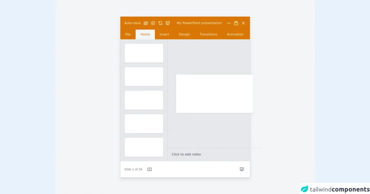
The preview of Powerpoint ui component.
To create a Powerpoint user interface with Tailwind CSS, we will use a combination of HTML and CSS. The resulting user interface will consist of a title slide, content slides, and various navigation buttons.
Free download of the Powerpoint's source code
The source code of Powerpoint ui component.
The source code for our Powerpoint user interface can be found below.
<div
      class="flex items-center justify-center h-screen antialiased bg-gray-100"
    >
      <div class="w-11/12 max-w-4xl border border-gray-300 shadow-lg lg:w-1/2">
        <div class="flex flex-col bg-yellow-600">
          <div
            class="flex flex-row items-center justify-between p-5 text-yellow-100"
          >
            <p class="hidden mr-3 font-medium sm:flex">
              Auto-save
            </p>
            <svg
              class="hidden w-6 h-6 mr-3 sm:flex"
              fill="none"
              stroke="currentColor"
              viewBox="0 0 24 24"
              xmlns="http://www.w3.org/2000/svg"
            >
              <path
                stroke-linecap="round"
                stroke-linejoin="round"
                stroke-width="2"
                d="M17 16v2a2 2 0 01-2 2H5a2 2 0 01-2-2v-7a2 2 0 012-2h2m3-4H9a2 2 0 00-2 2v7a2 2 0 002 2h10a2 2 0 002-2V7a2 2 0 00-2-2h-1m-1 4l-3 3m0 0l-3-3m3 3V3"
              ></path>
            </svg>
            <svg
              class="hidden w-6 h-6 mr-3 sm:flex"
              fill="none"
              stroke="currentColor"
              viewBox="0 0 24 24"
              xmlns="http://www.w3.org/2000/svg"
            >
              <path
                stroke-linecap="round"
                stroke-linejoin="round"
                stroke-width="2"
                d="M11 15l-3-3m0 0l3-3m-3 3h8M3 12a9 9 0 1118 0 9 9 0 01-18 0z"
              ></path>
            </svg>
            <svg
              class="hidden w-6 h-6 mr-3 sm:flex"
              fill="none"
              stroke="currentColor"
              viewBox="0 0 24 24"
              xmlns="http://www.w3.org/2000/svg"
            >
              <path
                stroke-linecap="round"
                stroke-linejoin="round"
                stroke-width="2"
                d="M4 4v5h.582m15.356 2A8.001 8.001 0 004.582 9m0 0H9m11 11v-5h-.581m0 0a8.003 8.003 0 01-15.357-2m15.357 2H15"
              ></path>
            </svg>
            <svg
              class="hidden w-6 h-6 mr-3 sm:flex"
              fill="none"
              stroke="currentColor"
              viewBox="0 0 24 24"
              xmlns="http://www.w3.org/2000/svg"
            >
              <path
                stroke-linecap="round"
                stroke-linejoin="round"
                stroke-width="2"
                d="M7 12l3-3 3 3 4-4M8 21l4-4 4 4M3 4h18M4 4h16v12a1 1 0 01-1 1H5a1 1 0 01-1-1V4z"
              ></path>
            </svg>
            <p
              class="flex-grow font-medium text-left text-yellow-100 sm:text-center"
            >
              My PowerPoint presentation
            </p>
            <svg
              class="w-6 h-6 mr-3"
              fill="none"
              stroke="currentColor"
              viewBox="0 0 24 24"
              xmlns="http://www.w3.org/2000/svg"
            >
              <path
                stroke-linecap="round"
                stroke-linejoin="round"
                stroke-width="2"
                d="M20 12H4"
              ></path>
            </svg>
            <svg
              class="w-6 h-6 mr-3"
              fill="none"
              stroke="currentColor"
              viewBox="0 0 24 24"
              xmlns="http://www.w3.org/2000/svg"
            >
              <path
                stroke-linecap="round"
                stroke-linejoin="round"
                stroke-width="2"
                d="M19 11H5m14 0a2 2 0 012 2v6a2 2 0 01-2 2H5a2 2 0 01-2-2v-6a2 2 0 012-2m14 0V9a2 2 0 00-2-2M5 11V9a2 2 0 012-2m0 0V5a2 2 0 012-2h6a2 2 0 012 2v2M7 7h10"
              ></path>
            </svg>
            <svg
              class="w-6 h-6"
              fill="none"
              stroke="currentColor"
              viewBox="0 0 24 24"
              xmlns="http://www.w3.org/2000/svg"
            >
              <path
                stroke-linecap="round"
                stroke-linejoin="round"
                stroke-width="2"
                d="M6 18L18 6M6 6l12 12"
              ></path>
            </svg>
          </div>
          <div class="flex flex-row items-center font-medium">
            <div
              class="px-6 py-3 text-yellow-100 transition duration-200 cursor-pointer hover:bg-yellow-700"
            >
              File
            </div>
            <div class="px-6 py-3 text-yellow-600 bg-gray-100">Home</div>
            <div
              class="px-6 py-3 text-yellow-100 transition duration-200 cursor-pointer hover:bg-yellow-700"
            >
              Insert
            </div>
            <div
              class="px-6 py-3 text-yellow-100 transition duration-200 cursor-pointer hover:bg-yellow-700"
            >
              Design
            </div>
            <div
              class="px-6 py-3 text-yellow-100 transition duration-200 cursor-pointer hover:bg-yellow-700"
            >
              Transitions
            </div>
            <div
              class="px-6 py-3 text-yellow-100 transition duration-200 cursor-pointer hover:bg-yellow-700"
            >
              Animation
            </div>
          </div>
          <div class="flex flex-row bg-gray-200">
            <div
              class="flex-col hidden p-5 space-y-5 border-r border-gray-300 sm:flex"
            >
              <div
                class="w-48 h-24 transition duration-200 transform scale-100 bg-white border border-gray-300 shadow-sm scale hover:scale-95"
              ></div>
              <div
                class="w-48 h-24 transition duration-200 transform scale-100 bg-white border border-gray-300 shadow-sm scale hover:scale-95"
              ></div>
              <div
                class="w-48 h-24 transition duration-200 transform scale-100 bg-white border border-gray-300 shadow-sm scale hover:scale-95"
              ></div>
              <div
                class="w-48 h-24 transition duration-200 transform scale-100 bg-white border border-gray-300 shadow-sm scale hover:scale-95"
              ></div>
              <div
                class="w-48 h-24 transition duration-200 transform scale-100 bg-white border border-gray-300 shadow-sm scale hover:scale-95"
              ></div>
            </div>
            <div class="flex flex-col w-full">
              <div
                class="flex items-center justify-center flex-grow p-5 mx-auto xl:p-10"
              >
                <div
                  class="h-48 mx-auto transition duration-200 transform scale-100 bg-white border border-gray-300 shadow-sm w-96 scale hover:scale-95"
                ></div>
              </div>
              <div
                class="p-5 text-gray-600 border-t border-gray-300 cursor-pointer hover:text-gray-800"
              >
                <p>Click to add notes</p>
              </div>
            </div>
          </div>
          <div
            class="flex flex-row items-center justify-between p-5 text-sm text-gray-500 bg-white border-t border-gray-300"
          >
            <div class="inline-flex items-center">
              <p class="mr-4">Slide 1 of 16</p>
              <button class="transition duration-200 hover:bg-gray-100 p-2 rounded-lg">
                <svg
                  class="w-6 h-6 text-gray-500"
                  fill="none"
                  stroke="currentColor"
                  viewBox="0 0 24 24"
                  xmlns="http://www.w3.org/2000/svg"
                >
                  <path
                    stroke-linecap="round"
                    stroke-linejoin="round"
                    stroke-width="2"
                    d="M12 6.253v13m0-13C10.832 5.477 9.246 5 7.5 5S4.168 5.477 3 6.253v13C4.168 18.477 5.754 18 7.5 18s3.332.477 4.5 1.253m0-13C13.168 5.477 14.754 5 16.5 5c1.747 0 3.332.477 4.5 1.253v13C19.832 18.477 18.247 18 16.5 18c-1.746 0-3.332.477-4.5 1.253"
                  ></path>
                </svg>
              </button>
            </div>
            <button class="transition duration-200 hover:bg-gray-100 p-2 rounded-lg">
            <svg
              class="w-6 h-6"
              fill="none"
              stroke="currentColor"
              viewBox="0 0 24 24"
              xmlns="http://www.w3.org/2000/svg"
            >
              <path
                stroke-linecap="round"
                stroke-linejoin="round"
                stroke-width="2"
                d="M8 13v-1m4 1v-3m4 3V8M8 21l4-4 4 4M3 4h18M4 4h16v12a1 1 0 01-1 1H5a1 1 0 01-1-1V4z"
              ></path>
            </svg>
            </button>
          </div>
        </div>
      </div>
    </div>
How to create a Powerpoint with Tailwind CSS?
Follow the steps below to create a Powerpoint user interface with Tailwind CSS:
Step 1: Set up your project
To get started, create a new HTML file and add the necessary CSS and JavaScript files. You can either download the Tailwind CSS files or include them from a CDN.
Step 2: Create the title slide
The title slide typically consists of a title and a subtitle. To create the title slide, add the following HTML code:
<div class="flex flex-col h-screen justify-center items-center bg-blue-500">
  <h1 class="text-5xl text-white font-bold mb-4">Title</h1>
  <h2 class="text-3xl text-white font-bold">Subtitle</h2>
</div>
This code creates a full-screen container with a blue background color. The flex and justify-center classes center the content vertically and horizontally, while the items-center class centers the content vertically. The text-5xl and text-3xl classes set the font size of the title and subtitle, respectively.
Step 3: Create the content slides
The content slides typically consist of a title and some content. To create the content slides, add the following HTML code:
<div class="flex flex-col h-screen justify-center items-center">
  <h1 class="text-4xl font-bold mb-4">Title</h1>
  <p class="text-lg">Content</p>
</div>
This code creates a full-screen container with a white background color. The flex and justify-center classes center the content vertically and horizontally, while the items-center class centers the content vertically. The text-4xl and text-lg classes set the font size of the title and content, respectively.
Step 4: Create the navigation buttons
The navigation buttons typically consist of a previous button, a next button, and a slide indicator. To create the navigation buttons, add the following HTML code:
<div class="fixed bottom-0 left-0 w-full bg-white">
  <div class="flex justify-between items-center p-4">
    <button class="bg-blue-500 text-white py-2 px-4 rounded">Previous</button>
    <div class="flex items-center">
      <span class="text-gray-500 mr-2">Slide</span>
      <div class="flex">
        <div class="w-2 h-2 rounded-full bg-blue-500"></div>
        <div class="w-2 h-2 rounded-full bg-gray-300 mx-1"></div>
        <div class="w-2 h-2 rounded-full bg-gray-300"></div>
      </div>
      <span class="text-gray-500 ml-2">of 3</span>
    </div>
    <button class="bg-blue-500 text-white py-2 px-4 rounded">Next</button>
  </div>
</div>
This code creates a fixed container at the bottom of the screen with a white background color. The flex, justify-between, and items-center classes align the content horizontally and vertically. The bg-blue-500 and text-white classes set the background color and text color of the buttons, respectively. The py-2 and px-4 classes set the padding of the buttons, while the rounded class rounds the corners of the buttons. The text-gray-500 class sets the color of the slide indicator text, while the w-2 and h-2 classes set the width and height of the slide indicators, respectively.
Step 5: Add interactivity
To add interactivity to the navigation buttons, you can use JavaScript to change the slide when the previous or next button is clicked. You can also update the slide indicator to show the current slide.
Step 6: Customize the design
Tailwind CSS provides a set of pre-defined classes that can be used to customize the design of the Powerpoint user interface. You can update the background color, font size, and other properties to match your brand or project requirements.
Conclusion
In this article, we showed you how to create a Powerpoint user interface with Tailwind CSS in six easy steps. By using Tailwind CSS, you can create a responsive and customizable user interface quickly and easily. With a little bit of JavaScript, you can also add interactivity to the navigation buttons to create a more engaging presentation.