- Published on
Learn How To Build A Post With Gallery With Tailwind CSS Like an Expert
- What is Tailwind CSS?
- The description of Post with gallery ui component
- Why use Tailwind CSS to create a Post with gallery ui component?
- The preview of Post with gallery ui component
- The source code of Post with gallery ui component
- How to create a Post with gallery with Tailwind CSS?
- Conclusion
What is Tailwind CSS?
Tailwind CSS is a utility-first CSS framework that allows developers to rapidly build custom user interfaces. Instead of writing custom CSS from scratch, Tailwind CSS provides a set of pre-defined classes that can be used to style HTML elements. This makes it easier for developers to create consistent and responsive designs without having to write a lot of CSS code.
The description of Post with gallery ui component
A post with gallery is a common UI component found on many websites and blogs. It consists of a main post or article, along with a gallery of images that are related to the post. This UI component is often used to showcase a collection of images that are related to a particular topic or theme.
Why use Tailwind CSS to create a Post with gallery ui component?
Tailwind CSS is an excellent choice for creating a post with gallery UI component. It provides a wide range of pre-defined classes that can be used to style HTML elements, making it easy to create a consistent and responsive design. Additionally, Tailwind CSS is highly customizable, allowing developers to easily modify the styles of individual elements or create their own custom classes.
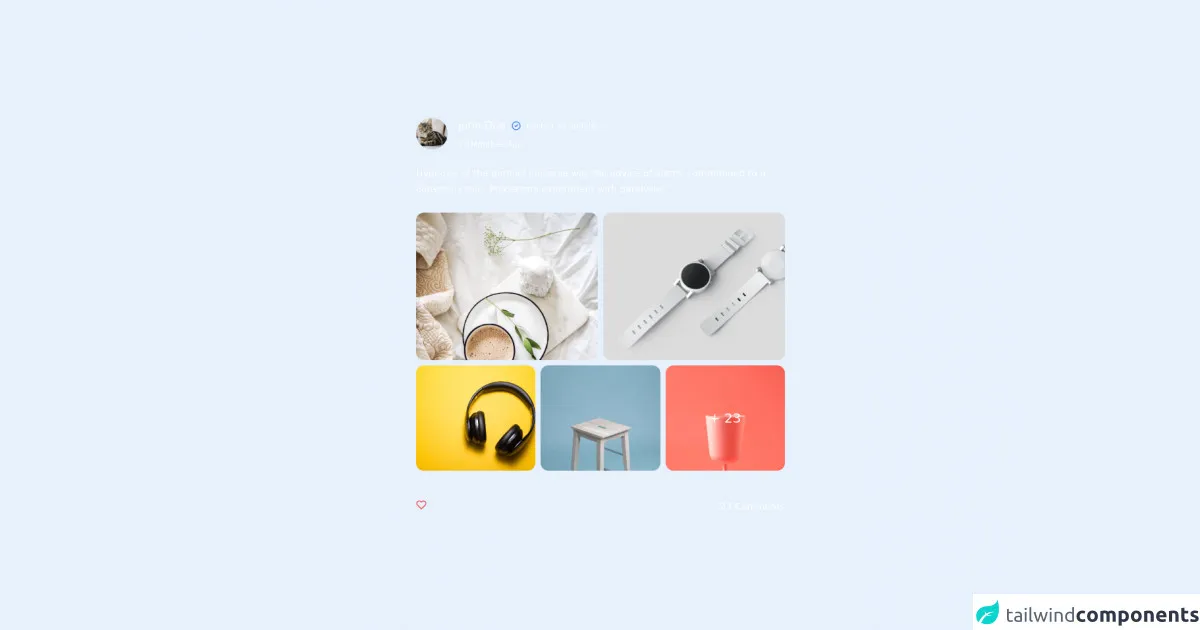
The preview of Post with gallery ui component
To create a post with gallery UI component, we will use Tailwind CSS to style the HTML elements. The resulting UI component will consist of a main post or article, along with a gallery of images that are related to the post.
Free download of the Post with gallery's source code
The source code of Post with gallery ui component
To create a post with gallery UI component, we will use HTML and Tailwind CSS. The HTML will define the structure of the UI component, while the Tailwind CSS classes will be used to style the elements.
<div class="h-screen w-screen flex justify-center items-center bg-slate-900 ">
         <div class="bg-slate-800 text-white rounded-lg w-full mx-5 md:w-[40rem]  space-y-6 p-10">
        <!-- header -->
        <div class="flex space-x-4 items-center ">
          <div class="w-12 h-12"
          >
            <img
                alt="avatar"
                src="https://images.unsplash.com/photo-1518791841217-8f162f1e1131?ixlib=rb-1.2.1&ixid=eyJhcHBfaWQiOjEyMDd9&auto=format&fit=crop&w=800&q=60"
                class="rounded-full w-full h-full object-cover ">
            <div>
            </div>
          </div>
          <div class="space-y-2">
            <div class="flex space-x-2 items-center">
              <h2 class="text-base"> John Doe</h2>
              <svg class="h-4 w-4 text-blue-500" fill="none" viewBox="0 0 24 24"
                   stroke="currentColor" stroke-width="2">
                <path stroke-linecap="round" stroke-linejoin="round" d="M9 12l2 2 4-4m6 2a9 9 0 11-18 0 9 9 0 0118 0z"/>
              </svg>
              <div class="  text-xs text-slate-400">posted an update</div>
            </div>
            <p class=" text-xs text-slate-400">10 Monthes Ago</p>
          </div>

        </div>
        <!--content-->
        <div>
          <p class="text-sm leading-6 text-slate-300">
            Hypnosis at the parallel universe was the advice of alarm, commanded to a conscious ship.
            Processors experiment with paralysis!
          </p>
        </div>


        <!-- image grid-->


        <div class="grid grid-cols-6 col-span-2   gap-2  ">
          <div class=" overflow-hidden rounded-xl col-span-3 max-h-[14rem]">
            <img class="h-full w-full object-cover "
                 src="https://images.unsplash.com/photo-1517487881594-2787fef5ebf7?ixlib=rb-1.2.1&ixid=MnwxMjA3fDB8MHxwaG90by1wYWdlfHx8fGVufDB8fHx8&auto=format&fit=crop&w=735&q=80"
                 alt="">
          </div>
          <div class=" overflow-hidden rounded-xl col-span-3 max-h-[14rem]">
            <img class="h-full w-full object-cover  "
                 src="https://images.unsplash.com/photo-1523275335684-37898b6baf30?ixlib=rb-1.2.1&ixid=MnwxMjA3fDB8MHxwaG90by1wYWdlfHx8fGVufDB8fHx8&auto=format&fit=crop&w=1399&q=80"
                 alt="">
          </div>
          <div class=" overflow-hidden rounded-xl col-span-2 max-h-[10rem]">
            <img class="h-full w-full object-cover "
                 src="https://images.unsplash.com/photo-1505740420928-5e560c06d30e?ixlib=rb-1.2.1&ixid=MnwxMjA3fDB8MHxwaG90by1wYWdlfHx8fGVufDB8fHx8&auto=format&fit=crop&w=1470&q=80"
                 alt="">
          </div>
          <div class=" overflow-hidden rounded-xl col-span-2 max-h-[10rem]">
            <img class="h-full w-full object-cover "
                 src="https://images.unsplash.com/photo-1503602642458-232111445657?ixlib=rb-1.2.1&ixid=MnwxMjA3fDB8MHxwaG90by1wYWdlfHx8fGVufDB8fHx8&auto=format&fit=crop&w=687&q=80"
                 alt="">
          </div>
          <div class="relative overflow-hidden rounded-xl col-span-2 max-h-[10rem]">
            <div
                class="text-white text-xl absolute inset-0  bg-slate-900/80 flex justify-center items-center">
              + 23
            </div>
            <img class="h-full w-full object-cover "
                 src="https://images.unsplash.com/photo-1560393464-5c69a73c5770?ixlib=rb-1.2.1&ixid=MnwxMjA3fDB8MHxwaG90by1wYWdlfHx8fGVufDB8fHx8&auto=format&fit=crop&w=765&q=80"
                 alt="">
          </div>
        </div>

        <!--        comments-->

        <div class="flex justify-between pt-5">

          <svg class="h-4 w-4 text-red-500" fill="none" viewBox="0 0 24 24"
               stroke="currentColor" stroke-width="2">
            <path stroke-linecap="round" stroke-linejoin="round"
                  d="M20.84 4.61a5.5 5.5 0 00-7.78 0L12 5.67l-1.06-1.06a5.5 5.5 0 00-7.78 7.78l1.06 1.06L12 21.23l7.78-7.78 1.06-1.06a5.5 5.5 0 000-7.78z"/>
          </svg>

          <div class="text-slate-400 text-sm"><p>23 Comments</p></div>

        </div>
      </div>


  </div>
How to create a Post with gallery with Tailwind CSS?
To create a post with gallery UI component with Tailwind CSS, follow these steps:
Define the HTML structure of the UI component. This will consist of a main post or article, along with a gallery of images that are related to the post.
Add the necessary Tailwind CSS classes to style the HTML elements. This may include classes for positioning, sizing, and styling the images.
Customize the styles as needed to achieve the desired look and feel.
Here's an example of what the HTML code for a post with gallery UI component might look like:
<div class="container mx-auto">
  <div class="max-w-4xl mx-auto">
    <h1 class="text-3xl font-bold mb-4">My Awesome Post</h1>
    <p class="mb-4">Lorem ipsum dolor sit amet, consectetur adipiscing elit. Sed euismod, urna eu mollis lacinia, tellus est consequat massa, quis imperdiet nunc quam id ex. Sed ullamcorper, quam vel venenatis lacinia, ipsum dolor convallis sapien, vel imperdiet justo ex vel velit.</p>
    <div class="grid grid-cols-3 gap-4">
      <img src="https://via.placeholder.com/150" alt="Placeholder Image" class="w-full h-64 object-cover rounded-lg">
      <img src="https://via.placeholder.com/150" alt="Placeholder Image" class="w-full h-64 object-cover rounded-lg">
      <img src="https://via.placeholder.com/150" alt="Placeholder Image" class="w-full h-64 object-cover rounded-lg">
      <img src="https://via.placeholder.com/150" alt="Placeholder Image" class="w-full h-64 object-cover rounded-lg">
      <img src="https://via.placeholder.com/150" alt="Placeholder Image" class="w-full h-64 object-cover rounded-lg">
      <img src="https://via.placeholder.com/150" alt="Placeholder Image" class="w-full h-64 object-cover rounded-lg">
    </div>
  </div>
</div>
In this example, we've used Tailwind CSS classes to style the main post and the gallery of images. We've used classes like text-3xl, font-bold, mb-4, grid, grid-cols-3, gap-4, w-full, h-64, object-cover, and rounded-lg to achieve the desired look and feel.
Conclusion
In conclusion, Tailwind CSS is an excellent choice for creating a post with gallery UI component. It provides a wide range of pre-defined classes that can be used to style HTML elements, making it easy to create a consistent and responsive design. Additionally, Tailwind CSS is highly customizable, allowing developers to easily modify the styles of individual elements or create their own custom classes. By following the steps outlined in this article, you can create a professional-looking post with gallery UI component with Tailwind CSS like an expert.