- Published on
Ways To Make A Post Card Course Online Responsive With Tailwind CSS In 60 Minutes
- What is Tailwind CSS?
- The description of Post Card Course Online Responsive ui component
- Why use Tailwind CSS to create a Post Card Course Online Responsive ui component?
- The preview of Post Card Course Online Responsive ui component
- The source code of Post Card Course Online Responsive ui component
- How to create a Post Card Course Online Responsive with Tailwind CSS?
- Step 1: Create an HTML file with the basic structure of the component
- Step 2: Link the HTML file to the Tailwind CSS stylesheet
- Step 3: Add the Tailwind CSS classes to the HTML elements to style the component
- Step 4: Test the component on different devices to ensure it is responsive
- Conclusion
As a FrontEnd technology blogger, it's important to stay up-to-date with the latest tools and techniques to create responsive user interfaces. In this article, we will explore how to create a Post Card Course Online Responsive ui component using Tailwind CSS.
What is Tailwind CSS?
Tailwind CSS is a utility-first CSS framework that provides pre-defined classes to quickly style HTML elements. It allows you to create custom designs without writing any CSS code. Tailwind CSS provides a set of pre-defined classes that can be used to style any HTML element.
The description of Post Card Course Online Responsive ui component
A Post Card Course Online is a great way to share knowledge with others. It's an online course that is delivered through a series of postcards. Each postcard contains a lesson or an exercise that the user can complete. The Post Card Course Online Responsive ui component is a user interface element that displays the postcards in a responsive way.
Why use Tailwind CSS to create a Post Card Course Online Responsive ui component?
Tailwind CSS provides a set of pre-defined classes that can be used to create a responsive user interface. It eliminates the need to write custom CSS code, which can be time-consuming and error-prone. With Tailwind CSS, you can quickly create a responsive user interface that looks great on all devices.
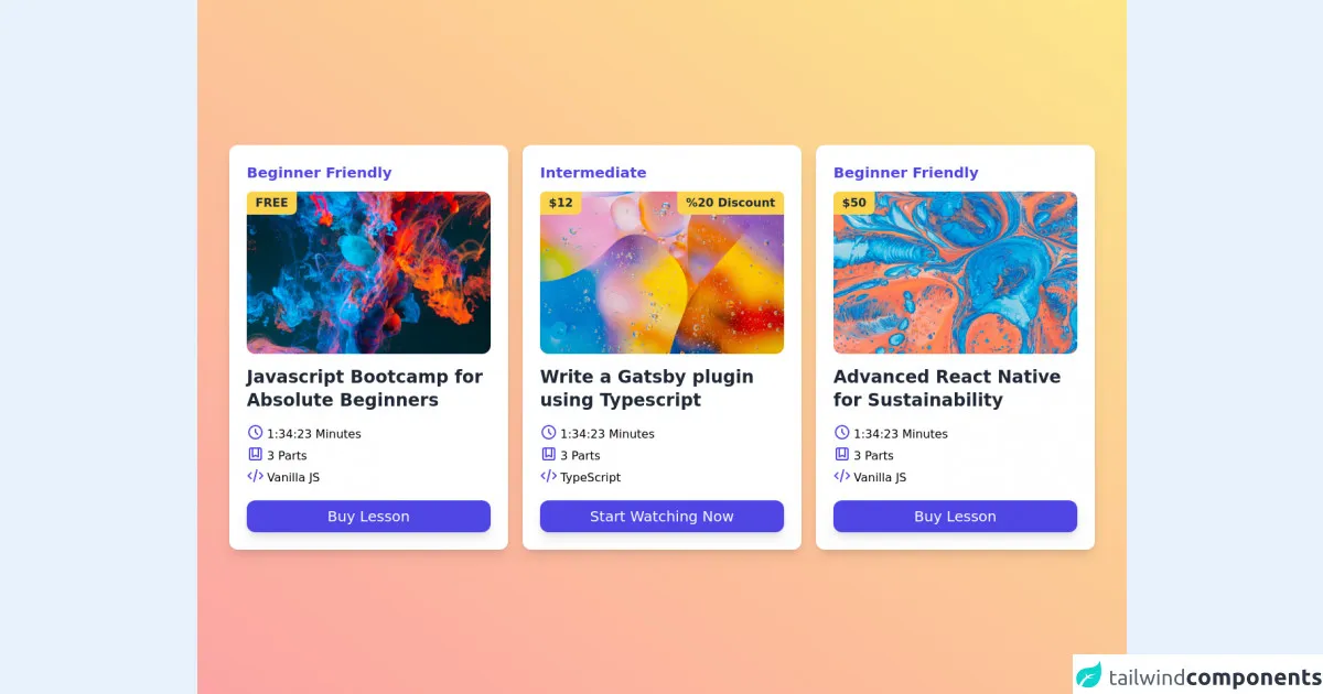
The preview of Post Card Course Online Responsive ui component
To create a Post Card Course Online Responsive ui component, we will use Tailwind CSS. The component will display the postcards in a responsive way, with each postcard taking up one-third of the available space.
Free download of the Post Card Course Online Responsive's source code
The source code of Post Card Course Online Responsive ui component
To create the Post Card Course Online Responsive ui component, we will use HTML and Tailwind CSS. The HTML code will define the structure of the component, while the Tailwind CSS classes will be used to style the component.
<!-- Create By Joker Banny -->
<div class="min-h-screen bg-gradient-to-tr from-red-300 to-yellow-200 flex justify-center items-center py-20">
  <div class="md:px-4 md:grid md:grid-cols-2 lg:grid-cols-3 gap-5 space-y-4 md:space-y-0">
    <div class="max-w-sm bg-white px-6 pt-6 pb-2 rounded-xl shadow-lg transform hover:scale-105 transition duration-500">
      <h3 class="mb-3 text-xl font-bold text-indigo-600">Beginner Friendly</h3>
      <div class="relative">
        <img class="w-full rounded-xl" src="https://images.unsplash.com/photo-1541701494587-cb58502866ab?ixid=MnwxMjA3fDB8MHxwaG90by1wYWdlfHx8fGVufDB8fHx8&ixlib=rb-1.2.1&auto=format&fit=crop&w=1050&q=80" alt="Colors" />
        <p class="absolute top-0 bg-yellow-300 text-gray-800 font-semibold py-1 px-3 rounded-br-lg rounded-tl-lg">FREE</p>
      </div>
      <h1 class="mt-4 text-gray-800 text-2xl font-bold cursor-pointer">Javascript Bootcamp for Absolute Beginners</h1>
      <div class="my-4">
        <div class="flex space-x-1 items-center">
          <span>
            <svg xmlns="http://www.w3.org/2000/svg" class="h-6 w-6 text-indigo-600 mb-1.5" fill="none" viewBox="0 0 24 24" stroke="currentColor">
              <path stroke-linecap="round" stroke-linejoin="round" stroke-width="2" d="M12 8v4l3 3m6-3a9 9 0 11-18 0 9 9 0 0118 0z" />
            </svg>
          </span>
          <p>1:34:23 Minutes</p>
        </div>
        <div class="flex space-x-1 items-center">
          <span>
            <svg xmlns="http://www.w3.org/2000/svg" class="h-6 w-6 text-indigo-600 mb-1.5" fill="none" viewBox="0 0 24 24" stroke="currentColor">
              <path stroke-linecap="round" stroke-linejoin="round" stroke-width="2" d="M16 4v12l-4-2-4 2V4M6 20h12a2 2 0 002-2V6a2 2 0 00-2-2H6a2 2 0 00-2 2v12a2 2 0 002 2z" />
            </svg>
          </span>
          <p>3 Parts</p>
        </div>
        <div class="flex space-x-1 items-center">
          <span>
            <svg xmlns="http://www.w3.org/2000/svg" class="h-6 w-6 text-indigo-600 mb-1.5" fill="none" viewBox="0 0 24 24" stroke="currentColor">
              <path stroke-linecap="round" stroke-linejoin="round" stroke-width="2" d="M10 20l4-16m4 4l4 4-4 4M6 16l-4-4 4-4" />
            </svg>
          </span>
          <p>Vanilla JS</p>
        </div>
        <button class="mt-4 text-xl w-full text-white bg-indigo-600 py-2 rounded-xl shadow-lg">Buy Lesson</button>
      </div>
    </div>
    <div class="max-w-sm bg-white px-6 pt-6 pb-2 rounded-xl shadow-lg transform hover:scale-105 transition duration-500">
      <h3 class="mb-3 text-xl font-bold text-indigo-600">Intermediate</h3>
      <div class="relative">
        <img class="w-full rounded-xl" src="https://images.unsplash.com/photo-1550684848-fac1c5b4e853?ixlib=rb-1.2.1&ixid=MnwxMjA3fDB8MHxwaG90by1wYWdlfHx8fGVufDB8fHx8&auto=format&fit=crop&w=1050&q=80" alt="Colors" />
        <p class="absolute top-0 bg-yellow-300 text-gray-800 font-semibold py-1 px-3 rounded-br-lg rounded-tl-lg">$12</p>
        <p class="absolute top-0 right-0 bg-yellow-300 text-gray-800 font-semibold py-1 px-3 rounded-tr-lg rounded-bl-lg">%20 Discount</p>
      </div>
      <h1 class="mt-4 text-gray-800 text-2xl font-bold cursor-pointer">Write a Gatsby plugin using Typescript</h1>
      <div class="my-4">
        <div class="flex space-x-1 items-center">
          <span>
            <svg xmlns="http://www.w3.org/2000/svg" class="h-6 w-6 text-indigo-600 mb-1.5" fill="none" viewBox="0 0 24 24" stroke="currentColor">
              <path stroke-linecap="round" stroke-linejoin="round" stroke-width="2" d="M12 8v4l3 3m6-3a9 9 0 11-18 0 9 9 0 0118 0z" />
            </svg>
          </span>
          <p>1:34:23 Minutes</p>
        </div>
        <div class="flex space-x-1 items-center">
          <span>
            <svg xmlns="http://www.w3.org/2000/svg" class="h-6 w-6 text-indigo-600 mb-1.5" fill="none" viewBox="0 0 24 24" stroke="currentColor">
              <path stroke-linecap="round" stroke-linejoin="round" stroke-width="2" d="M16 4v12l-4-2-4 2V4M6 20h12a2 2 0 002-2V6a2 2 0 00-2-2H6a2 2 0 00-2 2v12a2 2 0 002 2z" />
            </svg>
          </span>
          <p>3 Parts</p>
        </div>
        <div class="flex space-x-1 items-center">
          <span>
            <svg xmlns="http://www.w3.org/2000/svg" class="h-6 w-6 text-indigo-600 mb-1.5" fill="none" viewBox="0 0 24 24" stroke="currentColor">
              <path stroke-linecap="round" stroke-linejoin="round" stroke-width="2" d="M10 20l4-16m4 4l4 4-4 4M6 16l-4-4 4-4" />
            </svg>
          </span>
          <p>TypeScript</p>
        </div>
        <button class="mt-4 text-xl w-full text-white bg-indigo-600 py-2 rounded-xl shadow-lg">Start Watching Now</button>
      </div>
    </div>
    <div class="max-w-sm bg-white px-6 pt-6 pb-2 rounded-xl shadow-lg transform hover:scale-105 transition duration-500">
      <h3 class="mb-3 text-xl font-bold text-indigo-600">Beginner Friendly</h3>
      <div class="relative">
        <img class="w-full rounded-xl" src="https://images.unsplash.com/photo-1561835491-ed2567d96913?ixlib=rb-1.2.1&ixid=MnwxMjA3fDB8MHxwaG90by1wYWdlfHx8fGVufDB8fHx8&auto=format&fit=crop&w=1050&q=80" alt="Colors" />
        <p class="absolute top-0 bg-yellow-300 text-gray-800 font-semibold py-1 px-3 rounded-br-lg rounded-tl-lg">$50</p>
      </div>
      <h1 class="mt-4 text-gray-800 text-2xl font-bold cursor-pointer">Advanced React Native for Sustainability</h1>
      <div class="my-4">
        <div class="flex space-x-1 items-center">
          <span>
            <svg xmlns="http://www.w3.org/2000/svg" class="h-6 w-6 text-indigo-600 mb-1.5" fill="none" viewBox="0 0 24 24" stroke="currentColor">
              <path stroke-linecap="round" stroke-linejoin="round" stroke-width="2" d="M12 8v4l3 3m6-3a9 9 0 11-18 0 9 9 0 0118 0z" />
            </svg>
          </span>
          <p>1:34:23 Minutes</p>
        </div>
        <div class="flex space-x-1 items-center">
          <span>
            <svg xmlns="http://www.w3.org/2000/svg" class="h-6 w-6 text-indigo-600 mb-1.5" fill="none" viewBox="0 0 24 24" stroke="currentColor">
              <path stroke-linecap="round" stroke-linejoin="round" stroke-width="2" d="M16 4v12l-4-2-4 2V4M6 20h12a2 2 0 002-2V6a2 2 0 00-2-2H6a2 2 0 00-2 2v12a2 2 0 002 2z" />
            </svg>
          </span>
          <p>3 Parts</p>
        </div>
        <div class="flex space-x-1 items-center">
          <span>
            <svg xmlns="http://www.w3.org/2000/svg" class="h-6 w-6 text-indigo-600 mb-1.5" fill="none" viewBox="0 0 24 24" stroke="currentColor">
              <path stroke-linecap="round" stroke-linejoin="round" stroke-width="2" d="M10 20l4-16m4 4l4 4-4 4M6 16l-4-4 4-4" />
            </svg>
          </span>
          <p>Vanilla JS</p>
        </div>
        <button class="mt-4 text-xl w-full text-white bg-indigo-600 py-2 rounded-xl shadow-lg">Buy Lesson</button>
      </div>
    </div>
  </div>
</div>
How to create a Post Card Course Online Responsive with Tailwind CSS?
To create a Post Card Course Online Responsive ui component with Tailwind CSS, follow these steps:
- Create an HTML file with the basic structure of the component.
- Link the HTML file to the Tailwind CSS stylesheet.
- Add the Tailwind CSS classes to the HTML elements to style the component.
- Test the component on different devices to ensure it is responsive.
Let's dive into the details of each step.
Step 1: Create an HTML file with the basic structure of the component
The first step is to create an HTML file with the basic structure of the component. We will use a simple HTML structure that includes a container div and three postcard divs.
<div class="container mx-auto">
  <div class="flex flex-wrap -mx-4">
    <div class="w-full md:w-1/3 px-4">
      <div class="bg-white rounded-lg shadow-lg overflow-hidden">
        <!-- Postcard content goes here -->
      </div>
    </div>
    <div class="w-full md:w-1/3 px-4">
      <div class="bg-white rounded-lg shadow-lg overflow-hidden">
        <!-- Postcard content goes here -->
      </div>
    </div>
    <div class="w-full md:w-1/3 px-4">
      <div class="bg-white rounded-lg shadow-lg overflow-hidden">
        <!-- Postcard content goes here -->
      </div>
    </div>
  </div>
</div>
Step 2: Link the HTML file to the Tailwind CSS stylesheet
Next, we need to link the HTML file to the Tailwind CSS stylesheet. You can download the Tailwind CSS stylesheet from the official website or use a CDN link.
<head>
  <link rel="stylesheet" href="https://cdn.jsdelivr.net/npm/[email protected]/dist/tailwind.min.css">
</head>
Step 3: Add the Tailwind CSS classes to the HTML elements to style the component
Now, we can add the Tailwind CSS classes to the HTML elements to style the component. We will use the flexbox utility classes to create a responsive layout.
<div class="container mx-auto">
  <div class="flex flex-wrap -mx-4">
    <div class="w-full md:w-1/3 px-4">
      <div class="bg-white rounded-lg shadow-lg overflow-hidden">
        <!-- Postcard content goes here -->
      </div>
    </div>
    <div class="w-full md:w-1/3 px-4">
      <div class="bg-white rounded-lg shadow-lg overflow-hidden">
        <!-- Postcard content goes here -->
      </div>
    </div>
    <div class="w-full md:w-1/3 px-4">
      <div class="bg-white rounded-lg shadow-lg overflow-hidden">
        <!-- Postcard content goes here -->
      </div>
    </div>
  </div>
</div>
Step 4: Test the component on different devices to ensure it is responsive
Finally, we need to test the component on different devices to ensure it is responsive. You can use the browser's developer tools to test the component on different screen sizes.
Conclusion
In this article, we explored how to create a Post Card Course Online Responsive ui component using Tailwind CSS. We discussed the benefits of using Tailwind CSS and provided step-by-step instructions on how to create the component. With Tailwind CSS, you can quickly create a responsive user interface that looks great on all devices.