- Published on
Beginners Guide: Build A Post Article With Tailwind CSS
- What is Tailwind CSS?
- The description of Post Article UI component
- Why use Tailwind CSS to create a Post Article UI component?
- The preview of Post Article UI component
- The source code of Post Article UI component
- How to create a Post Article with Tailwind CSS?
- Conclusion
As a beginner in FrontEnd development, it can be overwhelming to choose the right CSS framework to use. However, Tailwind CSS is a popular choice among developers due to its flexibility and ease of use. In this article, we will guide you on how to build a Post Article UI component with Tailwind CSS.
What is Tailwind CSS?
Tailwind CSS is a utility-first CSS framework that provides pre-defined classes to style HTML elements. It allows developers to create custom designs without writing CSS from scratch. With Tailwind CSS, you can easily customize the look and feel of your website by adding or removing classes.
The description of Post Article UI component
The Post Article UI component is a common design element used in blogging platforms. It consists of a title, author, date, content, and social media sharing buttons. It is essential to have a well-designed Post Article UI component to attract readers and keep them engaged.
Why use Tailwind CSS to create a Post Article UI component?
Tailwind CSS provides a wide range of pre-defined classes that can be used to create a Post Article UI component quickly. It also allows for easy customization of the component's design by adding or removing classes. With Tailwind CSS, you can create a responsive design that looks great on all devices.
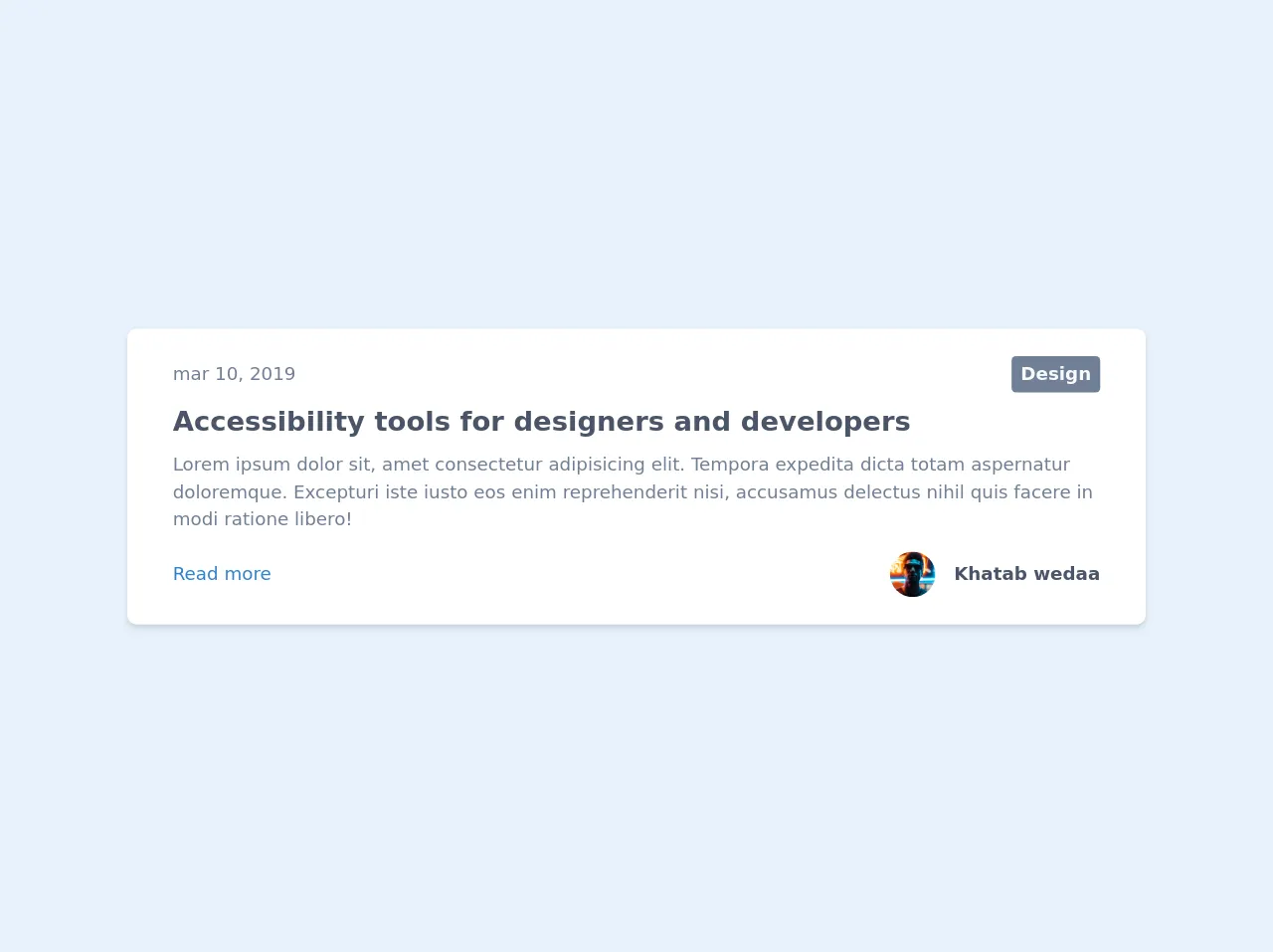
The preview of Post Article UI component
To create a Post Article UI component with Tailwind CSS, we will use the following classes:
bg-white- sets the background color to whitep-6- adds padding of 6 units to all sides of the componentmax-w-4xl- sets the maximum width of the component to 4xlmx-auto- centers the component horizontallyrounded-lg- adds rounded corners to the componentshadow-md- adds a shadow effect to the component
Free download of the Post Article's source code
The source code of Post Article UI component
To create a Post Article UI component with Tailwind CSS, we will use the following HTML code:
<div class="max-w-4xl px-10 my-4 py-6 bg-white rounded-lg shadow-md">
        <div class="flex justify-between items-center">
            <span class="font-light text-gray-600">mar 10, 2019</span>
            <a class="px-2 py-1 bg-gray-600 text-gray-100 font-bold rounded hover:bg-gray-500" href="#">Design</a>
        </div>
        <div class="mt-2">
            <a class="text-2xl text-gray-700 font-bold hover:text-gray-600" href="#">Accessibility tools for designers and developers</a>
            <p class="mt-2 text-gray-600">Lorem ipsum dolor sit, amet consectetur adipisicing elit. Tempora expedita dicta totam aspernatur doloremque. Excepturi iste iusto eos enim reprehenderit nisi, accusamus delectus nihil quis facere in modi ratione libero!</p>
        </div>
        <div class="flex justify-between items-center mt-4">
            <a class="text-blue-600 hover:underline" href="#">Read more</a>
            <div>
                <a class="flex items-center" href="#">
                    <img class="mx-4 w-10 h-10 object-cover rounded-full hidden sm:block" src="https://images.unsplash.com/photo-1502980426475-b83966705988?ixlib=rb-1.2.1&ixid=eyJhcHBfaWQiOjEyMDd9&auto=format&fit=crop&w=373&q=80" alt="avatar">
                    <h1 class="text-gray-700 font-bold">Khatab wedaa</h1>
                </a>
            </div>
        </div>
    </div>
How to create a Post Article with Tailwind CSS?
- First, create a new HTML file and add the following code:
<!DOCTYPE html>
<html lang="en">
<head>
  <meta charset="UTF-8">
  <meta name="viewport" content="width=device-width, initial-scale=1.0">
  <meta http-equiv="X-UA-Compatible" content="ie=edge">
  <title>Post Article UI Component</title>
  <link rel="stylesheet" href="https://cdn.jsdelivr.net/npm/[email protected]/dist/tailwind.min.css">
</head>
<body>
  <div class="bg-white p-6 max-w-4xl mx-auto rounded-lg shadow-md">
    <h1 class="text-3xl font-bold mb-4">Title of the Post</h1>
    <p class="text-gray-600 mb-2">Written by <span class="text-blue-500">Author Name</span> on <span class="text-blue-500">Date</span></p>
    <p class="text-gray-800 leading-relaxed mb-4">Lorem ipsum dolor sit amet, consectetur adipiscing elit. Sed quis augue vitae velit vehicula tincidunt. Sed sed purus id nulla bibendum bibendum sed sit amet metus. Fusce eget sapien vel nibh facilisis consequat. Donec vitae sapien euismod, interdum eros vel, iaculis nulla. Vestibulum ante ipsum primis in faucibus orci luctus et ultrices posuere cubilia curae; Aliquam id ante vel est imperdiet dapibus. Sed euismod, velit in mollis pretium, lectus elit dignissim ipsum, eu dapibus lacus elit a eros. Sed vitae felis vel arcu bibendum semper. Nunc euismod, justo sed bibendum sagittis, sapien elit ullamcorper nunc, vel semper magna odio ut lorem. Nam sit amet quam euismod, cursus quam eu, malesuada nunc. Praesent euismod, massa ut aliquet ultrices, sapien nisl congue sapien, quis ullamcorper enim elit vel velit. </p>
    <div class="flex items-center">
      <button class="bg-blue-500 hover:bg-blue-700 text-white font-bold py-2 px-4 rounded-full mr-4">Share on Facebook</button>
      <button class="bg-blue-500 hover:bg-blue-700 text-white font-bold py-2 px-4 rounded-full mr-4">Share on Twitter</button>
      <button class="bg-blue-500 hover:bg-blue-700 text-white font-bold py-2 px-4 rounded-full">Share on LinkedIn</button>
    </div>
  </div>
</body>
</html>
Save the file and open it in a web browser. You should see a Post Article UI component with a title, author, date, content, and social media sharing buttons.
To customize the design, add or remove classes from the HTML code. For example, to change the background color to gray, replace
bg-whitewithbg-gray-200.
Conclusion
In this article, we have shown you how to create a Post Article UI component with Tailwind CSS. With Tailwind CSS, you can easily customize the design of your website without writing CSS from scratch. We hope this article has been helpful, and you are now ready to create your own Post Article UI component.