- Published on
Learn How To Make A Popover With Tailwind CSS Like an Expert
- What is Tailwind CSS?
- The description of Popover UI component
- Why use Tailwind CSS to create a Popover UI component?
- The preview of Popover UI component
- The source code of Popover UI component
- How to create a Popover with Tailwind CSS?
- Step 1: Create the HTML markup
- Step 2: Add the JavaScript code
- Step 3: Customize the styles
- Conclusion
As a FrontEnd technology blogger, it's important to stay up-to-date with the latest trends and tools in the industry. One of the most popular CSS frameworks right now is Tailwind CSS. In this article, we will learn how to create a Popover UI component using Tailwind CSS.
What is Tailwind CSS?
Tailwind CSS is a utility-first CSS framework that allows you to rapidly build custom user interfaces. It provides a set of pre-defined CSS classes that you can use to style your HTML elements. With Tailwind CSS, you can create complex layouts and designs without writing any custom CSS.
The description of Popover UI component
A Popover is a UI component that displays additional content when a user interacts with a trigger element. The additional content can be displayed in a tooltip, modal, or dropdown. Popovers are commonly used in web applications to provide additional information or options to the user.
Why use Tailwind CSS to create a Popover UI component?
Tailwind CSS provides a set of pre-defined CSS classes that you can use to style your HTML elements. This makes it easy to create a Popover UI component without writing any custom CSS. Additionally, Tailwind CSS is highly customizable, so you can easily modify the styles to match your design requirements.
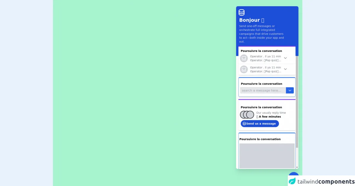
The preview of Popover UI component
To create a Popover UI component with Tailwind CSS, we will use a combination of CSS classes and JavaScript. The Popover will be triggered when the user clicks on a button, and will display additional content in a tooltip.
Free download of the Popover's source code
The source code of Popover UI component
To create the Popover UI component, we will use the following HTML, CSS, and JavaScript code:
<div class="bg-green-200 h-screen flex flex-col items-end">
        <div class="flex-1 bg-white shadow-xl mt-8 mr-5 w-80 rounded-lg relative overflow-hidden">
            <div class="bg-blue-700 h-64 rounded-t-lg absolute w-full"></div>
            <div class="flex flex-col overflow-y-auto h-full space-y-3 py-3">
            <div class="flex flex-col ml-4 z-10">
                <div class="">
                <svg class="text-white w-10 h-10 -ml-2" xmlns="http://www.w3.org/2000/svg" fill="none" viewBox="0 0 24 24" stroke="currentColor">
                    <path stroke-linecap="round" stroke-linejoin="round" stroke-width="2" d="M4 7v10c0 2.21 3.582 4 8 4s8-1.79 8-4V7M4 7c0 2.21 3.582 4 8 4s8-1.79 8-4M4 7c0-2.21 3.582-4 8-4s8 1.79 8 4m0 5c0 2.21-3.582 4-8 4s-8-1.79-8-4" />
                </svg>
                </div>
                <div class="text-white text-2xl font-extrabold my-1">Bonjour 🖐</div>
                <div class="text-gray-300 w-60 text-sm">Send one-off messages or orchestrate full integrated campaigns that drive customers to act—both inside your app and out.</div>
            </div>

            <div class="bg-white border-0 border-t-4 border-purple-600 rounded-b-md flex flex-col z-10 shadow-md ml-3">
                <div class="text-sm text-black ml-3 mt-3 font-bold">Poursuivre la conversation</div>
                <div class="flex px-2 py-2 border-b">
                <div class="bg-gray-300 rounded-full flex w-10 h-10 items-center justify-center">
                    <svg class="text-white h-7 w-7" xmlns="http://www.w3.org/2000/svg" fill="none" viewBox="0 0 24 24" stroke="currentColor">
                    <path stroke-linecap="round" stroke-linejoin="round" stroke-width="2" d="M20 13V6a2 2 0 00-2-2H6a2 2 0 00-2 2v7m16 0v5a2 2 0 01-2 2H6a2 2 0 01-2-2v-5m16 0h-2.586a1 1 0 00-.707.293l-2.414 2.414a1 1 0 01-.707.293h-3.172a1 1 0 01-.707-.293l-2.414-2.414A1 1 0 006.586 13H4" />
                    </svg>
                </div>

                <div class="flex flex-col">
                    <div class="text-gray-500 text-sm ml-3 mt-0">Operator . Il ya 11 min</div>
                    <div class="text-gray-500 text-sm ml-3 mt-0">Operator. 🌟Pop quiz🌟...</div>
                </div>
                <div class="mt-2 ml-3">
                    <svg class="h-5 w-5 text-gray-500" xmlns="http://www.w3.org/2000/svg" fill="none" viewBox="0 0 24 24" stroke="currentColor">
                    <path stroke-linecap="round" stroke-linejoin="round" stroke-width="2" d="M19 9l-7 7-7-7" />
                    </svg>
                </div>
                </div>

                <div class="flex px-2 py-2">
                <div class="bg-gray-300 rounded-full flex w-10 h-10 justify-center items-center">
                    <svg class="text-white h-7 w-7" xmlns="http://www.w3.org/2000/svg" fill="none" viewBox="0 0 24 24" stroke="currentColor">
                    <path stroke-linecap="round" stroke-linejoin="round" stroke-width="2" d="M20 13V6a2 2 0 00-2-2H6a2 2 0 00-2 2v7m16 0v5a2 2 0 01-2 2H6a2 2 0 01-2-2v-5m16 0h-2.586a1 1 0 00-.707.293l-2.414 2.414a1 1 0 01-.707.293h-3.172a1 1 0 01-.707-.293l-2.414-2.414A1 1 0 006.586 13H4" />
                    </svg>
                </div>
                <div class="flex flex-col">
                    <div class="text-gray-500 text-sm ml-3 mt-0">Operator . Il ya 11 min</div>
                    <div class="text-gray-500 text-sm ml-3 mt-0">Operator. 🌟Pop quiz🌟...</div>
                </div>
                <div class="mt-2 ml-3">
                    <svg class="h-5 w-5 text-gray-500" xmlns="http://www.w3.org/2000/svg" fill="none" viewBox="0 0 24 24" stroke="currentColor">
                    <path stroke-linecap="round" stroke-linejoin="round" stroke-width="2" d="M19 9l-7 7-7-7" />
                    </svg>
                </div>
                </div>
            </div>

            <div class="bg-white border border-t-4 border-blue-500 rounded-md flex flex-col z-10 shadow-md ml-3 py-2">
                <div class="text-sm text-black ml-3 mt-3 font-bold">Poursuivre la conversation</div>
                <div class="flex flex-row p-2">
                <input type="text" name="" class="p-2 rounded-l h-8 flex-1 bg-gray-200 shadow-inner focus:gray-200 outline-none" placeholder="search a message here..." id="" />
                <button class="bg-blue-600 w-10 rounded-r flex items-center justify-center">
                    <svg class="h-5 w-5 text-white" xmlns="http://www.w3.org/2000/svg" fill="none" viewBox="0 0 24 24" stroke="currentColor">
                    <path stroke-linecap="round" stroke-linejoin="round" stroke-width="2" d="M19 9l-7 7-7-7" />
                    </svg>
                </button>
                </div>
            </div>

            <div class="bg-white border-0 border-t-4 border-purple-600 rounded-b-md flex flex-col items-start z-10 shadow-md ml-3 py-4">
                <div class="text-sm text-black ml-3 mt-3 font-bold">Poursuivre la conversation</div>
                <div class="flex px-2 py-2 gap-3">
                <div class="flex -space-x-6">
                    <div class="bg-gray-300 rounded-full border-2 border-black flex w-10 h-10 items-center justify-center"></div>
                    <div class="bg-gray-300 rounded-full border-2 border-black flex w-10 h-10 items-center justify-center"></div>
                    <div class="bg-gray-300 rounded-full border-2 border-black flex w-10 h-10 items-center justify-center"></div>

                </div>

                <div class="flex flex-col">
                    <div class="text-gray-500 text-sm ml-3 mt-0">Our usualy reply time</div>
                    <div class="text-black text-sm ml-3 mt-0 font-bold">⏱ A few minutes</div>
                </div>
                </div>
                <button type="button" class="flex bg-blue-700 text-sm text-white font-semibold items-center justify-center ml-3 px-4 py-2 rounded-full gap-2">
                    <svg class="text-white w-5 h-5 -ml-2" xmlns="http://www.w3.org/2000/svg" fill="none" viewBox="0 0 24 24" stroke="currentColor">
                    <path stroke-linecap="round" stroke-linejoin="round" stroke-width="2" d="M4 7v10c0 2.21 3.582 4 8 4s8-1.79 8-4V7M4 7c0 2.21 3.582 4 8 4s8-1.79 8-4M4 7c0-2.21 3.582-4 8-4s8 1.79 8 4m0 5c0 2.21-3.582 4-8 4s-8-1.79-8-4" />
                </svg>
                Send us a message
                </button>
            </div>

            <div class="bg-white border border-t-4 border-blue-500 rounded-md flex flex-col z-10 shadow-md ml-3 py-2">
                <div class="text-sm text-black ml-1 mt-3 font-bold">Poursuivre la conversation</div>
                <div class="bg-gray-300 h-32 mx-1 my-3">
                </div>
                <p class="text-sm text-gray-500 ml-1 text-justify">
                    Share automated messages with quick, conversational chats, or use attention-grabbing posts for more important updates.
                </p>
            </div>
            </div>
        </div>
        <div class="bg-blue-600 rounded-full w-14 h-14 m-4 flex items-center justify-center cursor-pointer shadow-xl">
            <svg class="h-6 w-6 text-white" xmlns="http://www.w3.org/2000/svg" fill="none" viewBox="0 0 24 24" stroke="currentColor">
            <path stroke-linecap="round" stroke-linejoin="round" stroke-width="2" d="M19 9l-7 7-7-7" />
            </svg>
        </div>
        </div>
How to create a Popover with Tailwind CSS?
To create a Popover with Tailwind CSS, follow these steps:
Step 1: Create the HTML markup
The first step is to create the HTML markup for the Popover. We will create a button that will trigger the Popover, and a tooltip that will display the additional content.
<button class="bg-blue-500 hover:bg-blue-700 text-white font-bold py-2 px-4 rounded">
  Popover
</button>

<div class="popover hidden bg-white border border-gray-300 rounded-lg p-4 shadow-lg">
  <p class="text-gray-700">This is some additional content.</p>
</div>
In this code, we have created a button with the bg-blue-500 and hover:bg-blue-700 classes to give it a blue background color. We have also added padding and rounded corners using the py-2, px-4, and rounded classes.
The tooltip is hidden by default using the hidden class. It has a white background color, a gray border, and rounded corners using the bg-white, border, and rounded-lg classes. We have also added padding and a shadow using the p-4 and shadow-lg classes. Inside the tooltip, we have added a paragraph with the text-gray-700 class to give it a gray text color.
Step 2: Add the JavaScript code
The next step is to add the JavaScript code to show and hide the tooltip when the user clicks on the button.
const button = document.querySelector('button');
const popover = document.querySelector('.popover');

button.addEventListener('click', () => {
  popover.classList.toggle('hidden');
});
In this code, we have selected the button and the tooltip using the querySelector method. We have then added an event listener to the button that toggles the hidden class on the tooltip when the button is clicked.
Step 3: Customize the styles
The final step is to customize the styles of the Popover to match your design requirements. You can modify the background color, border, padding, and text color using the pre-defined Tailwind CSS classes.
Conclusion
In this article, we have learned how to create a Popover UI component using Tailwind CSS. We have seen how Tailwind CSS provides a set of pre-defined CSS classes that you can use to style your HTML elements, making it easy to create complex layouts and designs. We have also seen how to use JavaScript to show and hide the Popover when the user interacts with the trigger element. With this knowledge, you can create custom Popovers that match your design requirements and provide additional information or options to your users.